One of the most challenging tasks when working on the design of a project is, and always will be, choosing the right color and building the color palette. It’s great if you can start with brand colors, but that’s not always convenient. Especially when the logo is black and white or just red and white. The internet is already overflowing with red-and-white websites, to the point that yet another one just feels dull and uninspiring — you don't even care what it’s selling or saying. Designers use different approaches to pick colors for their designs, but for some reason, the idea of using a monochromatic palette often comes much later.
In reality, monochromatic projects can have a strong emotional impact on users, offer more room for creativity, and can be incredibly diverse and... multidimensional. Some designers manage to create monochrome websites that are so stunning and visually rich that users begin to perceive even the most ordinary elements in a whole new way. Sometimes it even feels like there are many colors — when in fact there’s just one.
In this article, we’ll take a closer look at the unique qualities of monochrome palettes in web design and explore how to create one quickly and effectively.
The Basics
The trickiest part when starting a monochrome palette is choosing the base color — the one that will show up most often and set the tone. It should be a color whose shades suit the overall theme and style. But the simplest way to choose is based on mood. Think about the mood you want to evoke and rely on classic associations developed over centuries.
Red = love, Green = hope (eco), Pink = romance, Blue = trust, Yellow = energy, Purple = imagination, faith.
Take a closer look at the brand and pick one color to focus on. Maybe that’s the one that can become the foundation and set the emotional tone of the whole project. And if the logo is colorless, think about why you’re building the site and who it’s for — select your base accordingly.
But before finalizing your choice, you need to consider the saturation and shades of the base color. Sometimes, despite the core color being right, the tones might feel too harsh or too pale (pastel). You might need to combine them somehow — but without making the result feel gaudy.
Projects like coaxsoft , niika , and normsugar are all built with monochrome palettes. And yet, the range of shades used is so wide that they feel like they contain a full spectrum of distinct colors. In fact, using blended tones between purple and pink adds a lot of visual interest. The "sugar" theme, for instance, could appeal to both a feminine audience (pink) and to those who value trustworthy information (purple).


Tone, Saturation, and Shades
We've previously discussed in detail the difference between tones, shades, and saturation , so we won’t go deep into that again. But it’s worth noting: when working with monochrome palettes, you absolutely must use tones and shades — and lots of them. It helps to think of each as a standalone color, which makes the palette feel more complete and easier to manage.
Just like a regular palette includes multiple colors, a monochrome one consists of a base color, its shades, tones, and saturation levels. Each of these plays a different role in design. Tones highlight key elements, shades darken backgrounds, and saturated colors bring focus. Great examples of this can be seen in designs for hoyermotors , ouestsecuritemarine , labottegavail , and oneupstud .


Some examples rely on high contrast — and even with the addition of just one contrasting color, the visual effect becomes clear and immediate. Users quickly understand where to click, what to read, and what to look at. To simplify shade selection, it’s always a good idea to keep a color/shade chart handy. (We’ve covered this earlier in the article.) That way, identifying your main working "colors" becomes much faster and easier. And of course, monochrome isn't just about color — it’s also about using textures in the background, images, tints, and gradients.
Combining with Elements
Great, we’ve chosen the color range for our monochrome palette! Now how do we avoid overwhelming the user’s (and our own) eyes with too many tones and shades? Usually, web designers tackle this by not picking colors that are too similar. That way, the contrast between tones is more noticeable, and it's easier for the eye to focus.
The project ouestsecuritemarine , for example, uses shades of black as the base, but adds bright red to highlight key UI elements. Similarly, futuramo uses purple backgrounds for emphasis, while making icons, buttons, and headers stand out in vibrant, non-monochrome colors. This helps direct users’ attention to the most important actions or sections right away. The design of investmentcalculator also uses a monochrome palette — but in a very minimalistic way.


So, a few details are worth keeping in mind:
Color tinting – Before applying a monochrome filter to an image, desaturate it first. That way, colors won’t blend unexpectedly, and your working tone stays clear.
Bold fonts – Thin fonts often get lost against bright or pastel backgrounds, regardless of their own color. That’s why bold typefaces or fonts with thicker strokes work much better in monochrome layouts.
Shadows – Sometimes you’ll want to subtly lift certain design elements so they don’t visually blend in. Small shadows can help with this. But instead of the usual gray, try using shadows tinted with tones from your working monochrome palette — it often looks much more refined.
You can clearly see this in investmentcalculator . Each card element has a barely noticeable shadow and a soft, tinted gradient border — light and airy.

Illustration – Add small illustrations to the background to emphasize the project’s monochrome vibe. It makes the design more engaging and avoids that “flat, faceless color” effect. That’s exactly what eulerr had in mind. On one hand — the design looks “alive”, on the other — strong contrast and clear monochrome expression through textures, button colors, and icons.


Color Matching – If your project already includes monochromatic photos or videos, it gets a lot easier: the design palette will naturally match the visual assets.
Style & Trends
Don’t forget about Material Design palettes — this year encourages bold and bright design decisions. Plus, ultraviolet itself is anything but dull. Also consider pink, orange, light green, yellowish, or bluish hues.
Don’t assume that monochrome = light and pastel. The beauty of monochrome is its flexibility. You can play with tones and saturation. Add just a bit of black or white, and you get dozens of variations on your base color. If one version looks flat or washed out, you can tweak it with neutral colors and saturation levels.
But trends don’t last forever. Things have stayed relatively stable over the last few years — but who knows what the next season or year will bring? What if monochrome palettes fall out of fashion? That’s why it’s smart to be selective with shades, to avoid visual overload. For example, if you're designing for winter — go with blue, icy tones, or pale violet. Spring? Try orange, yellow, or green. You can also mix in small color pops to highlight UI elements or headings.
The project lifewisepetfood uses a variety of tones — but they’re all basically beige. And beige works well in any season. Or take variations like ahk-prod , fullrotation , and ginoangelinifoods — the color choice aligns with the project’s theme, making it timeless.


Black Monochrome
Not all monochrome palettes are colorful. Some are made entirely of black, gray, or very dark tones (deep green, dark red) — colors that almost fade into black. These palettes can be even more interesting but are harder to work with, since you don’t have tonal range to distinguish elements. Everything is dark.
Still, this kind of design feels modern and sophisticated. Designers often use dark monochrome with a single bright accent color, especially when there’s a lot of content and the homepage needs to look clean and elegant.
Examples: antmoves , bee-creations , freshsince2015 , lesanimals , minthisresort , clearmotion


Almost Monochrome
An almost monochrome palette is what you get when you add a foreign color to an otherwise strict monochrome scheme. In this case, designers reduce the palette to just a couple of tones and introduce a completely different color that sits far away on the spectrum. For example: scarlet with gray, orange with green, yellow with blue, and so on. This can’t really be called true monochrome — it’s more like “nearly monochrome”.
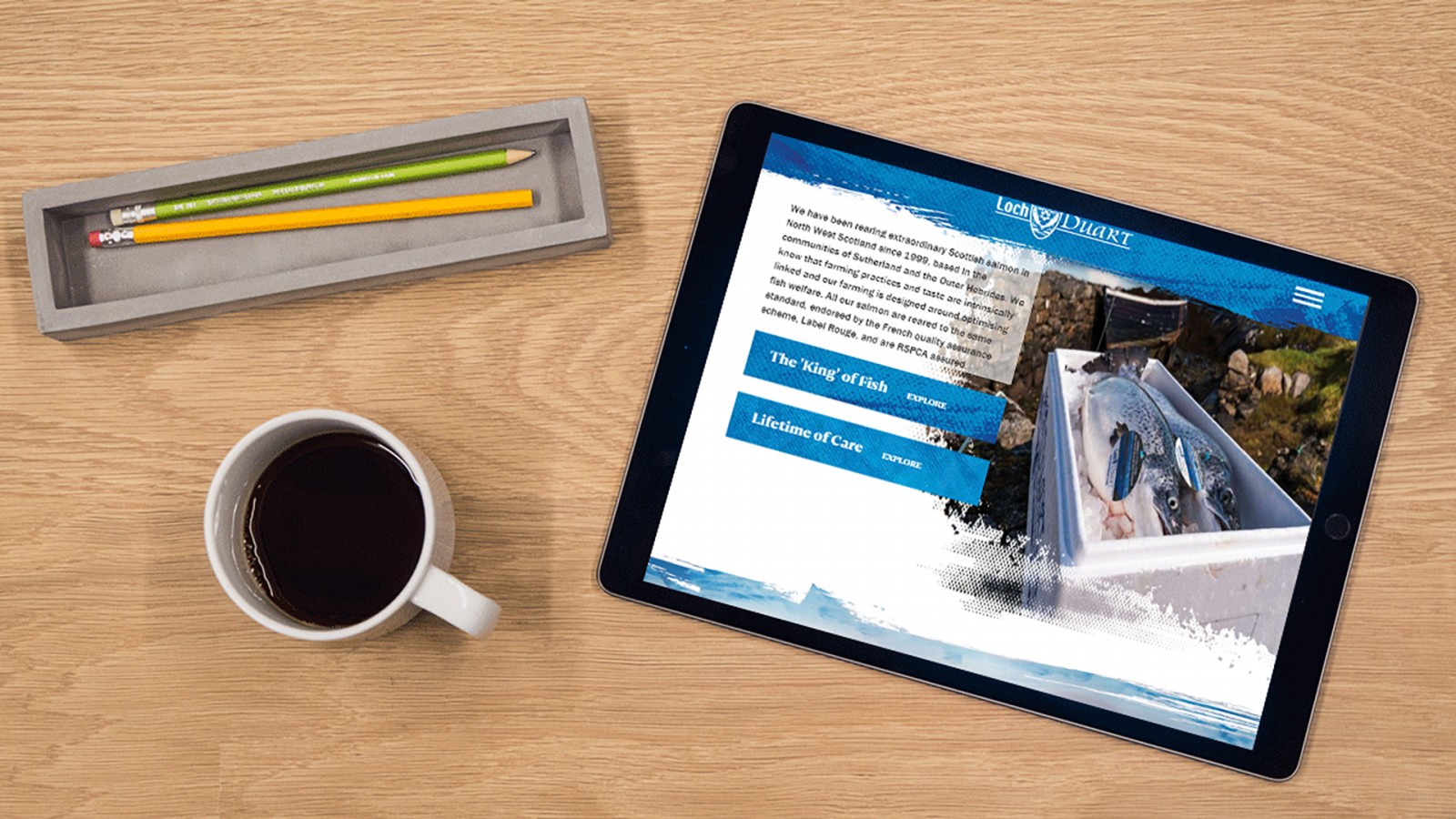
But it’s a great way to solve visual challenges — like highlighting buttons, headers, blocks, or important actions. It’s also helpful to use a contrast color for small text. Great examples include nstudio and cfli, where cool tones like blue and purple dominate, but warm contrast colors like red or orange are used to break the monochrome and guide the user’s focus. Compare that to lochduart, which sticks to subtle light blue and white shades. Also worth exploring are finethought, nikoskatrina, and Juste Debout.


Conclusion
A monochrome color palette can be not only interesting to use but also fun and creative to build — especially when tailored to a specific project or topic. The reason is simple: Monochrome doesn’t go out of style. Trends may shift in terms of brightness or saturation, but the monochrome color style remains evergreen.
Many well-known projects use monochrome palettes when presenting new products or services. It’s convenient for users, as it keeps the visual focus on content rather than a rainbow of colors.
One tough challenge for designers — whether novice or pro — is user fatigue. If someone visits the same site for years, they eventually get bored of the design. That’s why it's smart to use monochrome not throughout the entire project, but in specific sections or pages. You can then gradually swap out colors over time, refresh key areas, or even use seasonal variations to attract attention: “Hey, we’ve updated the design of our Services page — check it out, what do you think?” This creates both a form of feedback and a reason to revisit the site.
In the end, monochrome palettes play many vital roles in web design — and can take on countless variations. But whatever the approach, each site can end up looking beautifully cohesive and visually impressive.