First appearing back in 2015 as part of Spotify’s visual identity, the colorful and vivid photo effect is now more popular than ever. An effect that uses just two colors (sometimes more), transforming images in a way that makes them look fun, energetic, and beautiful. And while in 2016 it was just starting to make its way into the toolkit of web designers, today its use is considered a sign of a webmaster’s refined taste, sensitivity to trends, and unlimited creative imagination.
Yes, we’re talking about the "Duplex" or Duotone effect. In Photoshop, however, it’s not exactly an “effect” in the traditional sense, but rather a display and print mode — similar to “grayscale,” “CMYK,” or “RGB.” Still, “Duotone” is widely regarded as a photo effect. Every month, more and more websites emerge or get redesigned using this technique. And we often encounter them while browsing the web or exploring works on Awwwards or Behance.
But how do you use it? When is it appropriate? And how can you create it in three simple ways in Photoshop? Each method alters the image in a different way.
What is Duotone?
Duotone implies nearly full two-color toning of the original image. Since it usually involves just two colors, one highlights the main details while the other fills the background. Here’s how it looks in the original Spotify design.

The name and technique come from the print world. Duotone is based on halftone printing and allows for the creation of shaded photographs using two inks: either different tones of one color, or black combined with a tint. The printing itself is done using two plates, each with a relief version of the image, positioned at different angles.
In digital graphics, of course, everything is much simpler. In many cases, a few clicks in Photoshop is enough to produce a bright, vibrant, and cheerful effect. The variations of duotone can be virtually endless, helping avoid visual repetition across projects. A big reason for this is the rich Pantone annual palette, which defines a Color of the Year along with complementary tones.
Minimalist designers often believe a web project’s palette should be limited, so duotone becomes a clever trick using the smallest number of colors possible. The effect is mainly used on promo websites and applied to large logo images, individual design elements, or background visuals. It’s especially handy when the designer uses stock photography or works by famous artists that are already widely known online.
In this way, a traditional print style has found a second life online—and it’s unlikely to become outdated anytime soon.
And here’s why…
Dominant Imagery
Duotone is frequently used on large-scale images. Designers often choose bold color pairs—even ones that may not conventionally match. The main goal is to create an element that draws the user’s attention and, through color and contrast, highlights what’s important.
To make a duotone image effective, designers usually pick two contrasting or brand-matching colors. The image itself should be neither dull nor already two-toned. Some designers begin by adjusting the image’s contrast—typically a standard contrast filter that helps emphasize the story or focal point. At the same time, one must plan where the buttons, text, and overlays will go, and how the selected tones will affect the user’s mood. After applying the duotone effect, photos are sometimes framed or paired with a subtle parallax motion.
Here’s what we’re talking about: Runbetter.newtonrunning, Winter Capital, Adison Partners


Simplified Color Palette
Duotone is easy to master and visually digest. Most often, designers start with a simple graphic base and layer the effect over it.
The project Assurity used just two shades of red plus white text. Even though the text blocks also had white backgrounds, your eye is still drawn to the red tones. You feel the urge to go back to the homepage and even inspect the tiny grid in the corner. The trick is that the effect feels too simple to be effective—but red by nature catches our eye and pulls our attention.

Similar results can be seen on Renate Rechner and Ortiz. Leon.


Improved Readability
Oddly enough, duotone can actually make text more readable and higher in contrast. "Why is that?" you might ask. The reason is that two-tone coloring helps smooth out the range of colors in the background photo, making the image feel calmer. As a result, any text placed on top becomes easier to see and read, no matter where it’s positioned.
Of course, designers usually opt for more muted colors in this case—not too bright or toxic. Examples like Etremarin, Fcinq.com, and Music Incubator are great demonstrations of this idea. Scroll down the second site a bit and you’ll feel how difficult it becomes to read text placed on a full-color image. The white letters almost disappear into the picture.


Grabbing Attention
The duotone effect also works well on smaller images and elements placed throughout a page. It can be used on site section tiles or divider areas within a Landing Page. In short — it works for secondary content too.
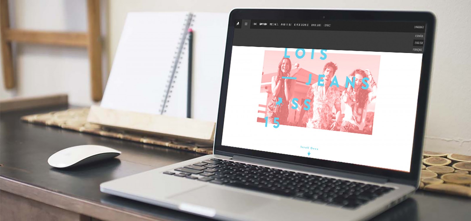
This approach is helpful when a designer isn’t sure whether the actual content will grab user attention. But the effect itself certainly will, right? That’s why duotone tones are applied to images, videos, links, icons, and even diagrams. Sites like Viens-la, Lois Jeans, and Boomex Agency showcase examples with both toned videos and images.


The Background Matters Too
“What if the site uses few photos—or none at all for backgrounds?” you ask. Duotone can still be used to create a beautiful backdrop or lightly toned subtle pattern. In such cases, designers typically use the brand’s color scheme, trend colors of the year, or shades associated with the site’s theme.
Still, there’s a challenge — picking tones that match the interface palette, animations, and text. A gradient from light to dark, either top-to-bottom or angled (with the dark color at the bottom), is generally well-received by users. People have grown used to interacting with bottom sections: tapping, scrolling, or flipping the page. Take a look at the background on Join Radio, where the duotone overlay subtly reveals a pattern of pink flamingos.

The Too Pop project chose to use a photo as the background, but duotoned it so heavily that the content of the image is almost hidden — resulting in a mysterious and unique look. Nurture Digital also deserves a mention.


Three Ways to Create Duotone in Photoshop
The duotone effect is genuinely simple to create and apply. Especially since Photoshop offers three different ways to achieve it. That said, there are a few caveats. Some people recommend applying duotone with CSS or scripts. But since designers typically use pre-selected photos, it’s better to tone them manually — this allows you to control the exact color shades, transition smoothness, contrast, and so on.
Photoshop offers not only two-tone duotones — Adobe has also added mono-, tri-, and four-tone options. Technically, duotone means “two colors,” but the effect is so beautiful that many designers push beyond that limit. All these variations are widely used in web design today.
This mode is available in any version of Photoshop, both CC and CS. We’re using red here for brightness and clarity. There’s nothing overly complicated about this process — so let’s skip the theory and get practical. Some key tips are included below.
Method 1
Open the image (in our case, some artwork), create a new layer on top of it, and fill it with your desired color. Then set the new layer’s blend mode to “Color”. Your duotone is ready — the image is now tinted in multishades of red and black, effectively using two colors.


Important: This method only works with full-color images. Black-and-white ones won’t be tinted. On dark photos, only skin and hands will be colored — the rest will remain black.
Method 2
Open the photo and go to Layer → New Adjustment Layer → Gradient Map. Since we already chose red as our fill, the toning will follow suit. Double-click the gradient strip to change its style, tweak the colors, add more shades, and adjust the smoothness of the transition. This method works with images of any original color.


Method 3
Recommended by Adobe themselves, this method works with absolutely any image and offers the most visually striking toning.
Open the image and go to Image → Mode → Grayscale (even if your image is already black and white). Once that’s done, the “Duotone” option becomes available. Now go to Image → Mode → Duotone — and the toning settings window will appear. You can select your colors, edit the tone curve, and fine-tune the gradient. Use darker shades first and lighter tones second (or “lower” in the layer stack, if you’re doing multi-color duotones).


Important to remember: When using multi-color duotone, colors will blend. That means you won’t see pure yellow or green — only the result of their mix. This is exactly what makes duotone such a creative playground if you’re working with just two colors and one image.
Contrast helps highlight image details. Compare the examples below — before and after adding contrast.
.jpg)
.jpg)
You can also blur the edges, add vignettes, adjust contrast, brightness, or color saturation for specific parts of the image. There’s a huge range of color play options, especially if you explore features like “Overlapping Colors” and multi-tone duotones.


Conclusion
It’s hard to find a design technique more fascinating than playing with color. Duotone is equally appealing to both artists and web designers. It can bring a site to life or add that little extra “pop” when something feels missing and you want to grab your visitor’s attention.
Beyond that, duotone lets designers experiment with bold color combos and stretch their creative thinking. Yes — it’s an excuse to get wild with unexpected color pairings like neon green and electric blue or hot pink with bright yellow. These combinations add surprise and, when used on small (non-background) images, won’t annoy users.
In any case, using the duotone effect always makes visuals feel unique and intriguing. And this effect won’t be going out of style anytime soon. Big companies are using it on their websites, it shows up on promo pages, landing pages, and creative portfolios alike.