You’ve probably noticed that CSS animations have been increasingly popping up on websites lately. Animation was a major trend on the web in 2018 and continues to grow in popularity today. Web designers are becoming more creative, their projects are rich in artistic elements, and animation has become a tool that brings personality to a site, helps convey complex ideas effortlessly, and subtly guides user actions.
The golden rule is that each individual CSS animation should not be large and bulky. Even the slightest, lightest movement can have a significant impact on the viewer's perception. At the same time, overly heavy animations can distract users from the content and annoy them with their mere presence. Interestingly, the best animations we see online still trace their roots back to the 12 classic principles of Disney animation, laid out in the early 1980s book The Illusion of Life: Disney Animation.
In this article, we've decided to compile a small selection of the best examples of CSS animation from websites around the world and dig a little deeper into the code to see how these visual effects are created and just how easy it can be.
What is CSS animation?
CSS animation is a method of animating certain HTML elements without using JavaScript or Flash processors. There are no limitations on how many or how often CSS properties can be changed. Animation is created by specifying keyframes, each containing styles for the elements involved in the animation.
Bubbles
Just visit the well-known website of the beverage brand 7UP and bubbles will immediately appear before your eyes. The animation consists of several elements: the bubbles are drawn in SVG, and each bubble uses two animations.

The first changes the opacity and moves the bubble vertically; the second creates a wobble effect for added realism (When you open a soda bottle, bubbles don’t rise in a straight line—they “float” a bit). The offsets are handled by capturing each bubble and applying a different animation to it, with varied durations and time delays.
An example of this animation is shown on CodePen where you can see two layers of bubbles: one for larger and one for smaller bubbles. They are all placed at the bottom of the viewport.

Then, each element gets its own animation. CSS has a powerful engine and simple syntax to create complex animations. First, the bubbles move upward while changing opacity (fading in and out), then the wobble effect is defined.
The wobble variations are tested visually. Too strong and it looks unrealistic; too slow and it becomes unnoticeable. Even in code, some experimentation is necessary.
After defining the core animation, we need to apply it to the bubbles. That’s where grouping comes in (small ones separately, large ones separately). Also, pay attention to animation duration and delays, and then enable repetition using the animation function.


Bird flight
A light, airy, tiny animation of small birds flying across the sky adds a touch of elegance to the site. The project fournier-pere-fils would look great even without it, but the animation gives it a unique charm. Such animation is more complex and nearly impossible without proper graphic skills. Each frame of the bird's flight must be drawn in vector. Then all frames are combined and saved as SVG.


The HTML and CSS part is then very simple. We place the “bird” in a container to apply multiple animations – one for flapping, another for moving across the screen. Refer to these examples of one bird here and multiple birds.
The ready SVG file is used as a background for a div element, and the size of each frame is defined. If the SVG has 10 frames, the width of the block is multiplied by 10, then slightly adjusted for realism.

CSS animation has a few tricks you may not know. We can use animation-timing-function to simulate movement, like flipping pages in a book. But such code will only make the bird flap its wings, not move across the screen. So a frame-by-frame animation is created that also changes vertical position and scale for more realism.

After creating the animation, just apply it. You can make multiple bird copies and use different timings and delays to simulate a flock or two to three birds flying.
Snowfall
There are many ideas for this, but a clear example is the project usatoday where differently sized circles fall evenly from top to bottom in the background. Of course, instead of circles, other images or objects can be used. Source example.


The snow is created with SVG and technically the code is very similar to how the bubbles were made. First, two layers of circles are created inside the SVG, then animated by changing the Y value in the keyframes.
The animation is applied to each layer rather than individual elements (unlike the bubbles). The same animation is reused for both layers. By assigning different speeds, depth and dimension are added to the scene.
Moving Background
On the project sbs there’s another original animation – a moving background. The title consists of two parts. The top is solid, bold text; the bottom has animation, or rather, an image “sliced” into strips. This subtle animation definitely catches attention. It again uses SVG settings and mask movement for keyframes.


Pulsating Circles
This animation is clearly presented on the peekabeat website. It's simple yet effective and easy to create, capable of transforming a website's design and drawing attention to the project.
Working with CSS code involves creating three (in this case) circles and animating them to change scale and opacity to 50%. The animation function defines the pulsing speed for each circle.


This opens up many options for customization.
Spot Absorption
A strange name, but if you explore the heartbeat website, you’ll see that page transitions look like they're being absorbed by an irregular black spot. A similar example is on CodePen.


The essence of this animation is not the drawn shape. The transition is done using the ::before pseudo-element. It starts as a thin strip (1-2px high) covering the width of the link (button).
When the link (button) is interacted with, the pseudo-element grows to 105%, creating a strong vertical effect. Simultaneously, the link/button color changes.
In the CodePen example, the spot is replaced by a rectangle that first appears as a simple underline.
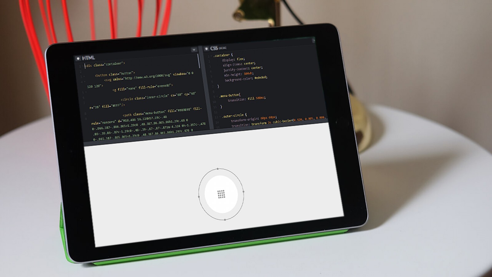
Spinning Effect
On the couleecreative website, you'll find a hamburger menu icon at the center. Hovering over it causes a large outer circle to rotate counter-clockwise. Moving the cursor away rotates it clockwise. It’s nothing new, but it feels original.

A similar example is on CodePen where the circle is clearer and rotates in the opposite direction (clockwise on hover).

This animated menu button is also created using SVG. It combines circular 360-degree animation and color change for the center icon. The most complex part is the timing function—specifically cubic-bezier —for more control. By setting a total duration, the animation can be split into phases: slow start, faster middle, and slow end.
Conclusion
There are still many interesting and original animations out there. Examples include thepaaonline (colored corner appears on rectangles), godofwar (button has red fill animation), and greenwichlibrary (orange button with an arrow changes appearance). These animations might feel commonplace, but their frequency has notably increased over the past six months.
This is due to browsers and user devices becoming more powerful, along with advances in animation processing technologies. Even if an animation has been used before, that doesn’t mean it can’t be reused.
The hamburger menu animation is a great example of how developers modified the original version (changing direction, speed, and the look of the wheel, not to mention the icon color). With enough creativity, you can even modify the 7UP bubbles—change their shape, number, make a fountain, geyser, or spark effect.
In short, this article aimed to show you what major companies (like PlayStation) and individual developers draw inspiration from, how they reinvent existing elements and create something new—not 100% unique, but beautiful and well-suited for the specific design.