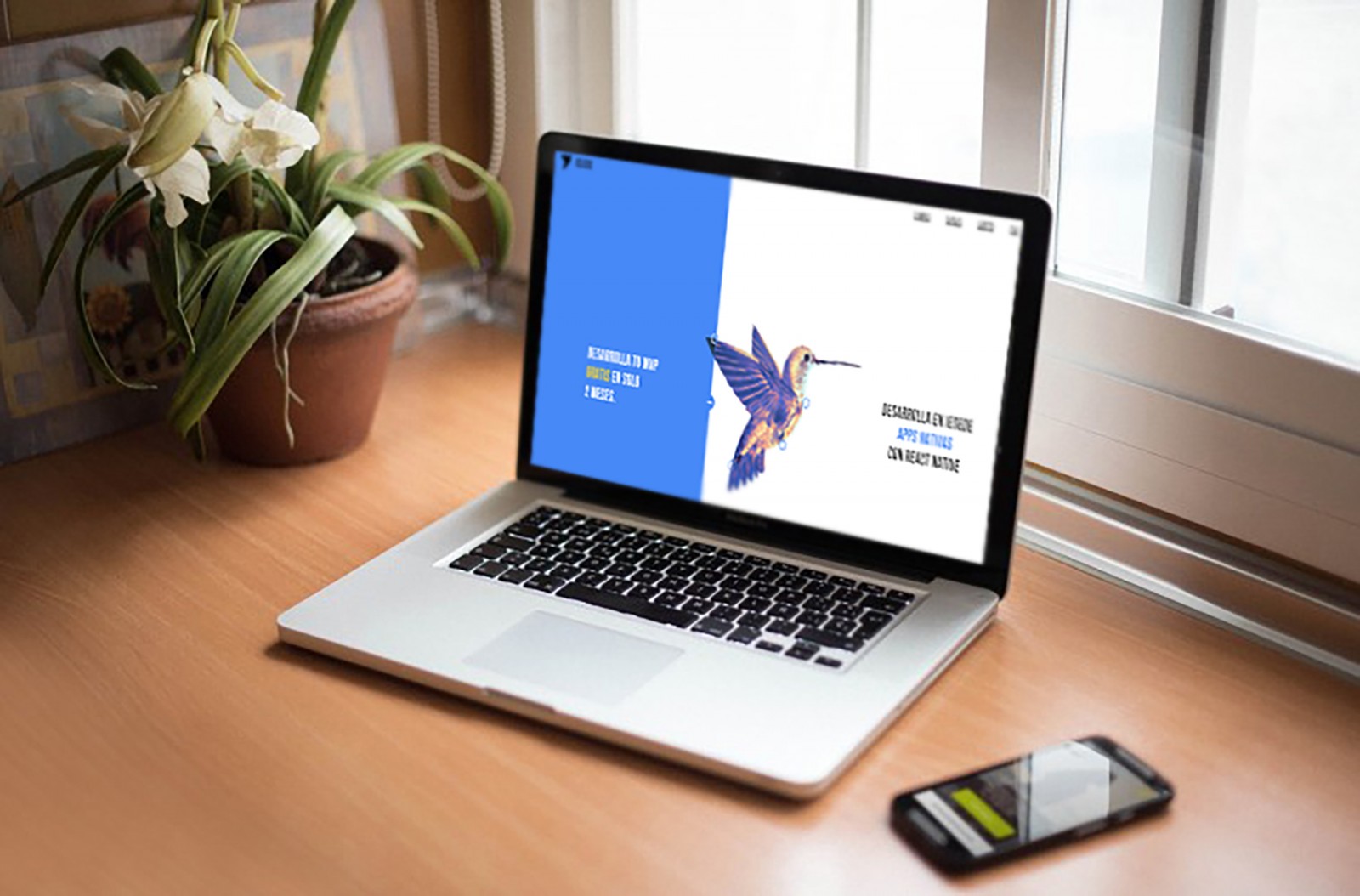
More and more websites with split screen design are appearing online. It seems like only a year ago we discussed this technique , but already now we can see incredible variations of its use, beautiful design solutions, which allows us to confidently say that web designers are increasingly aiming to create split screens for their sites.
There are many reasons for this popularity, not to mention the basic convenience of adapting the design for mobile screens and the ease of perceiving content. And of course – pure aesthetic brilliance! It’s essential. But as the trend evolves, over time it becomes interesting to observe and learn how exactly this trend is changing, what’s new, what solutions and interesting combinations have been discovered by other creators.
So, let’s try to take a closer look at all these changes (or the most uniquely beautiful parts).
A Growing Trend
The growth and development of the split screen trend are primarily due to the fact that this method (as a design solution) can be more effective than other variations. If a website's content tells about multiple similar elements, then a split screen is the most suitable format for presenting this variety. The visitor gets a chance to see two different contents or more at once, presented as a whole, even if visually separated.
A split screen is also a great choice when the user is to make a selection to continue exploring the content. It's particularly handy if a web designer has many narrow-format images (not widescreen), allowing for a more adaptive design and adding visual flair that makes the site stand out among others—not just competitors, but all design styles in general.


Timeless Classic
“Classic” usually refers to those aesthetic items, trends, and more that have been popular for a very long time and, importantly, have significantly influenced the development of a particular direction or field. “Classic” is not just a music genre – a pattern, a combination of shapes and colors, a style of shoes or clothing, etc., can also be classic. The same applies to web design: many standards used on nearly all websites can be considered “classic.” Some might think it’s too early to call split screen a classic design. But here’s something to consider: web design evolves incredibly fast , so even if not now, in six months we’ll be able to say so. But it will have to be said anyway. And to the question: Why? – let’s highlight what's important in this trend's development:
Imagine a vertically implemented split screen that creates two equal parts. This, in turn, forms a modular scheme, allowing content to be organized within those two blocks. As if clear boundaries are created, which should not be crossed visually.
Animation. For each type of content, a different animation can be created and presented clearly and conveniently. The screen doesn’t become cluttered with all kinds of things.
Browser window resizing. If the screen has two or more parts and the user shrinks the browser window (perhaps to place another app next to it on a PC screen), the sections end up stacking vertically. The content doesn’t disappear – it stays within its blocks. A clear example can be seen in screenshots from treethatgives.


Another beautiful example of split screen design is found at la-peche , where the screen is divided into three parts. The third, bottom part scrolls, changing the animation in the large left section and the content in the upper right. Best to see it in action.

Another excellent example of split screen with animation is sztafetapokolen. It should be viewed both in a narrow and wide browser window. It looks different each way. What’s common: initially, text visually splits the screen in half; then, the screen is divided into three parts; later, a portrait and surrounding text create even more separations. It looks beautiful and unusual against strict and angular designs.

The Trend Moves Forward
Initially, split screen was nothing more than a strict, simple, and symmetrical design. Two equal parts, each with its content. Such designs are still common, but designers are trying to diversify the format . Adding something in the middle, creating more divisions, and so on. And these divisions are no longer made with straight lines and angles, but with zigzags, waves, grids.
Previously, split screen design felt heavy, as creators aimed to make users scroll through all content and sections. Now, the division is simplified, and there are cases where users can explore content in independent blocks.
Let’s look at business-advisory-taxation , where the screen is first split into two; then a division block appears on the right, and links on the left, and so on. Still, it’s a split screen, as each part has unique content.

An interesting solution was created by awink . First, the screen is split into three parts, then into two. When you scroll with the mouse wheel, the left section changes content and… the split disappears. If you click the links on the right – the left block returns and content changes again.

It’s worth exploring iesede , studioforum , standby-inc , acrylice , autobusoberbayern . All of them use different, original variations—it even feels like the simple two-part split is a thing of the past.


Clicks, Links, and CTA
We’ve looked at many options above, but one big change in the trend is the placement of a huge number of links (various types) in each area. Not just text and one or two images per side, but also buttons, links—each side with different amounts and styles.
For example: cfr , l-mg , texasbeardcompany , clemenshill . Each features links and buttons in different amounts in various areas of the screen . This looks great on large screens, where the full image and links are visible. On mobile, blocks simply stack, resembling a list of sections—which doesn’t hinder content exploration.


Subtle Separation
Most examples above feature clear and explicit split screen. But designers are also creating ghostly separations. Something resembling sztafetapokolen , where text boundaries define blocks. This kind of split often appears ghostly on desktop projects, as it's not colored or filled with images. On mobile, however, the split becomes clearer. It’s a “hidden feature” design.
To better understand what we’re talking about, look at effectlab , owlstudios , crema , ttp , wavemakerlabs . These variations of subtle separation are beautiful in their own way and simpler to design, since the main difference from regular split screen is the lack of coloring. In every other aspect, it’s just a vertical or horizontal division.


Hidden Pitfalls of Split Screen
It may seem simple: divide, color, place content — and the most basic version is ready. But in the examples above, there’s one recurring issue, although not everywhere. It's the overly large-scale division, which in the end makes the second part invisible on the screen (even a large one). As a result, the design appears ordinary.
For example, ascendlearning, poundandgrain, gyrotonic. All of these sites are excellent, with truly beautiful designs, but compare how they look on a large screen versus a smartphone. In the second case, there’s a lot of information right away, and it’s immediately clear to visitors where things are and what they’re about.


Horizontal split screen usually creates a very large top section. It’s often difficult to make it narrower, but this also leads to different user experiences. Typically, users expect the mobile version of a site to look nearly identical to the desktop version. But when faced with a completely different layout, they can be very surprised.
Nevertheless, there’s always a solution. Especially when combining different types of splits (without necessarily aiming for asymmetry), where each content block is unique but also interconnected. We’ve selected a few examples of truly original projects that not only reflect the essence of this trend's development but may also inspire the creation of something similar or entirely new.
We’re talking about northeastshop (with a slider on one side and menu and posts on the other); allhero (with triple division that updates simultaneously and even a progress bar at the bottom); gyrotonic (featuring both vertical and horizontal splits using angled lines); legacyrules (with a triple split where the bottom part is clearly visible and creates the impression of multiple divisions); as well as eleken, youngtribe, lustonelabel, divanchik, bijou-de-m. These are genuinely interesting to explore, even if you're not looking for a sofa or jewelry.


Conclusion
Whether the screen split is explicit or not, it is being used more and more frequently in web design. Designers are coming up with new ways to divide layouts, adding variety through animation, content themes, and types of elements. They are similar to one another and yet all different — not only on desktop screens but also in mobile presentations.
Thus, the development of the split screen trend is not just giving rise to new and unique projects. It also propels the entire field of web design forward, encouraging new ways to combine colors and capabilities. Furthermore, it boosts user engagement. It doesn’t matter whether the visitor specifically needs the content — they’ll be intrigued by the design, stay longer on the site, and the owner will benefit from traffic, potential conversions, and more.
Split screen is both simple and complex to create, but also highly effective — perhaps even more so than a traditional full-width image with a site title. Yes, that’s a different style altogether — a cover-style approach — but even a narrow strip on the side or bottom can transform and refresh a site's appearance. There are countless ways to do it, and creativity knows no limits!