
Про логотипы мы говорили уже не раз, тема важна и нужна. С логотипа начинается бренд, это один из важнейших элементов айдентики. Вот тебе десяток рекомендаций, которые точно пригодятся.
1. Учитывай темный фон и ч/б
Темные темы на сайтах и в приложениях сейчас в моде, поэтому важно предусмотреть такой вариант использования. Можно заранее продумать цветовую гамму так, чтобы ничего не менять при смене фона. Или сделать вариант с инверсией, который будет смотреться отлично в любом цвете.
Сразу продумай черно-белый вариант. Два основных цвета и акцент – практически беспроигрышный вариант. Но не забывай про универсальность. Изображение должно также хорошо смотреться в черно-белом цвете. Пусть будет цветная версия или с градиентом, но непременно проверь и монохромный вариант. Представь, что это гравировка или штамп – будет ли лого смотреться в этом случае без потери смысла и так же эффектно?
2. Делай сразу адаптивный дизайн
Без него никак нельзя, даже здесь. Как и любая веб-графика логотип должен хорошо смотреться на различных платформах и в приложениях. Будет ли он таким же интересным, если смотреть не с монитора, а со смартфона? И наоборот, не станет ли рисунок слишком скучным при увеличении? Важно продумать это и прийти к читаемости во всех вариантах.
Укажи размеры логотипа, если нужно – минимальный и максимальный. И обязательно распечатай эскиз – экран компьютера и лист бумаги (фирменный бланк, крафтовый пакет, листовка, календарь) сильно отличаются.
3. Правильно подбирай шрифты
Просто красиво написать название и может еще добавить короткий слоган – это готовая идея для огромного ряда ситуаций. Но при этом очень важно подобрать правильные шрифты:
А здесь можно почитать, какие шрифты в дизайне работают лучше.

4. Стремись к лаконичности
Если какой-то элемент можно убрать – сделай это. Сокращай максимально, пока не дойдешь до самой сути. Самые запоминающиеся и эффектные логотипы легко можно нарисовать на стене баллоном под трафарет и даже без него. Стремись к тому, чтобы создать такой же.
Не нужно впихивать в логотип все аспекты истории и деятельности компании, в принципе, он вообще не обязан отображать непосредственно свое направление – гораздо важнее посыл и соответствие стиля. Смотри, как это делается в онлайн-премьере «Создаём аккуратный логотип с нуля».

5. Используй психологию цвета
Много раз мы обсуждали роль цвета в маркетинге. Тут обозначим основные моменты, которые касаются логотипов:
От сочетания цветов их смысл может меняться. А еще они должны гармонично смотреться вместе, если в логотипе использованы разные цвета. Подбор можно сделать на специальных сервисах, например Colour Lovers, ColoRotate, Paletton, Adobe Color или Pictaculous.

6. Используй психологию формы
Нужно работать и с формами, а не только с цветом. Линии и фигуры тоже несут свой посыл и воспринимаются подсознанием. Вот основные фигуры и их значение:

7. Думай о будущем
Быть в тренде – это прекрасно. Но использовать модные фишки при создании лого нужно очень аккуратно. Основа всегда должна быть вне времени и трендов, чтобы оставаться актуальной через многие годы и даже десятилетия. А вот с оформлением можно позже поиграть и изменить его при необходимости, когда придет мода на другие эффекты.

8. Придирайся
Посмотри на свое творение со стороны, представь что ты недоброжелатель, маленький ребенок и представитель каких-либо меньшинств (национальных, религиозных, сексуальных). Нет ли никаких неприятных ассоциаций, оскорбительных моментов, двусмысленности или пошлости? Поверь, среднестатистический адекватный человек может не заметить это сразу, но интернет широк, на его просторах найдутся уникумы, которые разглядят в невинных деталях призыв к истреблению народов или позу из Камасутры. И тогда слава разлетится по сети, но ведь нам нужна совсем не такая известность.

9. Не бери чужое
Мы не раз советовали смотреть работы хороших дизайнеров, чтобы вдохновляться, развивать вкус и понимать модные тенденции. Но косить под чужой бренд и тем более копировать его – это моветон. Кроме морального вопроса здесь есть чисто практический – за плагиат могут как минимум уволить и испортить репутацию. А как максимум – подать в суд и лишить не только перспектив на дизайнерском поприще, но и денег. Не надо так.

10. Учись
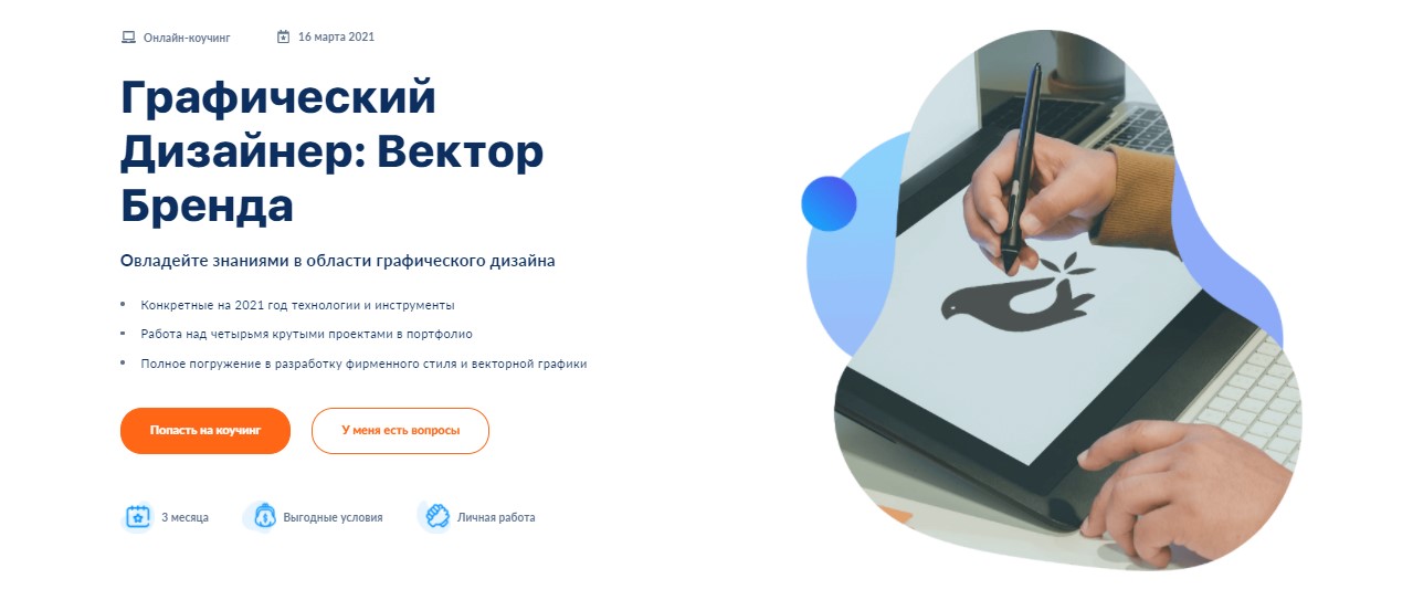
Если не знаешь, как создать классный логотип – узнай у специалистов. Практикующих дизайнеров, а не книжных теоретиков. Где? На онлайн-коучинге «Графический дизайнер: вектор бренда». Получи полное погружение в разработку фирменного стиля и векторной графики.