Each of us has probably encountered multi-step forms on websites: filling in personal information, entering payment details, confirming orders, and so on. Typically, it starts with entering your data, then STEP 2 – payment information, STEP 3 – verification, STEP 4 – confirmation. This multi-step data input format is quite standard across websites, and it can be compared to breadcrumb navigation – where pages or user actions follow each other, whether it's informational content or an online store checkout process.
The idea and logic behind progress steps are clear, but we, as web designers, are more interested in looking at them from a visual and artistic point of view. Surprisingly, they often come in very different designs. What’s more, no matter how differently they're styled (with some exceptions), the structure of step-by-step flow always works. It’s easy to understand, intuitive to use, and even when users see they have to complete 3–4 steps, they’re not discouraged. On the contrary, it brings clarity. In case of technical issues, it also simplifies communication with customer support.
You can find plenty of ready-made vector illustrations of progress steps online. In this article, however, we’ll look at some interesting (and free) plugins, modern and attractive design examples, and of course, ideas and variations from designers to inspire you.
Tips
Whenever designers work on progress steps, many tend to design them as labels or stickers – bold and noticeable (compared to the main site palette). This makes sense, because users need to clearly see where they are in the process.
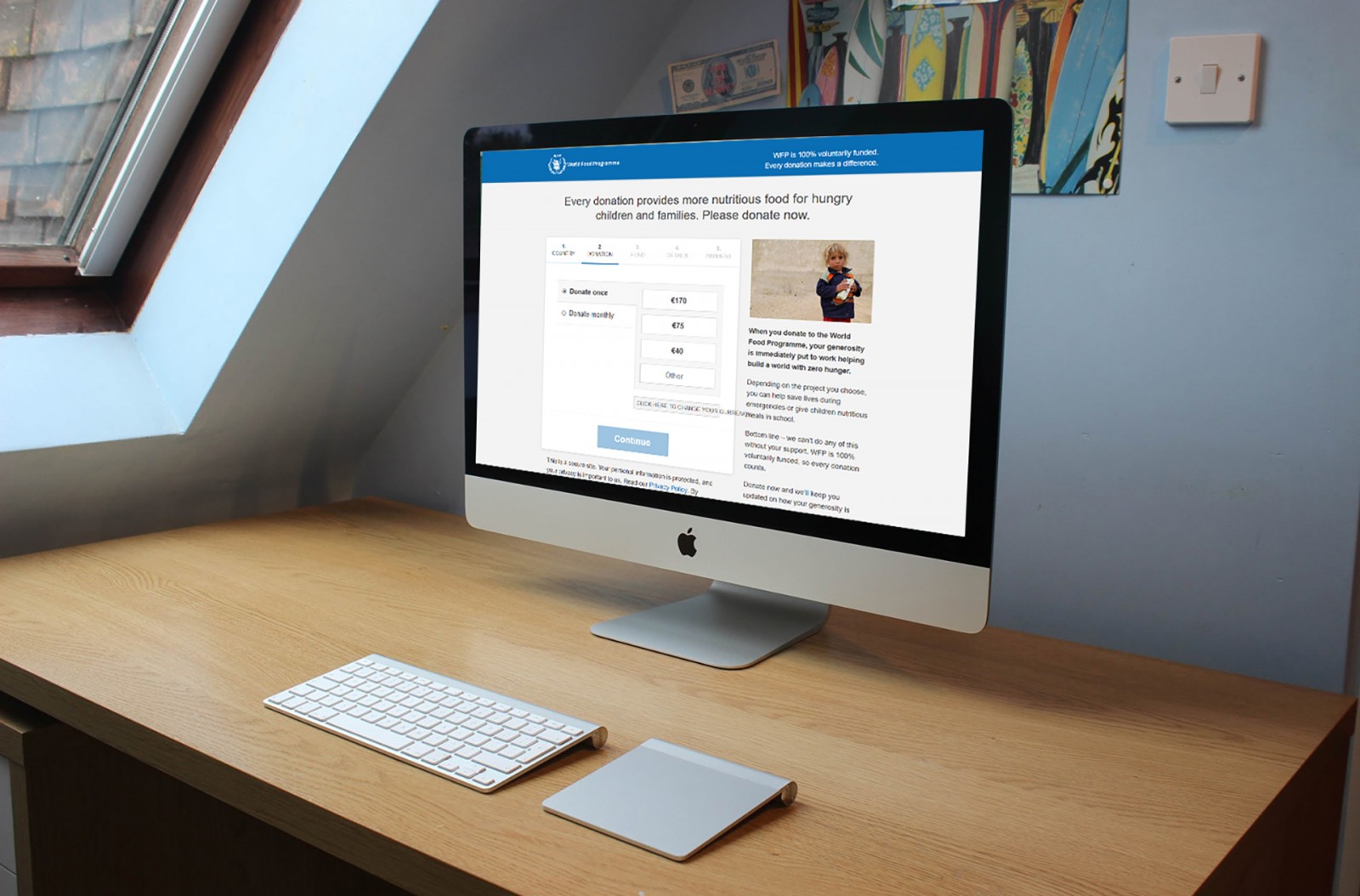
Therefore, it's a good idea to use bold, uppercase, and high-contrast text, even for inactive steps. Next, make sure the wording accurately describes what each step entails. For example: World Food Programme, Shyne.


You can highlight the current step by changing the label’s font color or by using icons, arrows, lines, and other indicators – but they all need to be visible on the background. Labels can also give users an idea of what will be required in the process – especially helpful on complex checkout pages where keeping the user engaged is important.
There's no magic formula for the perfect label. However, 3–4 steps are considered optimal. More than that may confuse or tire users.


Take a look at: Podruzhka, 1c-interes, primagames, and other similar websites. All use 3–4 steps, the last being a simple “ Hooray! Your order has been placed! ” – meaning no further action is needed from the user. Note the font color, contrast, clarity, and how cohesive the logic is. Also note the generous whitespace – these pages avoid distractions like ads, focusing entirely on input fields. This gives designers flexibility in styling.
Icons for visualization
If you have ample space in your design, try adding custom icons to represent each step. They can range from detailed graphics to minimalistic SVGs. The goal is to provide clarity and guide the user in a friendly way.
A great example from Tri Nguyen. Often, designers just use numbers, but adding animation (even a simple icon change) helps sell products faster. So don’t just design – test it as a user yourself.

A simple yet effective idea: adding a checkmark icon for completed steps. It’s visually pleasing and user-friendly. The checkmark is universally recognized, though even a color change can do the trick.

Navigation
As mentioned earlier, progress steps function as user guides across a series of pages. At this point, it's more helpful to think in terms of navigation: sequential and hierarchical.
Examples: lonelyplanet, marchanddetrucs, park, ieee, hflu, sberbank. These are large websites with many pages, where even subtle navigation aids are extremely useful.


The key here is consistency. Like with forms, don't worry about using space or making labels prominent. Many large websites use just arrows and text – no frills.
What designers focus on is keeping elements visible at all times, so users know where they are and what to click next. This design should match the overall look of the site.
For instance, le-hameau-du-renard-blanc offers excellent progress visualization: as you scroll a long page, a line progresses and highlights the active section title.

Similarly visualized on moleskine, thomasmaybespoke, hoover, bistroboudin. Future steps appear lighter; as users proceed, the tone darkens and stays that way – helping them track progress.


Variations in Progress Step Design
Starting progress step design from scratch isn’t the most fun task. But let’s be honest – freebies are a designer’s best friend. They can spark ideas and provide visual inspiration. So let’s now explore some of the most interesting design examples that align with current trends and modern styles. All of them are easily customizable – you can change lines, colors, icons – anything to match the goals and aesthetics of your site. These templates work great for any UI progress flow.
Option 1
Tahir Yusuf introduced one of the simplest and cleanest solutions. Thin lines, intuitive round icons that enlarge when active, and transform into checkmarks when completed. A free PSD file is available too.

Another unique three-step order progress bar by Barbara. What makes it stand out is the gradient between the completed and current steps. The emphasis is on well-matched icons, while the text acts as a complement. It's an excellent solution for both mobile UI and desktop. PSD available.

A practical interface for e-commerce checkout. It includes simple linear icons, text labels, numbers, and color changes. A PSD version is available here as well.

Code and Plugins
A beautifully designed progress bar in a site mockup is great – but it's only the beginning. The next step is implementation. Whether you're a front-end developer or just a designer, here are some useful plugins that can help you work with progress steps. Some designers prefer to start with code and plan the layout first; others do it the opposite way; and some only focus on visuals. These modules can save tons of time once development begins – and they can also be a source of inspiration.
Released in 2017, this plugin quickly gained a huge following. It’s one of the best progress bar plugins out there. Easy to install, configure, and use – what more could we ask for?

If you’re aiming for something more advanced, SmartWizard is worth checking out. Built for jQuery + Bootstrap 4, it only works with the BS framework. It’s not for everyone, but a great reason to learn Bootstrap. It allows you to create various types of progress flows, add icons or text, or keep it minimal. There are lots of styling and animation options.

Another plugin worth mentioning. Built on jQuery, it supports extensive customization. Although setup may take time, the payoff is flexibility and speed when creating new flows. Documentation is available on the plugin’s GitHub page.

There are also many CSS and JS-based options available on CodePen. Notable examples include: Progress Steps in Bootstrap, Multi-Step Form, and Progress Wizard. You can also search for ideas using the progress tag.


Conclusion
Step-by-step progress design in user interfaces is a rapidly evolving trend that consistently focuses on enhancing user convenience. A simplified interface and unobtrusive hints in registration or checkout forms can ease tension and encourage action. It builds trust and improves the overall experience.
We hope the examples and resources shared above will inspire you to create your own version, combine different elements, and develop something unique. That’s the beauty of design – everything’s been done, yet there’s always a way to make it feel new.
And never forget to explore ready-made solutions online. Authors share them for a reason – so others can learn, create, and be inspired.