Application interfaces, websites, and devices are ways for humans to communicate and receive information. A website, in turn, is a tool for users to achieve some broader goal, and the task of a web designer is to create an interface that helps visitors reach that goal quickly. One way to tackle this rather complex task is by using icons and symbols in the interface, as they can convey meaning without using words. Users can quickly grasp the functionality of the interface simply by observing and occasionally interacting with the visual elements.
In this article, we’ll look at some interesting ideas for using icons to improve website interfaces. Yes, we’ve touched on this topic before, but from a different angle. So, there will be no repetition. It’s worth noting that there is no perfect method or solution for how to use icons in a particular case. Everything depends on the designer’s goals, the project’s purpose, theme, style, and many other factors.
Enhancing Navigation
Icons naturally help users navigate a site using only visual cues. The best icons in this case are those that are intuitive and understandable to most users. That’s why they are often included in menus and navigation links. Still, you’ll often notice that alongside icons there is also text—because unfortunately, it’s hard to do without. Pure icons rarely work well for navigation and are not the most effective option for clarity.
The site My Own Bike uses simple icons, but at least the user can guess what each one means and where the link will lead. Yes, the site is in German, and the icons serve as additional visual cues.

Another interesting element is the “hamburger” menu. While many designers outright dislike it, more and more users have grown accustomed to this unique icon and know what it represents.
The menu on Inc is another good example of how icons are used in navigation. Submenu items feature a plus icon, indicating the presence of additional links—especially helpful on mobile devices.

Let’s not forget a popular trend we previously covered in more detail— the expanding mega menu. A great example familiar to our readers is Mashable, where each item features a small arrow pointing to a nested list of links.

None of these icon examples are absolutely essential, but they significantly enhance the user experience. Most visitors intuitively understand what an arrow icon represents and expect a visual cue or interaction. Of course, navigation can work without icons, but with them, it becomes much easier and faster to find what you need and achieve your goal.
Visual Effects
Navigation can evolve into something more than just a strip of links at the top of the page. These can include internal page links or sidebar links that help users move through the site. Icons are great for drawing attention to such elements. That’s why they’re usually highlighted and relatively large in size.
The homepage of Media Temple features several colored “read more” link boxes. Each one has a small arrow icon on the side, indicating the possibility of clicking through. The idea isn’t new—even browsers use arrows to indicate forward and back navigation. But on this site, the designers have implemented it subtly and tastefully.

One of the standout elements of any page is the call-to-action button, or CTA. Icons can work beautifully with a button or around it to serve a specific purpose.
Let’s take a look at the jQuery site, which features a large download button at the top of the page. Alongside the text, there's an icon that helps users instantly recognize it as a file download option. That said, the CTA button or icon doesn’t always lead directly to a downloadable archive. Sometimes it links to an additional product or service page. The site also uses many icons throughout other sections, making the content easier to understand and… charming to look at.

To help attract visitors and sell a service, the designers at ResumeBaking used a great idea: they surrounded the CTA button with icons, arrows, and text. These icons help users understand what to expect after clicking the button. Since the company focuses on résumé creation, distribution, and job searching, the captions are more than necessary. Try covering the text and showing it to someone unfamiliar with the site—they likely won’t immediately grasp what it's about. Yet people see the icons, see the arrows, and end up clicking.

Forms
Almost every website includes different types of forms—whether it’s sending an email, logging into an account, or filling out a contact form. Icons are used here too, building user trust and assisting with form completion.
On the site Life Could Be Better, there's a fixed footer block for subscriptions and contact. A small envelope icon appears next to the form, signaling users to pay attention. The same goes for the phone icon and social media links. Designers use icons to visually describe the content beside them, making it easier and faster to understand and more noticeable at first glance.

Another handy approach is adding icons to registration form fields. This is helpful when the form has three or more fields to fill out. A great example of this can be seen on the vladmaxi site. The icons blend well with the interface and look fantastic. Even better, they help users quickly understand what should be entered into each field. Once a user clicks on a field and begins typing, the icons disappear.


Features
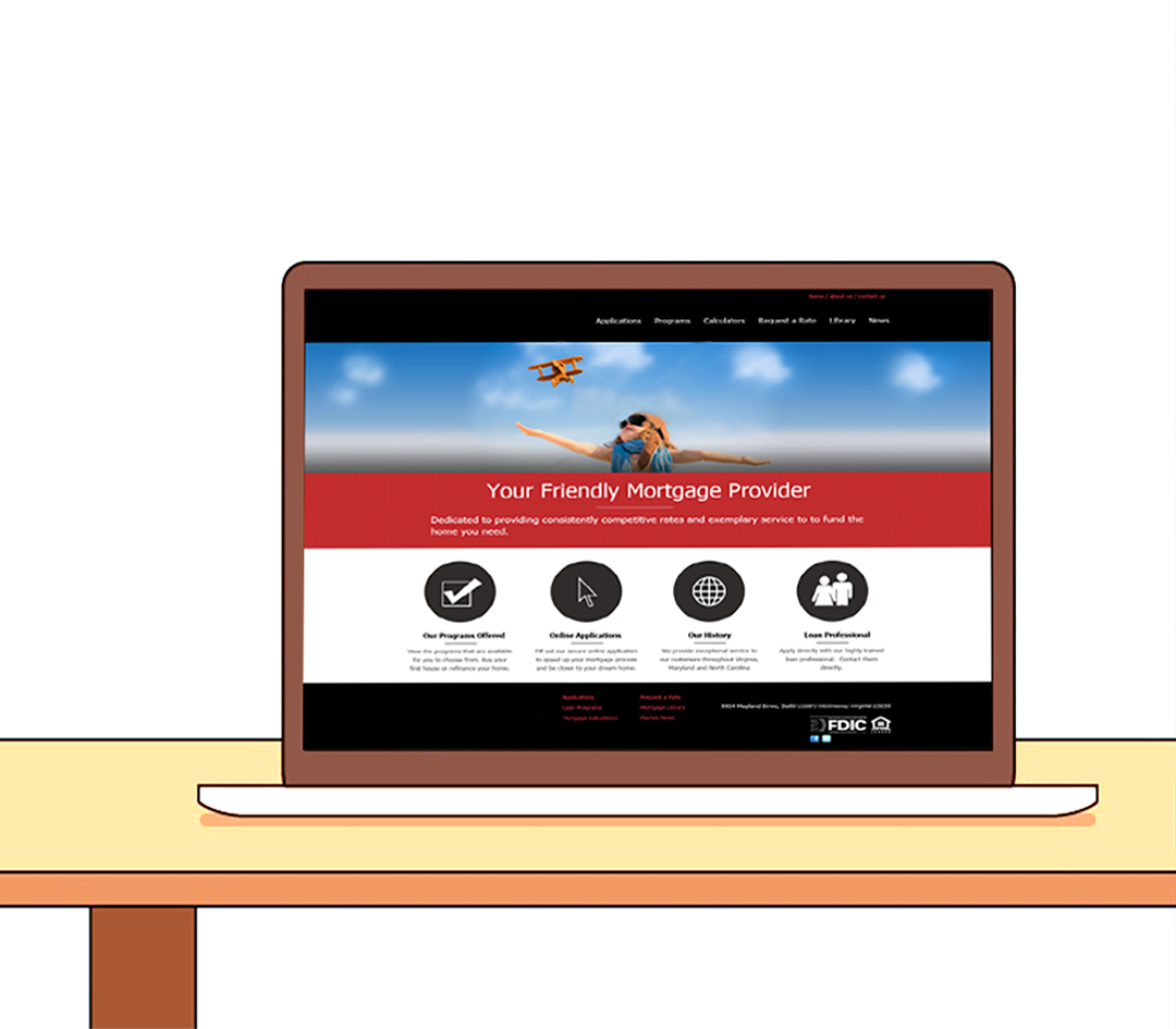
Every new startup, small business, or website has a range of features and reasons that attract people to visit. All these features can be listed in plain text, but that will engage only a small portion of the target audience. That’s why many web designers add various icons to visually highlight and explain key characteristics. Visuals are easier to grasp and encourage visitors to scroll further or click on related links.
For example, the icons on LightCMS are superb—subtle and perfectly integrated into the overall content and page design. They help clarify functionality. Used alone, they wouldn’t have much effect. But combined with the content, they genuinely support product conversion. Also, note the use of mobile device mockups, which we recently covered in another article.


A similar design approach is used on Disqus, where icons are placed alongside textual feature descriptions. By the way, the project has had a solid and user-friendly design for years. Yes, designers created custom icons exclusively for this project. At the same time, the internet offers a vast selection of resources for finding icons that fit your desired color, size, style, and meaning.


Global Experience
It's one thing to talk about icons in general or to review a few well-known project examples. It’s another thing entirely to explore the work of web designers over the past year or so. It’s no secret that, due to modern standards, website designs have become simpler and more minimal. Not boring—but not overly playful either. Still, even within this minimalist aesthetic, designers find ways to use a variety of icons effectively—whether in menus, forms, page content, or as visual backups to text. These solutions often look quite impressive.
For example, the website of the Italian company ZAPI spa, which produces and distributes fertilizers for garden and indoor plants, vegetables, fruits, and flowers. They use large icons in the menu to help visitors learn about the company’s products and activities. Even if the Italian language isn’t fully clear (or looks like gibberish to you), you can still understand each menu section thanks to the icons: a mouse symbol means rodent control, three leaves of different heights represent growth stimulants, a flower icon stands for blooming and fruiting, and so on.

Chuff is the website of a cozy café in Tokyo, Japan. All of the café’s menu and dish descriptions are laid out as site sections within a horizontal menu bar. And the menu itself is entirely made of icons—theme-specific (teapot, coffee beans, pastries) and instantly understandable. Text descriptions only appear when you hover over the icons. It's fresh, original, and delightfully convenient.

The team at AxisPoint Consulting in Russia decided to use icons in both their services mini-menu and in the gallery of completed projects. The entire design is flawless, following the latest trends in web design, and the icons add a hint of flair and a sense of comfort. Yes, it’s a serious business site, but the company’s mission focuses on client collaboration. They aim to solve client problems, and in a way, the icons symbolize that mission—a friendly dialogue.

We also recommend checking out the following projects: H ype, APP-BITS, Humankind, Autohaus Strunk (hoverable sidebar – brilliant), wdlkids.de, Martina Cars Car Rental, Walters Homes, Autentika Software House. We won’t go into detail, as even the homepages give you a good idea of what we might discuss. Still, we encourage you to explore a few pages—you’ll likely find inspiring ways to use icons there as well.


Conclusion
Icons are part of every interface—from desktop software and websites to mobile apps. But their styles and applications are vast and constantly evolving. You can’t say with certainty that icons in registration fields are always the best solution. It all depends on the overall design, project theme, and whether using icons makes sense in the first place. That’s why it’s important to stay updated on trends and shifts in web design. In just a few months, designers can come up with a small, subtle idea that becomes globally popular.
We hope this article helps you explore global icon usage practices and see how they work in action across different scenarios.