The long-standing debate among designers in print and digital media continues unabated. What is the ideal font for a project? What size should be used on a website, and why does the same image and font look completely different in print compared to on a monitor screen? Yet the essence of all these questions remains the same: should the font be serif or sans serif?
In other words, as we all know, there are many fonts, but they can generally be categorized as strict block fonts and more "playful" ones with serifs. As we've discussed many times before, both types are successfully used in web design. But here's the thing: there are so many trends , changes, developments, and yet when it comes to choosing a font—it's always a struggle again.
Let’s think about everything we know about serifs and sans serifs, and the myths surrounding them. Let’s explore the anatomy of serifs and more. That will help us better understand and decide when it is (truly *necessary*) to use Serif or Sans Serif fonts.
The Anatomy of Serifs
Serif fonts are among the oldest modern typefaces. They are used everywhere: from book publishing, newspapers, and magazines to billboards and, of course, we also encounter them in web design. So, what exactly are serifs?
They are small decorative elements that extend from the ends of letters. They can look like little tails: sharp or blunt, decorative or plain. Each typeface family with serifs has its own unique style, which makes it recognizable and distinct from others. Serifs appear on all letters (lowercase and uppercase) in the same font family, as well as on glyphs, numbers, and other characters in the set.
But serifs are not just graphic strokes—they convey mood and feeling. They evoke associations, memories, and fantasies often linked to confidence, elegance, tradition, and formality. If you're opening a literary book, there's a 90% chance it uses a serif font. When visiting websites with casual themes (cafes, design studios, blogs, travel, and more), we subconsciously expect to see serif fonts. Food and drinks evoke feelings, so a strict and dull site just wouldn't work.
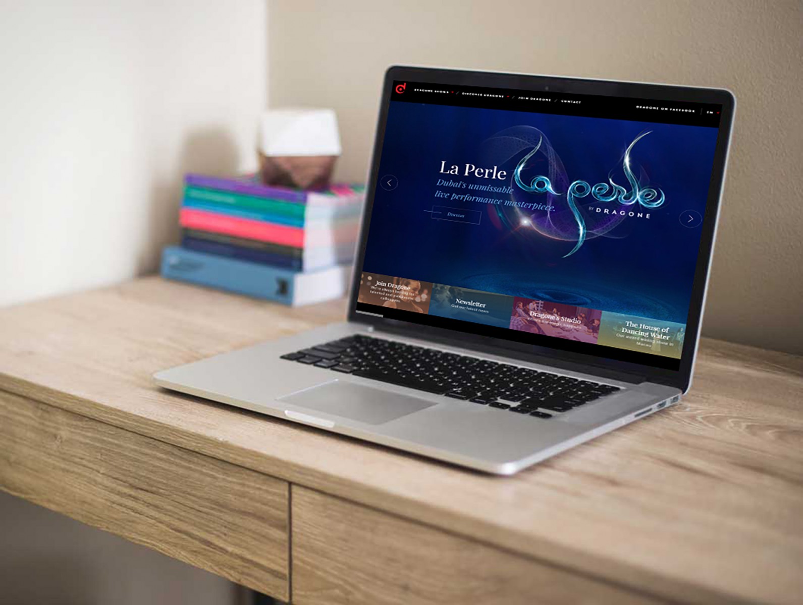
Here are some visual examples: oursroux , centurion-magazine , femmefatale , dragone , intercontinental


Moving Toward Sans Serif
Sans serif fonts are considered more modern and may consist of letters of different widths and shapes. Yes, they lack serifs, which makes them appear simple and calm due to the absence of decorative elements. However, they don't necessarily evoke a sense of serenity. Despite sometimes having rounded corners or sharp angles, they are generally straight, slightly rigid symbols.
As for mood and emotion, sans serif fonts embody modernity, minimalism, clarity, and straightforwardness. If the goal of the content is to convey clear, concise, and important information, sans serif fonts become vital. Imagine a city hall website using a serif font—it just wouldn’t feel as formal or serious.
At the same time, sans serif fonts are used in the same kinds of themes as serif fonts. For example: codigovision , ultragroup , vita-electricskinhair , fubiztalks .


Font Myths
The topics are universal, but the fonts differ. Why is that? How do web designers make such choices ? What really influences their decisions? The problem is often worsened by common myths frequently found across various sources. In the past, some of these had some credibility, but modern publishing methods (both print and digital) have significantly reduced the readability gap between serif and sans serif fonts. In many cases, readability issues are not about the font type but rather about the specific font and how it's used.
Let's look more closely at some of these myths…
Printing Requires Serifs Only
This myth is often repeated. But take a look at atomkyrkan , galialahav and other examples we've shown throughout our blog. Serifs are used beautifully in all of them. They are readable and add emphasis to the overall design concept.


So where did this myth come from? In the past, screens had poor quality, while printed graphics were far superior, making serifs nearly invisible on monitors. And even today, print quality is often better. But now screens on monitors, smartphones, and tablets are high-quality and sharp, which is why this argument is becoming obsolete.
Sans Serifs Are for Web Design Only
Similar to the previous myth, some designers insist that sans serif fonts must be used on websites. Every bit of text should be set in a strict, simple font. That’s not entirely true. Yes, sans serifs have been used in print for many years. But limiting them to digital publishing only is laughable. Just look at how many books and magazines use sans serif fonts on covers and throughout their content.
Sans Serifs Are Too Informal
Using a sans serif font does not automatically make the message informal or unofficial. On the contrary, it can add strictness. However, it may become informal when combined with other fonts or decorative styles.
One of the nice qualities of sans serif fonts is their adaptability—they tend to absorb characteristics of surrounding fonts. So whether a font has serifs or not, when paired with old-style fonts, it can evoke a sense of age and tradition. Examples like baileyscreamers and brandaffair show how a sans serif font can convey ease, playfulness, and contrast in tone and mood.


Serif Fonts Are Hard to Read
Readability studies for both print and online content have actually found that serif fonts are easier to read. The reason is simple, though it may seem surprising—serifs make each character more distinct and unique. Human vision finds it easier to recognize characters that differ more from each other. Hence, serif fonts can boost reading speed and comprehension, compared to staring at uniform, straight sans serif letters that may cause eye fatigue over time.
Additionally, serifs help guide the eye from one letter to the next, creating a natural flow of reading through words, sentences, and paragraphs.

Serifs Can Increase Letter Spacing
This is a widely used argument, but in reality, serifs don’t affect spacing. Properly set text with correct kerning might even make serifs look like they merge into a whole, with letters extremely close together. In other words, the effect can be the opposite. So no, this too is a myth. Serifs are not a solution for kerning issues.
Sans Serifs Increase Focus on Content
Let's examine two examples: agostinetto-wine and expressbank .


The amount of attention a site design gets is not based on the font type alone. It’s about color, imagery, contrast, and typography as a whole. People are engaged when all of these elements come together to stimulate their attention and thoughts.
The banking website uses bold, dramatic sans serif fonts in different sizes and shades to attract attention.
The wine brand site uses a single-color serif font in varying sizes. Even the paper labels use the same style. It draws the eye, is easy to read, and is overall very pleasant.
The most interesting part? Both examples are equally effective and user-friendly.
Final Thoughts
And the questions return again. So what should you choose: serif or sans serif? Are there rules for themes and design styles? Are there guidelines for correct choices? The answer is no. It all depends on the designer's mood, the project's specifics, and font usage. The best answer is usually clear: combine both styles. It doesn't matter if it's for print or digital.
Serifs and sans serifs can work well anywhere: apps, websites, books, posters, flyers, and more. But the key to designing a tool or concept that enhances the project lies in aligning the project's goal and font style with the content .
A bank site can use serif fonts—but sparingly—because the content must be clear and unambiguous. A hotel website, on the other hand, benefits visually from serif fonts, sometimes even in italics. But for a restaurant site, the designer has more freedom to mix elements—even decorative fonts and symbols (used moderately).
Simply put: there are no fixed themes—only the meaning and goal of the project, which influence color, contrast, and typography choices.