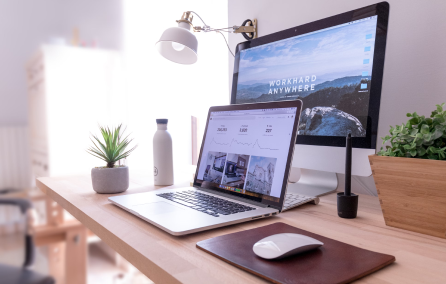
Достижение баланса в вебе-дизайне это и усилия, и мастерство, и многочасовые размышления, и, разумеется, опыт. В большинстве случаев, основной момент, характеризующий баланс – отсутствие перегрузки, исключение беспорядка. Это то, что служит пользовательскому опыту. То, что позволяет посетителям чувствовать себя комфортно на том или ином сайте. Баланс в веб-дизайне создает гармонию во всей конструкции проекта и одновременно поражает своим удобством и функциональной простотой.
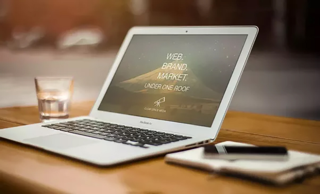
Мы уже рассматривали вопросы работы с пространством, текстом, графикой. Но сегодня решили поразмышлять и поискать идеи интересных вариантов сбалансированного сочетания текста и изображений/фотографий. Чтобы при взгляде на тот или иной сайт приходила мысль: всего этого не слишком много и не слишком мало; не слишком ярко и не слишком уныло.
Визуальная составляющая обрабатывается быстрее, но текст способствует глубокому пониманию информации. Именно поэтому в веб-дизайне так важен баланс сочетания текста и графики для обеспечения посетителей лучшим контентом и оправданием их ожиданий.

Идея баланса в целях
Начало каждого дизайнерского проекта – поиск цели. То есть то, чего именно веб-дизайнер хочет достичь с помощью работы над данным сайтом. Как правило, наиболее распространёнными целями является создание узнаваемости бренда, повышение продаж, взаимодействие с пользователями, призыв к действию или контакт. Разумеется, есть и другие, но рано или поздно они все равно сужаются до основных.
Дизайн проекта очень зависит от целей и потому способен задавать «правила» расположения элементов, размер и их форму, доступность их для разных пользователей. Поэтому гораздо проще продумать, сколько в проекте будет содержания, текста и визуальных эффектов.
Например, планируете вы бизнес-сайт. Его цель контакт, рассказ о деятельности. Но можно расширить и рассказать об услугах, о сотрудниках, истории и так далее. И каждая такая страница с информацией будет иметь разное сочетание текста и графики.
Давайте взглянем на roastworks, carazoarquitectura, myfarbe, elixirr. Цель сайтов: рассказать о проектах/товарах/услугах. Соответственно, текста мало, а вот изображений гораздо больше. Почему? Специфика. Краски и штукатурки выбирают визуально и по характеристикам, но размещать подробную информацию сразу на основных страницах – моветон. Архитектурные проекты Коста-Рики также не требуют больших описаний. На каждой станице проектов есть короткая сводка основных сведений и «море фотографий». Аналогично и с компанией по выпуску разных сортов обжаренного кофе.


Типы контента
Какой тип контента лучше? Казалось бы, каждый веб-дизайнер знает, но когда дело доходит до решения относительно данного конкретного сайта – ответ не всегда есть. И тут на помощь может прийти конструкция проекта.
Поразительно, но баланс сочетания текста и графики/видео может быть простым. Дело в том, что изучая контент, сначала понимаешь его визуально, а затем только читаешь что-то более подробно. И такой тип баланса можно увидеть в блогах, интернет-магазинах, соцмедиа, объявлениях, Landing Page. Если рассмотреть тип контента, то обычно это книги, блоги со статьями, руководства, инструкции, описания, новости.
При работе же с сайтами все гораздо проще. В основе – визуальный рассказ о чем-то, а текст позволяет углубиться в изучение, и то только при желании пользователя.
И вот несколько интересных блогов и промо-сайтов. Это hellozurich, C.O. Bigelow, moustache, naterapija, sentinelservices. Каждый из них уникален. Проект здоровья и генетики рассказывает о людях, о рисках заболеваний, признаках. Такая информация не может быть представлена только одним каким-то типом. Возможно, некоторые скажут, что изображений и видео много, но таков уж тип проекта – промо, реклама, привлечение пользователей.


Сайт телесериала «Пациенты», казалось бы, насыщен фотографиями, но если зайти на страницу блога, то мнение кардинально меняется. И этому тоже есть объяснение. На главной странице представили героев и артистов, а дальше выбор раздела остается за пользователем. Захочет ли увидеть видео и фото скрытых сцен или почитать новости. Логично, что скрытые сцены не описать словами, их можно только показать.
Аналогично выглядят и блоги о Цюрихе, аптеке C.O. Bigelow. Каждый из них что-то предлагает. Посетителям остается найти нужное глазами, а уже потом изучить.

Важно: в отличие от бизнес-проектов, цель таких сайтов что-то рассказать, «просветить» посетителей. Если на сайт компании приходят и знают зачем, ибо род деятельность известен заранее и об услугах можно догадаться, то на блоги, магазины, журналы приходят, чтобы найти что-то новое и интересное. А глаза, повторимся, усваивают графику быстрее.
Эффекты и текст
Так часто хочется совместить синемагарфию с текстом, красивые фотоэффекты с заголовками и прочее. Но задумайтесь о своей аудитории. Например, посетитель блога не ждет увидеть иллюстрированию книгу и он очень расстроится, если обнаружит текст релиза в две строки.
Разнообразие, вот еще один фактор баланса текста и графики. По опыту веб-мастера уже знают, что сработает для аудитории, а что нет. Или просто представляют себя на их месте.
Проект intours-dmc обладает визуально большим количеством текста, чем графики. Но зато их анимационные эффекты добавляют пикантности и позволяют комфортнее изучать сайт. Таким образом, малое количество изображений они компенсировали всплывающими элементами. Появляющимися и исчезающими инфоблоками и красивыми фотографиями балерин.

Сайт spiritsbyoskarblues также поразит параллаксом и анимацией, различными фотоэффектами. И если сначала создается впечатление, что на сайте почти нет текста, то пролистав страницу вниз, можно увидеть совсем иную картину. Баланс сочетания достигнут использованием не всего и сразу на одном холсте, а по раздельности.

В свою очередь mi-pad порадует и эффектом миниатюры, и чертежами, и использованием волновых линий, и обилием текста. Чего больше? Всего поровну, каким бы удивительным это не было. И, увы, но уменьшить количество чего-то одного невозможно. Изучите сайт, рассмотрите контент и поймете, что усвоение его происходит очень быстро и зрительно, и подсознательно.

Визуальный вес
Текст может иметь крупный шрифт или мелкий, но как выбрать размер рядом с изображением? Поиграйте с масштабом. Будет ли смотреться и читаться мелкий шрифт? Может его немного, но увеличить?
Визуальный вес компонентов может меняться от страницы к странице. Именно поэтому на главной допускается большое фото и контакты внизу. Целевая страница может содержать логотип и изображение, а вторичные – много текста и маленькие картинки-превьюшки. И если каждая страница обладает своим визуальным весом, в целом весь проект будет выглядеть сбалансированным.
Посмотрите на проекты Museum of Science and Industry, centoventigrammi, nmni. Каждый из них обладает разными по размеру изображениями и текстом, которые меняются, сортируются, размещаются на сайте в разных вариантах. Но в действительности все имеет четкую структуру, четкие грани, где можно увеличить масштаб, а где лучше оставить малые картинки и мелкий текст. И причина в акцентах на контенте, на тематике.


Как достичь баланса
Теперь, когда мы поговорили о том, каким может быть баланс сочетания изображений и текста необходимо задуматься как же его достичь. Даже некоторые из наиболее ярких проектов могут стать неказистыми и унылыми, если разместить элементы, не добившись гармонии. Но способы достижения этого есть.
Нахождение баланса в расположении всех элементов или только графики и текста – это часть веб-дизайна. Она происходит еще на стадии прототипирования, когда частенько на листочке бумажки мастера ручкой или карандашом рисуют и прикидывают, где и что будет на страницах. Затем прикидывают на макете, размеры фоток и инфоблоков.
Посмотрите еще на некоторые проекты отличного сочетания изображений и текста: extranet.who, barnesfoundation, pinestreet, Ducks Unlimited Canada IWWR, Swiss Parks, Princeton NU.


Волшебная пропорция
Если вы ищите «волшебную пропорцию» для определения необходимого места под текст и под графику, то, увы, такой «золотой середины» нет. Не существует универсальной формулы сочетания и баланса. Существуют только разработки мастеров, теории, размышлении, конструкции… рекомендации.
Вам потребуются визуальные эффекты для текста.
Мы живем в визуальное время. Мы поглощаем графическую информацию глазами и мало читаем. А значит, и на сайте графики должно быть чуточку больше.
Отсюда «вытекает», что если на сайте будет немного больше изображений, чем текста – это нормально. Как нормальным считается и небольшое доминирование текста над графикой.
Основная цель баланса: увеличить с 60% до 80% впечатление от первого варианта дизайна путем добавления изображений. Вы должны увлечь аудиторию, прежде чем предложить им читать. Даже книги имеют яркие и сюжетные обложки, форзацы, короткие аннотации, прежде чем предлагают читателю погрузиться в огромное количество страниц.
И да, убедитесь, что текст и фотографии работают вместе. Если у вас небольшой перевес в количестве элементов – на балансе это может не отразиться. Главное, чтобы элементы визуально не конфликтовали друг с другом. Они должны гармонировать.
И вот еще некоторые проекты, где использование большого количества текста попросту излишне, но и без визуальных эффектов достичь гармонии в сочетании элементов было бы невозможно. Это thecoloradan, tbilisigardens, flex49, topcalgaryrealestate, OnBrand '17, woocloud.


Вывод
Несмотря на то, что тенденция к конструкции имиджевых проектов была сильно «задокументирована», описана многими веб-мастерами, такой дизайн может восприниматься очень «тяжело». Его поэтому и называют – авторским. Поэтому старайтесь отталкиваться от содержания вашего проекта. Путь оно диктует стратегию дизайна.
Рассматривайте такие моменты, как цели проекта, типы контента, визуальный вес элементов, ожидания аудитории. Подумайте о балансе всего дизайна, о важности первого визуального впечатления о сайте. Книга имеет обложку, тогда почему бы не разделить дизайн на составляющие и действительно не создать обложку сайта, а уже на страницах разместить текст и картинки? Почему бы не сравнить сайт с книгой?
Веб-дизайн многогранен и необычен. Это не только погоня за постоянными «ноу-хау». Это еще и создание зоны комфорта для аудитории; места, где им будет приятно и удобно.