Maybe it's time to start creating pages in the spirit of 2021? Here's a collection of ten key trends for the upcoming year.
1. Floating visuals
With the help of shadows and soft gradients, elements can appear more lively and three-dimensional. It’s easier to load, perceive, and implement than 3D design, yet it looks impressive and gives a sense of visual depth.
This approach is used not only in graphics but also in text blocks and functional elements. Layering doesn’t distract from the content but makes the page more engaging.

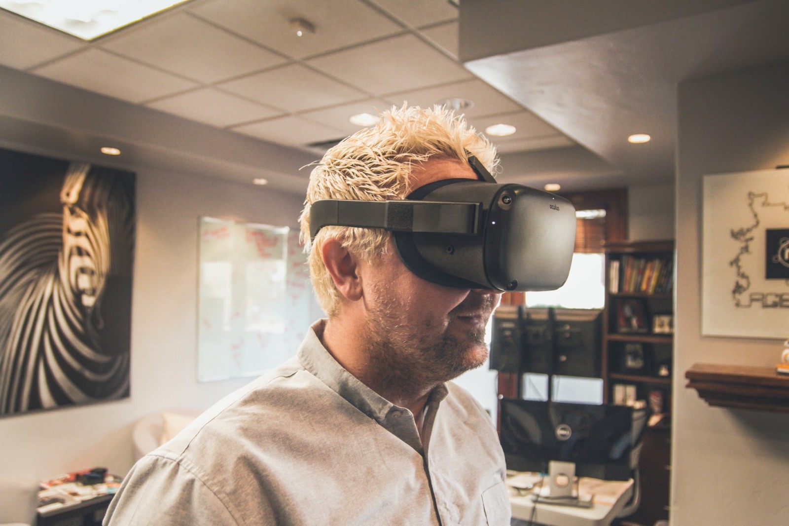
2. VR integration
The first VR-enabled website appeared in 2017, and now it’s becoming increasingly in demand. The technology is simpler now, and users have better access. It’s not yet mainstream, but the future clearly points in this direction. Browsing menus with your eyes and confirming actions with a nod—didn’t we see this in sci-fi movies and dream of making it real?
This approach will be especially relevant for smartphone and tablet users. All they’ll need is VR goggles.
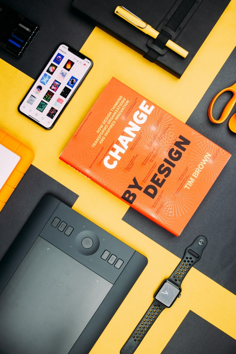
3. Interactive design
Users are no longer satisfied with just reading text and viewing static images. They want something more stimulating—something interactive. We’ve long known that adding video boosts conversions if the content is smart and concise. To ease loading, you can use GIFs when appropriate.
But that’s still not enough. Websites should respond to user actions. This doesn’t require complex transitions—even small animated details are enough. A classic example is changing the color of an element on hover or animating the cursor. You can also add gently floating elements and visuals.
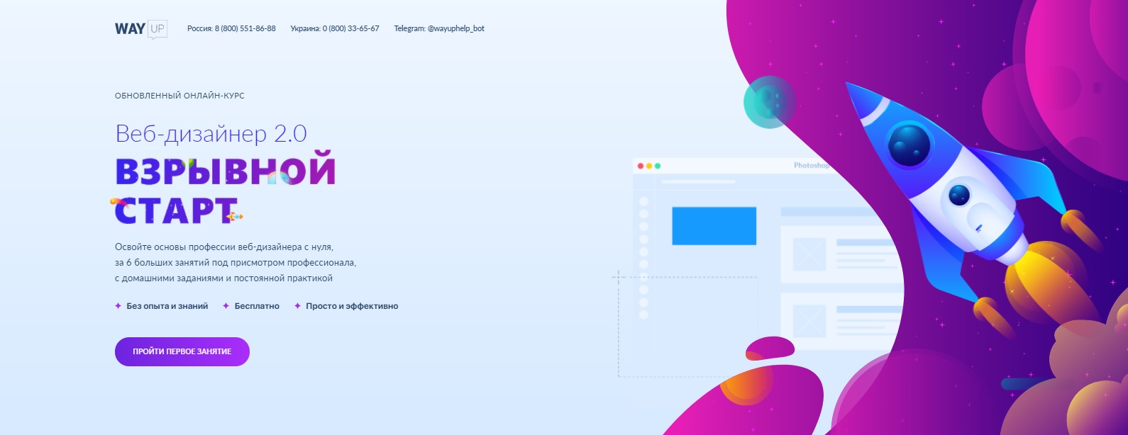
Check out how we implemented this on the course page “Web Designer 2.0: Explosive Start”: the rocket and surrounding elements move smoothly under the cursor. Yes, we did it before it went mainstream.
4. Asymmetry
After years in the field, every web designer knows all the possible grid layouts. And users have grown tired of standard templates too. To shake things up and stand out, try breaking the mold—even abandoning traditional symmetry.
Asymmetrical layouts are a chance to show uniqueness, be memorable, and build a structure that serves the business's needs. But it’s still important to maintain visual balance and emphasize key elements.
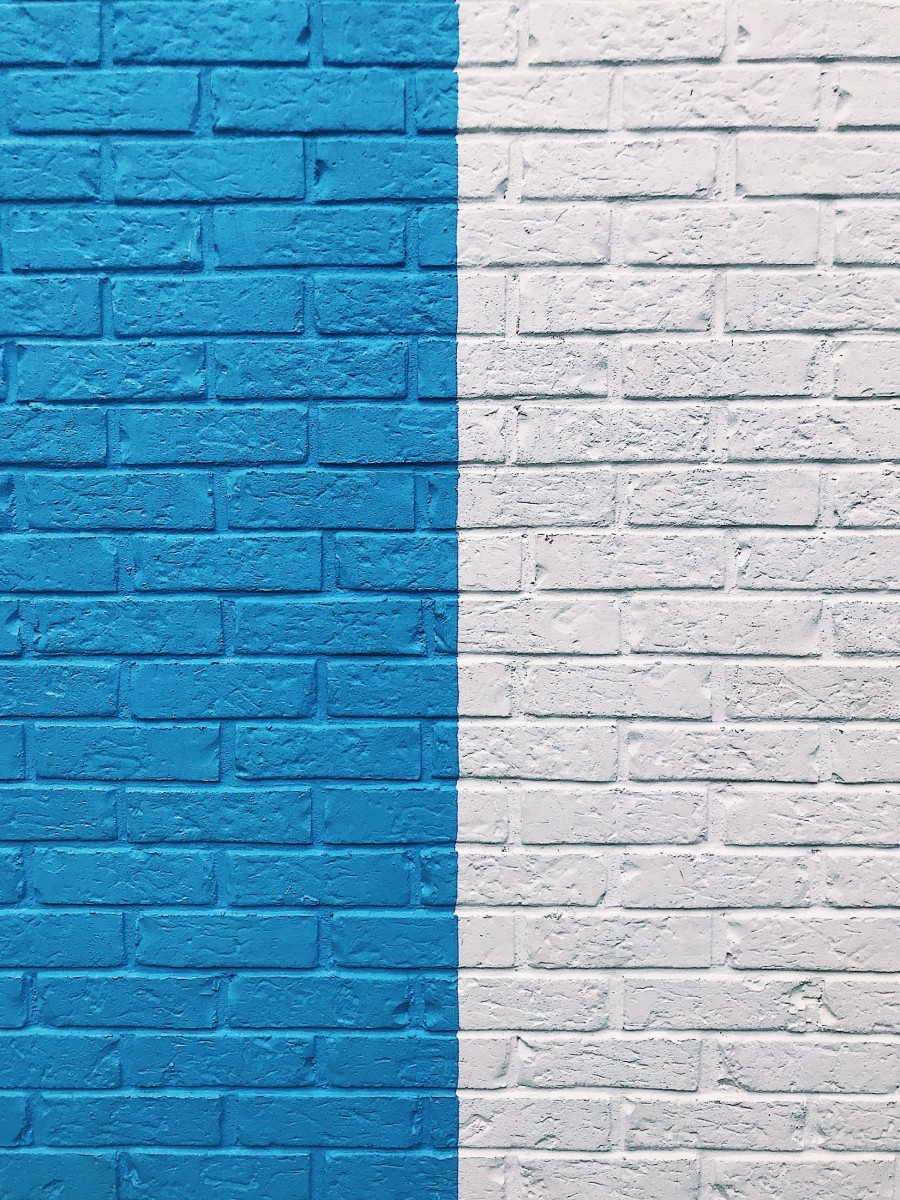
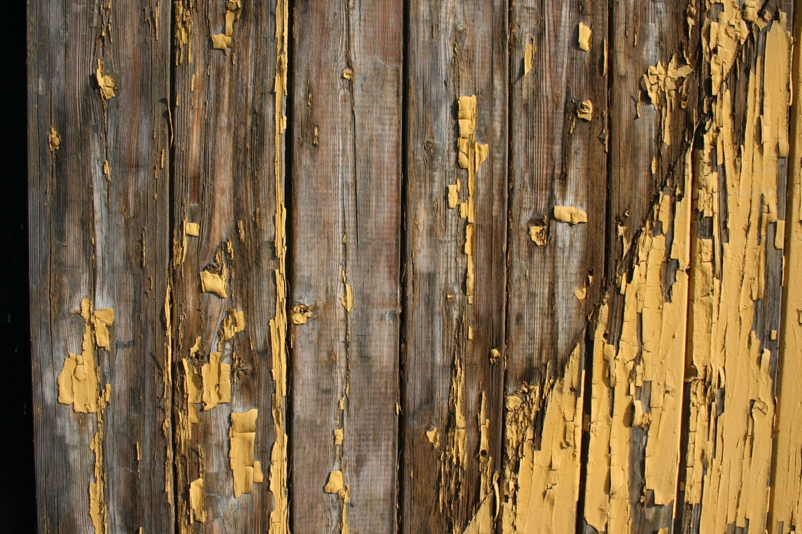
5. Natural forms and textures
Moving away from symmetry often leads to rejecting strict geometric shapes. Wavy lines, hand-drawn edges, and imperfect frames can create a softer experience while still maintaining structure. Organic forms are easier on the eyes and more emotionally appealing.
Along with soft shapes come natural textures. These help add warmth when rigid grids are still needed. Wood grain, stone, brick, and asphalt textures are familiar yet distinctive.
6. Inclusivity
In an age of accessibility and acceptance, websites must become more inclusive. For many people with disabilities, the internet is their only way to feel equal. Who better than us to improve their digital experience?
Features like transcripts, audio versions, subtitles, and adjustable font sizes are becoming standard. Yes, these add complexity for designers, but the result is worth it—your site becomes more trusted and respected by all users. Read more in our article on inclusive design.
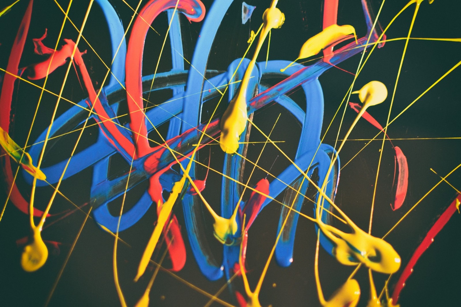
7. Hand-drawn graphics
There’s growing demand for hand-drawn elements—icons, illustrations, even buttons. This adds a touch of imperfection that feels human, emotional, and soulful.
It’s a way to make your site one-of-a-kind and build a unique brand identity. Rough lines instead of pixel-perfect shapes reflect the artist’s hand. It's also an opportunity to turn your visuals into real artwork.
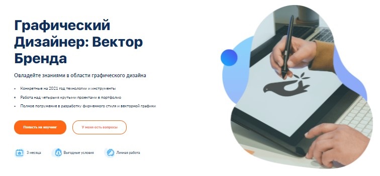
You can learn more about the secrets of great visuals in our new online intensive “Vector Graphics in Web Design in 4 Weeks”.

8. Content personalization
AI is now so integrated into websites that even smaller developers can offer personalized experiences. Sites don’t look the same to everyone—they adapt to previous queries, activity, and geolocation. AI can even change layouts and visuals based on user behavior. Dynamic content opens new doors for engagement and conversion.
There are also multiple UX versions that adapt to user types, not just activity. How? Advanced data collection reveals user behavior patterns—how fast they scroll, whether they focus on visuals or text, and whether they are passive observers or active participants.
This lets you build sites tailored to each visitor—no more one-size-fits-all. Designing one website that suits both grandmothers and developers used to be impossible. Now it’s real.

9. Split screens
Splitting the screen in two and giving each side a different design can be not only visually interesting but also practical. Twice the content, double the message, multiplied meaning. This powerful layout makes your first screen count. Just don’t overload it—and make sure both halves still feel cohesive.
10. Even simpler visuals
Flat design with its minimalist forms dominated recent years. But now, designs resembling Paint-level simplicity are in trend—lines and shapes that look almost childlike.
Some may think anyone can do this. But like Malevich’s square, simplicity is deceptive. Creating something stylish in this form takes years of practice and flawless taste—otherwise, it looks childish, not professional.
To sum up, in 2021, web designers will focus on simplifying the user experience and creating more personalized, human-centered websites. The goal is to help people achieve their objectives—not impose our own. Of course, these trends should be applied with consideration for the business context. Some projects need hand-drawn art; others need futuristic minimalism. In any case, improving user experience is key. We explore these ideas in depth in our online intensive “Graphic Designer: Brand Vector”—sign up now and get 20% off.