Lots of creativity – poor usability
One of the 2020 interface design trends was combining photography with graphics. Also popular were hand-drawn elements and glowing futuristic colors. But these are formal solutions. When it comes to UI/UX, informativeness and usability come first. Rely on user experience, needs, and habits. Anticipate reactions, deliver only relevant content. Make the path to the goal as clear and simple as possible. Only then think about how to make the site look cool.
Prioritizing trends over user needs
This mistake builds on the previous one. We often want to replicate perfect cases we see on Dribbble or Behance, but forget about Good User Experience.
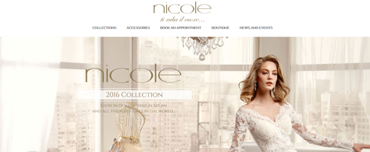
For example, we see full-size background images used in many projects. We try to do the same, but forget that on screens with different resolutions, we still get a cropped photo. It's better to ensure consistent display across all devices.
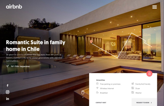
Another trendy feature is placing elements on top of each other — like the map on AirBnb’s site. It looks stylish but lacks functionality. The user sees an image but gets no useful info. A better solution would be to allow switching to a real map or to provide additional location details.
User expectations not considered
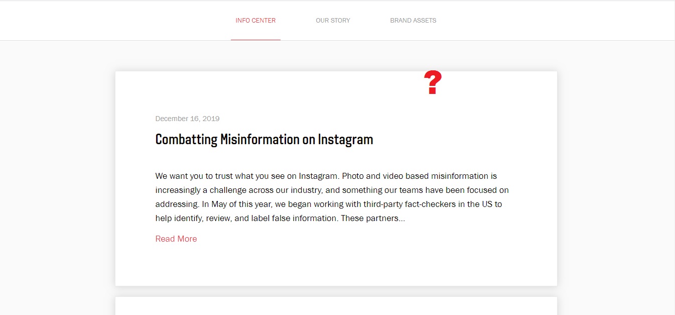
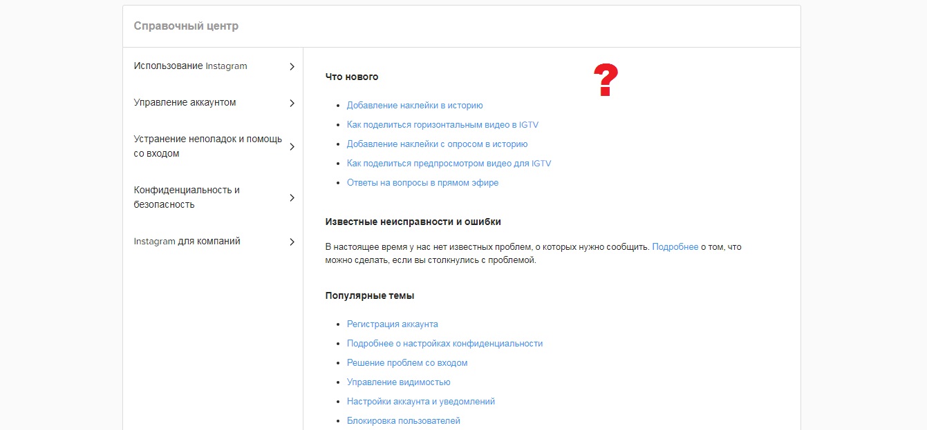
Try to find the press contact email for Instagram and see how long it takes you. The “Press” section looks like a blog with news updates. There's no direct email link. Nothing useful at the bottom of the Info Center either. Only under Brand Assets (?) I found “Send Us An Email”. Clicking it does nothing, but if you hover over it, a mail link appears.
You can Google “Instagram Press Center Contact” — but it won’t help much.
Eventually, I did find the email… but I don’t remember how.
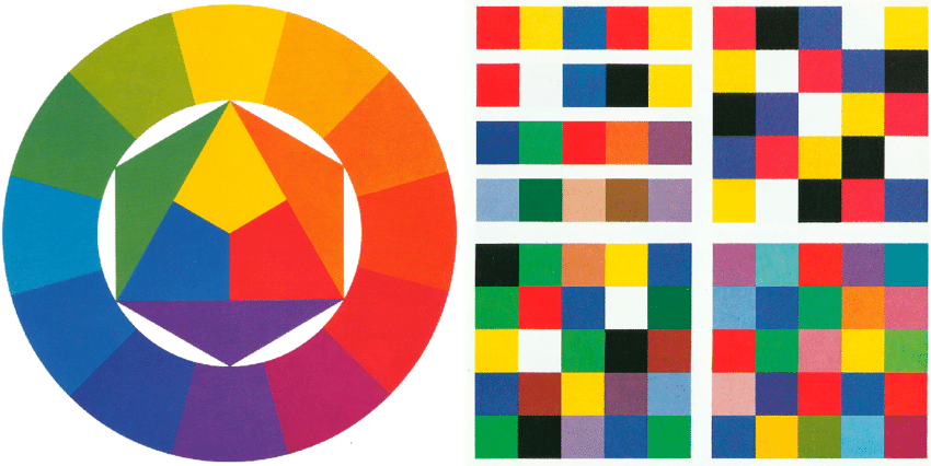
Insufficient color contrast
High contrast improves readability, separates elements, and helps create focus. There are 5 types of color contrast.
Without enough contrast, visuals become blurry, and elements blend together. Contrast helps guide attention and emphasize key areas.
Oversized fixed headers
A large “sticky” header can create a claustrophobic feeling. A fixed element at the top blocks content as the user scrolls, reducing usable space and constantly showing the same header. The solution is to make the header gradually transparent as the user scrolls down. It will visually fade away.
Fonts that are too thin and light
The goal of typography is readability. Text should convey information, not just act as a decorative element (unless intentionally so). Light and thin fonts are harder to read on iPads and iPhones with Retina Displays. On high-res monitors they might look fine, but not on budget laptops, tablets, or smartphones. Always test fonts on different devices.
Another issue from the minimalist trend: low-contrast text. When paired with thin fonts, poor contrast reduces readability and usability. Use the tool Colorable to test and improve text contrast.
Scroll-jacking
Scroll-jacking is when a website decides how fast and in what way you scroll. The idea is to make scrolling feel smooth and automated. In reality, you can’t predict how quickly each user wants to navigate. That’s why scroll-jacking is considered one of the most controversial and frustrating design patterns.
Visual chaos instead of structured hierarchy
A user’s attention lasts only about 8 seconds. If you don’t hook them or provide information in the right order, they’ll leave.
To catch the user:
Remember about prioritization. Separate primary content from secondary information.
For example, on a homepage, highlight key info about the company and the product’s value. The next priority might be leading the user to the course catalog.
With this structure, users quickly understand where they are and what they can get from the page. The main content block is highlighted with font size and a border. Now imagine if everything looked the same — users would get lost.
Learn to design intuitive interfaces without common mistakes in the course “Web Designer: Your Ticket to Thailand”
The list above shows things that can go wrong in UI design. These mistakes can ruin Good User Experience and make users leave your site.
In the course “Web Designer: Your Ticket to Thailand”, you’ll learn how to build informative, mistake-free UI/UX. You’ll master composition, color theory, learn to anticipate user needs and reactions, and create interfaces that are user-focused, yet trendy and stylish.
You’ll also complete 5 strong portfolio projects and get all the tools you need to earn up to $5,000 as a freelancer.