Web design, in its development, lies somewhere at the intersection of function and form. This statement holds true simply because web design trends are very, very, very dependent on technology, on the types of devices we use every day, their computing power, the sophistication of our browsers, and even on the programming libraries available to us. At the same time, trends always influence design philosophy as a whole, its principles, and the way products are created.
In recent years, we have seen several technological shifts in progress and innovation that will continue to evolve rapidly this year.
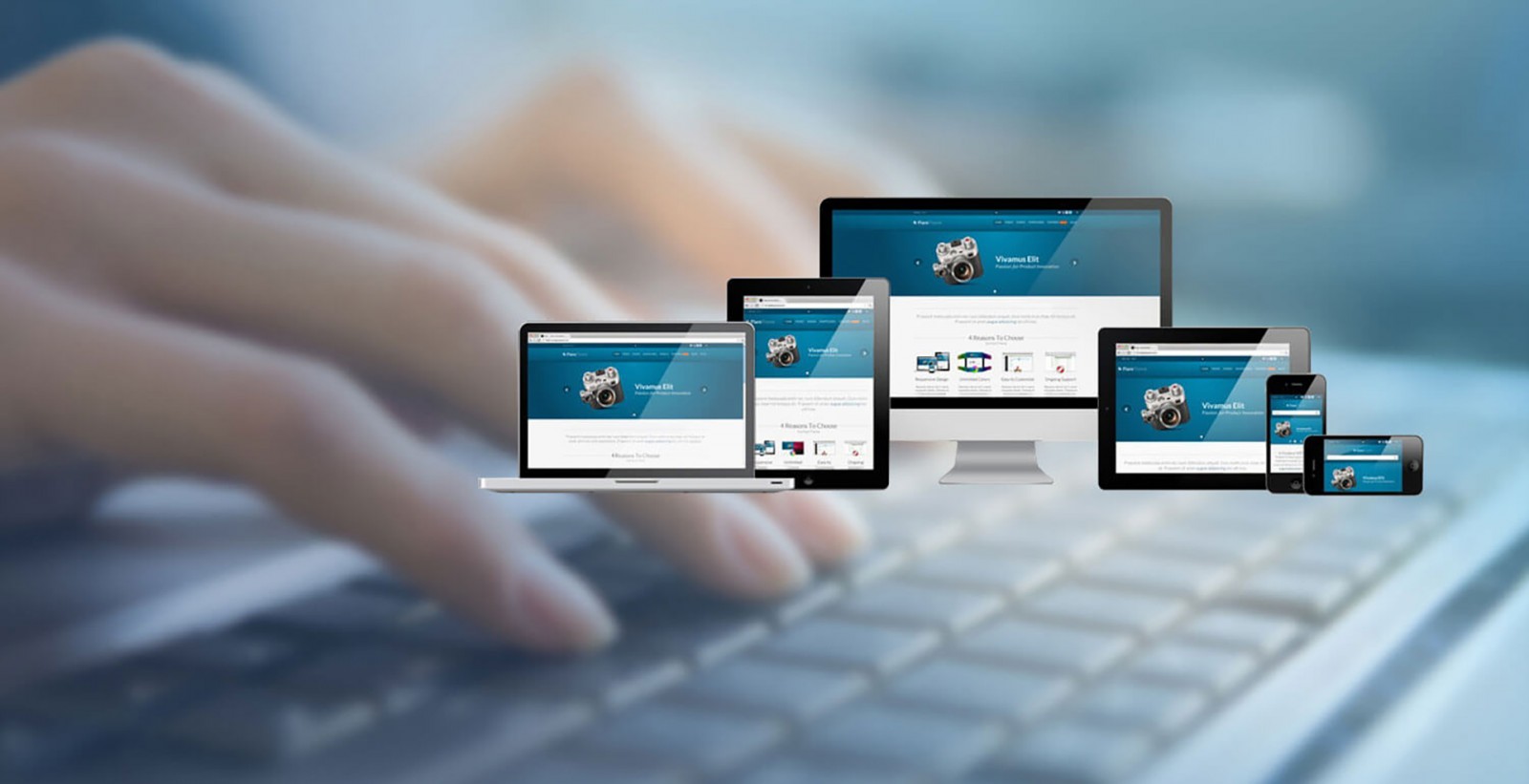
Taking all this into account, we can clearly see a major shift in the capabilities of working in web design and the internet — primarily in creating responsive and adaptive products, and in the very philosophy of web design as a field.
From an aesthetic perspective, flat design dominated three years ago. Then, Google introduced Material Design, which led us to a bit of abstraction. In 2017, the industry stepped back toward realism — reflected in the use of colors, their combinations, functionality, and shapes. But one way or another, 2017 was the year of hybrids, where reality and technology collided to create a seamless experience of browsing and interacting with content and websites.
The topic is broad, so in this first part, we’ll examine how the combination of technology and design philosophy in 2017 affected navigation, interfaces, color — and why this very blend will remain 100% on trend this year.
Menus That Defy Convention
In the dark ages of web design (about 20 years ago), there were only two standard types of menus: a top bar and a sidebar list. With the rise of responsive design, the hamburger menu appeared. It’s a great solution for mobile devices, though it has been criticized for hindering user engagement, being confusing for many, less effective for conversions, and even lacking character. Still, it’s widely used — especially when a website is built as a single version for all devices. And it’s precisely the “hamburger” menu we expect to see throughout 2018, as smartphone use continues to grow.
But here are a few variations that could challenge that trend.
Full-Screen Menus
Projects like Hillsiderancho, Maxchocolatier use a unique approach to menu framing — placing it on all sides of the screen. It appears at the top, right, and left. It’s both convenient and functional. A similar setup is seen in the WE3 project, where the menu may be simpler, but it's positioned in the same way.


No Menu at All
It’s an intriguing idea — not needing to tell users what to do on a website. Scrolling is intuitive, so users simply scroll through content until they find what they need. Some designers now prefer to completely remove menus, giving users the freedom to explore. On mobile devices, this trend is becoming quite popular, especially with the rise of horizontal scrolling. Examples of “menu-less” sites include Anonymous Hamburger and Bachoy.


Popup Top Menu
For a long time, we’ve been so blinded by the “dropdown” paradigm that we’ve overlooked a simple alternative: navigation that pops up! There are many areas on a website where such a menu can appear — it doesn’t have to drop from the top. Take a look at Circles Conference. When you click the hamburger icon in the top-right corner, a navigation panel appears right in the center of the screen.


Overlaid Navigation
A variation of popup navigation is the popover panel — a kind of “overlay” that covers the entire page. It’s a bold move for designers, but it feels incredibly intuitive for users. It even challenges the layout of traditional table-of-contents. The Pinqponq project uses a standard hamburger menu that opens a full-screen popover. The Edelson site does the same, but its popover shows six items in a grid layout. Each navigation item changes the background image when hovered over, displaying a part of the full photo — beautifully done. Also notable is the Wibicom project.


Custom Scrolling
We’re now seeing a clear trend of websites moving away from default browser scrolling. Instead, developers implement custom page scrolling, allowing users to explore content at their own pace. Some use “virtual scrolling” that performs the same function but bypasses browser control entirely. This opens up creative freedom, as seen on Build in Amsterdam. Famous for its horizontal scroll on the homepage (and vertical inside), the site recreates the desktop experience on mobile. Also notable is its off-canvas side menu that slides in from a hamburger icon.
Similar scrolling is used by Dess and Interword.


Some projects even let users scroll by dragging or clicking. Fantastic Beasts Magical Maps and Grim London are examples. These websites offer interactive maps where users can physically move the screen to discover content — like a digital museum or city panorama. It’s an alternative to traditional navigation, giving users freedom to explore.


Most such projects use WebGL. But Grim London stands out for using PixiJS — a 2D WebGL engine built with JavaScript.
Tangibility and Virtuality
Three years ago, flat design gave way to material design, which added shadows and gradients to flat elements — creating the illusion of depth. In 2017, we took a step toward realism again. And in 2018, this trend continued. Not as a return to skeuomorphism, but as its evolution.
Instead of placing objects in fake windows, they are now cut out of their environment and placed on digital landscapes. They have light, shadow, and volume — but no longer follow real-world logic. A book may appear larger than a truck. See the Beoplay project — where headphones appear larger-than-life and interactive.


This integration of real-world objects into digital environments blurs the line between screen and life. It creates a strong emotional connection: “ Wow, I have that same thing in real life!” See also: Prettyflyfpv, Adriaansen, 1stChoice.


Subtle Animation & Microinteractions
Much was said about this in 2017, but it’s worth revisiting. Movement draws human attention — it’s an evolutionary trait. Big, sudden motion signals danger. Small, subtle movement shows life and growth. Remember this when adding motion to your designs. Overpowering animation distracts, while delicate motion brings harmony and balance.
For years, animations rewarded user actions (hover, click). Recently, we’ve seen subtler animation integrated into site layouts to attract attention, such as waypoints triggered during scroll.
This can be implemented with JavaScript or CSS. While not essential for UX, these animations give websites personality and depth.
The Project Sunday site is rich with animations: sliding menus, hover color effects, scrolling transitions, changing photos, tooltips, animated text. Explore it yourself!


Similarly, Kekselias uses gentle animations for text, images, and page transitions.


Other good examples include Kamata1010, Frame Optik, Max Chocolatier, Folk Strategies.


Yes, this type of animation isn’t new — but it’s refined, effective, and tasteful.
Breaking Proportions for Art’s Sake
Wide, short visuals look great on widescreen or Retina displays — but won’t fit mobile screens. In responsive design, content renders differently everywhere. So how do you maintain composition? Usually, by cropping. But how to do that while preserving meaning?
Recently, tools have emerged that let us control cropping smartly. But they shifted focus from page layout to image content.
Instead, think: what story are you telling with that photo? Emphasize it and help users view it fully. Technically, you can do this with smartcrop.js.


Some sites completely ignore aspect ratio. On MikeBravo and Google Arts & Culture, images are big and center-aligned — auto-cropped when necessary, but their focus remains intact.


Conclusion
We could go on about cinematography, split screens, muted colors, and gamified layouts — but we covered those in separate articles. 2017 was exciting, and design trends are becoming more tactile and realistic.
In 2018, expect graphic elements, gradients, flat styles, and more. We'll explore this further next time. But keep in mind: web design evolves quickly and unpredictably. More mobile users and growing digital literacy push designers to create tech-savvy, original, and flexible solutions.
We entered 2018 with these trends, but which of them survive into 2019? Time, technology, and art will decide — all of which heavily shape the internet and web design.