
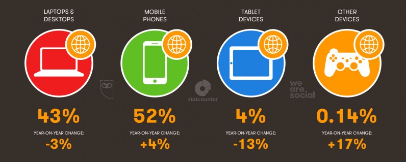
Is there still a need to prove that the share of mobile internet traffic is growing rapidly every year? According to the international analytics agency We Are Social, as of 2018, about 52% of internet users worldwide access the web using mobile devices.
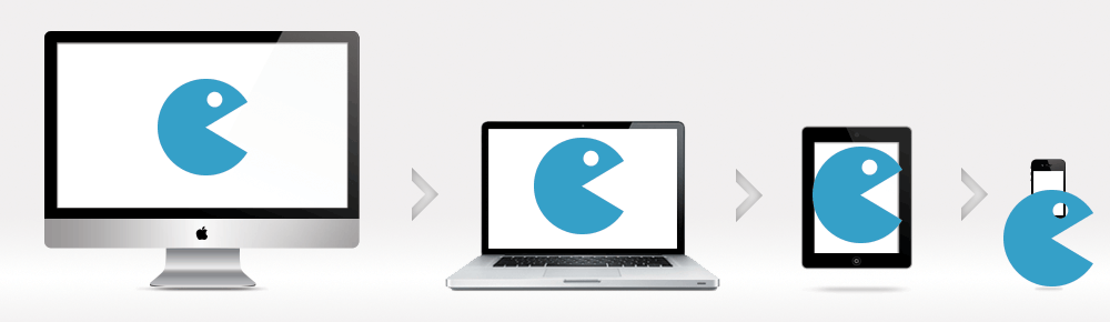
This data shows that when creating a website, sufficient time and effort must be dedicated to the mobile version. This should be understood not only by those developing websites — designers, web developers — but also by business owners who want their website to be an effective tool for achieving goals.
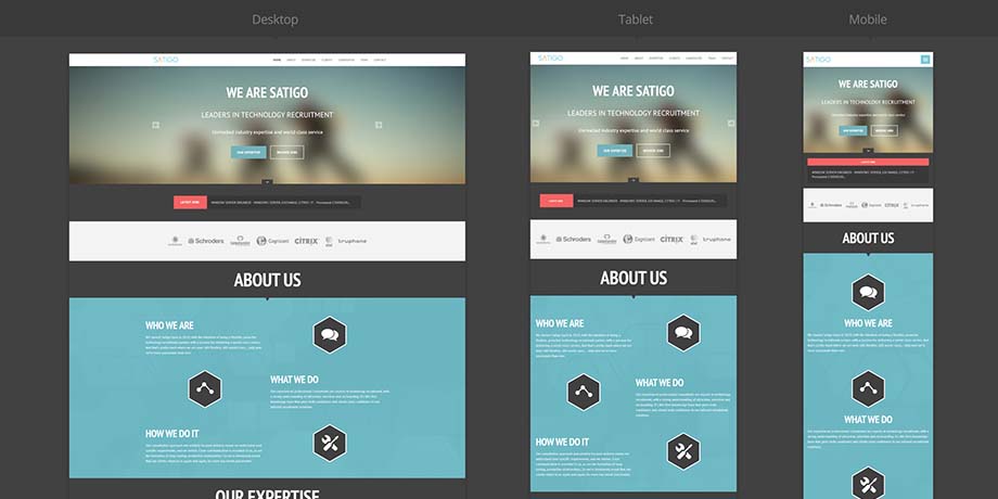
Responsive design is now an integral part of web development. Website pages should look equally appealing and be user-friendly on both desktop and mobile screens. It’s increasingly rare to come across websites that display incorrectly on either type of device — especially when it comes to selling products or services. If a site looks, let’s say, weird, users will likely close it without even attempting to make a purchase.
Sites that aren't optimized for mobile devices are immediately noticeable. When opening such web pages on a smartphone screen, only part of the content is visible, and you’ll need to scroll left and right to see everything.

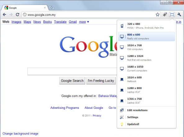
How can you check a site’s responsiveness when viewing from a desktop? Google Chrome has a special plugin called Window Resizer. It allows you to open sites in the most common screen resolutions.
Responsive design or "mobile friendly" allows the page layout to adjust depending on the screen width of the device used to open it. With this approach, the layout isn’t redrawn for each resolution — instead, the size and position of individual elements are adjusted.

Creating a responsive version of a website starts with a mockup developed by a designer. Their task is to effectively convey the main ideas and essence, highlight important information, and remove or hide some of the auxiliary content and decorative elements. At the same time, the functionality of the desktop version must be preserved.
Responsive design involves adjusting image and text sizes, as well as changing the overall layout of elements on the page. It is implemented using CSS3 and HTML5.
CSS Media Queries
With CSS media queries, you can control the style of any page element depending on the device’s characteristics. A media query is essentially a rule that defines the style of each element based on the screen width.
Every query starts with @media, followed by conditions related to the device type, media features, and logical operators.
Media features commonly used in responsive design:
Prefixes like min or max can be added to some features, representing minimum or maximum values. For example, min-height: 300px means the viewport will be no smaller than 300 pixels.
Responsive design using media queries is not the only, but certainly the best and fastest, way to make a website user-friendly on mobile devices. Let’s face it — writing a few hundred lines of code is easier than creating a separate mobile version of the site.
Besides improving usability, responsiveness also impacts SEO. Search engines prioritize websites that are optimized for mobile. In other words, Google ranks websites that are equally convenient to use on both desktops and smartphones higher.
Another benefit of responsive design is that all versions of the site share a single URL. This means content isn’t duplicated, and different versions don’t compete with each other. SEO efforts apply equally to both desktop and mobile search results.
Mobile First
Not all website development starts with creating a desktop version and then adapting it for mobile devices. Historically, more attention has been given to the full desktop version. However, there are trends we can’t ignore.
In 2015, Google set a trend for the Mobile First strategy. This concept prioritizes the mobile version. In other words, web developers first design for smartphones and only then adapt the project for computers.
With this approach, the mobile version doesn’t feel stripped-down or incomplete. Everything is thoughtfully designed for the user’s convenience. All functions are initially planned with screen width and capabilities in mind. Also, it’s easier to expand something simple than to simplify something complex — which is exactly what happens when creating a desktop version from a mobile layout.
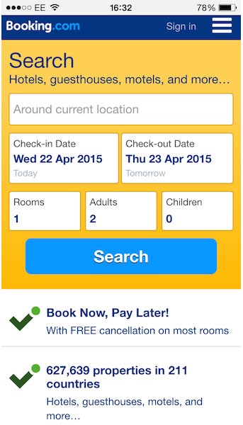
A good example of a Mobile First website is booking.com.
Mobile First is relevant, but that doesn’t mean it’s a mandatory approach for all websites. Some websites could actually be harmed by responsiveness — for example, sites with complex functionality or content that needs more space for better perception. To determine which screen resolution to focus on, you need to analyze incoming traffic and the types of devices most commonly used to view the site.
Responsiveness is one of the key requirements for a modern website. A user-friendly, fully optimized site for all devices isn’t just a whim — it’s essential for making the website an effective business tool.