Proper composition is the key to a successful photo, painting, and website. But unlike works of art, a website must prioritize not just aesthetics but, above all, practicality and attention control. That’s why the main principles of web design composition lie at the intersection of marketing and visual art.
Rule of Thirds
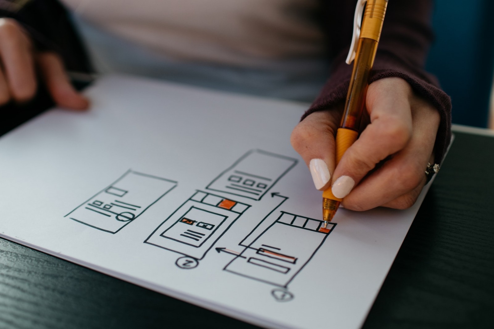
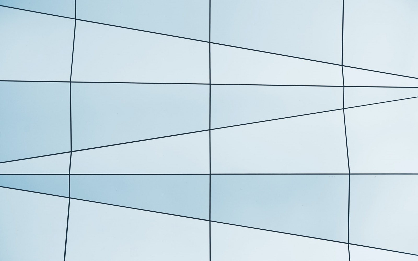
Everything starts with the rule of thirds, familiar not only to designers but also to photographers. It’s the most basic principle of composition, based on the “golden ratio.” According to this theory, you should divide the page into 9 equal parts – draw two vertical and two horizontal lines. The points where they intersect are where people naturally focus their attention. Using this scheme correctly helps create a harmonious layout.
People naturally perceive divisions into two or three parts – that’s what you should build from. No need for complex geometry; it can confuse the user.
Modern design programs and editors offer several grid options, even beginner designers are familiar with them. This significantly simplifies the process – you can easily choose a suitable grid and place your elements accordingly.
Hierarchy
Our brain has a unique ability to instantly classify information. That’s why you need to create a layout that is easy to read and visually digest. The user’s mind will group visually similar elements and highlight what’s important – this happens in fractions of a second. This is not only a way to convey large volumes of information, but also to guide attention.
It’s obvious that you need to differentiate between primary and secondary elements. Place the key elements at the intersection points mentioned earlier. Remember, we read in a Z or F pattern. Accordingly, the first square in the 3x3 grid is the most viewed. This concept doesn’t apply to sites for Arabic or Asian audiences due to their different reading patterns.
Think through the user journey. Knowing the eye trajectory and rule of thirds, you can arrange elements to lead to your desired outcome. You can apply marketing models like AIDA here.

Balance
It’s important to balance your composition. You’ve added two or three main elements, but there are still additional ones. You can’t overload one part of the page and leave the other empty – distribute the elements evenly, carefully, and precisely. Balance a large heading and button with an image on the opposite side. Distribute small navigation and informational items around the corners or relative to them.
Stick to the idea of "power lines," where graphic blocks are aligned along certain lines. These lines can be horizontal, vertical, or diagonal, depending on your concept and the specifics of the project.
Visual balance is a relative concept – it can’t be measured, and you can’t always rely on symmetry or other familiar references. You’ll need to train your eye, experiment, try different things, and learn from the best professionals.
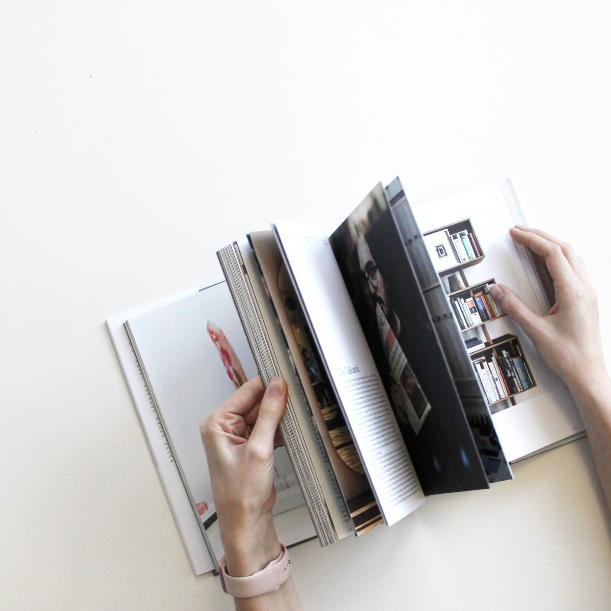
Magazine Rule
Think of the most famous magazines and transfer their best layout ideas to the web. Print media has been around much longer than the internet, so it offers many time-tested solutions. Of course, there’s a difference – websites are flexible, while magazine pages are static. Keep that in mind, but you can still borrow basic compositions from glossy layouts. Imagine opening a beautifully designed article, an ad, or a feature spread – that’s the feeling your site should evoke. Adapt the design to your theme, add buttons and animations.
Color Combinations
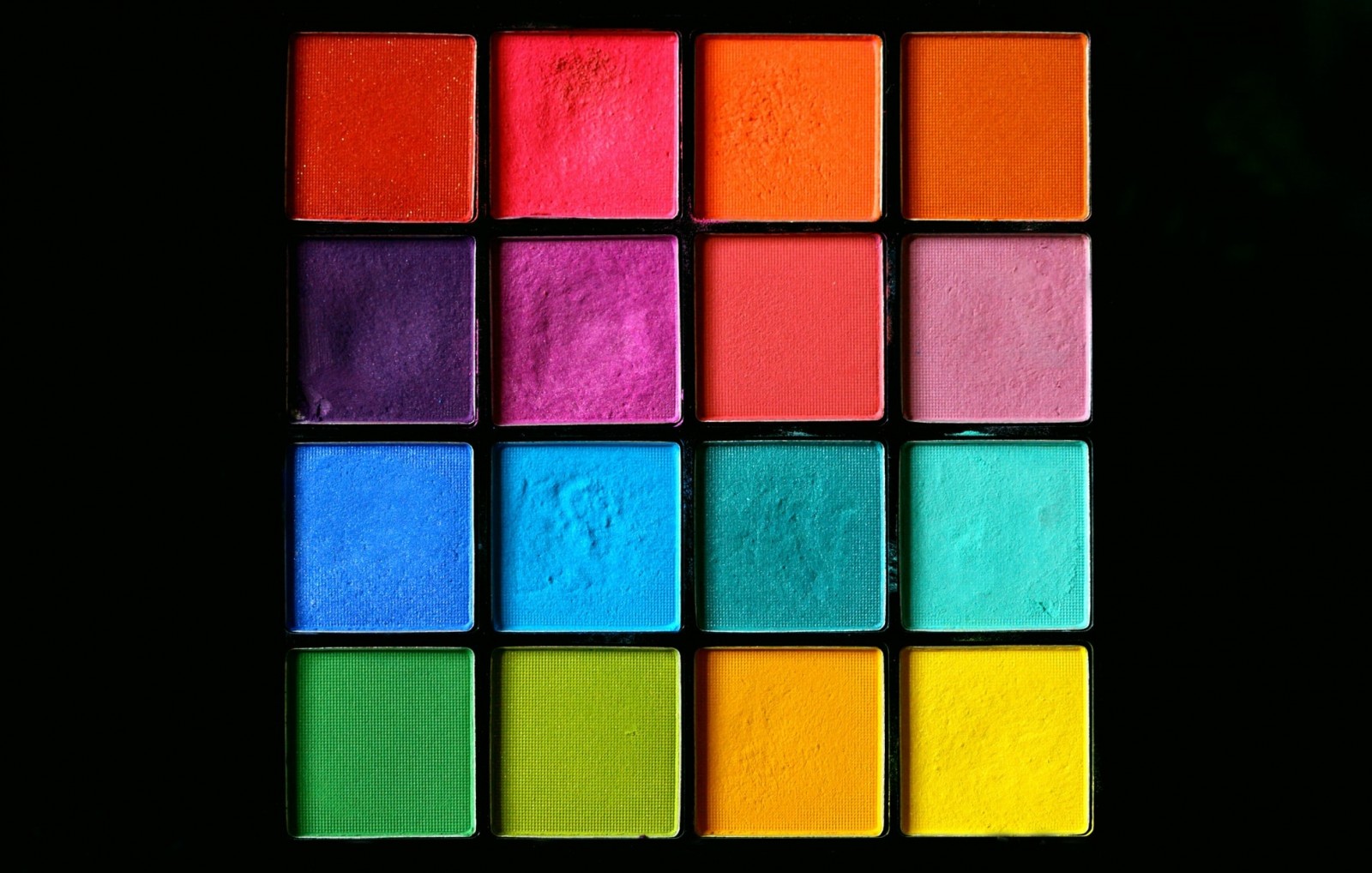
It's not just about where you place objects, but also what color they are. Even the most perfect composition can be ruined by poor color choices. Here too, the principles of hierarchy apply.
Define your primary and secondary colors. Assign specific roles to each and stick to them. One of the simplest and most universal solutions: 3–4 shades of one color, one contrasting color, plus white or black. Use the contrast for accents – highlight buttons, navigation, add fine borders. Learn more in the article “Why Ready-Made Palettes Don’t Work” .
Rhythm and Repetition
Designing a great first screen is a complex and important task, but it’s often a designer’s favorite part – it’s creative and always allows for self-expression. Be sure to watch the online premiere “Secrets of the First Screen: 5 Variations” .
After the first screen, you’ll need to build the rest of the blocks and pages in a similar concept but with simpler structure. It’s important to stick to a consistent style.
If your page includes a large amount of information, you’ll need to create rhythm. A solid wall of text and elements is outdated. The most progressive sites today use alternating light and dark backgrounds, clear separation between blocks. Look at Tesla, Microsoft, Wrike, Jira, Asana.
White Space
Empty space, or "air" between blocks and elements, is sometimes more important than any complex feature. You can’t cram as much info as possible into a limited space and sacrifice white space – that will ruin your design. If you need to present a lot of important information, find a way to divide and structure it.
Be sure to read this article: “The Power of Nothing: The Importance of White Space in Design” .

Learn the Basics
We often describe bold ideas, cutting-edge trends, unusual approaches, and creative solutions. But all the creativity in the world is useless if you don’t know the fundamentals. Your design won’t be effective if users can’t understand what’s going on. They might admire the beauty and futurism of your site, but don’t expect commercial success. If you have a lot of ideas but lack experience and practice – join the online coaching program “Web Designer: Your Lucky Ticket to Thailand” .
An experienced mentor will personally guide you through the core concepts of web design, reveal insider tricks and techniques, help you build a strong portfolio, and correct your mistakes. This way, your learning journey will be shorter, smoother, and more impactful. Sign up now!