Welcome to the "Design Closet"!
This is our third issue and today we're going to talk about how to make a website adaptive and responsive: what’s the difference between these two terms, what are media queries, and how to create your first adaptive page with minimal knowledge of HTML and CSS.
As you've guessed, there are two concepts – adaptability and responsiveness. In developer circles, these are referred to in English as adaptive and responsive.
Adaptive
So, what is adaptivity?
It’s a set of measures aimed at creating an ideal user experience across all devices and gadgets. I came up with this definition and find it both concise and simple. The key here is the "user experience," because adaptivity isn’t some isolated solution – it’s a full range of techniques.
What does adaptivity include?
1. Coding. The front-end developer creates the magic in code that allows us to view different versions of the same page on mobile devices and desktops.
2. Design. You definitely need a designer who creates visual solutions that, due to the nature of creativity, are outside the coder’s skill set.
3. Constant improvement. Adaptive web design is constantly evolving and searching for new solutions.
Previously, adaptability was achieved through subdomains. If we had the domain sitename.ru for the desktop version, when visiting it on mobile, you would be redirected to the subdomain m.sitename.ru. This subdomain contained a so-called lightweight version of the site, with little or no graphics, since mobile networks used to be very slow, making large images impractical.
Responsive
So, what is responsiveness?
It’s a component of adaptive web design. It enables content to adjust across devices without changing the domain, instantly. This is a modern trend and approach to creating adaptive site versions.
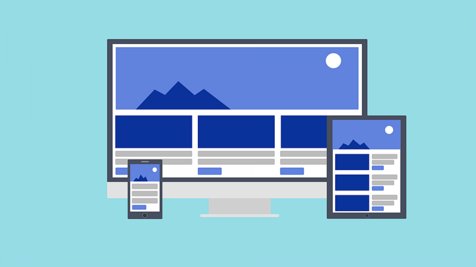
For example, when you visit sitename.ru from a desktop, you see a typical website layout.

If you enter the same URL from a tablet, you’ll see a version of the page that fits the tablet’s screen – without any redirection. That’s the essence of responsive web design: it responds to the device’s screen size.

If you open the same URL from a mobile device, you’ll see the version of the site optimized for phones.

How is responsiveness implemented in practice?
The only way to make an HTML page "responsive" is by using media queries in CSS.
What is that?
Let’s imagine a basic CSS block with a class “block” – 500px wide, 300px tall, and a 1px solid gray border. Here it is on the right:

Now, what if we add another rule to that same CSS file?
We add a container media screen and (max-width: 1024px) with the same code for the “block” element but slightly modified – height and border thickness are changed. This is a media query. The block will now be transformed only if someone visits the site from a device with a resolution below 1024px. Otherwise, the default styling is used.

Let’s look at another example with three elements. The code on the left generates the block on the right.

We add the following to our CSS file:

These are the same properties, but some elements are slightly overridden. This is wrapped in the container media screen and (max-width: 480px), which means users with devices under 480px wide will see the same blocks – but transformed.

This allows us to control elements depending on the device.
So, our CSS file will have: the first part (desktop), then the second (for tablets), and the third (for mobile).

The first part is for desktop (961px and up). When a user opens the site on a tablet (769px–960px), the second part of the code is triggered. And for devices from 0 to 768px – the mobile view applies.

You see: 961px+ uses the desktop styles, 769–960px triggers tablet styles, and 0–768px triggers mobile ones.

This way, one CSS file handles all screen sizes and element behavior.
Let's see an example on the page of my free web design course. When you open the link, you'll see this desktop version:

Press F12 to open Chrome DevTools – you’ll see HTML and CSS code. If you've seen the previous Design Closet episode, you’re already familiar with this.

Locate the container with class left-side. On a 1024px screen, CSS shows it’s 50% wide – half the screen.

On a 768px screen, CSS now shows the left-side container as 100% wide. Previously it was 50%, but this is overridden.

The media query here is: media screen and (max-width: 998px)

Why 998px? Because in large projects, it’s common to have more breakpoints to finely control element behavior across ranges.
In conclusion
I hope this lesson helped you understand what responsiveness and adaptivity are. Be sure to watch my free masterclass "Day of the Coder" — even with little or no HTML/CSS knowledge, you’ll be able to create your first real professional webpage.
See you in the next issues of the “Design Closet”.
More awesome topics ahead for designers, developers, coders, freelancers, and just free people!