Welcome!
This is the second issue of the “Design Closet”!
Today I have a topic for you that, for some reason, doesn’t get much attention online, so I decided to give it a little more spotlight.
It’s no secret that design is the sum of all the little things — tiny details that shape how we perceive a project. And today we’ll talk about shadows — a key element that’s often overlooked or neglected.
Let’s figure out how to properly place and create shadows in our work.
Shadows
Why do we need shadows in web design?
Just like in the real world, shadows help us determine the position of an object in space, understand what’s primary and what’s secondary. They help highlight some elements visually while hiding others.
A shadow is a supporting element that helps our mind perceive everything that’s happening on the web.
Shadows must be used with care — here’s a pretty good and pleasant example on screen of how to use shadows properly.

But take that same block, tweak it a little, and change the shadow settings — and it can ruin how the layout is perceived.

I see this every day in the works submitted by students in my free course “Web Designer: Explosive Start.”
Now let’s talk about how to avoid common shadow mistakes.
It’s no secret that two trendsetters in web design are Google and Apple.
Each of them has their own approach to design. For example, Google calls it Material Design. Apple’s style is more ambiguous — they haven’t officially named it yet. But we’ll come back to that in a bit.
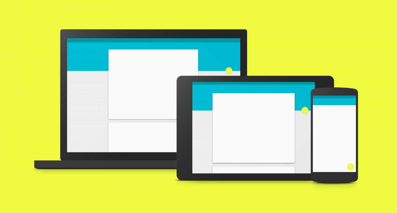
Material Design
Let’s break down what Material Design is. I think many of you are already familiar with the term. It’s a design philosophy announced by Google at one of their recent conferences — a kind of standard the company adopted to shape their products, both mobile and desktop. This is important because Material Design became a sort of benchmark, and ignoring it can lead to major problems. Today we’ll talk a lot about how to use shadows for Material Design.
Recently, the guidelines — or rather, the rulebooks — for Material Design were collected on a single domain: material.io. It’s an excellent site filled with tools and tips for web designers, and when you visit it, you’ll see a beautiful layout like this.

Here you can find guidelines, examples, articles, and different ways to apply Material Design as a system. I highly recommend checking it out.
I think we’re good on Material Design. Now, what about Apple?
Apple
As I mentioned earlier, Apple doesn’t really have an official name for their style — it’s just the “Apple style.” But I’ve come up with a more concise term: the Apple Approach. Basically, it’s Apple’s take on design. I think it makes sense.
So what characterizes the Apple Approach? If you look closely at Apple’s mobile apps or desktop websites, you’ll notice shadows are almost never used. So, if you’re designing in Apple’s style, please don’t go heavy on shadows — unlike Material Design, which is built around cards that need visual separation, either via borders or shadows.
A clear example of where Apple uses shadows is around pop-up cards — they’re the most prominent.

But aside from that, shadows are barely used in most Apple designs.
Where can shadows be used?
I’ve picked a few common use cases for shadows. This isn’t a full or final list, but it’ll give you some guidance:
1. Around cards and elements. Cards usually contain groups of elements, so they need to be visually separated — shadows are great for that.

2. Transitions between sections. This is often used to visually distinguish areas not just with color but also with depth. For example, you see the header, then a second section below it — and between them, a strong shadow shows one element is layered above another.

3. For images. Images can be highlighted using shadows — or not. And between us, it’s no longer trendy to add shadows to images. But there are scenarios where this still works well.
I’m not saying shadows should be used everywhere, but if you do — make sure you do it right.
Shadow formats
1. Short shadow — the simplest kind. Here you see a set of elements, and each needs to be separated. This is typical for Material Design — content arranged in cards with short, minimal shadows.

The Material guidelines go into great detail on how to build this kind of shadow. If you look closely, the shadows act almost like borders here.
2. Large-radius shadows. Here we have an element with a wide shadow radius.

These are often used for pop-ups or feedback forms placed, for example, over a map. The shadow shows the element is closer to the user’s eye. Just don’t overdo it.
3. Long shadow — very trendy about 1–2 years ago. Although now it’s less common, it still pops up. Long shadows are often used on icons — like the one in the lower-right under the gear icon.

4. Angled offset shadow. Often used for images. It can vary:

The shadow is slightly offset, showing the element hovers above the layout. It may have no blur radius or a small one, like on the right example.
5. Colored shadows. Rare, but when done right — super stylish.

You’ll see these in bold designs on Behance, Dribbble, or concept art — like the glowing red heart icon here. It looks cool and stylish. If you use bright colors in your design, a soft shadow can work really well.
Keep in mind: all the examples I’ve shown are nearly perfect implementations. A little more or a little less — and it won’t work. So watch closely.
I’ve prepared a special file for you to explore different shadow examples. Some are from the Material guidelines, some from my personal experience — like the last two examples.

These include: short shadow, large-radius shadow, large shadow offset downward, short shadow offset to the right, and angled blur shadow at 45° in the lower right.
There aren’t many types. The key thing to remember: if you’re using a shadow in your design, it should fit into one of these five categories. If not — and you’re making something totally new — you might end up with something poor. Stick to standards first. As Steve Jobs (and common sense) would say: copy first, follow conventions. Only then will your own style and taste emerge.
I hope this material was helpful and you’ve learned something new. Use the download link .
It’ll help you dig deeper into everything we’ve just explored.
Be sure to check out the course program “Web Designer: Explosive Start” , which I personally teach. It’s 100% free and will help you dive into web design basics, create your first mockups, learn how to freelance, and most importantly — go deeper into shadow use.
See you in the next issue of the “Design Closet”.