What can make a website not only unique in design but also interesting, engaging, even captivating for the imagination and attention at the same time? Many would think of different things — and they'd be partly right. Today, the overall impression of a project for visitors and clients is shaped by several factors. Yes, content plays the leading role, but without proper surroundings, that content may fall flat. This includes pleasing visual effects, loading speed, readability, modern design features in general, and of course, ease of navigation — without which a website loses its value and appeal. Regardless of the project's scale, good navigation is the key to helping visitors understand what the site is about and how to use it.
Content and navigation are the two main elements that, when used wisely, can do without extra effects, decorations, and other bells and whistles. These two components alone can offer users everything they expect from a website. Yes, really. And despite the frequent use of “hamburger” menus (single-button dropdowns), websites that take a non-standard approach to navigation remain just as popular. In other words, the menu items are not laid out in the typical vertical or horizontal fashion.
Let’s explore variations of circular navigation. And we’re not just talking about using circles and ellipses as shapes — but about truly circular placement and its integration with the site’s content. After all, you can position elements in many ways, but tying them closely to the content — that’s where it gets really interesting.
Circular navigation in web design
It's worth noting that this type of navigation adds a touch of sophistication to a project’s user interface, capturing attention and sparking interest with its very appearance. Naturally, this affects not just site visits, but also conversions and the overall experience. Even when following modern trends like flat design and minimalism, circular navigation can still be applied. It adapts to any visual concept: no shadows? No problem. No gradients? Still works. Sharp and linear icons? That too. Circular navigation works especially well for virtual tours, creating atmosphere and a sense of immersion. But even on standard projects, this approach never goes unnoticed.
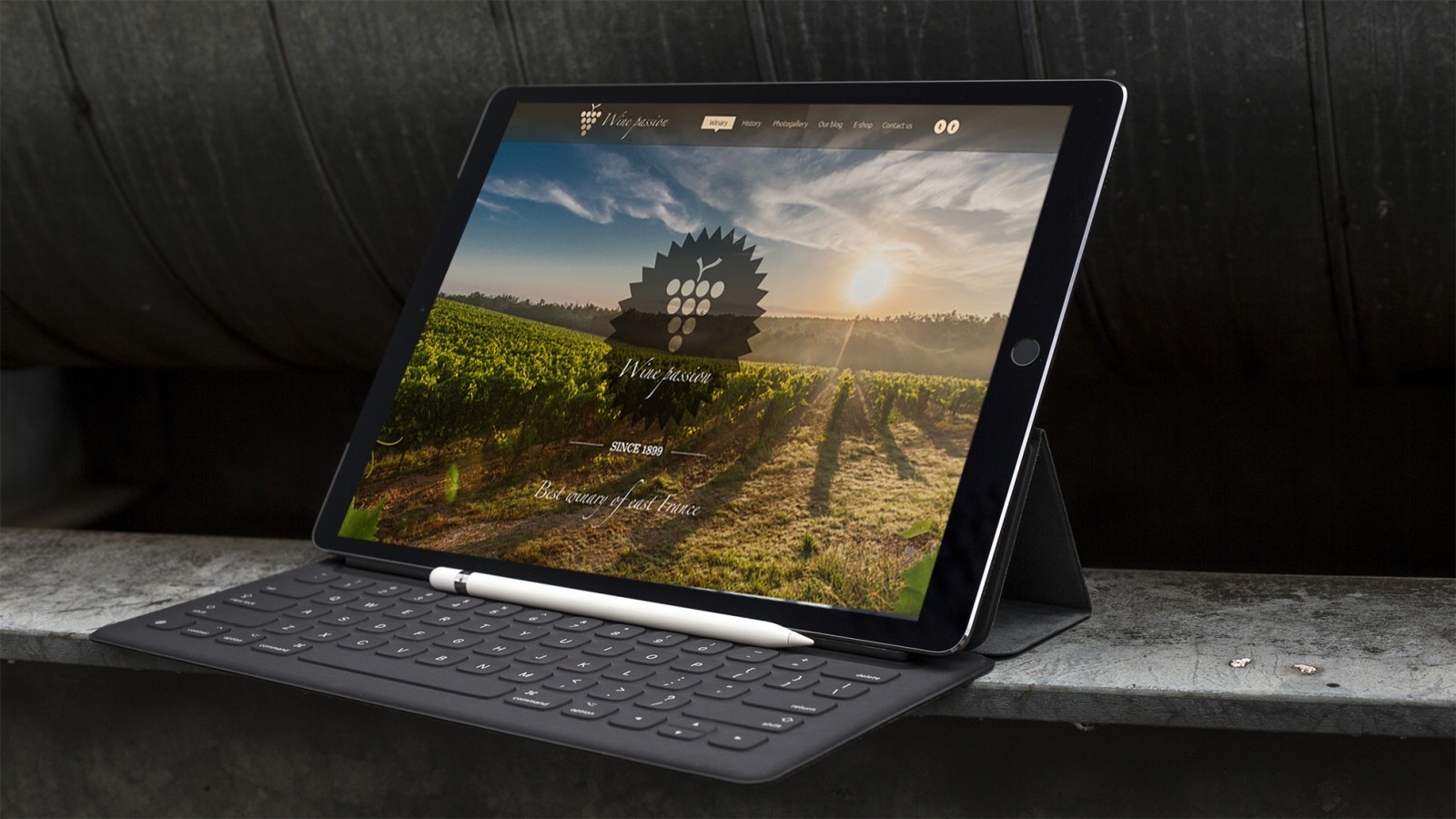
1701 Franciacorta
1701 Franciacorta chose not just circular navigation, but actual circles as icon shapes. Interestingly, the icons contain secondary sections and materials, while the main menu is hidden behind a hamburger button. Moreover, the site includes animations, videos, even an interactive 360° virtual tour and much more.
Viewed as a whole, the project is interesting in many aspects, which we’ve covered in our previous articles.


Wine Explorer Brancott
Another wine-themed website. On one hand, it features an illustrative and animated design that looks extremely simple. But the main focus is content and how it’s structured. As you click through the circular menu, new information is revealed with each step. And although there’s no traditional text content, each page can be shared on social media — the sharing icons are always visible on the left side menu and never disappear.


When switching to the main Brancott brand website, you’ll see a more traditional modern design — not without its strengths, but lacking circular navigation.

Nadezhda
The website of this Bulgarian women’s health clinic is built entirely on circular navigation. In fact, it’s everywhere. As users scroll through the page, more and more circles appear — containing images, photos, text, and menu items. It’s beautiful, intuitive, and functional. Even if someone doesn’t need this clinic, they can quickly orient themselves, see what’s what, and navigate with ease.


Luxury Resorts
This luxury resort project takes a more straightforward approach to circular navigation. The designers created schematic linear icons in round shapes, each with a themed image inside, arranged vertically along the side.
.jpg)
Thanks to beautiful photography, elegant typography, and the combination of these with clean iconography, the project creates an alluring and luxurious atmosphere. Many of the images are animated — brought to life. Books’ pages flutter in the wind, candle flames flicker in the twilight, and more.

7Up
The beverage brand’s website embraced circular navigation to align with the project’s overall theme. What characterizes a product like juice or water from this brand? Bubbles. Yes, it's the bubbles that set their drinks apart from others. You’ll see animated bubbles during logo loading and then in the appearance of the navigation itself — even in the background styling, gradient types, photos, and elements.

Despite its playful and atmospheric feel, the website later uses tiled navigation and table-style information blocks. Still, even the sliders retain circular navigation elements.
Overall, the project is intriguing from all angles.


Why circles are so popular
The circle is often considered a perfect or even "divine" shape. In web design, circular elements can bring a project to life and give it a fresh look. Thanks to CSS3, circles are easy to implement without relying on images. After years of dealing with rigid rectangles — image frames, buttons, layouts — the transition to circles feels refreshing and eye-catching.
With the rise of touchscreens and mobile devices, circular shapes have become even more relevant. It’s simply easier to tap a round button — it mimics the tip of the finger, which is round rather than square or triangular. Circular elements can also hold more icons, text, and content within compact space, making them perfect for smartphones, tablets, and responsive design. Over time, circular navigation evolved from a decorative gimmick to a fully functional UI tool.
Unique custom projects
Circles are used in more than just navigation. While circular icons, images, info blocks, and logos are already familiar and no longer feel novel, circular navigation still appears a bit extravagant.
For example, the Audi TT microsite impresses not just with navigation but with its entire design — animation, aesthetics, music, even loading screens. The circular navigation here doesn’t particularly stand out but fits the theme and content perfectly, just like the 7Up site.


Another fascinating case is Interaction with Artificial Physics. Each menu item appears as a swinging ball on a string, like a pendulum. The menu responds to mouse movement — hover effects light up the text. If you click and drag the line holding the pendulums, they begin to swing, simulating real physics.

Circles were creatively used on the official site for Sing by Illumination Entertainment. The menu can be dragged using your mouse. Hover over character icons to hear them sing. Click to access detailed pages. These subpages also use circular navigation (vertical and horizontal), in addition to the traditional menu.


The site Bergluft Hervis — dedicated to skiing — features another twist on circular navigation. You can scroll the main page or jump to a circular navigation interface, selecting sections like training, preparation, or even a glossy magazine. Thematic pages load accordingly.


One last custom project is striking in its uniqueness: Cantina Negrar. This website uses circular navigation in a single prominent circle. Scroll down and you’ll see a color-segmented circle. Clicking any segment reveals details about a specific wine variety. The project also features framed layouts, tile-style navigation, image effects, and more.


Conclusion
Circular navigation — whether it’s built on actual circles or simple dots — looks intuitive and familiar to users, allowing them to interact effortlessly through simple touches. But this form of navigation is also great for desktop experiences, looking just as elegant and working just as well with a mouse.
The key to effective circular navigation is relevance to content and theme. Wine is made from grapes (round), stored in barrels and bottles (also round). So, circular navigation is a natural fit. Audi’s cosmic design or 7Up’s bubbles? Again — perfect alignment between idea and execution, even the Audi logo supports the concept. Same goes for the other examples.
While still unfamiliar to most users, circular navigation grabs attention quickly and draws focus to key areas of a page. Its advantages both enhance usability and turn the menu into a distinctive and essential part of the project — even the brand's identity.