Designer, artist, and studio websites have their own specifics, as their portfolios, work samples, and project lists often form the first impression for users, partners, and investors. Still, while we humans prepare for meetings, interviews, and rehearse our speeches, we often neglect our portfolio, our completed projects, or ignore basic design trends when showcasing it online or in presentations. From the perspective of a mid-sized company, they often review an overwhelming number of portfolios from startups, freelancers, and agencies. And if you sum up all those cases (regardless of the industry), some shared mistakes clearly stand out—mistakes that push creators further away from achieving their goals.
In this article, we’ll focus on web design for portfolio sites and examine the differences between a well-constructed case and a sloppy one. Essentially, we’re talking about presenting the site owner's work—whether it’s a web designer’s samples, a music studio’s projects, a construction firm’s real estate developments, or custom furniture examples. Though the emphasis here is on design portfolios.
Photos and Samples
As designers, we naturally focus on the visual aspect. After all, the purpose of a portfolio is to showcase what we've built, designed, and accomplished. But in most cases (with few exceptions like playgrounds or niche installs), viewers crave context—descriptions, background, specifics. Yet many creators simply dump photos onto a page and leave visitors guessing what they’re looking at. Is that a logo? A flyer? A business card design?
But what if you broke your work into stages and shared a short narrative or insight for each? You can even use longer captions and headlines next to every image, as seen in the portfolio of Mackey Saturday (designer of the Instagram, Oculus, and Luxe logos). That’s pretty much all you need, because visitors skim portfolio pages looking for a spark of interest. So the simpler and more intuitive, the better. It's surprisingly effective to group works by topic or medium—instantly boosting how clients perceive the designer’s effort and professionalism.


For instance, dadesign.studio labels each project by category (animation, branding, illustration), since the visuals alone don’t always clarify what’s being shown. eunicejoung shares photos with brief write-ups—for example, the Cinemagram mobile app or the Mark On brand. You can easily explore the process and outcomes. In contrast, evoluted seems to just upload a bunch of images with mouse-over text only, which is less intuitive. Sure, it looks nice—but it’s harder to skim.


Trendy but Meaningless
If you're designing a personal portfolio (not for a company), it makes sense to include a short bio to help users understand who you are. And please, avoid empty phrases like “I paint pixels with perfection.” That tells recruiters or potential clients nothing. And they’re the exact people reviewing your site. Most regular visitors don’t care about a designer’s logos—until they need one. That’s when they become clients and start evaluating your portfolio more seriously.
Anyone considering hiring a designer wants to instantly understand what you do. So say it clearly: “I’m a brand designer and art director.” Clear is better than clever. And being both—like Marina Rachello —is best. Her minimalist, brutalist-style website includes both a personal intro and a curated showcase.

Or look at thedistance, who summarizes their value in one sentence: they make products for local clients. flowstudio takes a minimal approach: a short description, big photos, titles, and a link. Simple and clear.


Outdated Aesthetics
We’re all guilty here. We work so much we forget our own portfolios need to stay fresh and relevant. Your portfolio should evolve with your career. You know this when designing for others—but often delay updates to your own site. An outdated portfolio can hurt your credibility. Even if you’re not sending it to potential clients, anyone can find it just by Googling your name. And that might cost you opportunities without you even knowing.
The good news: even if you're focused on long-term projects, you can still keep your site looking current. That’s why off-the-shelf templates aren’t great—they visually expire over time.
The best solution is a custom-built site you control. It’s unique and lets you update styles or colors at any time, without a full redesign.
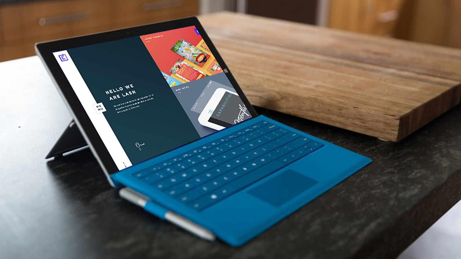
Examples: clicky, verenamichelitsch, tiltfactory, lashcreative, and buzzworthystudio (where hovering a project title reveals info right in-browser).


The Dreaded "About" Page
Your “About Me” page is a prime opportunity to connect with viewers and inspire trust. But too often, it’s bland and forgettable.
Instead of listing clients and contact info only, use this space to share personality. The reader may have browsed dozens of portfolios today and is tired. Make them smile, and they’ll remember you. Not with a joke—but a cute mascot, a thoughtful animation, a soft gradient.
Examples: alinaskyson (her “10 honest facts” are delightful), Sarah Ledonne (simple and effective).


Also, check out Roxane Zankel —not a web designer by trade, but her site is one of the boldest. Her portfolio is clear and detailed: short titles, categories, links, and illustrations. Plus, the layout is so adaptable it won’t feel outdated anytime soon.


Another unique site: unspokenagreement. Their portfolio is simply a reverse-chronological list. The contact page shows hours, location, and contact options. There's also a services page. That’s it. But it’s clean, modern, and features subtle animations.


Also worth visiting: roudstudio, krisztinatoth, martin-laxenaire, londoncreativedesigns.


Final Thoughts
Portfolio sites often look similar, yet differ wildly. The goal is the same—to showcase accomplishments and capabilities. But visually, the internet is filled with incredibly diverse interpretations of that goal.
Whether you’re designing a portfolio for yourself or a client, these principles still apply.
Most importantly: your case studies don’t need to be digital art pieces. Don’t overdo animations, filters, or VR effects. Design and visuals matter—but in the end, your portfolio is there to clearly showcase what you do and what you offer. Nothing should get in the way of that. Think about your audience, their needs, their time. Design your portfolio to be useful first—and beautiful second. That’s the recipe for success.