
Today, let’s look at the key principles needed for a great CTA.
1. CTA is a button
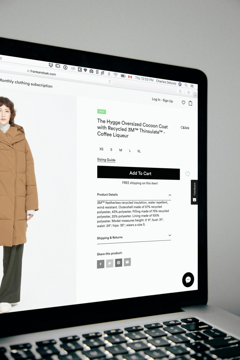
Let’s start with the form. Rectangular, rounded corners, or unconventional—it must still be styled as a button. This format is instantly recognizable and requires no explanation. See a button? Click it!
Text links without borders often get lost on the page and are only clicked by users who are truly determined. That’s not the designer’s achievement—that’s just luck. Such CTAs are easy to miss, and that’s definitely not our goal.
When it comes to unusual design, be cautious. Most users expect familiar behavior—it’s important to meet that expectation. Creative or unconventional approaches might spice up your portfolio, but they won’t necessarily boost conversions. Unless, of course, it makes sense—like on an escape room website, a CTA that asks you to unlock a padlock instead of simply clicking might be appropriate.

2. How to highlight the button
The call to action is the highest priority action on a page. Naturally, it needs to stand out from the rest of the content. Here are a few ways to do that:

3. The pain of choice
Sometimes there’s a need to place multiple buttons. First, know that if they’re not necessary, it’s best to avoid this—each extra option increases decision fatigue and moves the user away from your main goal.
However, in some cases, multiple buttons are justified. For instance, in an online store, after selecting an item, users often want both to buy and continue shopping.
When adding several buttons, it’s crucial to define their hierarchy. The main action should always stand out. Secondary buttons shouldn’t be too hidden—keep the same shape and size but use a transparent background with just a border, or a lighter color tone. If all buttons look the same, the user is forced to stop and think.
4. Placement on the screen
When placing a CTA, consider behavior patterns—especially familiar reading flows. We’re used to scanning top to bottom, left to right. That’s why one of the most popular placements on a landing page is the bottom right corner of the first screen.
If the button is placed too early, the user may not have enough information to want to click it. But at the end of an info block, it makes perfect sense as a closing action. Also, this position is easier to reach with your finger on mobile devices.
When you have multiple CTAs, place the main one last. A common mistake is placing it first to avoid missing it—but once users move on to the next elements, they rarely go back.
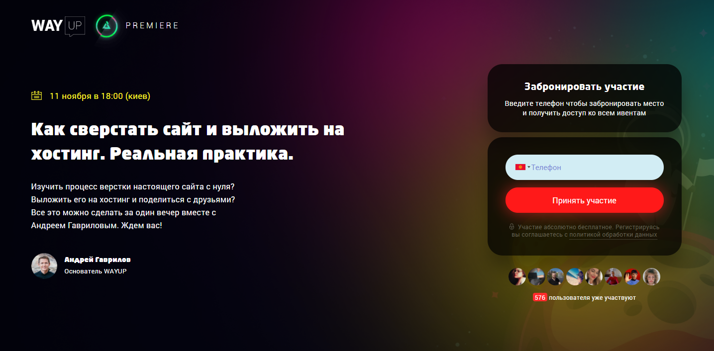
Don’t make visitors scroll just to find your CTA—it should always be visible. And remember to leave whitespace around it. Your button shouldn’t compete with anything visually. Learn more about practical CTA placement techniques in the online intensive "How to Build a Website and Upload It to Hosting: Real Practice".
5. Text
CTA text should always be readable and have high contrast. The wording itself is just as important as the design. Here are a few key principles for writing CTA text:

6. Icons and symbols
What’s easier than reading a one-word CTA? Not reading at all. If you pair your CTA with a relevant icon, it becomes almost impossible to ignore.
This also helps users who have difficulty with visual color perception or who don’t speak the language well. If the word "Buy" is accompanied by a shopping cart icon, it’s immediately clear that clicking the button will add the product to the cart. A small graphic also adds visual weight, helping the CTA stand out.
The key here is to use universally recognizable, unambiguous symbols. When users see it, they should get a clear message—nothing confusing.

7. Animation
If the button pulses or shimmers slightly, it draws more attention. If it reacts to hover with extra animation, it becomes even more inviting—users are curious to see what will happen next. You can also use shadows, arrows, or other effects to enhance your CTA.

Of course, there are exceptions to every rule. But always remember—the brain follows patterns. It wants to recognize something familiar and avoid unnecessary effort. So when designing and placing CTAs, consider your audience’s habits and experiences. The goal is to simplify decision-making and make users click effortlessly.
Want to create not just great buttons but full websites with high conversions? Learn all the tricks of the trade and build 5 portfolio projects in the online coaching program "Web Designer: A Lucky Ticket to Thailand". Join us!