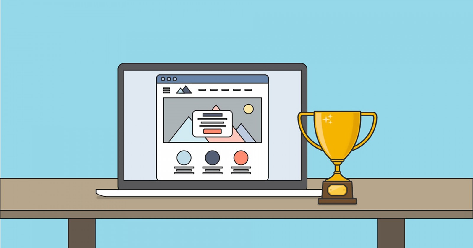
The internet is overflowing with all kinds of web design ideas. Unique websites, inspiring projects, and innovative solutions. Webmasters strive to bring something new to each project, to create their own “signature,” to use their own set of technologies that will attract organizations and clients.
But how do you find such hidden gems—pure diamonds of web design? How do you determine that a website's design is not just the best right now, but has been top-tier for a year or more? On the flip side, web designers themselves often ask: what should I create or “draw” so that my work is recognized as outstanding—or at the very least, good?
The simplest answer: study the winners of web design competitions like Webby Awards (international, accepting work from all over the world), Awwwards (Spain, judged by experts from the US and Europe), CSS Awards, and even Golden Site (Russia). These are not only the largest and most prestigious competitions in the world—they also help webmasters grow, stay updated on design trends, and understand which websites provide the best user experience.
We’ve selected the best works from different years—examples of modern design, UX, and UI. They have strong information architecture, are optimized for speed and conversion, feature video marketing, and simply look innovative and engaging. We’ve also included some other examples that might remind you of ideas from our past articles. Some elements may be reused, but they are cleverly reinterpreted and paired with other design solutions to great effect.
Each project title contains two links: one to the site itself and another to the competition entry.
Montage ( Awwwards )
A site for creating and ordering printed photo albums. Its design stands out for combining photography and illustration, animation and flat elements, icons, and a decorative logo. It might seem like too much, but it's all used so thoughtfully and consistently that it feels cohesive. This is a perfect example of how to highlight the strengths of a product and focus user attention on them. Vertical scrolling and a single-page layout make browsing faster without waiting for separate pages to load.

Revols ( CSS Design Awards )
Revols is a project featuring mini-earphones that won acclaim at CES2017. The design successfully blends macro video, photos, icons, and clipart. As users scroll, they become more immersed in the product's features—perhaps even tempted to buy. Large typography grabs attention and complements the visuals perfectly.

Grapple ( IMPACT Awards )
Grapple’s design is extremely modest—not minimalist, just simple. The goal was to showcase a multi-platform tool for organizing and tracking information during events, contests, reporting, and more. Many similar tools exist, so standing out was tough. Pages feature central menus and logos, subscription and registration forms as CTAs, and various elements like icons and graphs that explain the product’s benefits. Behind this simplicity lies a dense and well-thought-out project that proves “over-design” can backfire.

SLI Systems ( Awwwards )
This project is nominated in the “User Approved” category and awaits jury evaluation. It already attracts attention. The site design features diagonal layouts, large icons (both animated and static), and a dynamic logo. Each menu link leads to pages filled with engaging text, buttons, and clipart. Subscription forms, order buttons, and menus are repeated at the bottom, allowing users to decide after reviewing the content. There are also blocks combining photos and illustrations.

Ocean Health Index ( W3 Awards )
While not particularly innovative in design or tech, the Ocean Health Index site features a colorful and calming aesthetic. The beauty of the ocean world—its flora, fauna, coral reefs, and jellyfish—is brought online in a tasteful way. The large fonts, info blocks, and photos all reinforce a structured, readable layout. Text is easy to absorb, and the navigation is intuitive.

What about Russia?
While exploring international works and drawing inspiration from western designers, it’s natural to ask: what’s happening in Russia? Which websites are considered top-tier in design, and what standards do they follow? Back in the late 1990s, Microsoft, Intel, APC, and IBS launched the national “Golden Site” contest (2016.goldensite.ru/results/). You can see all 2016 winners on the official site—but here are a few standouts.
Discover Moscow (Узнай Москву)
A project for exploring and learning about Moscow, featuring a mobile app for all three major platforms. If you’ve read our previous piece on using icons , you’ll recognize familiar ideas: full-width horizontal menus with icons, “shutter” effects showing Russian cultural elements (a troika, ballet, the Kremlin, Moscow City towers, etc.). There’s a strong blend of photos and illustrations, large fonts, and clear text. While nothing seems completely new, the combination of these features—rare in Russian web design—makes the site beautiful and user-friendly.


Chekotin Jewelers Website
A personal blog for jewelers offering custom-made pieces. What’s unusual here? Everything! From hover text and artistic layout to typography animations that gently appear (rather than being typed out). It's engaging, intuitive, and leaves few questions unanswered.


Export Education Project (REC)
A bold and unusual educational platform for adult learning. While there’s a video on the homepage, scrolling down reveals dynamic content that appears from above, alongside, or in the center, transforming into animations or illustrations. The design uses deliberate asymmetry to break up the traditional grid. For users, it’s not overwhelming—it’s rich in content and stands out among many Russian educational sites.


Sila Sveta (Сила света)
The official website of a light and visual design studio founded in 2008. Now a global company, they’re behind many of Moscow’s high-profile shows. The site is hard to compare to western examples—there’s heavy use of animation, creative typography, asymmetrical info blocks, flat minimal design, and a unique blend of menus, illustrations, videos, and detailed technical descriptions. It’s informative, visually striking, innovative, and conversion-focused.


Time for a redesign?
So why did we explore these sites? Because every website you create as a web designer is your face on the internet. If your design doesn't support the client’s goals, no one will take you—or the site—seriously. The IMPACT project specializes in identifying and recommending exactly what companies worldwide are looking for.
Look at your own site. Does it represent the brand well? Can it boost conversions and keep visitors engaged? Will users actually want to scroll through it?
And yes—borrowing ideas is totally fine. The key is not to copy, but to interpret, combine, and innovate. Asymmetry, icon menus, shutter effects—they exist on many sites, but each feels unique. Some say Russia’s “Golden Site” awards only go to big companies. That’s the perspective of outsiders. But as designers, your task is not just to “draw” a site and place elements—it’s to solve problems. Why did this design win, and another didn’t? Hopefully, you now have your own answers.