It's no secret that even the slightest image editing for a website can significantly impact the overall visual presentation of its web design. The site takes on a new appearance, evokes different emotions in users, and often the interface needs to be redesigned or recolored to stay aligned with the brand palette.
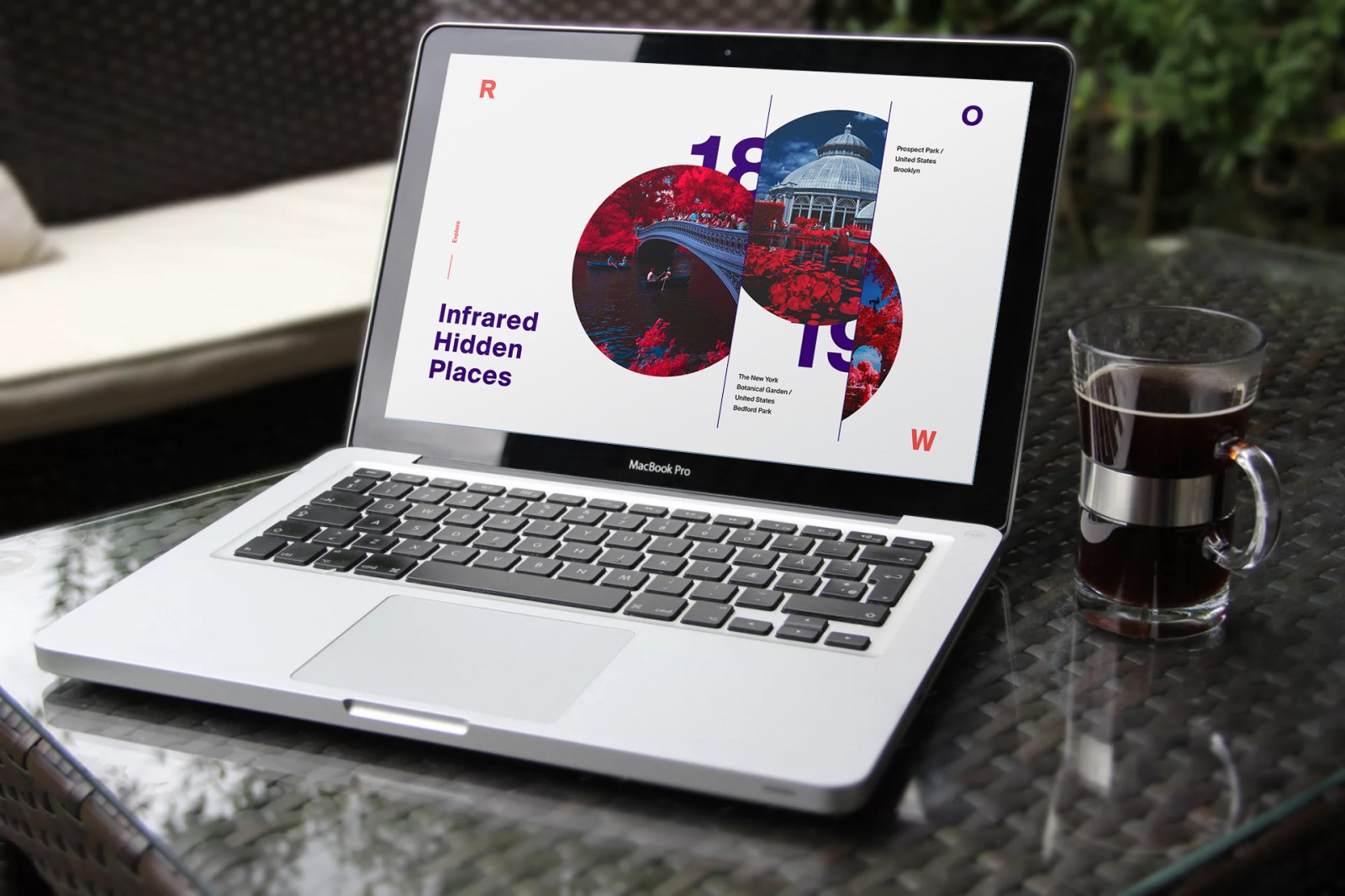
We've talked a lot about different photo effects in our blog — about how these edited images are used by webmasters in their projects. But today, we’d like to dive into the topic of using the infrared photography effect in web design. You might be surprised by this, especially since recent design trends advocate the use of strictly realistic images. But take a closer look at stunning infrared photos taken by skilled photographers and compare them to those used on some websites: can you say with confidence whether an image has been edited and how? The secret to beautiful, emotional, and impressive web design lies in using authentic elements that naturally complement each other. Accordingly, the image must also match the overall concept.
It’s important to remember that images in web design serve different purposes. They can be used as background decoration for a page, a header, small preview thumbnails, photo galleries in portfolios, and so on. This means the graphics may go through initial editing (by a designer or content creator) or post-processing automatically during image upload to the website. And this post-processing can vary greatly.

Infrared Photography in Web Design
The infrared photo effect is typically used to create black-and-white landscapes that display incredible detail and sometimes a magical glow in objects. Why is it called “infrared” instead of just black-and-white or desaturated? Because when you convert an image to grayscale, many details may be lost. Infrared photography uses color and channel swapping to create images rich in grays or even with added color filters. At the end of this article, we’ll look at an example where an IR image is processed with film — specifically from the Kodak Aerochrome or Rollei Infrared series — with color filters that produce a “false-color” effect. That means red, green, and blue channels are swapped, resulting in stunning surreal scenes where trees and foliage appear in vibrant pinks. It looks as if the photo was taken on another planet!
However, Photoshop and other editors allow you to recreate this beauty using just a few standard filters — and this method remains a favorite among both photographers and web designers. Let’s start by looking at the most striking “surreal” IR images.
These works (albums) are by photographers like Richard Mosse, David Keochkerian, Jack R. Seikaly, Bruce Wayne, Helios Spada -1, 2, La-Vita-a-Bella, MichiLauke, myINQI, bram BoG.


Some of these works will amaze you with their rich color palette, others with unique effects, and some will transport you to the landscapes of China and Japan — but none will leave you indifferent. Important: all of these were captured using professional digital cameras with infrared lenses or on infrared film.
If you browse various websites that feature photography, you’ll notice some use black-and-white and some use infrared-style images. Not very often, and usually subtly, but it’s happening. Take a look at these examples and you’ll see what we mean: khubsooratcollection, mybucketlistevents, kabusan, collabo-miu, he-garden.


And yes, experimenting and transforming doesn’t mean abandoning standards or trends. On the contrary, it shows the designer's ambition to improve and bring something unique to the table. Users will instantly recognize the image has been enhanced — and this will only encourage them to stay longer and explore it. You can always use the original version elsewhere on the site in a themed section. The homepage… is like a book cover — eye-catching and inviting. That’s why how impressive it looks often determines the success of the entire project.
Photoshop and the Mysterious Infrared Effect
Using Photoshop allows you to create a more realistic (so to speak) infrared effect. For example, by selecting a landscape, we’ll try inverting the colors so that the greens turn pink-red, while still retaining detail and emotional impact.

For our sample, we picked this landscape. It features a river with blue hues, earth with brown tones, lush greenery, a cloudy sky, and touches of yellow and orange. There’s good contrast and plenty of room for creativity. You can apply the IR effect to the whole photo, just part of it, or create a transition from one effect to another.
Open the image in Photoshop and create a copy (Ctrl+J).

Choose Image → Adjustments → Invert for the copied layer, then set its Blending Mode to Color. We can see that the colors have changed, but we still don’t have a true IR effect — despite having rich greens and blues in the original image.


So we add a Channel Mixer adjustment layer. We're interested in the Red and Blue channels. In the Red channel, set Red to 0 and Blue to 100%.


Now switch to the Blue channel and do the opposite: Red to 100%, Blue to 0. This swaps the channels — the sky becomes blue, the river light blue, sheep remain white, and buildings retain their natural color. The greenery turns pink-purple. The Green channel is best left untouched to avoid blown highlights or color loss.

The result gives us a foundation for the infrared effect. It already looks IR-like, though slightly dull and futuristic.
Let’s add a Hue/Saturation adjustment layer and tweak the Reds. From the dropdown, select Reds and adjust Saturation and Lightness sliders. Tune it to match your vision of the IR effect.


Adjusting the Magentas helps with purple tones and slightly fine-tunes the blue and cyan areas. Be careful with other sliders — pushing them too far can introduce artifacts or off-colors.
Optionally adjust Blue and Cyan tones as well, in terms of saturation and brightness.
The IR effect is essentially complete. But let’s make it more realistic.

Merge all visible layers into one (Ctrl+Shift+Alt+E), then duplicate the original background layer beneath it. Add a mask to the IR-effect layer and use a soft brush at ~10% opacity to gently paint over select areas — e.g., the background, sheep in the foreground, buildings, and sky. Why? This adds subtlety and natural transitions. You can toggle layers to compare versions.

Once done masking, keep the mask selected and go to Filter → Blur → Gaussian Blur to soften painted areas. This smooths transitions between pink and green/brown.
This way, we’ve created a false-realistic IR image with muted pink trees and meadows, giving the scene a surreal look — like something from another planet. All it takes is inverting channels and adjusting hue/saturation. You can even save this as an Action for future reuse.


In this example, the glow effect was achieved using Filter → Filter Gallery → Distort → Diffuse Glow. It brightens light areas, so monitor your channel sliders closely — excessive brightness may ruin the IR+Glow combo.
In the image below, we slightly brightened the waterfall and surrounding area. It originally looked dull and lifeless.


Things to Remember
Don’t confuse the IR effect with the splash effect — where a black-and-white photo retains one colored object (e.g., a red berry in a gray basket). Infrared effect involves channel replacement. It’s subtle and sensitive. It can also be used to turn summer-autumn photos into winter scenes, as we’ve shown before.
Why does green foliage sometimes appear in different shades of red, no matter how we adjust the sliders? That’s because natural objects reflect IR light differently. Some leaves appear bright red, others purple-pink.
Also remember that Photoshop, as good as it is, can’t fully replicate the effect of professional IR film like Kodak. We can only approximate the magical originals.
When trying to mimic a monochrome IR filter, simply desaturating an image isn’t enough. You must use Channel Mixer, check Monochrome, and boost Reds, slightly raise Greens, and reduce Blues. You may also need to fine-tune using Levels (Ctrl+L) for better contrast. Results depend on the original image.

Here are some more examples created in Photoshop. As you can see, there's no one-size-fits-all IR effect. Each one is different. That means you can easily pick what best fits your color scheme, style, or brand. You could even use desaturated or surreal thumbnails in a portfolio, changing them to the original on hover.


Conclusion
The infrared filter effect works best on photos taken during bright sunny days, with saturated blue skies and good contrast. It’s fun to play with colors and give a photo a brand-new artistic look.
Of course, this type of editing isn’t suitable for every web project, nor can it be applied to every image. But for a site cover, homepage section, or promo banner — it can work beautifully. And keep in mind: IR filters don’t have to be red. Trees can appear yellow, orange, or green, depending on the filters used (see link at the beginning). Everything used in pro photography can be recreated in Photoshop.