Among all people, there are many who appreciate simplicity, conciseness, minimalism, the combination of two contrasting muted colors, openness, and freedom—both online and in real life. Honestly, we all like these things to some degree, though some more often than others, as they say: “just for fun.” One way or another, websites with a strict and elegant design appear quite frequently, even though creating them is actually very difficult.
The beauty of minimalism and simplicity is usually created with geometric shapes that a web designer makes interact with each other or respond to user actions. But when it comes to animation, one of the best and most beautiful solutions is the reveal block effect or smooth appearance. It's also known as the curtain effect or geometric parallax (though why, exactly, is unclear). Either way, the idea behind the effect is that as you scroll the page, one image slides out and is replaced by another, in a left-to-right block animation.
This effect enhances interfaces perfectly, adding a small drop of interactivity. And even though it's blocky and strict, it also brings boldness, elegance, and neatness to the design. The reveal effect can be a fresh alternative to the fade-in effect, which is used on websites far too often.
But like any style or effect, the block reveal has its variations and implementation details. So today, we’ll take a look at them (with examples) and try to see why this effect is far more interesting than its alternatives. You can only really see the animation for yourself if you visit the websites in person.
Slider
There’s a difference between ordinary image transitions in a slider and using them with the block reveal effect. The project lapeaudelours uses this effect on its homepage—not just swapping photos of artworks, but animating them with a reveal. This effect also sets the tone for the entire design and aligns perfectly with the overall style. Scroll further down and you'll see a huge number of content blocks used for both text and images.


Another similar site is baugeld-spezialisten which might shock users at first glance. A strict black-and-white design, densely packed content, simplicity, and functionality. But the most striking part is the choice of fonts!


We’re particularly interested in the internal pages, where images appear and change using the reveal effect. Although you can spot it on the homepage too. It fits the design like a glove. Sure, it doesn’t appear all the time, but when it does, it adds charisma and charm to the site as a whole.
Design Cohesion
Earlier we talked about applying the effect to a single design element. Now let’s see how it can create design cohesion across the entire layout. The project vrarlesfestival shows this to the fullest.


Here, all interactive elements are built on the block reveal (or curtain) effect. It decorates content blocks, handles interactions, opens a sliding side menu, and adds finesse to tiny details. Surprisingly, even though the effect is used nearly everywhere, it doesn’t annoy the user or overwhelm the layout. On the contrary, it enhances and harmonizes it.
Another great example of a site using the curtain or block reveal effect is dsa.clinic. The effect can be seen in buttons, text, and the site's main sections. As for overall balance, there’s no clash between interactivity and detail. The style is consistent and neatly executed—open and clean ( we explored this idea in a separate article ).


Interactivity also plays a major role on sequence. For text blocks, designers used basic fade-in effects, but images feature the block reveal in a very appealing way. The animation is quick but adds a nice touch of spice to the overall project. Moreover, the effect is present throughout the site—anywhere there are images.


A Journey Through Content
The block reveal or curtain effect can serve not just as decoration in web design, but also as something more meaningful for the user experience. For instance, it can guide the user through key sections and invite them to explore. The forh project shows block animations right from launch. As the user scrolls, new blocks and sections appear, inviting interaction. Everything looks calm, measured, and no important points are overwhelmed.


Another project with fascinating interactive design is getcarv. Its homepage is very long and might be a bit confusing at first, but the block reveal effect plays a major role in the user experience. It’s used for entering categories and sections, but also in headlines, some text areas, image blocks, video sections, and call-to-action buttons. Someone might think: isn’t that too much? But the designers found a fine balance, creating an atmospheric, neat, and harmonious project.

Full-Screen
When designing a full-screen website—one that doesn’t require vertical scrolling—sliders can be implemented with the block reveal effect. This combination creates a truly engaging user experience. In the vitra project, designers combined multi-window navigation with the block reveal effect to make it clear what opens, where users are going, and what content is being shown. Overall, the design remains strict, block-based, minimalist, and simple.


Conservatism
Web design experience, creative discoveries, and practical application of effects come with time. But websites are created by people with very different personalities, views, and aspirations, so sometimes we see effects used in interesting and subtle ways by different creators. Projects like prigipo and beoplay are great examples. They use the block reveal effect in a very standard form: horizontal, from left to right—but not only that.


The blocks are stacked, scattered, rotated like diamonds, shaped into elongated rectangles, and they all change. The carousel sliders look beautiful and subtle, while the animation among the geometric forms feels natural. Hover effects, animations on hover , and other small decorative elements also fit in perfectly.
In any case, even minimal and modest use of the block reveal effect gives a website a fresh, modern look.
Zebra
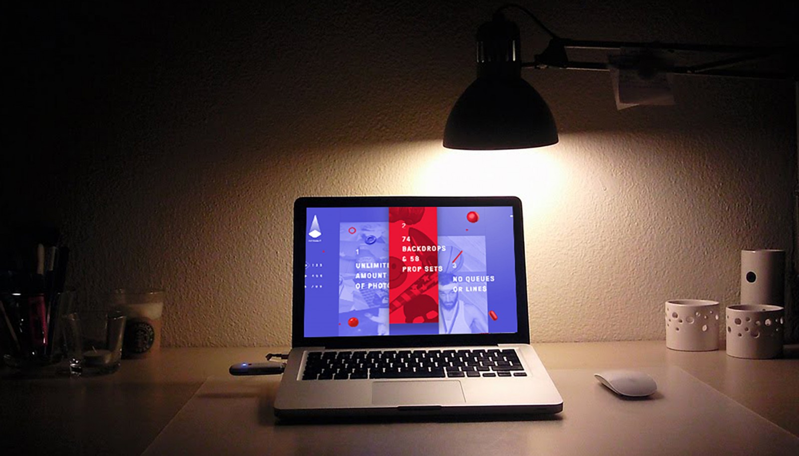
Who said the block reveal effect must always be horizontal? Everyone does it that way? Not true! A great example is fotonaut , whose design uses vertical stripes, each acting as a link to a different section of the site. Here, the reveal effect is applied in such a way that all stripes are visually connected, but the active one always stands out a bit, changes color, yet remains visually attached to the rest. The visual integrity remains intact, even with floating menu elements and decorative shapes (like balls, apples, pills, and more).


Yes, this type of effect and its use in menu animation has become quite popular in web design over the past year and a half. Still, it maintains visual flow, a playful tone, and minimalist clarity.
Minimalism
Probably the most unusual and beautiful site in our collection. It’s definitely worth seeing for yourself, but we can still talk about it endlessly. We're talking about zerodaysoff. The dark design makes it easy to miss the beautiful block reveal transitions at first glance. But watch the background: as you scroll, the blocks are small, compressed toward the center. When you stop scrolling, they expand slightly across the screen and gently animate—moving, rotating, then freezing. When the user scrolls again, they regroup, shrink, and are replaced. The animation is slow enough to observe in detail.


Another interesting detail: each block contains either an image or a video—or only video. Each one is different. The text itself is also animated. For example, if there’s a line between words, it eventually slides away, revealing the text behind it.
And here’s the most fascinating part: the block reveal effect is actually applied to the text , even though the background animations draw more attention. This clever use adds extra elegance and finesse to the interface.
Uniqueness & Conclusion
To sum up, the block reveal (curtain) effect can be used in many different ways in web design. While typically applied to images, there are some very interesting examples of it being used with text as well.
All the examples above—and many others online—share one common feature (aside from the effect itself): they’re all built on large squares and geometric shapes. Lines, triangles, and rectangles dominate. You won’t find curves or ornamental, flowery styles. Nor will you see parallax or asymmetry. Everything is strict and linear, as if measured with a ruler—and that’s no accident.
The block reveal effect says it all: I have a rigid, four-sided form that fits perfectly into this kind of environment. It’s entirely aligned with a clean, geometric aesthetic. This effect is hard to apply to rounded shapes and looks awkward in a “normal” design. For example, in an online store, if you add a block reveal slider at the top and nowhere else, it will feel out of place—because the rest of the layout lacks bold geometric forms (product cards don’t count). The slider would seem alien.
But if the entire design features bold geometric shapes in the background or layout, the effect is more than justified.