
And some more laws/effects/principles a designer needs to know. It's a concentrate from observations of user behavior - take it on board and use it in your projects. The first part of the article was published earlier, check it out first.
We've already reviewed several important laws and principles in the previous article, but that's not all. Here's a bunch more important points, let's continue the list.

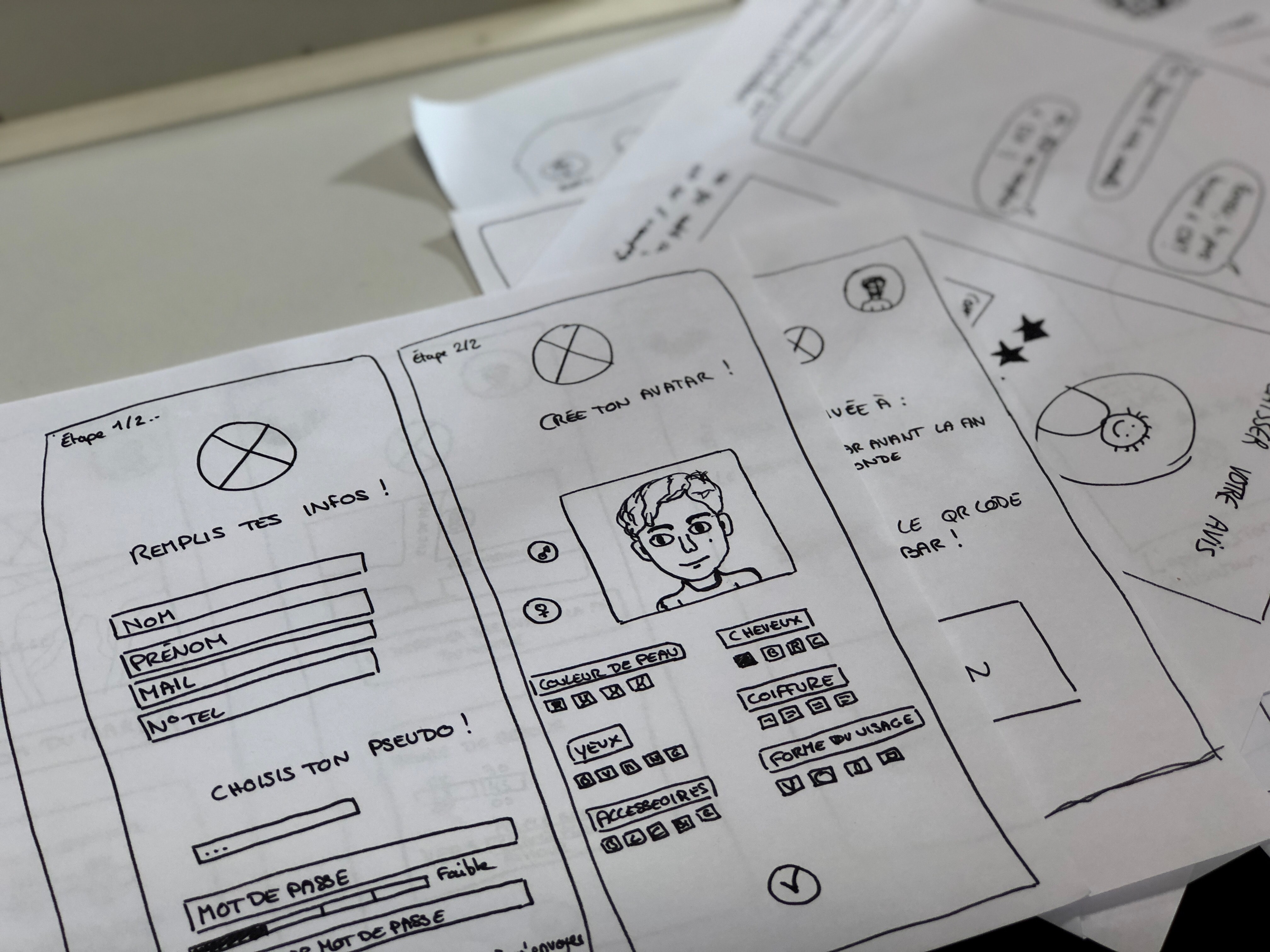
7. The Ikea effect
People tend to attach more value to products that they have been actively involved in creating or assembling.
The name of the effect comes from the Swedish company IKEA, known for its disassembled furniture that customers must assemble themselves.
The effect can be observed when users are actively involved in customizing interfaces, personalizing settings, or co-creating content. And in this case, the product is valued more! Apply this effect by incorporating co-creation or personalization of user-generated content into your designs.
Applying the Ikea effect in UX/UI design includes the following aspects:
- User customization: give users the ability to customize the interface or application according to their preferences. This may include choosing a color scheme, layouts, widgets, etc.
- Gradual adoption: allow users to gradually learn and customize new features and capabilities of the product, giving them control over the speed and complexity of the process.
- Training and support: don't forget about tutorials and tips to help users customize the interface or application on their own, without the need for outside help.
- Transparency and data management: give users control over their data and privacy settings so they can regulate what information is collected and how it is used.
The Ikea effect, when applied correctly, helps give visitors a sense of control and the ability to influence the end result. Sometimes it's a formality and sometimes it's real convenience and personalization.

8. Dougherty's Threshold
Determining the optimal speed of computer-user interaction.
Doherty's Threshold in the context of UX/UI design describes the level of complexity that a user is willing to cross before they become dissatisfied or give up on a task. This law can help designers determine how complex or curvy an interface can be before users lose interest and move on to other options.
The thing is, you can't take a specific metric and name some specific metrics to adopt. Because it all depends on the audience. Very different sites and applications turn out very differently if they are customized for IT specialists and for pensioners, for example. Therefore, it is extremely important to know what level of experience and skills your users have. Some user groups may be more tolerant of complex interfaces, while others may need simpler solutions.
Applying Doherty's Threshold Law to UX/UI design:
- Provide simple and complex navigation: design the interface so that users can easily start using it, but also provide more advanced features for those who are looking for them. Modularity and step-by-step integration of features can help meet different needs.
- Gradual deepening: the ability to start with the minimum and go deeper into the functionality of the interface as needed has already been mentioned elsewhere. And this is a very good idea in almost all situations.
- Testing with users: this is exactly the case when it is advisable to test with real users to determine what level of complexity they are willing to tolerate.
- Balanced design: try to balance the complexity of the interface by providing simple and complex ways to accomplish a task, so that users can choose them according to their preferences.
Understanding users' needs and expectations regarding interface complexity is important. User satisfaction and expectations can vary, so try to provide an interface that balances simplicity and functionality to suit different consumers.

9. The von Restorff effect
People tend to see meaning in more ordered and organized elements than in disorderly ones.
The Restorf effect can be applied in UX/UI design to improve the user's understanding and perception of information. How it works:
- Structure and organization: compose information and UI elements so that they are easy to perceive and understand. This includes logical structure, categorizing data, grouping elements, and proper alignment.
- Use templates: standard blanks help create an organized look for the interface. Use layouts, grids, and grids. Try to adhere to the same style for similar elements in terms of functionality and meaning.
- Clarity and consistency: Keep elements and information consistent. This will help users predictably perceive and use the interface.
- Color scheme: choose the right palette to highlight key elements and indicate structure. Color will also help create connections between different parts of the interface.
- Organized navigation: again, consistency and clarity will help you quickly and easily navigate the interface and find the information you need. And visual similarity of elements helps to understand how they work - if one is already mastered, the second does not need to be explored.
A nuance: if there are several similar objects, the one that is different from the rest is the most memorable. Emphasize what's important this way!

10. Law of Background Change
Background change = drawing attention to an object
Objects surrounded by nothing easily disappear from the field of attention, while the sudden appearance of an element or background change can significantly attract the user's attention.
This is due to the ability of human perception to highlight recently appeared or unexpected elements in the environment.
In the context of UX/UI design, this is used as follows:
- Create important notifications: use this effect to highlight important notifications, messages or alerts. For example, highlighting such elements with color or animation can draw the user's attention to key information.
- Hinting and highlighting: important interface elements, such as action buttons or links, can be highlighted with bright colors, animations, or highlighting on hover. This helps users identify which actions they can perform.
- Transition animations: adding motion can help the user understand how an interface element has changed or moved. For example, smooth transitions or animated indicators can make it easier to perceive changes.
- Attention to detail: add micro-animations, this will help make the interface more lively and attractive: loading animations, scrolling animations, drag and drop animations, animated icons.
- Hints and tutorials: use animation and highlighting to tell users how to interact with interface elements, especially in new apps or on pages with non-trivial features.
The law of background change can be a powerful tool, but should be used carefully to avoid unnecessary distraction and interface overload.
11. The Laws of Gestalt
There are several laws here at once, which we will combine under one section. Gestalt laws are a set of psychological principles that describe how humans perceive and interpret visual information as an organized whole.
In the context of UX/UI design, these laws can be a powerful tool for creating easily perceived and effective interfaces. Here are the basic laws of Gestalt and how they can be applied:
Law of Continuation: elements lined up in a line or curve will be perceived as a sequence and can be related to each other. Use this law to indicate the flow of information or steps in a process by using lines, arrows, and the direction of elements.
Law of closure: this law implies that one sees finished shapes even if they are not completely closed. Use this law to create circles around a group of elements to emphasize their relationship, even if the shape is not completely closed.
Law of Similarity: elements that are similar in appearance will group together in the user's mind. Applying this law involves using similar colors, shapes, or styles to indicate related elements such as buttons, menus, or links.
Law of proximity: elements that are close together will be seen as a group. Use distance and space to emphasize different groups of elements and create structure in the interface. Conversely, don't mold next to something that shouldn't logically be a group.
The Law of Common Background: this law describes how elements can come together against a common background. Create contrast between the background and the elements to emphasize their importance and make them more prominent.
The Law of Figure and Background: the brain sees objects as either figures or backgrounds, depending on their contrast and context. Create contrast between elements and the background to make the interface easy to perceive.

12. The effect of aesthetics and usability
Users perceive an aesthetically pleasing design as more convenient and efficient, even if it has no functional benefits.
This is a critical foundation for why visual design is so important in UX design. And why it's important for us to create visually appealing design elements to improve user experience.
This effect implies that users are more likely to appreciate and continue to use a product that is not only functional, but also aesthetically pleasing and pleasing to the eye. Here's how you can apply this to UX/UI design:
- Visual design: create an attractive and balanced UI design using harmonious color schemes, quality images and fonts, and successful placement of elements.
- Satisfaction: work to ensure that users are not only able to complete tasks, but also enjoy the process. Create intuitive interfaces, eye-pleasing animations and visuals.
- Individuality: allow users to customize the interface according to their own preferences. For example, give them the ability to choose themes, color schemes, or layouts. This will immediately satisfy the aforementioned Ikea Effect as well.
- Adherence to style and branding: pay attention to the style and branding of the product so that the interface is in line with the overall brand identity. If there is no brand book, suggest developing one.
- Attention to detail: detailed elements such as icons, buttons, and animations contribute to the overall perception of a high level of design quality. This is where we wrote in detail about buttons and margins.
Ultimately, a beautiful and user-friendly design can lead to higher user loyalty and increased product success.
Want to know more?
All these laws, effects and principles are best memorized in practice. And after making a bunch of interfaces you'll understand how it works. It is the practical approach that is our thing. Sign up for the online course "UX/UI Legend" and become a pro!