That’s the nature of all Adobe products — you can work with them for years, keep updating, exploring new features, and still not fully know what each app is capable of. Photoshop is no exception. Some of our blog readers are very familiar with it, others are just beginning to learn and wondering whether it's the right tool for them, how it differs from other similar programs, and so on.
Still, in this article, we want to share some interesting features of Photoshop. You could call them hacks, secrets, or just useful tricks. They’re simple, but they make working on web design and site mockups much easier. Plus, every web designer is a little bit of an artist — they need to come up with graphics, edit photos for backgrounds, maybe draw some lines or decorations manually. So general tips for both designers and artists will probably be useful to everyone.
We're not saying you'll learn something 100% new and super-secret here. You might already know some of these tips. But gathering them in one place makes things convenient and practical.
One more note: we've mentioned some of these tricks before in other Photoshop articles, so we won’t repeat those here. If you haven’t read them — now’s a good time to check them out.
We won’t give names to each trick — just simple numbering :)
Lifehack #1
In web design, working with shapes is one of the basics. Whether you're building a grayscale wireframe or placing final buttons, cards, and other elements. But you definitely don’t want to create the same shape five times manually. Imagine you need to build a geometric pattern or collage — precisely aligned shapes or even diagram-like structures.
Normally, you'd do this in Illustrator, but Photoshop is fully capable too — that’s what makes it versatile.
Create a standard Ellipse. Now hold Ctrl+Alt+T, click on the ellipse (while holding the keys) — it duplicates the shape into a new layer. Press Enter or click the checkmark in the top panel to confirm. That’s it, just a copy.

But now, if you press Ctrl+Shift+Alt+T, the ellipse will keep duplicating to new layers, automatically maintaining the same distance and transformation you originally created between the first two. It all happens right on screen.

This is super handy when building product cards for an online store, portfolio layouts, link sections, buttons, and more.
You can even change the spacing between shapes — for instance, set an angle.
Important: Be sure to click on the shape (without releasing the keys) to confirm the layer copy. If you release the keys first, the new layer won’t be created. Don’t press Enter until your first copy is exactly how you want it — spacing, size, angle, etc.
And now — voilà, we’ve got our little flower.

Just two key combos — and so many creative possibilities! Create a rectangle → press Ctrl+Alt+T → click the shape → make adjustments → hit Enter → then start pressing Ctrl+Shift+Alt+T — and watch it auto-transform!

Since each shape ends up on its own layer, editing any one of them is super easy. And boom — we’ve just created a “zebra” pattern.

Lifehack #2
Selecting objects on a layer — or part of a layer — can often be tricky. Sometimes it copies only part of what you meant, sometimes the wrong layer, sometimes it skips something altogether. Problems stack up, especially when you’re working with tons of layers that aren’t named or grouped properly. In both web design and illustration — selection secrets come in handy.
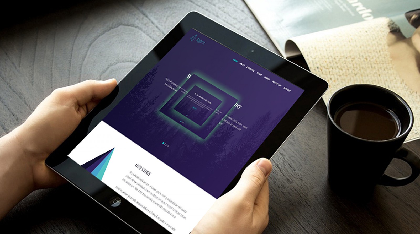
Let’s look at the classic Tajam mockup. The layers here are already organized into folders. But imagine that you’re working with someone else’s mess of a file and need to fix it up. That’s the case we’ll explore.

Grab the selection tool and select any portion of the content. Press Ctrl+C. Normally, if no layer is selected, you’ll get an error — something like “The selected area is empty.” But if you press Ctrl+Shift+C, then Ctrl+V, everything inside your selection gets copied as a merged composite onto a new layer.

You can now modify that fragment as needed. Sure — everything gets rasterized into a single layer, so no individual edits anymore. But still, for many use cases, this copy-paste method is a lifesaver.

There are tons of selection techniques in Photoshop, but let’s save those for another article. No need to overload the brain :)
Lifehack #3
A small trick for working with layers. It’s great when layers are neatly organized and named — it makes everything easier. But when you’ve got dozens named “Copy 3,” “Copy 45,” and so on... it gets messy real fast.
In our example, we have many layers labeled with brand names. Now let’s say we want to view just one single layer. One! Single! Layer!

Hold Alt and click on the eye icon next to that layer in the Layers panel. All other layers will hide (they’re not deleted, just hidden), and only the selected one remains visible.
Do the same Alt+click again to bring all layers back.
Lifehack #4
Using masks is often considered an artistic task — but in web design, they can be just as useful. Most Photoshop users know a mask is technically just another layer... but what else can you do with it besides painting over an image? Turns out — a lot.
Let’s select the purple overlay layer, add a mask, and then grab a soft brush with black color to paint something random. This removes part of the overlay and reveals the trees underneath — standard stuff.

Now press Alt + click on the mask — boom! You’re viewing the mask directly, and you can edit it like any other layer. Draw new shapes, use the eraser, select and transform parts — do whatever you like. It works just like a normal layer.

When you’re done, press Alt and click the mask again — you’re back to seeing the full layer with your mask applied. You can even use filters on a layer mask to create things like soft blur on the masked shape.


Lifehack #5
We’ve talked a lot about the Pen Tool before — and don’t forget that in Photoshop CC 2018, there’s a new and powerful Curvature Pen Tool that simplifies vector work. BUT!
Not everyone uses the latest version. So let’s assume you only have the classic Pen Tool. You’ve got a screenshot with a cool graphic you want to extract — but zooming in destroys quality, and Lasso isn’t accurate enough.

Zoom in and start placing anchor points with the Pen Tool. If the points are far apart, it will create straight lines, which won’t work for curves. If you place an extra anchor between two, it’ll curve — but not how you want.

Check the top toolbar — there’s a gear icon. Click it and enable "Rubber Band." Now, as you move your pen, a preview line shows exactly where the curve will go. Much easier to plan your points.


Also, remember: Ctrl + click on a point lets you move it freely.
That way, you get more control over Bézier curves and can work with the Pen Tool far more efficiently.
Lifehack #6
Color selection, palette building, color theory — the topics are endless, and practice is often missing. You can read and watch a ton, but when it’s time to start designing, you’re stuck... where do I even begin?
Let’s say you spot an amazing color on a website or image. What do we usually do? Take a screenshot, open it in Photoshop, use the Eyedropper. If the color profile is off or the screenshot compressed the image — the result might be off.
But here’s a better way. Open Photoshop. Now open a video or image in another window — maybe some colorful stained glass. Arrange the windows side-by-side. Grab the Eyedropper Tool in Photoshop, click inside the canvas, and without releasing the mouse, drag it into the other window to pick the color you want.


Down in the toolbar, you’ll see the selected color change in real time. Release the mouse when you’ve got it, pick your Brush Tool, and start painting. You can even save it to your library. This works from anywhere — even your desktop.

Lifehack #7
One last major trick — call it an editing hack or image tuning method, but it’s super handy. Let's say your client gives you a batch of photos — all differently lit or filtered. But their site uses a unified filtered look. You could manually tweak each one... or cheat a little.
Here are two photos with different filters. We want the one with the chocobo to match the tone of the one with the warrior.


Activate the chocobo image. Go to Image → Adjustments → Match Color. A unique panel opens — we’re interested in the Statistics section. Choose the warrior image as the source.


Boom — the lighting from the warrior image now applies to the chocobo. The result might be too bright, but you can adjust it using a mask, dodge/burn tools, or apply the color to just the background. You can also refine using blend modes — we’ve already explained that in detail.

This way, you can transfer tones and filters between any images — just make sure the source and target photos have similar compositions (sky, land, objects). Otherwise, the result won’t make sense. In our test, a forest photo + chocobo in forest worked great.


Final Thoughts
We’ve got plenty more Photoshop tips — small but practical — that don’t really deserve their own big article. These are the kinds of tricks web designers and artists use all the time in daily workflows. On screen, we see polished photos, stunning graphics, and crisp layouts — but we don’t see the process, the shortcuts, or filters behind them.
That’s what we’ve shared here. Maybe you knew some of them, maybe not. But as we said — having a cheat sheet or quick-reference stash is always a good thing to keep nearby.