
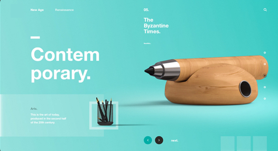
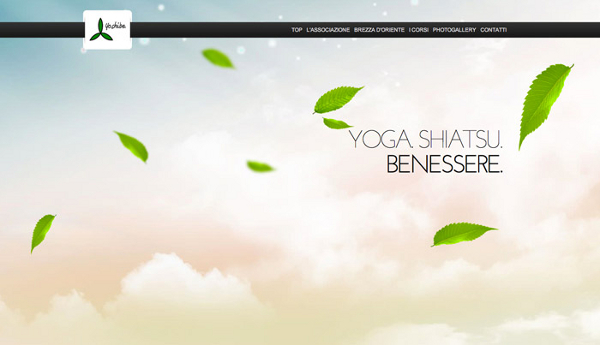
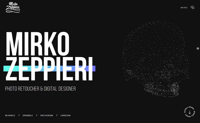
Easy to perceive and not overwhelming for the user’s attention — these are the advantages that make minimalist design increasingly popular in web page creation. Minimalism is used everywhere, from small coffee shop websites to the largest web services. Just think of any Google service.
This trend didn’t emerge yesterday, but it's gaining momentum every year. It’s directly related to the ever-growing stream of information that users encounter every minute.
So what is minimalism in web design? Minimalism isn’t just a white background with black text. It’s a concise style characterized by precision and simplicity. It needs to be understood, not blindly copied. A designer working in a minimalist style must know how to work with details and whitespace — these are the very elements that shape the aesthetics of this approach.
Advantages of Minimalist Design
Overloading a website is easy. But making key page elements stand out — that’s an art.
The minimalist design concept allows for uncluttered layouts where there are no unnecessary elements for the user. Here, every detail matters and each element serves a specific purpose. Studies show that this approach increases conversions and reduces bounce rates.
Sometimes you need to launch a website as quickly as possible. Minimalist design is perfect for such cases. You won’t waste time on image creation or custom graphics development.
When building a minimalist site, you don’t need to worry that users with a slow internet connection will face long loading times. These pages load much faster because they’re free from heavy images and excessive details. This is also a significant benefit for SEO.
A minimalist site without a strong emphasis on visuals is much easier to adapt compared to other styles. There’s no need for major redesigns, which also saves time during the design process.

It may seem that designing a minimalist layout requires less work. But in reality, it’s quite the opposite. Yes, the number of elements may be smaller, but each must be well thought-out, placed precisely, be clear and noticeable, and serve its function. That’s why web designers are constantly searching for simple solutions and implementing them as efficiently as possible.
A minimalist site with fewer elements is obviously easier to use. Users should be able to understand within seconds where to go — for example, to make a purchase. And it’s important they need to take as few steps as possible. Most users won’t use a site that looks impressive but is inconvenient.
Tips for Creating a Minimalist Website
As we’ve already mentioned, creating an effective minimalist website design is no easy task. And, of course, the best way to learn is through practice. That’s why WAYUP invites you to the coaching program “Web Designer: Your Golden Ticket to Thailand”. As part of the program, you’ll start by learning the theoretical foundations of design, explore major web design trends including minimalism, and then spend the second half of the course applying your skills on real projects.
These practical tips will help you create websites that are simple, but never boring — modern, aesthetically pleasing, and user-friendly.
Minimalism is just one of the trendy design approaches you can choose. But regardless of the style you work in, remember: there is no such thing as a good or bad style. What matters is knowing how to apply your knowledge in practice and create a sleek, impressive design using the fewest elements possible.