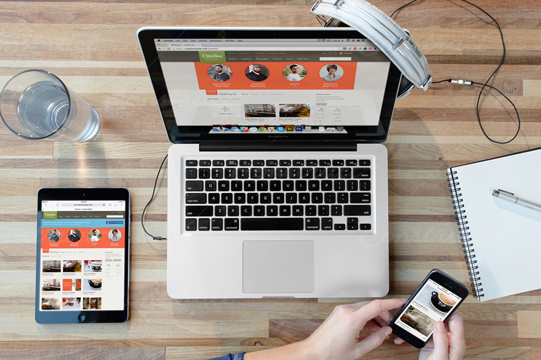
Mobile device mockups are perfect for presenting app demos. They also allow designers to edit screen contents, add or remove UI elements, and create presentation visuals. At the same time, although not very common, device mockups are also used in web design—especially for page headers. Recently, more and more such sites have appeared, so we decided to take a closer look at this trend and practice working with Photoshop.
The thing is, while there are many mobile device mockup images freely available online, mockups with artistic enhancements are harder to come by. And yet, it’s not that hard to create such enhancements if you have a vision of the result and know how to achieve it.
Standard View
Still the most common way to use a mockup is the front-facing view. Any device can be used here—from smartphones to laptops, including smartwatches. The key is that the device faces the viewer. These mockups are usually vector-based and replicate only the main features of the device, not an exact model. In other words, when we see an iPhone mockup, we recognize it by key elements, but we can't tell which version it is. This style allows blending graphics with the mockup, making the whole image appear like a framed picture.
Take, for example, the website Mimo. The designers used a dark vector iPhone mockup and placed a screenshot of the app on top to clearly show visitors what their app looks like and how convenient it is on mobile.

This version is easy to make in Photoshop and convenient for layout and content purposes. That’s why we often see this view or its angled variant. One particularly interesting design example is the project Spendee. Here, the team used a kind of slider to clearly showcase their app for both iOS and Android systems. As you scroll through the site, each section uses its own unique mobile mockup.


Perspective
Another popular mockup style is the perspective view. This approach uses photorealistic renderings to more accurately depict devices. Most of these mockups come in PSD format using smart objects (clipping masks), which allow you to paste content onto the screen area. Once edited and saved, the image automatically appears aligned in perspective within the final PSD.
Of course, these images require a transparent background so they can be layered into compositions. But in this case, designers often also apply filters and effects to match the website’s theme or the section’s mood.
The design for Filters also uses a non-realistic smartphone mockup, yet it’s detailed enough to convey the message and create an association with real devices. Thanks to multiple mockup variants, it was easy to showcase app adaptability across different screen sizes. And yes, all of this was done in Photoshop—adjusting angles for both the mockup and its embedded images.


On the Nuansa website, a more complex mockup perspective is used. Here, the mockup acts as a frame while embedded screen images change like a slider. This approach is harder to build but makes it easier for users to explore app functionality without heavy videos or overwhelming information.

Perspective mockups are just as widespread as front views. Designers use them with tablets, laptops, and smartwatches. Sometimes, they even create full animations with these layouts. Perspective can be aligned both horizontally and vertically.
Take a look at Stripe, where designers used an MP4 video instead of a static image or slider. This adds a touch of realism to the mockup without needing full live-action footage of someone using the app on a real phone.

Mockup as a Screen Hero
One of the popular trends right now is the use of a focus image — a photo with objects or people as the central visual subject. These thematic compositions usually convey the overall feel of a website. There’s a wealth of such images online: stock photos and beyond, featuring not just mockups but real prototypes. Typically, smartphones are shown in people’s hands, laptops are on desks or laps, and so on.
But even in such photos, the device screens can be easily replaced. Just open the original image in Photoshop and insert your screenshot in place of the screen. For example, the Weathertron site uses this exact approach with a realistic photo featuring an iPhone and iPad.

These mockups draw more attention and are more engaging for visitors to explore. A similar approach is used in the project Operator, where a woman is holding a real smartphone.

We've selected several more creative examples of mobile mockup usage on websites. There’s animation, parallax, graphic styles, and much more. Designers’ creativity knows no bounds. Just look at Yarno, Ultra-Responsive DD, Brring, Dylan de Heer, Joonik, Guarisco Fabrics, Oodi, Gamehive, We Are Creation.


PSD Mockups
Today, there are tons of websites offering a wide variety of mobile device mockups. They come in all styles — flat, photorealistic, perspective, real-life photos — and many of them are freely available under open licenses.
At the same time, the Ramotion team released a collection of high-quality realistic mockups called iPhone Clay PSD, which lets you customize the color scheme as you like. The library includes various Android and iPhone mockup models. While similar mockups can also be found elsewhere, the difference here is that these PSD files are fully editable. The image quality is high, vector-based, and created with smart objects. Unfortunately, the set is not free.

Dribbble
One of the leading design communities, Dribbble, also has a massive collection of free mobile mockups. Many of them were created by Ramotion, though not all are from their premium pack. Either way, Dribbble features many interesting mockups — realistic photos, with and without people, Android devices, front views, perspective layouts, and more.

You can also spend 30 minutes searching on Yandex or Google and easily find the perfect mockup for your project. But Dribbble is more convenient, offering previews and precise search filters.
Photoshop
Of course, we won’t go into detail on how to create your own mockup from scratch — there’s no need since so many already exist. Instead, let’s explore how to apply cool effects and filters to existing mockups to use them in more engaging visual content. Naturally, creating such imagery — more like digital artwork — takes time and effort to find the right objects. But the result is worth it.
Most people know how to insert an image into a device screen. But what else can you imagine? What do designers come up with?
Option 1
Choose a photo with a dark background, create a new layer, and use the Pen Tool to draw a curve — any shape you like.

Then select the Brush Tool and create a brush with pressure sensitivity and soft edges.

Go back to the Pen Tool, right-click on the path, and choose Stroke Path. In the dialog box, select "Brush" and check the Simulate Pressure option. Delete the path via right-click menu.


Now set the blend mode for the curve layer and configure Outer Glow, Color Overlay, Inner Glow, and other effects. If you want a stronger effect, duplicate the layer.
Create another new layer and draw a second curve. This time, use a dotted brush along the axis. Repeat the path-stroke steps and apply overlay effects. You can also add small icons — like we did with one.


So, if your image has a dark background, try adding a neon effect. As always — it’s up to your imagination.
Important: if your image is dark and you add glow, then objects affected by that glow should appear lighter. For example, if a neon line runs over a hand, that area of the hand should be lighter than the original. Use blending styles, highlights, and shadows to achieve this.


.jpg)
Option 2
Another creative approach involves 3D illusions. Start with the same photo and place various elements — pre-made images, scrap objects — on top. Add glow where necessary to build a visually interesting composition.
The objects themselves don’t need to be 3D. With correct mockup angles and perspective, the illusion of depth is achieved naturally.
Don’t forget to use layer masks and keep each element on a separate layer. Use the Eraser Tool to clean up any excess parts. Here's what you can achieve:


If you want, add Filter → Render → Lens Flare to highlight dark areas affected by the light. This is especially useful for very bright sources, like a firefly in someone's hand.

A few more examples: all these elements (tree, bench, person) were cut out from different images and neatly arranged on the device screen. There's no big secret to it.


Conclusion
Mockup images are usually used on landing pages and homepages. But they can also appear throughout the site — in blogs, online stores, business sections, portfolios. Your website theme doesn’t have to be strictly mobile-oriented.
The trend of using mockups is growing in popularity and proves useful in many scenarios. Moreover, this design approach is great for responsive layouts. The key is finding creative inspiration and ideas. Say you're building a website for a café and want to allow phone orders — place a coffee cup on top of a phone, or show a hand reaching out of the screen to grab it, or turn the phone into a serving tray…
Creativity, imagination… and design.