All the text we see on a website plays a specific role. Some of it is meant to grab attention, some is meant to inform us of important things. But how the text is perceived—and whether it fulfills its purpose—largely depends on the web designer. It is the designer who turns letters from mere symbols into something more. Something to not just read, but also to look at. This is living typography.
Before we even start reading, we form an overall impression of the page and perceive an image. The typographer's task is to make that image harmonious. There is no single correct solution, but there are certain principles every designer should understand.
Basic Rules of Typography
When it comes to long texts meant for continuous reading, you should first consider how easy it is to read. The text shouldn't be too small or too large. It should be as familiar and natural to the reader as possible. Also, pay attention to letter spacing—don’t cram them together, but don’t spread them out like from Novosibirsk to Copenhagen either.
.jpg)
Headlines are a different story. Designers’ creativity in trying to capture attention knows no bounds. But readability should still not be forgotten.
Curious—do typography courses really teach aligning ALL text to the center? Please don’t do that. Every object on the page, including text, should have its place. Centered text gives the impression that you had leftover space on the sides and didn’t know what to do with it.
More isn’t always better. When it comes to typography, the type and number of fonts used in a project matter. Don’t use too many different fonts in one design. Two or three is more than enough.
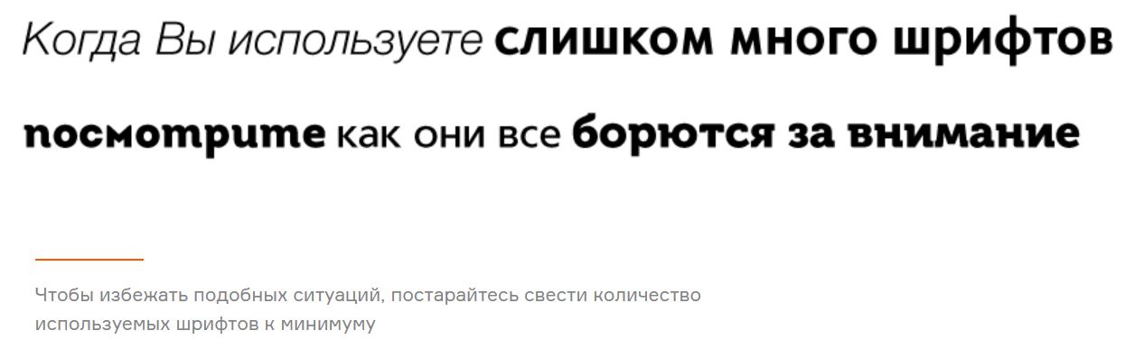
The fonts you choose can differ from each other—don’t be afraid of that. Choosing two very similar fonts will make no impression at all and might even look like a mistake.
Choose one font for your headings and stick to it. If needed, subheadings can use a separate font.
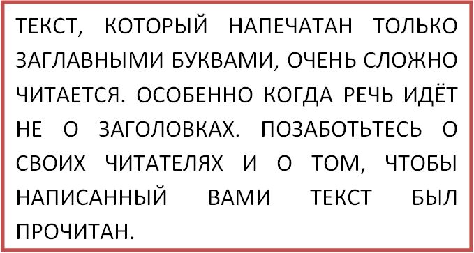
Text written in all uppercase letters is very difficult to read—even if it’s just a headline.
You can highlight individual words or short phrases to draw attention, but don’t write entire paragraphs meant for long reading with Caps Lock on.
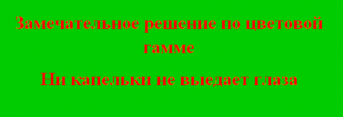
Classic black and white never goes out of style. It’s the most ideal combination of background and text color. But if for any reason this option doesn’t suit you, be careful when selecting other shades. A smart color combination is the foundation of good typography style.
Avoid using colors that are too similar—for example, light gray text on a dark gray background. Also be cautious with bright colors. Otherwise, you might end up with something like this.
Line length is very important in web typography. To make your text appear as a solid readable block rather than smeared across the page, maintain optimal line length in each paragraph. It also affects reading comfort.
For desktops, the optimal line length is about 60 characters; for mobile devices, 30–40 characters.
Modern Typography
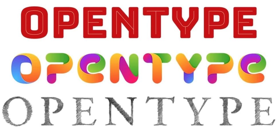
Typography starts with fonts. And each year, their use and combinations become bolder. Many large brands even have their own custom fonts.
.jpg)

The recognizability of these brand fonts proves that with the help of text and a designer's creative thinking, typography can be a powerful weapon in the battle for users' attention.
So, what does the new typography of 2019 have in store to surprise and impress us?
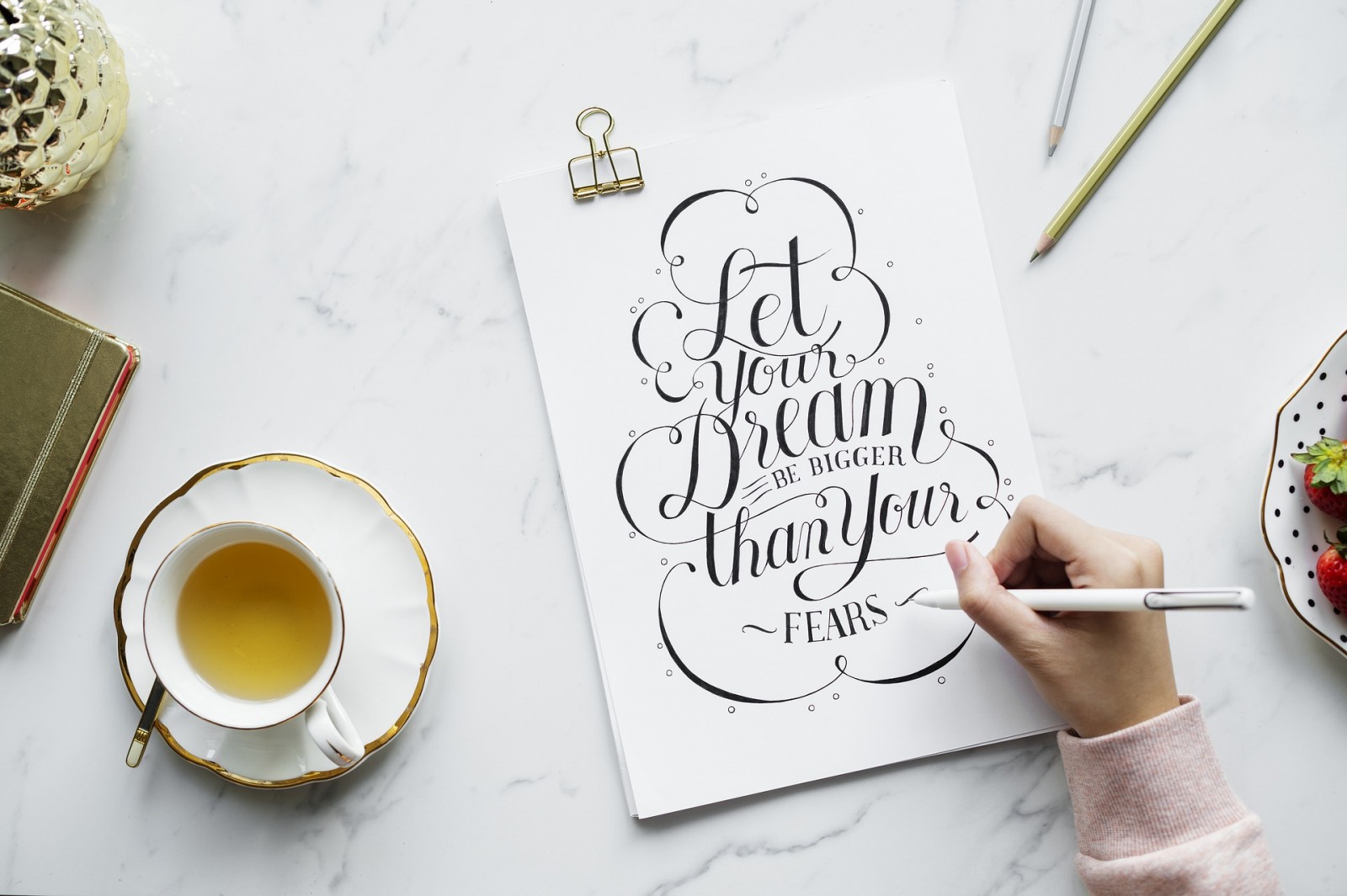
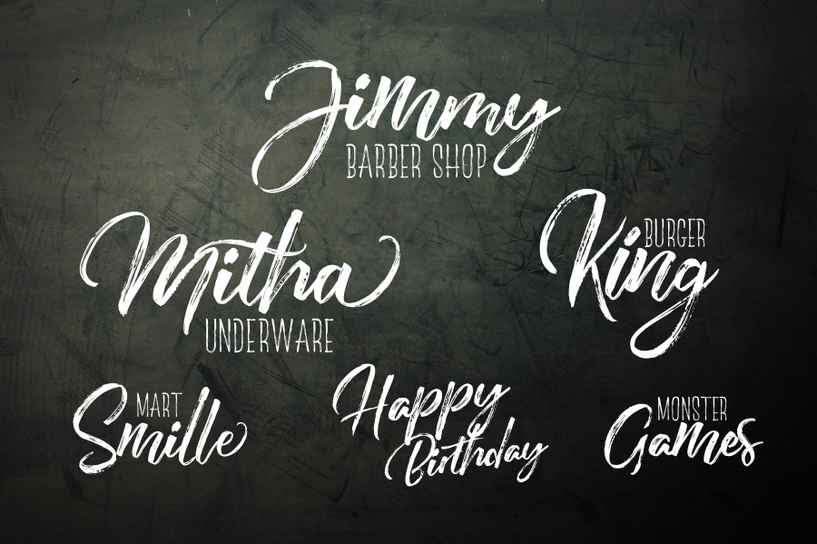
Handwritten Fonts
Let’s start with a timeless favorite.
Handwritten fonts look natural and add personality both to the brand and to its message. They help bring detail and atmosphere to the overall visual composition.
But be aware: this style doesn’t suit everyone. Handwritten text conveys a sense of casualness or playfulness, which might not be appropriate on, say, a law firm’s or construction company’s website.
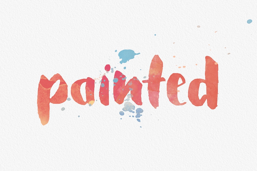
 Watercolor Fonts
This font style is relatively new, but has already gained popularity and even become a favorite. Text that looks hand-painted appears very aesthetic. For more vibrancy and uniqueness, you can even add a gradient.
By the way, this font is often combined with handwritten fonts—they work well together.
Serif Fonts
A return from the past. There was a time when serif fonts were considered hard to read.
Today, serif fonts with carefully crafted details are being used again in many design projects. They also add character and grab attention—both literally and figuratively.
Animated Text
A trend loved by designers but treated cautiously by developers. Designers love it for its visual impact and memorability. Developers worry because animating text is a time-consuming task.
In any case, animated typography must be well thought-out. Where and how the text moves, how it responds to hover—and it must still remain informative to the user.
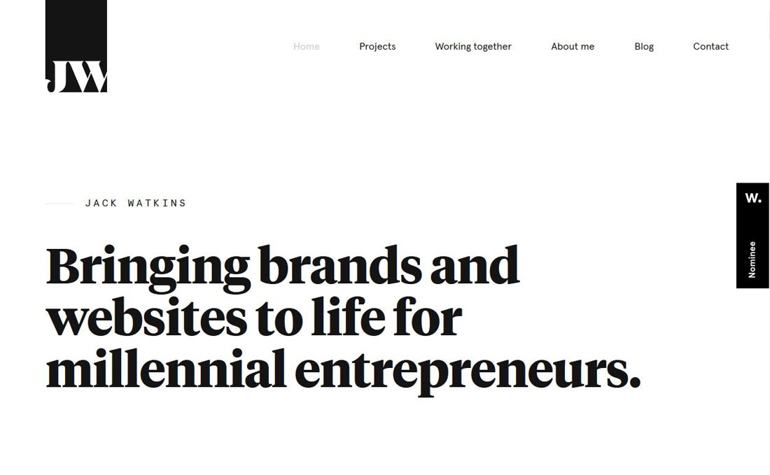
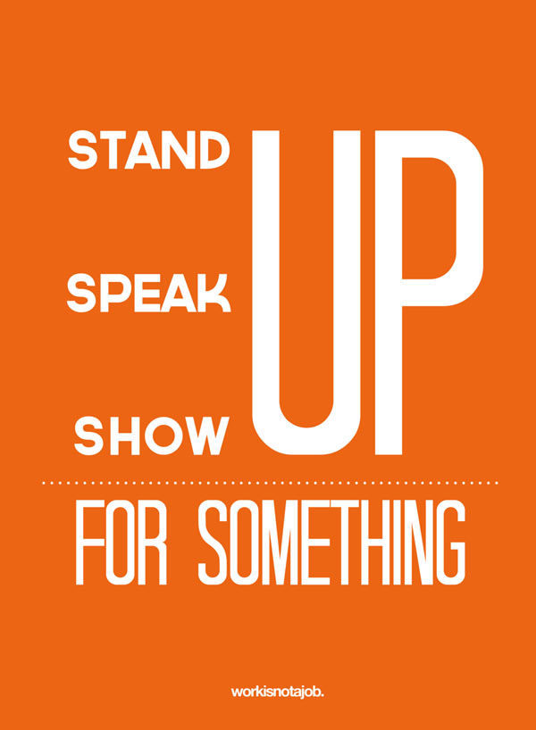
Mixing Large and Small Fonts
Breaking the basic rules of typography, many designers use the technique of combining large and small fonts. All in the name of standing out!
But when done right, this combination looks balanced, helps create emphasis, and grabs attention.
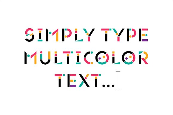
Colored Fonts
Classic black and white will always be classic, but in recent years, colored fonts have started to take center stage.
Don’t be afraid to experiment with this typography style—but remember to choose your shades wisely. The design should be bright and expressive, but not off-putting.
Text with Overlay Effects
Designers know another way to stand out with unconventional typography—using overlay effects.
This effect gives text a layered, dimensional look that definitely catches the eye.
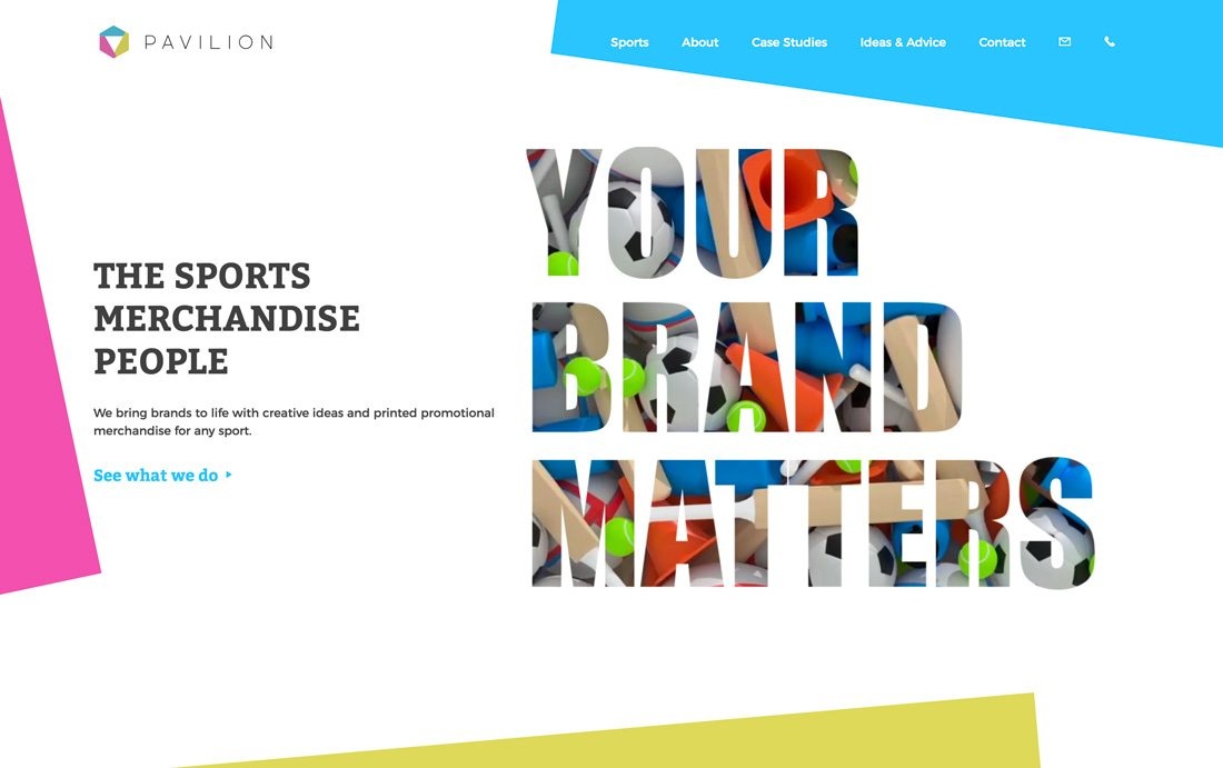
To maximize the visual impact, it’s best to use this trend with large letters and wide-format images.
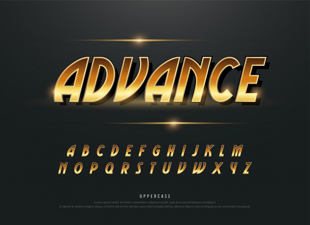
Metallic Fonts
A style for the bold—those who find traditional typography boring. Fonts with gold or metallic finishes are popular this year and are reshaping the graphic design landscape.
This font style adds a sense of luxury and exclusivity to your text—and your entire project.
While classic typography teaches us that fonts should be clean and readable, modern graphic design trends treat typography as a chance to stand out and impress.
Both perspectives are valid. Online, you’ll find minimalistic websites with classic black-and-white fonts as well as bright, flashy concepts—some successful, some not.
So the choice is yours. Show what your creativity and boldness are capable of.