In web design, using textures as a background is a reliable step toward success. A texture is a simple yet effective way to add depth to a website. With just one background like this, you can guide users through content — and you’ll see this online more often than you'd think. But textures, unlike plain backgrounds, are harder to use and even harder to create or edit.
In a previous article , we talked about backgrounds in web design and some ways to create a simple textured background. Backgrounds can be gradient, solid color, video/photo, or patterned. Today, we’ll talk more about patterns — how to work with small pieces of texture and transform them into something more modern, higher quality, and tech-friendly. Especially if you want to create a unique site background using your smartphone. With the help of Photoshop, of course.
The Mystery of Textures
Textures are essentially ghost-like images that give the illusion of a surface you could touch. As a result, using them can trigger specific emotions in users, thanks to the associations and messages layered on top.
They aren't so much about the user experience as they are about sensation and emotion. But a well-made texture differs from a generic one by its realism — especially if it mimics real physical surfaces. Plus, textures do a great job separating content on a page, just like solid-colored sections.
White Space
White space in itself isn’t something unique in web design. But if a client is strongly against a plain light background, no matter how great your design looks, it’s better to change it. A pseudo-texture is often the best solution. In other words, add small inserts in a slightly darker tone and place them randomly. For example, the site weaintplastic uses a two-tone background, but because the light and dark patches aren’t arranged in a strict alternating pattern, it feels more like an actual texture.


So, a textured background isn’t just a small repeating image — it can also be a geometric arrangement of sections and blocks placed asymmetrically.
Branding
A well-designed logo on a plain or gradient background is a great way to draw attention to branding and the company itself. But if the background is textured — especially if the texture matches the business theme — it adds character and helps the site stand out from competitors.
A great example is the Custom Shingles project, where the wood texture directly reflects the company’s focus — woodwork for country homes. Look at the top part of the page: it conveys restraint and professionalism. The rest of the page also features texture — a gritty, cracked surface. That’s concrete. And concrete and wood are perfect fits for construction or hardware businesses.


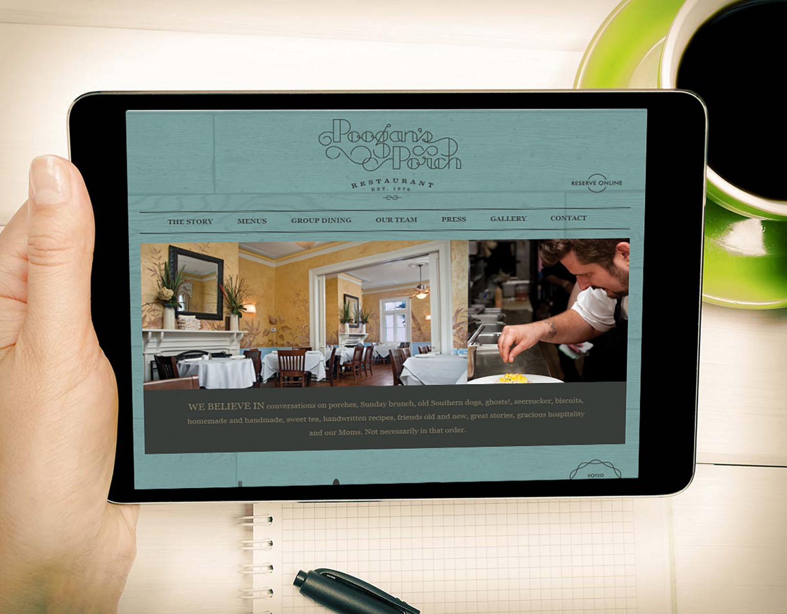
Or take a look at how the restaurant theme blends with wooden furniture and the website design at poogansporch, or how a crow in the logo ties into the restaurant website barrelandcrow. The textures imitate wood and feathers.


Typography on Textures
Typography must be legible. One thing to always keep in mind when combining textures and text — the text has to be readable, since it’s the main way to convey your message or make a sale. That means the color, size, and font should be chosen wisely and have strong contrast with the background. Consider fonts like Impact, Georgia, Verdana, Tahoma, Lucida, or Arial — but absolutely avoid Comic Sans.
The agency site KBS puts typography front and center. It’s done properly and looks clean and attractive. It’s pleasant to look at and easy to read.


Typography is also beautifully executed on the revelationconcept project, even though the lettering is semi-transparent. Thanks to tonal contrast, everything is still easy to read.

High-Quality Textured Backgrounds
High-resolution textures used as backgrounds may load slowly, but they look much better. If you use a small texture on a large background, it’ll pixelate when stretched and look outdated — users will lose interest. Some textures can be repeated to tile a block’s background, but that doesn’t always work.
For example, the Cladinox project uses one large high-res texture. You can’t really slice and repeat it — even though it might look like the vertical lines could be tiled, the texture works only as a whole.

Another interesting example is lemonadela, which uses a dirty-blue plaster texture across the entire site, even blending it with photos and illustrations. It’s a unified texture, not made by repeating smaller parts. It may not match the brand 100%, but it adds refinement and evokes emotion.


Creating Quality Textures by Hand in Photoshop
Textures are a valuable design asset that can be used as backgrounds or overlays. And even with a basic smartphone camera, you can create some pretty good ones. Capturing large, high-quality textures (photos) does take more than just pressing the shutter — but it’s much easier to create complex, beautiful textures in Photoshop.
We’ll walk through three ways to turn ordinary photos into high-quality textures — because sometimes it’s hard to find what you need online, or there’s no time to search, but you have a starting image.
For example, we took a photo of a basic tabletop surface that could serve as a site background. The photo is okay — but not quite graphic enough for design purposes.
Light & Tonal Adjustments
One of the most common issues with camera-shot textures is tonality. When you use such a texture in design, tonal inconsistencies become very noticeable — and distracting. It’s even worse when used on 3D objects, where tone plays a crucial role.
Open your photo and make two copies of the layer. On Layer 1, go to Filter → Blur → Average.


Now go to the top layer copy and apply Filter → Other → High Pass with a setting of 250 px.


Set this layer’s blending mode to Linear Light. If the result is too bright, simply reduce the layer opacity until the highlights and shadows match the original. In our case, ~60% worked well.


Now compare the original (above) with the result. We’ve smoothed out the tonal variations and now this texture can be used anywhere. Depending on your source and camera, you might still need to tweak saturation, contrast, brightness, or color balance — but overall, it’s a big improvement.
Correcting Distortion
If you don’t have a professional camera with adjustable lenses, your photos might have some fisheye distortion. You won’t always notice it — until you compare before and after corrections.
Open your photo again and go to Filter → Lens Correction. A new settings window will open. Photoshop includes presets for many cameras — though ours wasn’t there.

If yours is listed, use it — or create your own with Adobe Lens Profile Creator. Otherwise, go to the Custom tab and manually adjust geometric distortion, perspective, and so on.

Note: by default, Photoshop auto-scales the image. Turn that off and enable "Transparent Edges", then switch to Custom settings.
Compare the image before (above) and after. The difference might seem small, but if you toggle layers in Photoshop, it’s very noticeable. A quick flip animation reveals the distortion and how it's corrected.

This correction is most useful for textures with horizontal or vertical lines. Fisheye distortion bends them (edges slope down, center bulges) — not everyone notices at first, but it’s there.
Straightening the Texture
Textures like bricks, woodgrain, or stripes will always show distortion in photos — it's hard to hold a camera perfectly straight without a tripod. Usually we try rotating the layer using guides, but it’s slow and tricky.
A faster way: open the photo and use the Ruler Tool (found near the Eyedropper). Without holding Shift, draw a horizontal line over a clearly skewed area.


Then go to Image → Image Rotation → Arbitrary. Photoshop will automatically insert the right rotation value based on the ruler. Click OK to see the result.


You can also do this by clicking "Straighten Layer" in the top toolbar of the Ruler Tool. But using the menu is often more illustrative.
You'll need to crop the white edges. Use the Crop Tool to trim it down. The image will be slightly smaller but perfectly aligned.


Compare the result with the original. A straightened texture looks more professional and is much easier to use. Slanted textures are rarely seen on quality websites.
If you combine all three editing steps into one, you can turn a basic photo into a highly usable image — good enough for a full-page background or a specific content block. You can also apply drawing effects, pencil shading, and more. Maybe you spot water splashes on the surface?

As you can see, there’s nothing too complicated — and yet it gives you a chance to use a rare, unique texture in web design. Whether you're walking down a street, in a park, or just sitting at home looking at your table or floor — find an interesting texture, snap a photo, and play with it. Edit it, tweak the color or contrast — and voilà, you've got a truly unique background.
For example, as we did: we applied hue changes to the original and later adjusted the light-tones. The result is obvious.


Conclusion
Yes, textures are a powerful tool and a great solution for nearly any website. Just remember to use them wisely. Sometimes all it takes is a bit of noise from the Filter menu — other times, you might go for complex textures like sand, gloss, or plastic.
Without experimentation, you’ll never know what works best or when editing is needed. Even if you're not using your own photos, most textures found online aren’t great quality. Photoshop can help improve them — and it doesn’t matter which version you use. All the tools are available across versions, so there’s no excuse.
And this isn’t the last article on textures in web design. There are more detailed aspects to explore — important ones that designers often overlook or underestimate.