We are currently running the #wayuportfolio challenge, where every day we give small, engaging tasks to help build your own portfolio. In the end, everyone will design a strong portfolio, and the authors of the top 3 will receive a detailed review from the WAYUP team.
In this article, we’ll explain how to present yourself in a way that gets you noticed. And yes, join the challenge—this material will help you win.
Your portfolio is your face
Skilled professionals with experience and capabilities but identical resumes simply blend into a stream of faceless applications. Conversely, beginner freelancers with a precise, thoughtful portfolio are perceived as experts.
A portfolio is your business card, your face; it gives you a chance to present yourself uniquely, turning your skills into a toolkit for solving a client’s problems—not just a list. It showcases your taste and personality. In strong projects, professional and personal qualities, tastes, and character matter. All of this is reflected in your portfolio.
A portfolio is also your first job, your base project that the client evaluates. Its quality reveals storytelling and UX writing skills, design, layout, typography, and clarity of thought. A portfolio doesn't have to be a personal website with expensive design and animation. It can be a PDF file made in Photoshop or Google Docs.
If you still lean towards creating a website, check out the workshop “Real Order Layout”
4 rules and 4 blocks of a strong portfolio
Imagine you have the chance to tell a potential client six sentences and show six slides. You have about 30 seconds of their attention. Let’s break it down. In our opinion, a portfolio should answer the following questions:
As a result, a portfolio can fit into a 4–7 slide presentation or screens of a one-page site. Everything else is redundant.
In self-presentation, it’s easy to veer into prose—talking about stress resistance, graduating from school with advanced English, or how you see yourself as a team lead or art director in a year. You'll have a chance to tell all that once you're in the team. For now, present yourself briefly and clearly using facts, numbers, and skills.
Preparation: colors and fonts
The foundation of your portfolio is design + typography. When choosing colors, remember that minimalism and cleanliness still work well. Use contrast rules: warm + cool, saturated + pale. Also remember: while a portfolio is creative, it’s still a professional document. Avoid neon and overly bright colors—at most, use them for accents, not main elements.
Fonts should preferably be from the Open Sans family—minimalistic, concise, sans-serif, and clean. Two fonts are enough for a portfolio: one for headings and one for body text.
An important tip—don’t overload with content; keep enough white space in your design. Here we explain the power of white space in detail.
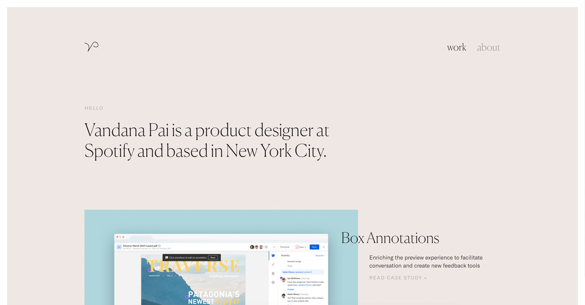
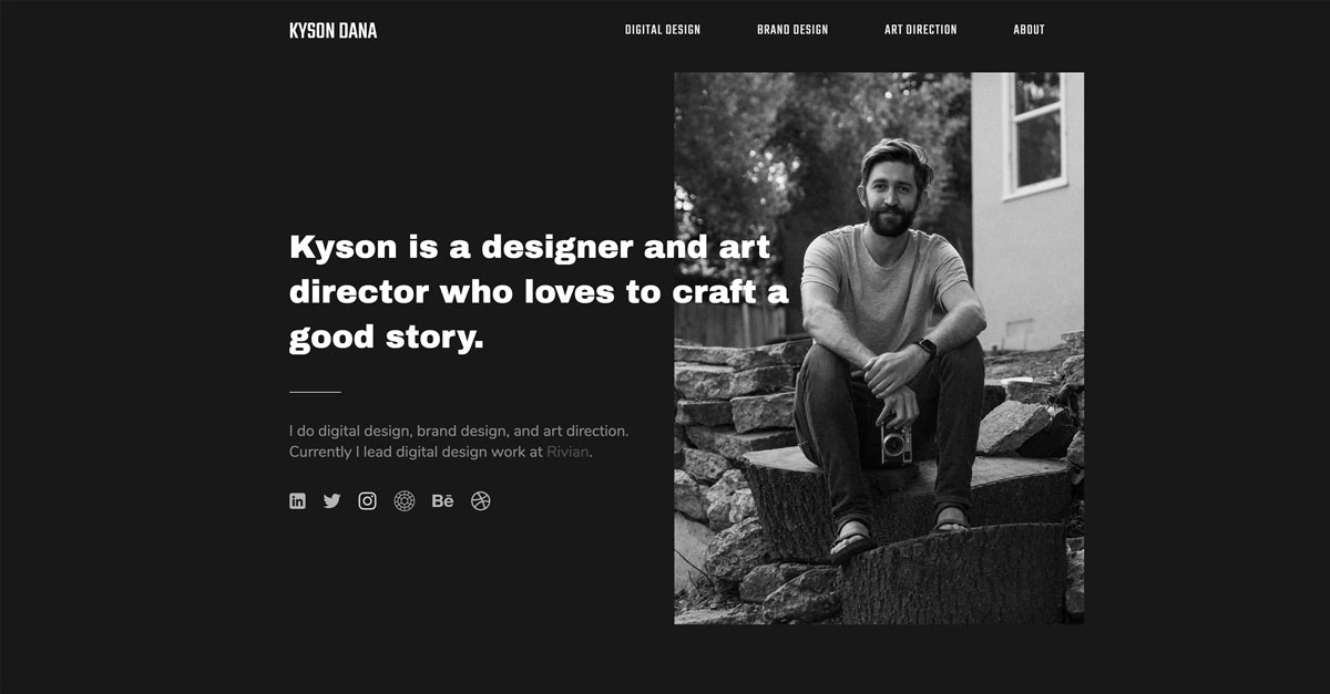
First slide: who you are
On the first slide/screen, simply include your name, profession, and a photo. For example: Max Ivanov, Graphic & UI/UX designer.
List several professions if they’re related. For example: French translator + copywriting. When fields overlap, you become more valuable in the client’s eyes—you can solve more tasks. But when roles are far apart, like English tutor + web developer, it’s confusing and distracting. In that case, pick your main profession and complement it with a useful skill. For example: Web Developer, Software Tester.
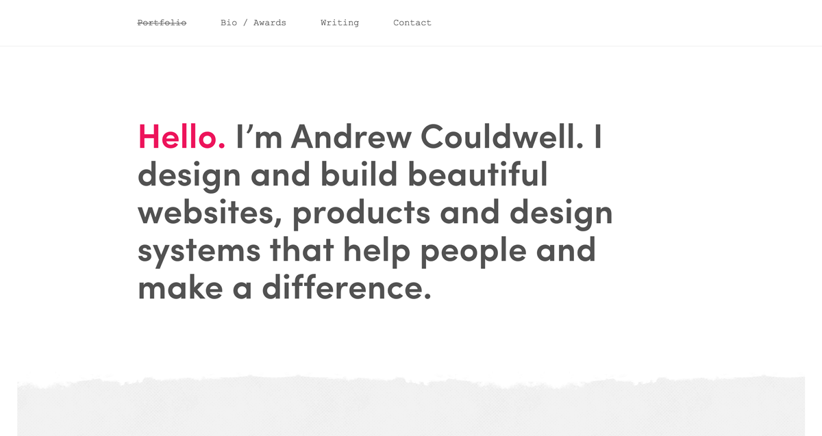
Second slide: tell about yourself
This is where people often drift into prose—talking about university competitions, eco-activism, and love of travel. But in a portfolio, concise articulation, precise messaging, and aligning with a client’s interests are key.
Answer these questions in your text: What can you do? In which companies and positions did you use those skills? What additional strong skills do you have? What non-university learning have you done?
You can fit all this information into two paragraphs of four lines each. For example:
Even better—share this in a video: concise, friendly, with a clean background and no noise. If your phone has a good camera, you don’t need extra gear. It's now clear that video performs better than text—people watch more than they read. Plus, video shows a real person, increasing trust.
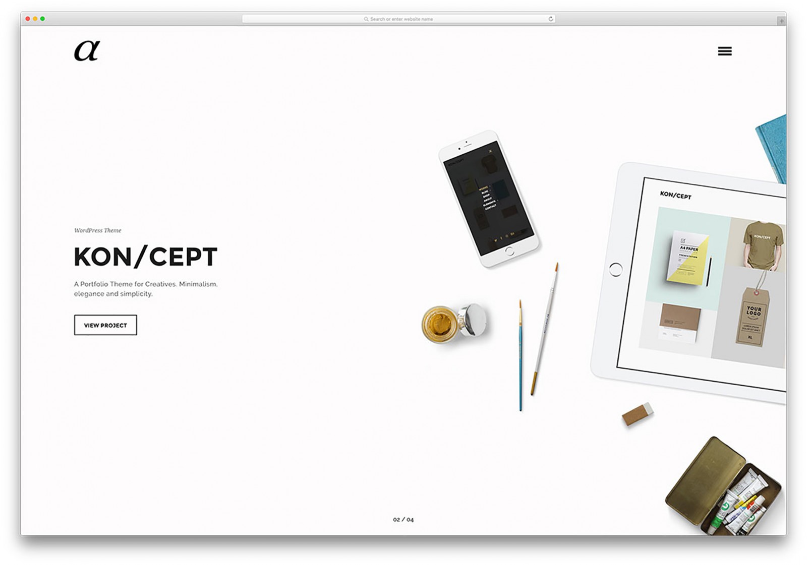
Slide 3: your projects
Projects are easy to pack: visual + link + description. A visual can be a website screenshot or animation. In the description, state clearly what was done and which tools were used. Choose the freshest, most complex and creative works. Let it be 3–6 projects, but large and diverse, rather than 36 that all look the same.
On the final slide, include your LinkedIn, Facebook, Instagram, and email.
If you want to learn where to find great clients to show your portfolio, check out this article. We talk about finding clients on online platforms that are more advanced than freelance marketplaces.
And in the intensive “My New Online Profession,” we’ll build a strong portfolio together and learn to communicate with clients. Join us.