If you’ve ever noticed that some web projects seem to glow with polish and charm, that they appear more popular than your work—or even the work of well-known professionals—then… don’t get discouraged. Some web designers simply have a certain instinct when it comes to creating websites, which helps them easily make each new project unique and pair it with stunning typography.
But in reality, each of us is capable of the same. With just a few simple rules, you can significantly improve the appearance of your design and the presentation of individual website elements. And not only in web design, but in print design too. These rules are well known and often talked about, but for some reason, when it comes time to implement your ideas, they’re quickly forgotten—or it starts to feel like using them is inappropriate. However, if you’re struggling to find or match the perfect combination of fonts and styles, it’s worth paying attention to this article.
Of course, we’re not aiming to retell the obvious. Some of these things we’ve already covered throughout the year (we’ll add links in the article). But taking a fresh look at how web designers creatively apply the rules of great typography—now that’s both useful and interesting.
Project Goals
Good typography begins with a clear understanding of what the site or project is actually for . Before diving headfirst into Google Fonts or TypeKit collections, try to answer a few questions:
Let’s start with laclairiere.design , primitivance , nove , Ingphi , sbs , viennesemodernism2018


Surprisingly, answering these questions can really help you determine which typography style to use and what message it conveys. Yes, just by looking at the letters, paragraphs, and colors, you can learn a lot—not only about the designer but about the project’s meaning and essence. But that’s a topic for another time…
Finding Harmony and Similarities
When it comes to comparing multiple fonts in your design, start by observing the default spacing between letters and words. Also pay attention to fonts with similar shapes and forms. Maybe the fonts are too round or oval, bold or thin, tall or short, serif or sans-serif.
Find the font that appeals to you—maybe its structure, maybe its overall look. Then pick a complementary font that supports it visually, with similar characteristics. The goal isn’t to choose drastically different fonts but to find those that harmonize, making the viewer think: “Why didn’t they just make a single perfect font family like this to begin with?”
For examples, look at font pairings on Open Wear , Pivot Design Happy Holidays , Academy of Architecture , buysellads , cellierdeschartreux


So what exactly should you be looking for? Each designer has their own process. But here’s a trick that’s both interesting and useful:

Determining Font Size by Scale
Font size can make or break a project—it can make the design less appealing or, conversely, more visually pleasing. We’ve already discussed oversized headlines. The point isn’t to create letters the height of a desktop monitor. Text that’s too big becomes hard to read—it slows people down. Even though there’s a common belief that “bigger is better,” too-small fonts make users squint and leave the site.
Here are some interesting examples: The Architect Paris , lensabl , znaturydoskonale , conebio , elevenandsun , quad


Text isn’t just a set of letters—it’s also about size , and that size should suit most users. You’ll want one size for body text, another for headings, another for subheadings, and so on. And all of them should be consistent throughout the project.
But how do users actually perceive text on a website? What matters to them?
If it’s large—it must be important. Standard font? Then it must be for common content. Text with clear headings? Much easier to scan and read.
Reading Direction
In Russian, as in many other languages, people read and write from left to right. That’s why left-aligned text is generally the most readable for blocks of content.
Small chunks of text or headings don’t need strict left alignment—they’re quick to read. But larger paragraphs are easier to process when aligned to the left, rather than justified.
It’s also important to remember there are projects designed for languages that read from right to left. We’ll talk more about that another time…


Two Font Families
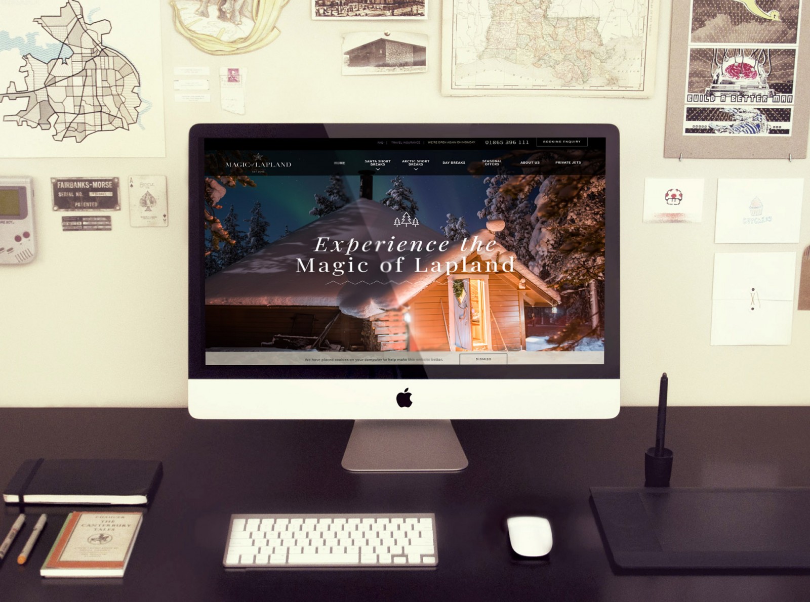
You've probably heard it a hundred times: use no more than two fonts in web and print design. Nothing more. “Seriously, how many times are we going to repeat this?” And yet, if you look at various websites, you’ll see many designers ignoring the rule—either using just one font or three or more. Take magicoflapland as an example: it’s beautiful and creative, but it breaks typographic norms.

If you’re planning to break this rule too, think again—not whether it's good or bad, but what you're trying to achieve by adding another font. Often, it’s better to thoroughly explore the two fonts you already have.
Take a look at Zero Studios , Alef , Domaine Jessiaume , project-redspace , terracap , open-uniqlo


Font Alternatives
Some designers like to heavily modify type—twisting letters, changing proportions, turning “o” into a squashed doughnut, and so on. It can take a lot of time but often doesn’t pay off. Altered type can be hard to read and pixelated when scaled.
One exception is hyperverve , where even distorted text remains readable and coherent.

However, things are different with drop caps. It’s acceptable to stylize the first letter of a paragraph, and readers often enjoy it if it suits the project’s theme. Just don’t distort the shape—embellish it, but don’t turn an oval into a square.
Some nice examples: surrealistgame , mellowselfhelptherapy , hondamotoglobal , hashima-island


.jpg)
.jpg)
Mobile and Contrast
Websites are almost always designed with mobile in mind. But images, textures, and tables don’t always work well on small screens. We've covered mobile typography before, so we won’t repeat it—better to read the original post.


The same goes for placing text over images. Without contrast, your text will likely be unreadable. Light and dark provide contrast—but busy images can swallow letters. Use overlays or toning. See more in our article on combining text and imagery in web design .
Still, here are some good (and not so good) examples: Domaine Jessiaume , Academy of Architecture , cacpro , tondo (text disappears into the background), terracap , open-uniqlo , Ingphi


Lifesaving Tip
Regardless of rules and trends, the main idea behind typography is understanding your web project and what kind of font fits it—its style and why it makes sense.
Make copies of your web mockups and keep them online. As you update your project, open past versions and compare. Lay them out in order and ask yourself: “How has my typography evolved? Have I achieved visual harmony?”
Conclusion
The only way to judge if a designer nailed the typography of a website, brochure, ad, or logo—is user feedback. They’ll know when something just doesn’t feel right.
When we talk about perfect typography, the key issue is legibility. Fonts should be easy to read and quickly understood. They should match the tone and theme of the project, fit the color palette, and yes—be felt but almost invisible. Users shouldn’t have to think about the typeface—they should just read and absorb the message. Don’t draw attention to letter spacing or font quirks.
We didn’t set out to reinvent the wheel today. But we did want to remind you that even these simple, well-known rules are often ignored—even by top designers. They make amazing work, sure, but it takes talent, instinct, and years of practice. Just like in art: many artists, few masterpieces. Yet achieving great web design is easier when you revisit the fundamentals and explore creative ways to apply them.