Many people believe that the world shown in black and white photos can’t be as beautiful as the one in color. But that’s not quite true—they’re missing something. Nature—whether it’s water or forest landscapes, deserts or mountains—and everyday life like streets, cities, subways, and the people around us can actually look fresh and different in black and white. The secret lies in tones, lines, and textures.
With the rise of Instagram, things got a bit sad. People started thinking that simply applying a black and white filter to a photo makes it “cool,” “artsy,” or even “fine art.” Unfortunately, it doesn’t. Basic filters won’t cut it. The best black and white photos require just as much editing as color ones—using adjustment layers, sharpness/blur filters, masks, brushes, blending modes, etc. A true black and white image isn’t just a desaturated version of the original—it’s a whole new composition, with its own visual impact, story, and emotional pull.
Try taking a regular photo and desaturating it. It’ll probably look boring. But try editing it and turning it into a new piece of art—you might be surprised how good it looks. You might even want to set it as your desktop background, depending on the subject.
Black and white in web design
We’ve already talked about how the combo of black, white, and grey shades is a timeless classic in web design—it never really goes out of style. Even though bright and colorful schemes are trendy and energetic, monochrome designs are still very much a thing. What’s interesting is that black and white sites can trigger emotions and connect with users just as strongly as colorful ones. Sometimes, it’s hard to say what’s better for a web designer to go with—color or black and white? One thing’s clear: working with monochrome is a true art form.
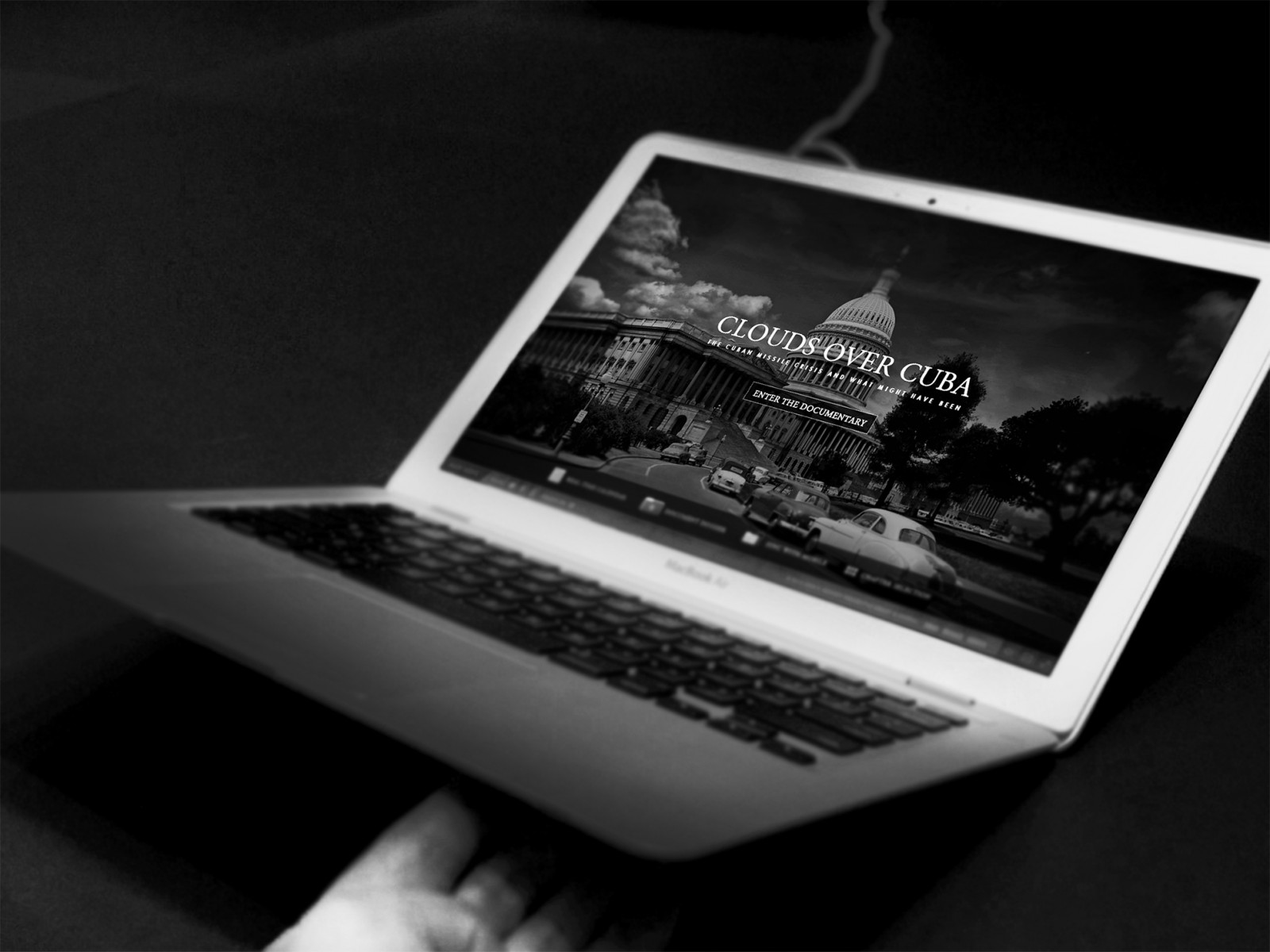
Here are a few interesting and beautifully designed black-and-white (and slightly tinted) websites: mrprezident, founders, marie, theboat, flplny, eattheordinary, weareisland, heckhouse.


 And take a look at the work of well-known photographers like BERT (QUASEBART), HUGHES LEGLISE-BATAILLE, Ansel Adams, Adam Meek, stephane, Giuseppe Milo, Emilien ETIENNE. Every one of their photos pulls you in—you want to look closer, and there’s no feeling of discomfort. It's kind of magical how these “desaturated” images still have so much character.


And here’s an example of a regular photo converted to black and white using a simple filter found in many apps. This image of a “corner of Catalonia” will be our working example in this article. The difference in quality and tonal range is striking. Which raises the obvious question: why? So how do you make black and white photos truly stunning—good enough to proudly use in web design and wow both clients and users? That’s what we’ll talk about today. 

The secret of gray tones
When you convert a color image to grayscale, you’re creating a kind of abstract visual—emphasizing elements of composition that color photos often don’t highlight. Everything shifts to tone, bringing out textures, contrast, and graphic elements. A black and white photo doesn’t have to “be” anything more—it’s like a sketch of a moment. It’s not trying to tell you how beautiful Spain is (like in our example), but it is trying to express the *feeling* of being there—the mood. That’s why black and white web designs often have a strong emotional impact.
To get that effect, though, you have to do some editing in Photoshop after converting the photo. But not just random editing. First, figure out *why* you want a black and white version and what emotion or idea you want to express. For example, that “corner of Catalonia” can reflect the emotion of natural space, mountain beauty, or even sky drama. Lots of options—but you should pick one!
Also, keep in mind: converting to grayscale removes tonal info, but brightness and saturation stay. Colors that are close in shade will often look the same in grayscale and may almost disappear to the human eye. So your goal is to use remaining brightness and saturation to highlight details and structure.
Photoshop offers many ways to go black and white, each with its quirks. Let’s walk through some of them.
Desaturate
Open your image and go to Image → Adjustments → Desaturate. This is the most common and basic tool people use to turn color into black and white.


The thing is, it technically gets the job done—but it just strips out color without caring about the underlying color tones in the image.
The result? A “washed-out” look where red and blue might turn into the exact same shade of gray.
Grayscale mode
Another method that also kills the vibe: switch to “Grayscale” mode in Photoshop. Go to Image → Mode → Grayscale.


This one completely wipes out color data, so you won’t even be able to layer colored text on top. Photoshop will warn you about this.
The result can be oddly “blurry,” with weird artifacts and blotches. It even feels like you zoomed in too much on a small image and lost quality. At least, that’s what happened in our test—even though the original color photo was high-res.
So what should you do?
If these default methods don’t deliver great results, then how come other web designers and artists are able to find or create such amazing black and white images? Some might say: just hire a professional photographer who knows how to shoot in black and white.
But!
Trust me, there’s way more potential in post-processing after conversion. Even top-tier photographers do this all the time. Plus, you can always keep your original image safe on a separate layer or file.
So let’s now check out how to actually convert a color image into black and white and turn it into a beautiful piece of art—something that’ll look right at home on a high-end website.
Channel Mixer
The Channel Mixer is an awesome tool for working in black and white. It lets you fine-tune individual color channels to get the right brightness and contrast balance.
Select your image layer and add a new adjustment layer: “Channel Mixer...” from the bottom of the Layers panel. Check the Monochrome box to work in black and white, and start tweaking the sliders for the best contrast and tone.


Move the sliders for each channel to darken or lighten certain areas—like the sky or daylight shadows.
Also keep an eye on the total percentage. If it goes over 100%, your image might be too bright. But hey, sometimes you want that. Go with what looks best.

This method gives you way more “color feeling” than just using Grayscale mode plus brightness/contrast edits.
Black & White
Another adjustment layer—“Black & White”—has been around since Photoshop CS3 and works similarly to Channel Mixer. You’ve got the same kind of color sliders.


The cool thing here is that you get lots of extra color adjustment options, plus built-in presets like sepia, cinematic, etc. You can use and tweak these however you want.
Gradient Map
Another way to convert a photo to black and white: use a Gradient Map. Yep, that’s right. Even though we didn’t focus much on them before , that was just because we were talking about color photos.
The Gradient Map adjustment layer doesn’t give you deep channel control, but it does create unique visual effects that add artistic flavor.
After adding the Gradient Map adjustment layer and picking a black and white gradient, double-click the gradient to tweak its color points.


You can use a simple black-to-white gradient or go with something more creative—like dark blue to creamy yellow—to add a subtle tone. This also gives you finer control over light levels.
Just be careful not to overexpose parts of the image like clouds—they could get blown out and lose all texture. But with just a few tweaks, your image can get that “artsy heat” and feel super engaging.

Important: A Gradient Map doesn’t delete the color info—it just maps it to your selected gradient. So black and white now replace all colors with grayscale tones of the same brightness, which helps keep the image’s original contrast.
Of course, with just one photo it’s hard to see all the differences between conversion methods. And honestly, each photo will probably need its own unique approach.
For example, here’s a side-by-side of Desaturate and Channel Mixer.


Whenever you’re working with grayscale, compare your options. Toggle the visibility eye on and off a few times and let your eyes adjust. For example, yellow shouldn’t become dark gray or black. In our case, Channel Mixer brought out more contrast and light-shadow balance, even revealing some details that weren’t obvious in the color version—without just washing everything out into gray blobs.
Conclusion
Web design doesn’t exist in a vacuum —especially not apart from the visual arts. You don’t have to be a musician or a poet. But artistic creativity really matters. You need calligraphy skills, an eye for color and tone, an understanding of light and shadow—and at least some basic photo editing chops. Why? Because often no one will do it exactly how you need except you.
You’ll need images, photos, artwork, icons, textures. Sure, you could spend hours searching online or trying to explain your vision to a teammate or friend. But sometimes it’s faster and better to just make it yourself—or at least create a sketch that’s good enough to use in your web design.
When you build a black and white website design, you want the photos to match the vibe—or even set the tone. And that tone? You have to create it too. How? As we said above: fine-tune those color channels, adjust brightness, highlight the details. That’s how you create breathtaking black and white visuals that stand strong—even in a world dominated by bright color and flashy styles.