Welcome to the "Design Closet"!
My name is Andrey Gavrilov, and I’m happy to welcome you to my new show with an unusual format.
Why such a strange name? A closet is a place where everything a person has accumulated is stored—things that are valuable and define them as a person.
Let's add one useful skill, secret, or technique to our shared design closet each week.
Modular Grids
This article is written as a summary based on the material from this video:
Today, we’ll deal with one of the most important issues in a modern web designer’s work—modular grids. I’m constantly asked: what grid should I use? When should I use 12 columns, 14 columns, 1170px, 960px, or maybe 940px?
Today, we’ll address all these questions in one simple lesson.
Let’s go…
Modular grids are essential for web designers to structure and logically arrange content on a page. It's impossible to imagine a modern responsive page without a modular grid. That’s why using them is a standard in web design. There are many opinions, questions, and uncertainties that scare beginner designers when they start working with grids. Today, I’ll try to clarify all of that.
Breakpoint
The first thing to know is the concept of a breakpoint. You might not have heard of it. It’s a point where a website transitions from one layout to another since it appears differently on mobile, tablet, or desktop. That’s exactly what the breakpoint is—a transition from mobile to tablet, from tablet to small desktops, and from small to large desktops.
To see what a breakpoint is and how responsiveness works, you can open any responsive website. For example, my personal website andrewgavrilov.me—visit it and test it. On my 1600px desktop screen, the site looks like this.
.jpg)
Let's open Chrome DevTools on your monitor. If you don't know how, please Google it—I won't focus on such basic things now. Open DevTools and see how your site looks on different devices. This tool allows us to test how the site appears on mobile devices with 320px, 375px width, etc. On small desktops, my site looks like this.
.jpg)
On tablets (768px), DevTools shows the site like this.
On larger mobile devices (420px width), the site rearranges itself. This is where the breakpoint happens—between these resolutions.
.jpg)
So you decide how many breakpoints your site needs and prepare a layout for each state. Modular grids help us with that.
Bootstrap
Usually, a site has only 2 or 3 breakpoints. Let’s look at the most popular developer framework.
.jpg)
It's so popular now that it’s become a standard. All developers and layout designers work with this framework. I won't go into detail, but just know that it speeds up layout work and has specific technical features. That’s why it’s normal—even standard—to design your layout with grids that match Bootstrap.
Don’t worry if you didn’t know this and are already working on some layouts. Any grid can be adapted for Bootstrap. The first thing to understand is—even if your grid is unique, it can always be reconfigured for Bootstrap. The main thing is that the developer knows how to do it.
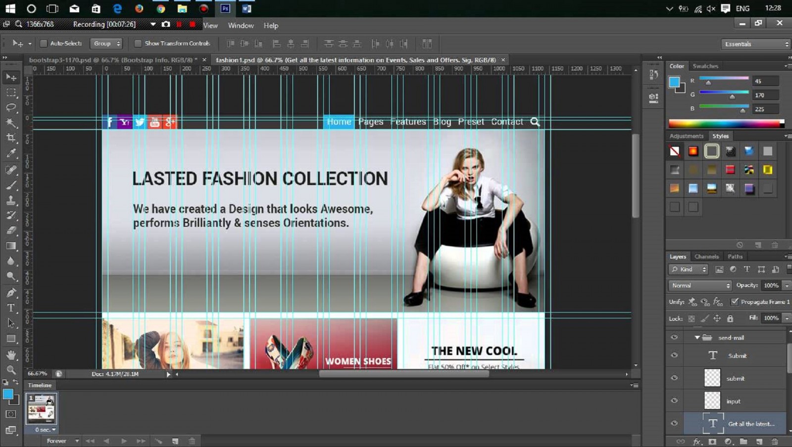
Let’s go to the CSS tab and open the Grid System section.
.jpg)
Here’s a table showing the default resolution ranges Bootstrap uses out of the box. Responsive design means a site looks good on all devices, but since there are so many screen sizes, we can’t design layouts for each phone. So we use resolution ranges and create one layout for each.
Bootstrap considers very small devices to be phones with less than 768px. So we prepare the first layout from 0 to 768px. Next are tablets (768–992px), then medium devices (desktops) starting from 992px. Devices over 1200px are considered large (large desktops).
.jpg)
So, for one project, we usually prepare about four layouts. But honestly, three are often enough—for mobile, tablet, and desktop. One desktop layout can usually cover both regular and large desktops. Since Photoshop uses static dimensions, you must know the size of your layout.
Here’s another tip: there are no strict rules. If you're covering the 320px+ range, you can prepare a layout at 320px, 768px, 322px, or 327px.
See the point? It makes no real difference.
That’s why I’ve prepared files for you—modular grids that I personally use. You can download similar ones as well.
.jpg)
The most important thing is that your layout (let’s say 480px wide) falls within the range the grid covers. Then you can work however you like within that grid. By the way, to toggle guides on/off, use the shortcut ctrl+H.
.jpg)
Guides form the grid. You can move them manually, but it’s slow and inconvenient—better to download the templates I provide.
Here’s a template for small devices over 768px.
.jpg)
Medium devices above 992px.

And large ones over 1170px.

I use this layout size whether it’s 1170px or 1200px—it doesn’t matter, because that’s the screen width, not the grid. The grid can vary within that screen width. Don’t overthink it—just use these grids in your work.
I typically use extra small, small, and large grids. That’s three ranges and two breakpoints: mobile to tablet and tablet to desktop.
I think we’ve covered everything about how modular grids are formed and used. Most importantly, don’t be afraid to use the ones you like!
Working with Modular Grids
Now the second point—how to actually work with modular grids. There’s a belief that scares beginners: every element must occupy a set number of columns, start and end at column edges—no exceptions. If we designed everything this way, it would be boring and uniform. So a grid is a guide—not a strict rule—and that’s important to understand.
The main idea: there’s a layer I sometimes show, sometimes hide—but mostly it's hidden.

The blue bars are columns—we work within them. The gaps between are off-limits. But we do break the rules sometimes—and I’ll show you when. Just don’t start your element *inside* a gap.
Its edge shouldn’t begin inside a gap—only within a column. Ideally, your element should start at a column edge.

If you manage that—great. But most elements don’t always align perfectly, and this raises concerns about layout difficulties or extra code.
In reality, it's just one line of code—so don’t stress if your element doesn’t start at the left edge of a column. Same goes for the right edge. Just try to extend it so it ends within a column.
Let me show an example that’ll clear up your doubts. Here's a typical website header: logo, menu, phone number, and a button.

This placement relative to the grid is totally fine. Not perfect—the menu doesn't end at the column edge, the phone doesn’t align perfectly, the button doesn’t reach the column edge. But imagine if every site used the same grid and element lengths?
The problem comes when you do this:

This isn’t great. The menu and phone start in the gap. It’s okay if it ends in a gap—but starting there is a real problem. Yes, you can still manage it in layout—but it’s unprofessional. Avoid this in your work.
Don’t overthink it—experience will help. Modular grids can feel intimidating, like every pixel matters. Perfectionism is good in design, but don’t overdo it in the name of grids.
I hope this helped you understand what modular grids are, how to use them, and why.
In Conclusion
See you next week in a new episode of "Design Closet." If you like this format and found this video useful—give it a thumbs up, subscribe to the channel, and leave your comments. That way, I’ll know what interests you and answer your questions.
Bye!