The structure of a platform and the placement of its elements directly affect user comfort. We'll show you what to do to make your mobile site or app user-friendly.
Touch-friendly design
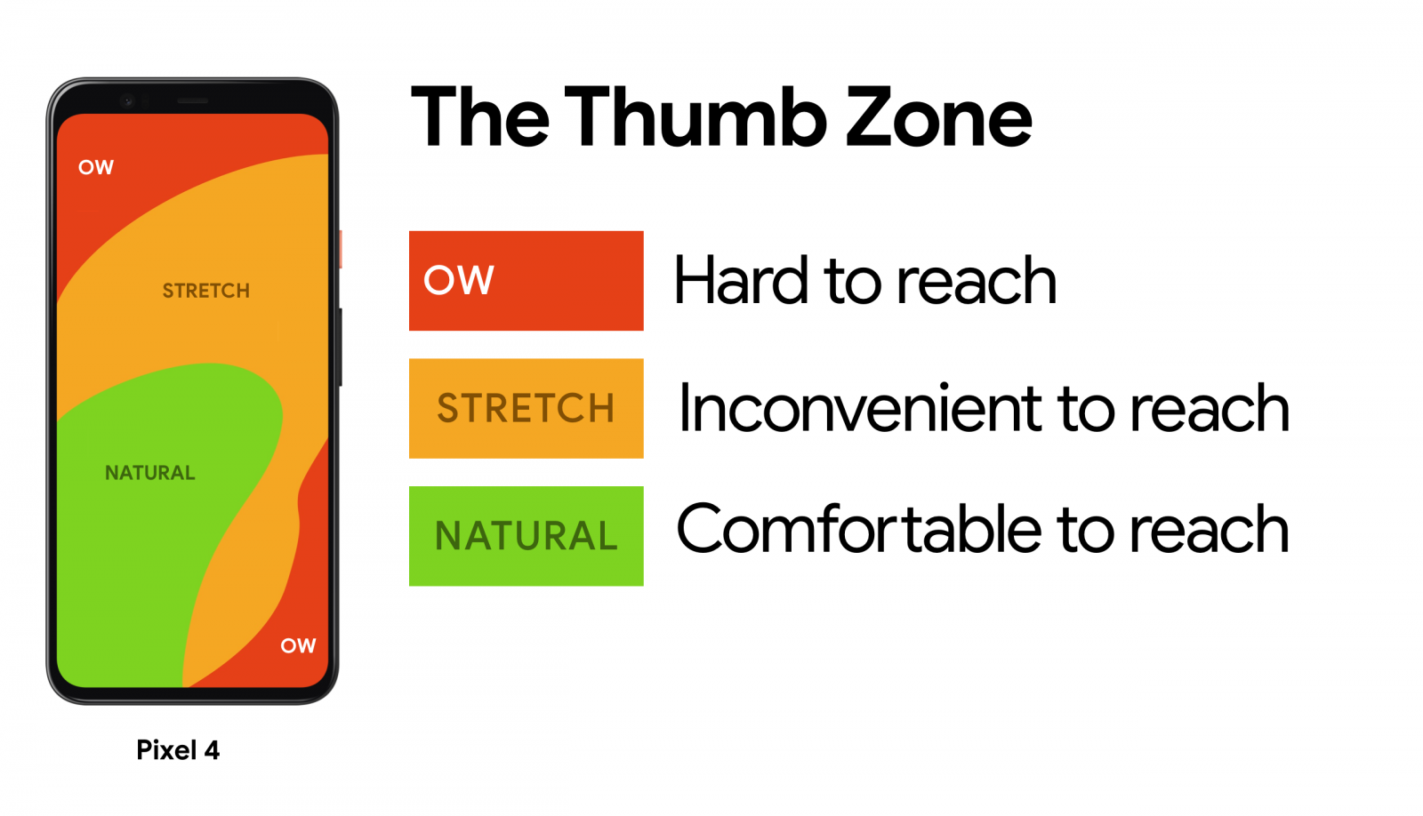
Let’s be honest—you mostly use your phone with one hand and your thumb, right? So do 75% of users. This fact must be considered when designing websites and apps. On desktops, laptops, and even tablets, we can easily reach all elements using a cursor or by holding the device differently. But with a smartphone, which we hold like an extension of our hand, using only our thumb to navigate, some elements—especially in the upper or lower corners—can be physically hard to reach.
Main content and actions belong in the center of the screen
Imagine Malevich’s “Black Square” hanging in a museum. Where would you look if it’s right in front of you? Most likely—at the center. That’s how our perception works: when we see a surface with borders, our attention naturally goes to the center.
Place core content and interactive elements in the middle of the screen. Secondary actions and tabs—along the top edge. Tertiary features—hide them in the menu. Want practical examples? Join the webinar “Design 3 Websites in One Evening” . We’ll create three functional, user-friendly resources together.
Research, user analysis, hierarchy
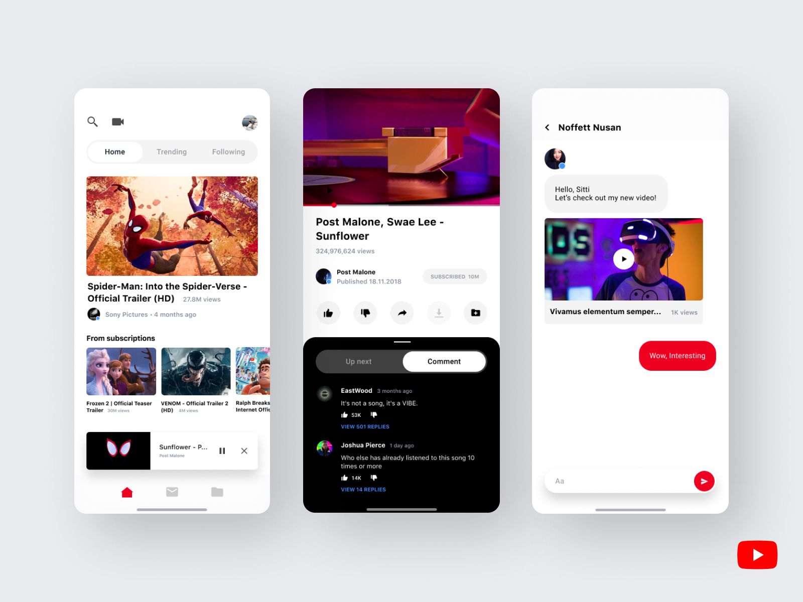
Open the YouTube app right now. What’s in the center of the screen? The most important thing—videos. From the very first screen, you see large previews. At the top—search and upload options. At the bottom—navigation, library, and subscriptions.
Ask yourself two questions:
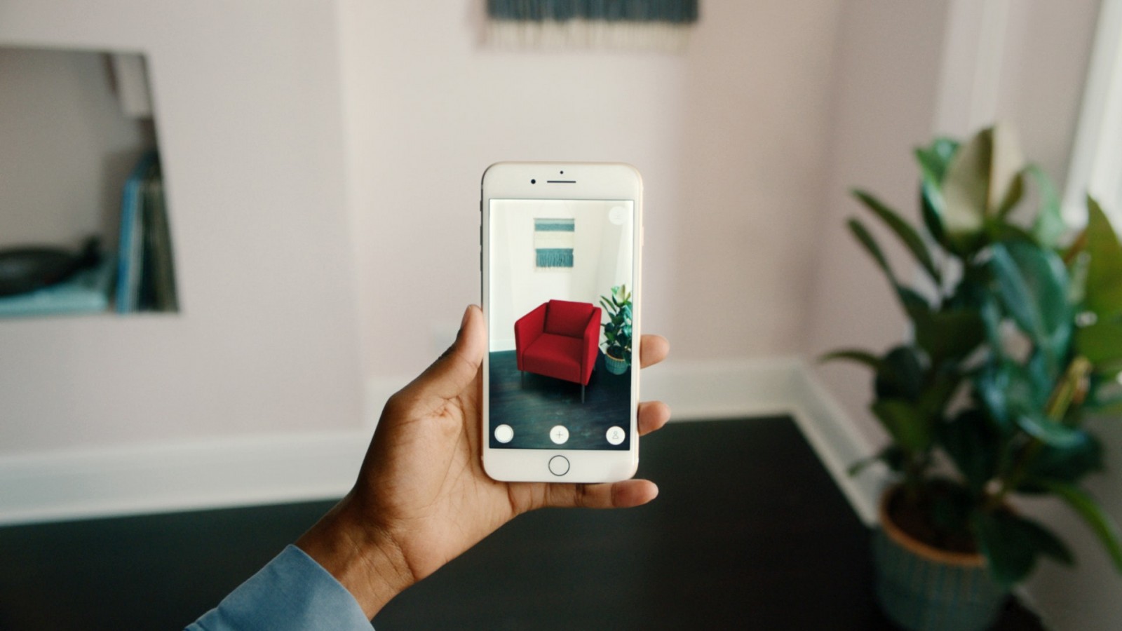
You can act based on existing patterns. Improve already working apps. That’s how IKEA PLACE came to life. The creators upgraded the familiar furniture shopping app by adding augmented reality. Furniture photos were replaced with realistic 3D models projected directly into the user’s room via their smartphone screen. We explain the tech here.
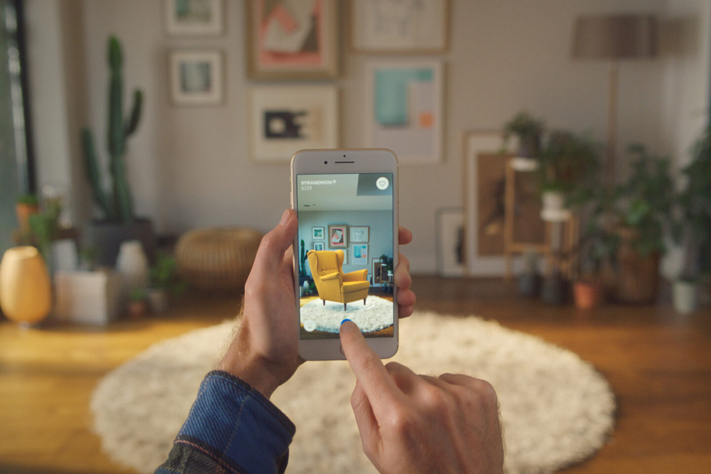
With IKEA PLACE, users don’t need to measure dimensions or guess how furniture will match the room’s colors and textures. That table or chair appears directly in your room—virtually, on your smartphone screen.
Almost any interface can be improved
When analyzing user needs and looking for solutions, it’s important to anticipate as many positive scenarios as possible. YouTube, for example, could’ve just been a platform to store and play videos, with upload functionality. But instead, it suggests relevant content based on your activity, offers livestreaming, lets you monetize with ads, build playlists, and more.
Want to learn how to build truly user-friendly apps and websites? Sign up for the online coaching course “Web Designer: Your Ticket to Thailand.” You’ll master Adobe tools, learn composition, typography, and color theory. You’ll also create a strong portfolio project.