It may seem like a strange thought, but portfolio websites often reflect the current state of web design development better than any others. The reason is simple. If a client isn’t yet ready to embrace animation, dynamic graphics, or a completely new style on their own site, personal websites (not only of designers) are usually the ones that implement these elements first. And the reason is equally straightforward – to make an impression. A big impression. That’s why a portfolio speaks volumes about a web designer’s skills – design is a smart thing !
Another point is that trends don’t change overnight, so even over two or three years, the most elegant, in-demand, and user-friendly techniques remain relevant. That’s why we’ve decided to take a closer look at the trends commonly found in portfolio websites – which also influence the broader evolution of web design.
Plenty of Space for Everyone
What has already been used for over two years (if not longer) across many types of web projects actually has its roots in portfolio design. We’re talking not just about a trend, but practically a standard – the generous use of whitespace between elements and blocks on a page.
The goal of this trend is to make content more accessible on mobile devices by ensuring everything is easy to navigate and understand. Extra space works well not only on the homepage but across all pages.
Let’s take a look at romainmurschel, eumray, webinword, measured. Extra-large headings occupy about a third of the screen, while vertical and horizontal spacing between images is wide. Every element sits in its proper place and doesn't shift wildly when the page is resized. There’s no chaos. Everything is interconnected, easy to view and process. This is a particularly good design approach for any site with a lot of imagery.


Oversized Typography
Large typography and the “power of words” can be the perfect feature for design work and portfolio presentations. Most people probably know Tobias van Schneider, a designer and podcaster – but who would expect his site to be nearly overflowing with text?

Typography and text are often overlooked in the early stages of planning a project or portfolio. We tend to focus so much on visuals or animations that we forget about the words.
But Tobias’ example shows why so many designers create personal projects – to highlight the power of typography. If a client is unsure, you can always present variations and let them “feel” the concept. Plus, bold typography sets the tone – it shows what your site is all about before you start adding flashy visuals. Dominant type is a great solution for layouts with lots of whitespace.
Consider clay, victor, herbesdeprovence, breadhead, qualiacreative – where large typography is used on all pages or just on the homepage. And despite the scale, the text doesn’t overwhelm – it’s readable, clear, and works well with other elements.


Fullscreen Animated Navigation
For quite some time, many designers have built portfolios (for themselves or clients) as long one-page sites. Naturally, these lack the traditional multi-page navigation.
The homepage often becomes the navigation hub, while other sections contain animated effects to create a more immersive and fully interactive user experience. This creates a strong UX that can impress a client who wants something similar for their own site. It’s also a great way to demonstrate a web designer’s skill in creating such effects – even if they haven’t yet had the chance to do so for a client. In short, your own site can show off what clients don’t ask for – because they haven’t seen it yet.
Examples like camiloalvarezhome, adrienlaurent, claudianoronha, kpowers, awink, mattpamer show that even with hamburger menus, the designs are still intuitive and functional. Scroll through the page and sections flow naturally. And if you do open the menu, the same sections are listed there too.


Less Is More
One of the best things about portfolios inspired by minimalism is that it makes the design clean and elegant. The design fades into the background, allowing visitors to focus on the content, images, and key elements the site owner wants to highlight.
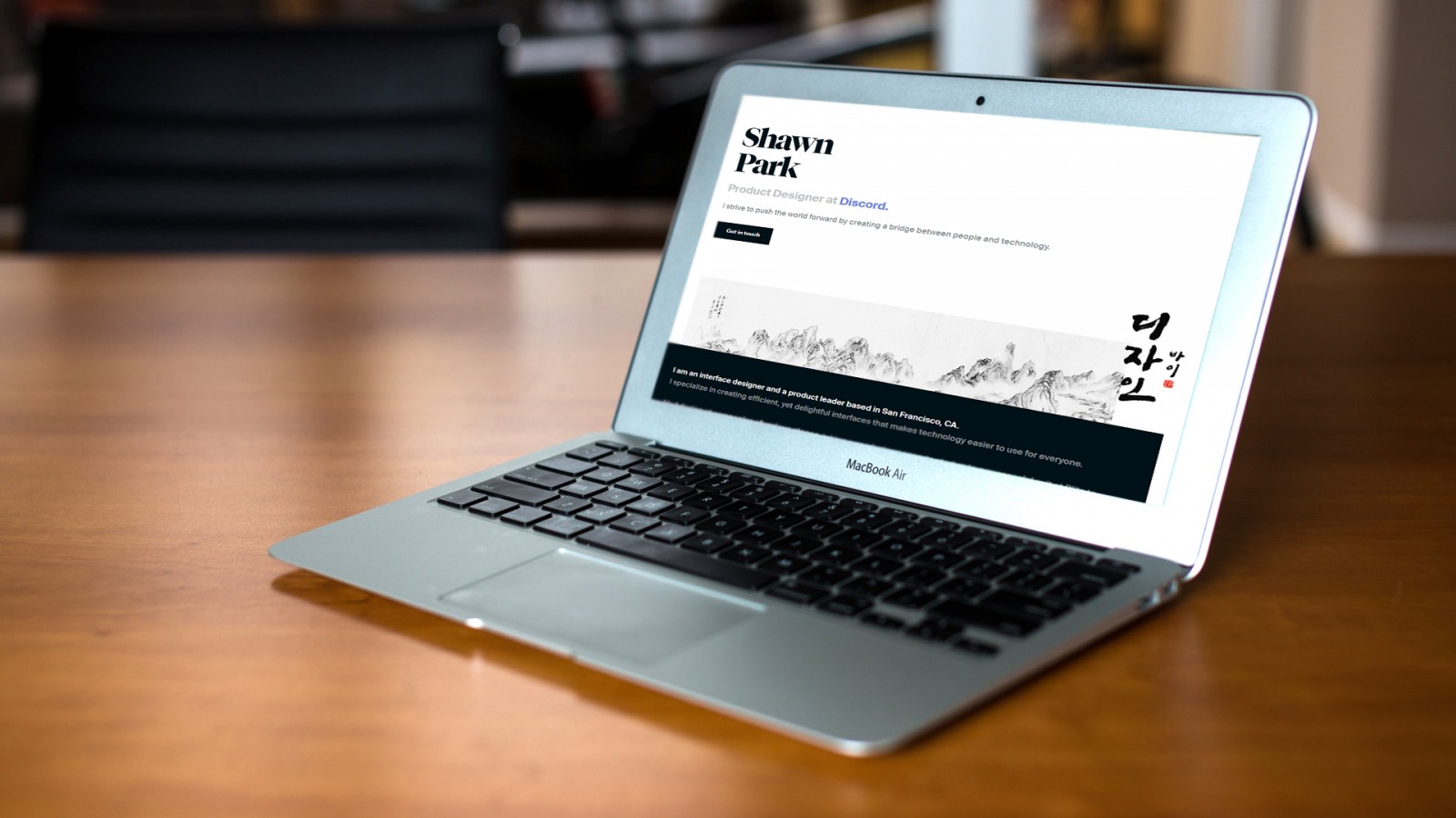
Designer Shaun Park recently wrote about how he redesigns his site every year (for six years). His post is worth reading to see how portfolio design trends have evolved. He presents all of his design iterations chronologically, explaining what he changed and why.

Most importantly, the timeline shows how a fresh minimalist approach makes his designs lighter, clearer, and easier to understand.
Similarly, minimalism works well for sites like marijnbankers, sirmary, theinlay, epo, designbyroka.


Color Accents
One of the most challenging parts of building a portfolio is the homepage or the main works section. How should those works or categories be displayed? What will be more engaging for users: text links or image-based links?
Searching for answers to these questions can take hours or even days. Many web designers turn to a simple yet effective solution: applying color overlays to images that serve as links. This makes items visually appealing and encourages users to explore specific works. Color overlays ( or tints) help organize the content, structure sections, and create filters. The main point is to ensure the page loads efficiently and gives users some context before they even click.
The portfolio of heathershaw stands out not just because every project looks different, but also because the overlays help categorize and present areas of work clearly. Similar approaches are used in ringer, serafino, scalzodesign, and cyber-duck. It doesn’t matter if the entire image is tinted or if there's a colored shape overlaid with text—the goal remains the same: to give users a preview of the content.


Grids & Layouts
One design trend in portfolios that never seems to go out of style—and is widely used across many site types—is the use of modular grids to structure galleries and portfolio items. It’s a highly functional solution because grids allow images to "flow" depending on screen size while maintaining order and alignment.
But there are also exceptions. For example, the project kimilewis uses a mix of different grids and introduces asymmetry. Squares are mixed with tall vertical images, resulting in a grid that appears random but feels fresh.

Still, this makes it easier for users to explore and understand the creator’s work. You could tweak the layout further by shrinking images and adding more spacing between them. Plus, each image includes an overlay and short description—just like we discussed earlier.
Using a grid is a natural and simple solution. It doesn’t require complex planning or visuals and is easier for users to navigate. Great examples include: istogether, independentproperties, scalzodesign, blkout, bscmp.


Conclusion
Even if you don’t plan to create or update your own portfolio website, you can always apply many of these ideas to client projects. Just remember: portfolio design—whether personal or commissioned—is a creative act, but it’s also an investment in your professional future (especially if it’s your own).
Many clients aren’t looking for someone who simply says, “yes, I can do it.” They want to see what you can actually create. And not just see someone else’s project, but also the effects, layout, interactivity, and polish. When they find what resonates, you’ll soon see those ideas spreading to “regular” websites too.
That’s how portfolio design influences mainstream design—new trends often start here and eventually spread widely. It’s too early to say what will dominate this year, but what emerged in 2017–2018 clearly isn’t going out of style anytime soon.