
Flat Design
The year 2014 brought us this wonderful direction, and web design in the upcoming 2015 will most likely (99% chance!) continue to evolve under the banner of flatness.
Fullscreen Background Images and Videos
It was impossible not to notice the growing popularity of websites featuring eye-catching background videos. At one time, it even felt like something out of a sci-fi movie. Still, looking ahead, we can confidently say designers will only continue to develop the use of background videos and images in their projects. There’s so much room for creativity here — even from a technical standpoint.
It’s nice to see developers increasingly turning to HTML5 video instead of outdated Flash animations. Given mobile device compatibility, it’s a transition that simply can’t be ignored.
"Ghost" Buttons

If something is minimalist, attractive, and responds to mouse hover — it just has to be on your page. Ghost buttons, which lack a background until hovered over, combine all these features. That’s why they’ve become favorites among web designers. They’re elegant and draw user attention exactly where it’s needed.
Material Design
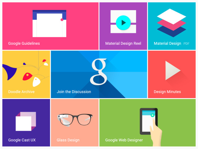
Many have heard of Material Design, introduced by Google at Google I/O in the summer of 2014. So what is it? According to the tech giant, Material Design is a unified concept for structuring the logic and look of services and apps in a new vibrant and responsive way. Its goals and principles look incredibly promising, and it's definitely a trend worth keeping an eye on.
You can already see it "marching forward" in the Play Market and the new Android 5.0 OS.
Scroll Over Click
Something I’ve been waiting for so long — users have finally changed how they perceive website content. There's no longer a need to cram everything above the fold. If you're still thinking that everything has to fit onto one screen so users don’t have to scroll — you're definitely behind the times. Scrolling has long since claimed a total victory over clicking.
First pages should be as informative as possible without being overloaded. As a result, the average webpage is getting longer. Users find vertical scrolling to be more intuitive, since it enables more dynamic interactions. And since any mobile-friendly solution is warmly welcomed, scrolling has been embraced by both users and designers alike.
Circular Button-Loader
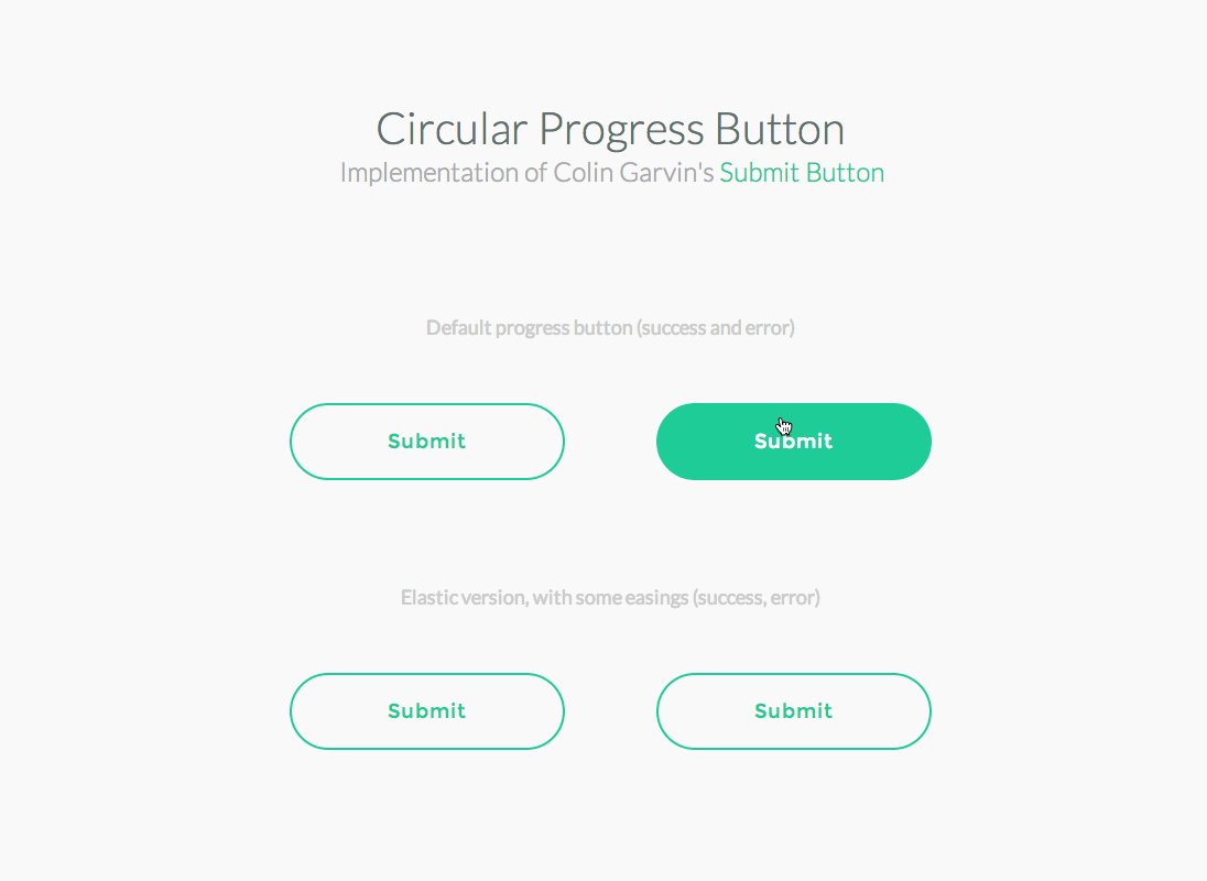
A button that can act as a progress indicator during data submission. It creates a feeling of instant feedback and helps save space at the same time.
Microinteractions
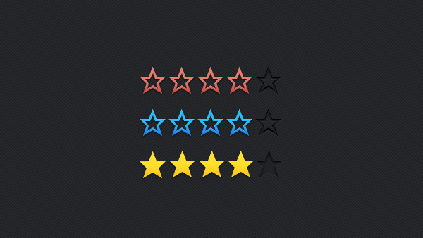
In the next few years, we’ll see more and more routine actions — like subscribing to newsletters or rating content — being handled through microinteractions. Otherwise, they’d require separate pages. Microinteractions increase user engagement, and designers seem to have caught on, as we’ve seen a huge surge in themes and plugins incorporating them lately.
Smooth Transitions
A great way to showcase before-and-after images. The Guardian used them brilliantly in its article about the Allied landings in Normandy. Real estate websites, design studios, and similar businesses can use smooth transitions to showcase the progress in their work.