When discussing the evolution of web design, the emergence of new trends and styles, the proper and tasteful use of colors, fonts, geometric elements, and special effects, there’s always the desire to see and explore as many interesting techniques as possible — to find out what’s new in the world, what kinds of websites are being created, and what kinds of tricks different webmasters are discovering. But let’s be honest: truly outstanding and mind-blowing projects aren’t released every week, month, or even every six months... Sure, every site has its own merits, but finding something refined and exquisite can be a challenge.
That’s why we don’t often publish materials in this blog that are solely dedicated to showcasing global web designers’ works in detail. The reason is simple — there’s little excitement in looking at similar-looking sites or ones that rely on familiar effects like parallax scrolling. What’s far more interesting is finding those unique elements and differences.
One way or another, this Monday it’s time — since our last similar piece — to return to this topic and simply take a look at some captivating projects. Despite the many trends of early 2018 and those dominating since the end of last year, web designers are still passionate about minimalism, animation in varying degrees, dynamic imagery and video, and even 3D graphics. That said, they are creating very simple websites with good design — sites you could describe quite plainly as: “Want to see how eclecticism is expressed in web design? Easy. Just scroll on.”
Since each site is unique, we won’t divide this selection into categories or dissect the use of specific styles or elements. Nope. This time, we’re simply going to showcase what we consider to be excellent websites — and figure out what makes them stand out.
Robbie Hall Creative
Photographer Robbie Hall’s website looks like a ready-made theme — something you’d expect to find on WordPress. Everything feels standard, with no frills, clean and... somehow very compelling and beautiful. The point is, the designer created it entirely using Bootstrap — and you wouldn’t even realize that unless you looked at the site’s code. But overall, the selected theme and layout are very simple, effective, and user-friendly. In other words: time-tested.

Florian Wacker
Some might immediately think: “What a terrible typography.” But there’s a twist. The designer built this site entirely in his native language — German — and there are no other localizations. German is quite specific and more complex compared to English or French. Without diving too deep into linguistics, it involves unique spellings and the use of letters not found on a standard QWERTY keyboard, definite articles for nouns, complex hyphenation and word-break rules... Taking that into account, and looking at how the text is presented on the pages, it becomes clear that everything feels harmonious — and the typography is actually quite comfortable to read.


Magic People Voodoo
An unusual minimalist site built in a graphic style that feels more like a presentation. Yet, it’s easy to explore and read — and it features a lot of animation. The animation is subtle and lightweight. The highlight is their logo — an eye — which… well, just click on it yourself.


Two Twenty Two
Two Twenty Two is a kind of interactive 3D-effect project. On one hand, when you move your cursor, you’ll notice design elements subtly react and shift; on the other, there are lots of volumetric objects. On the homepage you’ll see scattered 3D lollipops, pizza slices, Super Mario boxes, sunglasses, Minecraft items. It’s fun and engaging, especially since the cursor itself transforms throughout the site. The other pages, meanwhile, are designed in a more standard flat style with nice fonts and photography — but even they include animation.


Patrick Heng
Looking at this site, the first thing that comes to mind is that the designer stuffed every known effect and trick into a single project. There are so many, it’s almost impossible to list them all — you'd either forget something or go a little mad trying. But here’s the twist that caught our attention — you won’t believe it — the whole ensemble looks insanely beautiful and perfectly harmonious. It’s just a joy to explore. The colors aren't overbearing, and there’s no chaos from tiny or oversized elements.

The web designer achieved this partly through the use of a monochromatic palette, simple fonts, and carefully crafted typography (where headers, body text, and subheadings are clearly defined — no inconsistent sizes, no font overload). There’s lots of white space and many elements, but they all have room to breathe. Without a doubt, that had a big impact on the visual appeal and functionality of the site.
Uncanny Valley
This project radically shifts the idea of minimalism. The designers decided to distort even the very notion of structure. In other words, the entire site — its layout and logic — is warped from top to bottom, like stepping into a distorted Wonderland full of abstraction and grotesque. And it works. Some elements and pages are even interactive.


In short, this is a site best experienced firsthand. Scroll through it yourself, or even if you try to analyze its uniqueness, much will remain unnoticed unless you engage with it directly.
MoreSleep
At first glance, this design studio’s site seems totally unremarkable. A basic layout where the portfolio scrolls horizontally, with links and info arranged around the four edges, and a small menu at the top. The photos are slightly desaturated, the fonts are serious and blocky. Nothing that makes you go: “Wow! This is insanely cool!”

But here's the thing — as soon as you go to the “work” page, the fun begins. It looks like a simple list in a brutalist style, but when you hover over any item, animations, parallax effects, and preview info start appearing. At first it feels unexpected — but once you get used to it, it’s actually fun. And yes, it’s functional and intuitive in its own way.


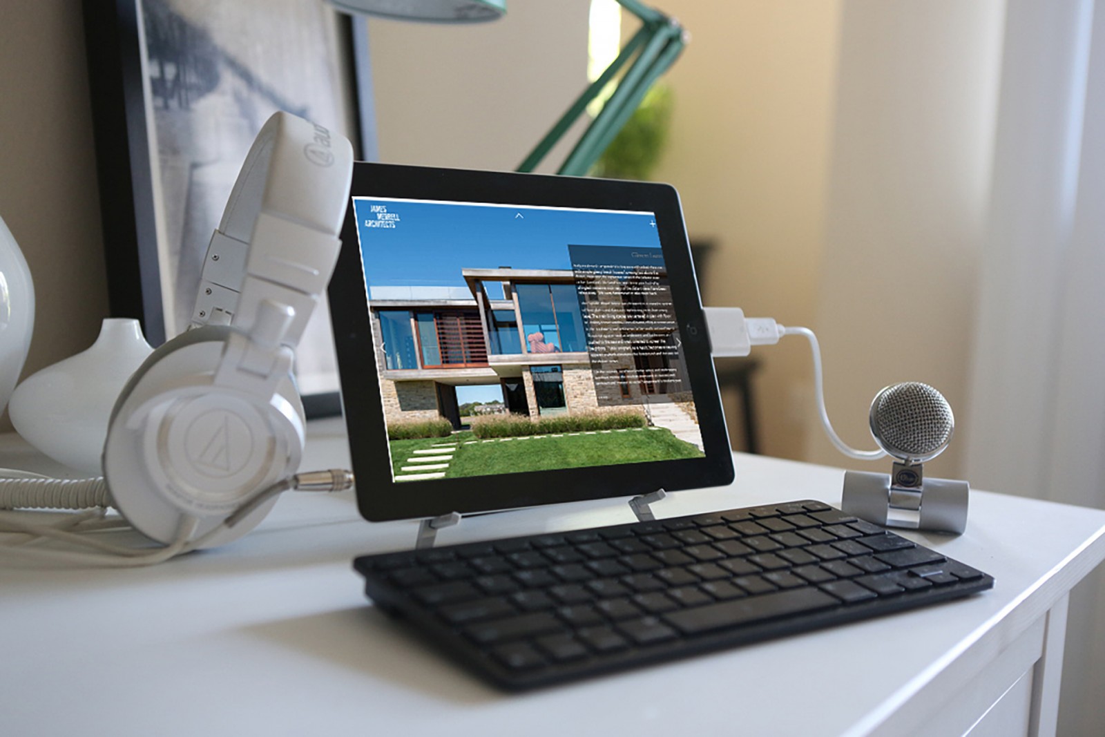
James Merrell Architects
We’ve previously talked about how websites related to architecture and real estate have unique web design challenges — designing them by the usual standards isn’t always appropriate. Most of the time, there’s an unspoken rule: go for a presentation-style layout (think PowerPoint). But James Merrell’s site steps away from that norm. It presents architectural projects not like a slideshow, but like something you’d see in a printed publication or brochure. It’s better to explore it yourself and take a stroll through its pages.


The site’s menu is tucked away at the bottom of the page and disappears unless you move the cursor to the lower-left corner. Still, everything is clear even without it. Click on images, links, or the little “+” icon at the top to explore the details and pick a project direction. Overall, it feels quite minimal and convenient.
Prollective
A minimalist and professional design — though some might say that’s an overstatement. There aren’t many images or photos, but there is a lot of text and graphic work. More precisely… gradients. But not bright or flashy ones — these are soft, pastel gradients that appear even when you hover over images. True, this project can’t be called artistic — the main focus is typography. And if it had a different background or color scheme, the design might feel like a mess. That’s why it’s worth noting how carefully the colors are chosen, how they match the fonts, their size and weight, how the buttons are styled, and how the animation works. Many people would see a simple, light-colored website — but we see a bold, expressive project that practically shouts: “Explore me.”


Pierre Georges
This might be one of the simplest sites in our Spring 2018 roundup. Everything about it is pleasant, calm, and functional. Large images, big text that works well on large monitors, no need for users to zoom in manually. It’s a site you can enjoy and take your time browsing. What makes it special? Well, this simplicity is bold and minimal in all the right ways.


Contemple
In contrast to simplicity, here’s another site overloaded with animation. Yes, the amount of animation feels borderline wild — and there’s even a music track. But what’s interesting is that the animation is pleasant to look at and easy to interact with. When you select a project and click, it loads with near-instant animation, and from there you enjoy smooth page scrolling and subtle section movements as the cursor passes over them. Sound familiar? We mentioned something like this at the beginning of the article.


That’s exactly why we said we wouldn’t categorize the examples — because each one is unique. This becomes even more obvious here. Two Twenty Two and Contemple share a few “tricks,” but implement them differently. Overall, each website feels self-contained — they even have distinct personalities and moods. And that’s what shows the designer’s skill: taking an idea and transforming it so it’s no longer a copy, but something original.
IPG Mediabrands
A great example of a corporate website. We've all been to banks or big companies where you’re surrounded by brochures. And for one reason or another — boredom, curiosity — you flip through one or two.
And you know what? This site feels exactly like a big, multi-page brochure. And it’s convenient, functional, and beautiful. There’s a well-used color contrast (gray and yellow), both black-and-white and full-color photos (we’ve discussed their significance), strong typography that makes the text easy to read and quick to understand. Light animation (in quality, not quantity), fast loading — what more could a corporate site need?


If you ask, “What does a good company website look like?” — here’s your answer.
Root Studio
At the start of the year, we talked about the trend toward bright, saturated colors — not over-the-top, but still bold. The design of Root Studio’s site leaves a mixed impression. On one hand, the loud yellow color can be off-putting. On the other, the site is interesting and pleasant to navigate. The unique fonts pair well, there’s plenty of white space so nothing feels cramped, and there’s light animation, graphic touches, photography, and more. Some might find it plain or boring — but for us, it’s a well-balanced and humble design.


Conclusion
Of course, there are tons of good or even great websites — packed with special effects or totally barebones. And naturally, everyone has different tastes, impressions, and opinions. But one way or another, it’s hard to pick out the truly impressive ones from the endless stream released each day. So when you're working on a layout, thinking through page structure, it might help to step back and look at the idea with some distance. Maybe what you need is more (or less) minimalism. Maybe no animation. Maybe larger fonts. Or maybe… head to your local bank or city office and flip through a few brochures?
Inspiration can be found anywhere — even while watching classic anime. The real question is: how can you take that idea and flip it just enough to make it original and fresh? All of the sites above aren’t 100% unique. They reuse ideas and effects. But the way they’re applied gives each site its own personality and charm — and that’s what draws people in.