When creating a website design, the first question you need to think about is the choice of color palette.
Color plays an important role in our lives. This applies to everything around us. And the secret lies in human psychology. Certain colors can evoke specific emotions.
The color scheme of a website is a marketing tool that must be used skillfully.
A person who visits a website for the first time decides within seconds whether to stay or close the tab. And the color scheme has a huge impact on that decision. The effectiveness of the color choices in a website’s design affects how long someone stays on the page, what impression they form about the product, and whether they will make a purchase.
What should be considered when choosing colors?
When selecting colors and shades for a website design, don’t rely solely on personal preferences. There are some key aspects that must be taken into account.
Color Psychology
The same color can influence people differently. It depends on the shade, its combination with other colors, and even factors like a person’s gender, location, or emotional state!
Still, there are general understandings of how certain colors work, when they’re best used, and what limitations they might have.
Blue
This color is associated with feelings like trust, calmness, safety, and loyalty. It has a strong soothing effect. Blue represents freedom and strength. This is proven by the fact that major companies like Facebook, Ford, Nivea, Visa, and Samsung use it in their branding.
.jpg)
Avoid using blue in websites related to healthy eating. It’s not a natural food color in nature.
Red
Probably one of the most complex colors. On one hand, red is linked to danger, anger, and fire. But it can also trigger strong emotions crucial for sales—passion, appetite, energy, power, boldness. Red creates a sense of urgency, which is why it’s often used in limited-time promotions.
Major brands that use red include CocaCola, McDonald’s, Lay’s, Lego, and YouTube.
.jpg)
Red is very controversial. That’s why not all designers are quick to use it in web design.
Yellow
Another complex and ambiguous color.
Yellow symbolizes optimism, joy, and happiness. It’s a warm and cozy color. When we see yellow, our brain receives signals that amplify emotions, making us feel happier.
At the same time, yellow is used as a warning signal. That’s why it often appears on road signs.
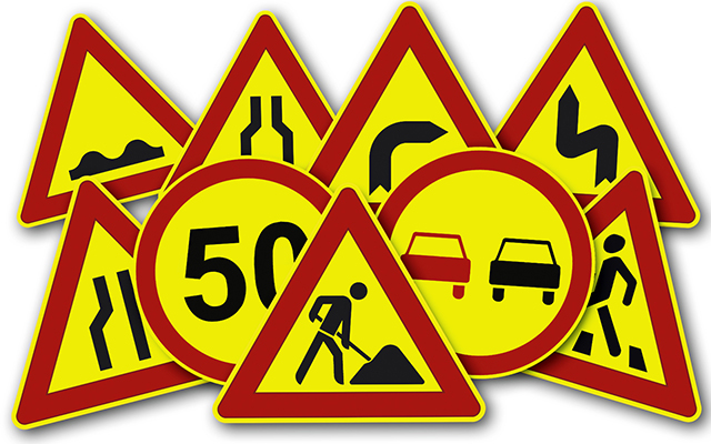
Yellow should be used with care—combine it well with other colors and don’t overuse it in your design.
Orange
Orange is similar in meaning to yellow. It conveys warmth, friendliness, energy, and joy.
Again, what matters is the right combination and context for using this color.

Green
A color that’s hard to imagine healthy food or summer vacation websites without. Green is the color of nature. It symbolizes health, freshness, purity, and growth.
.jpg)
This color is also popular in finance—banks and stock exchanges use it because it creates a sense of harmony and calm.

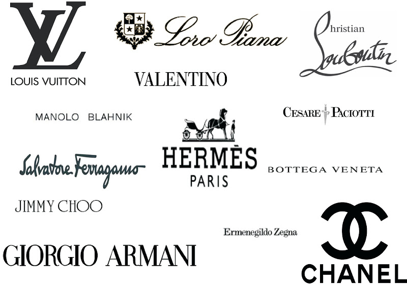
Purple
A color associated with luxury and prestige. High-end brands often use it for positioning.
Since purple is a blend of blue and red, its characteristics combine the energy and power of red with the calm and freedom of blue.
Depending on the shade and dominance of either blue or red, purple can produce different effects.
.jpg)
Black
A color that expresses elegance and luxury. Classic and minimalistic, black is often used in luxury brand identities.
Black can be used on its own, with white, or paired with bright colors. In any case, black conveys confidence, seriousness, and decisiveness.
White
A traditional color associated with freedom and cleanliness. In modern web design, white space is used to create a sense of openness.
It’s a color without contradictions. It symbolizes perfection.
But be careful not to make your design feel empty or dull—use bright colors in the details to balance it out.
About Color Combinations
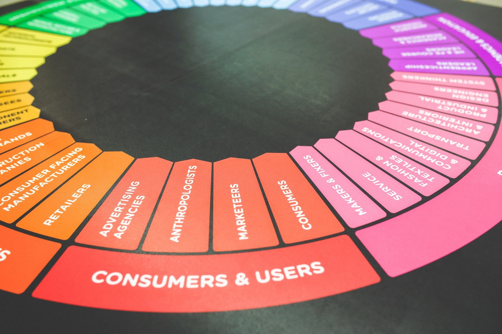
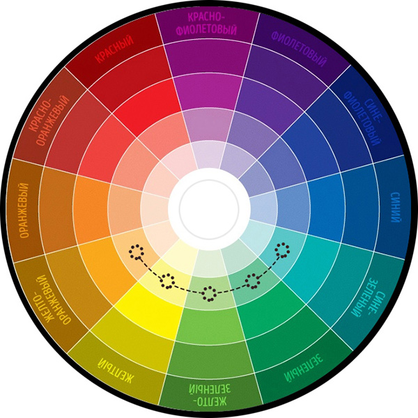
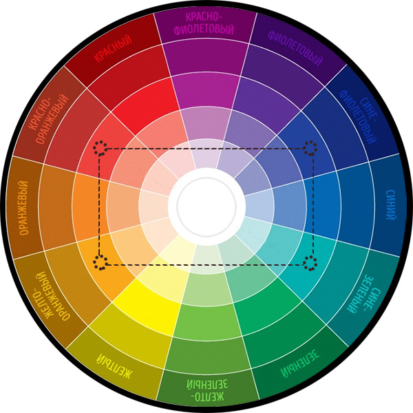
The theory of color combinations begins with Newton’s color wheel. While his methods weren’t flawless, the concept laid the foundation.
Today, the modern color wheel used for choosing color combinations looks like this.
.jpg)
The wheel is divided into 12 segments, each showing a gradient of shades from light in the center to dark at the edge.
There are several schemes for selecting effective color combinations:


Tools for Picking Colors
Technology has come a long way—there’s no need to sit with a printed color wheel and spin it to pick the right shade.
It’s much faster and easier to use online tools. These sites often offer extra features, like previewing a web page with selected colors to see how color blocks will look together.
To create an eye-catching but not overwhelming web design, you need to understand the meaning and emotional impact of main colors and how to combine them. Don't rely solely on your own taste—consider your target audience, brand colors, and even product packaging.