Strictness, clarity, and straightforwardness in website design styles are taking a back seat when webmasters decide to use wavy and “soft” lines. Where there used to be solid-color backgrounds, we now see curved dividers or gradient transitions between colors. Light, airy elements evoke a range of emotions and impressions in design. What’s especially nice is that waves and gentle lines can be combined and applied in many ways, offering designers a wide creative playground. Naturally, each website design looks different, and it’s quite difficult to find two that are exactly alike.
Oh yes, this trend may sneak up on you unexpectedly, as it appears in many different forms. You might not even realize at first that you've transitioned from strict formality to playful lightness—but visually, everything still looks quite nice.
Let’s take a closer look at the shapes and manifestations of the waves and "soft" lines trend in web design. Some website examples may repeat, but that’s for a reason, and as we go along, you’ll see why.
Accents
Rectangles and circles aren’t always enough to set a website's mood. In such cases, you might consider adding curved lines and waves. Key elements can be emphasized with large shapes or small circles, blobs, and ink splashes. The result—smooth curved shapes without sharp corners—gives a website a distinct look, a different style, and an appealing twist.
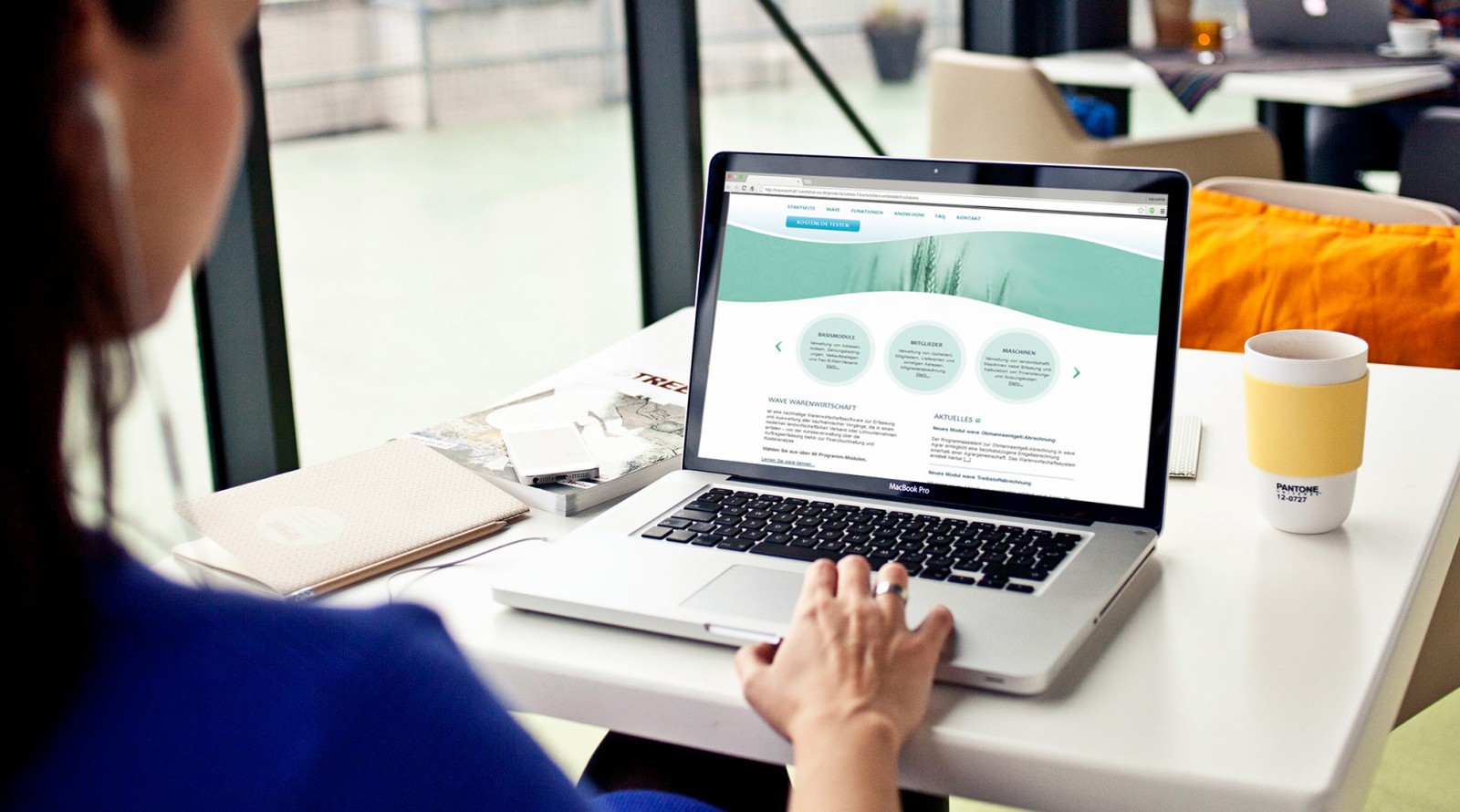
Great examples include Papillons de Nuit, momentomultimedia, brring, mi-pad, oprette, topnology. On each of them, waves are used in one form or another to emphasize key areas. Backgrounds are split into light and contrasting colors, and each site adds a unique touch—whether it’s animation or a combination of waves and circles. Soft lines are also often used to smooth out sharp corners in rectangles. These elements look casual but remain clean and structured.


Regardless of the website’s niche—be it an online store, design studio, construction company, or financial institution—the designers’ solutions look great and align with modern web design trends. Yes, this style may appear a bit playful and bold, but it’s also eye-catching and gives websites a competitive edge. That kind of approach can even boost traffic.
Click me!
Minimalist style, flat elements, and illustrations are popular and standard nowadays. But adding waves can help draw attention to specific details, especially calls-to-action.
Sure, you can use arrows and triangles, but waves can do the job just as well—if not better—offering a more subtle design approach. Users won’t feel forced to click or make a purchase. There’s no pressure to react—but the call-to-action will still be clearly visible and understandable.
Sites like Recruitz, celineandjad, orange-idea, designerspace, oprette, mi-pad use waves to separate calls-to-action from supporting information. This soft transition allows the viewer’s eyes to move naturally between elements, making it easier to process large amounts of content. It also creates a sense of depth, giving the site a more complex look. Add in bright colors, strong contrasts, and crisp lines—and you get a dynamic composition. Sometimes the wave element even mimics natural forms like leaves, but the point is still that gentle, flowing motion.


Wave Illustration
In addition to being used in backgrounds, waves and “soft” lines can also serve as illustrations. This design approach stands out from the crowd, replacing large icons, straight lines, and pointers that have recently dominated. But the result is no less effective—visitors can still navigate such websites with ease.
Wavy lines also help manage white space. The Retrace Health project uses waves to separate the sky from the white background—with added animation. The wave’s movement is subtle but effectively divides the header from the content below. Visually, it fills space, while still keeping the focus on the key area.

Similarly, wave illustrations are used on oprette, amnrus, district0x, withtiny, elje-group, iammoving. Sure, you could use straight lines instead, but the visual impact would be entirely different—more boring, more rigid. Waves bring mystery and uniqueness to the design.


Serious Can Handle It Too
Waves and “soft” lines can do more than just look pretty. They can serve as background or design elements—even in projects that are as serious as they get, where straight lines are typically preferred. In such cases, waves help balance the overall concept and add a hint of personality and focus.
The project Ghafari is composed almost entirely of straight lines. But if you look closely, you’ll notice the use of wavy lines as well. Visitors’ eyes are naturally drawn to the unique form, subconsciously searching for meaning in its use. Buttons, bold colors, large headings, symmetrical info blocks—everything feels solid and structured. But that light, airy wave balances the “weight,” softens the rigid shapes, and doesn’t break the design at all.


This method of using waves and “soft” lines deserves further consideration. The truth is, not every design element carries important meaning for the user. Sometimes the purpose of such elements is subtle or secondary. But it’s precisely these subtle elements that bring balance to the entire concept and presentation.
Look at momentomultimedia, brring, amnrus, heartbeat, thecoloradan, pomegranate-travel, ninefeettall. These are all serious, professional sites—yet wave elements are found throughout in various forms. And they don’t hurt the user experience; in fact, they often enhance it. In some cases, the soft lines help smooth harsh edges, making the overall design more friendly and calming. Psychologists even argue that sharp angles and straight lines can negatively impact emotions and mood.


Gradients and Waves – Friends Forever
Waves and smooth lines, as we usually think of them, are elements in drawing and design that help build a layered structure. And layers always feel less generic. To clarify: layering means drawing several wave lines that cross one another, but not in a parallel way. If your background uses a gradient, that doesn’t mean the transitions must follow straight lines. Try waves instead—they tend to feel more natural.
For instance, Algolia uses a mix of elements—from gradients to rounded buttons and frames. The overall structure looks great, is easy to process, and isn’t hard to create.

At the same time, iammoving, topnology, peekabeat, beoplay, thecoloradan all feature waves or soft, rounded lines that both convey gradients and act as dividers. In other words, a single wave element can help web designers create a complete concept without needing extra visual balancing.


Animation
What comes to mind when you hear the word “wave”? The ocean—that’s the most obvious. The sea, storms, surf. That’s why, no matter what kind of animation a site uses, wave animation tends to be the most standard and realistic. It’s also universal: everyone, even if they’ve never seen the sea in person, knows what a wave is—even from childhood. But that’s from a human perspective.
On the web, wave animation often imitates ocean flow, moving clouds, or mountain ridges. A car might be driving across the foreground, and the movement of the mountains in the background creates the illusion of motion. Regardless of the setting, this type of animation soothes the mind. There’s a saying: you could watch flowing water forever—and it’s true. The human mind finds rest in such visuals. A website design shouldn’t irritate—it should engage. So wave animation is especially suited to this purpose, whether the motion represents water, clouds, or hills. The smooth, flowing motion is what really matters.
Projects like Futuramo, elje-group, topnology, oprette, celineandjad, amnrus, riocriativo all use wave animation in a variety of contexts. These waves move naturally and often have nothing to do with the website’s theme. They simply set the mood, connect with users’ emotions and subconscious, enhance user experience, and spark interest in the content.


The stories are simple, but audience engagement is high. Often, wave animation runs through the entire design (on every page), creating a storytelling effect about the brand or company. This offers users a completely different experience—a unique identity.
Conclusion
Curved lines set a different tone and direction for a website. Just adding a wave or combining it with straight lines can completely shift a user’s perception of the site—and even their opinion of the company, its staff, and its web designer. From a design standpoint, it becomes simpler, lighter, more appealing, more airy.
And you know what? Users don’t mind this kind of visual experience. Sure, waves aren’t used everywhere—and the reason is complexity. Not necessarily drawing or animating them, but planning their placement and use. Trends favor straight, sharp lines because they’re easier. But waves require careful thought: what curvature, what length, where to place them, how many to draw, what gradient to apply for depth?
Sometimes it’s hard. Sometimes designers don’t see the point. But that doesn’t mean wavy lines are useless or “ruin” a design. It all depends on how you use and combine them. We’ve shown many examples, and if you study each one in detail, you’ll see trends, standards, and waves intricately woven throughout. Do any of these designs look bad, outdated, or dysfunctional? We didn’t think so.