Almost six years ago, a resource called Photoshop Etiquette appeared online, and since then it has been considered a kind of relic. Over the past years, much has changed on the internet, and Etiquette reflects the best of what was, is, and, surprisingly, will be.
In 2011, the foundations of responsive web design were just beginning to take shape. Traditional styles and working with HTML weren't yet criticized, but today many alternatives exist. Back then there were tile-based designs, prototypes, visual collages, and others. All of them were suitable for mobile screens. Yes, the time when styles were shifting from standard and strict to design-driven solutions was exciting and memorable.
But it was also during this time that a sort of "explosion" occurred among the toolkits designed to make designers' workflows more efficient. Webflow and Ara emerged, and some professionals moved away from Photoshop in favor of tools better suited for web design. Others remained loyal to Photoshop as a prototyping tool.
Nonetheless, Photoshop Etiquette continued to grow, and more and more new webmasters are still using the tool to this day. Yes, Adobe deserves much credit for that. But there are other reasons too.
Relevance of Photoshop Etiquette
Thanks to the standards and rules presented in Photoshop Etiquette, international organizations began conducting stricter employee selection, paying closer attention to how design work is delivered, and more. In other words, the way a website design is presented or how a company team collaborates on a project has become very important.

Surprisingly, despite the abundance of Photoshop alternatives, the world still needs the principles of Photoshop Etiquette. Because file sharing, collaboration, and workflow management are crucial processes.
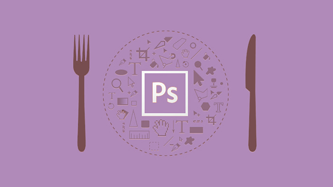
As you might have guessed, we won’t be discussing fancy effects, plugins, or award-winning projects today. We'll focus on something just as important for web designers—what can make their work truly correct in many aspects.
Responsive design consists of many elements—from various image sizes and qualities to pieces of CSS code and other details. If the project is to be profitable, the entire package must be efficient before it even goes live.
But poor organization and haste can negatively impact the whole process. In Photoshop, separating workflows, managing layers, and exporting materials are all areas where it's easy to cut corners in the name of speed. Yet everything we do must be not just good, but perfect and flawless. We create not for ourselves, but for users—for their comfort and interest.
What’s your role, Photoshop Etiquette
Photoshop Etiquette was created by professionals from a design studio in Syracuse, New York. For beginners in web design, Photoshop Etiquette serves as a sort of guide to optimal workflows in the application, promoting efficiency and clarity in design. And interestingly, the rules created for Photoshop are now applied by professionals working in Sketch and other tools that handle layers and offer design features.
The guide includes several sections: file organization, layer structure, asset export, typography, use of effects and filters, and final quality checks.

By visiting the site and studying it, you’ll find many well-known truths and workflows for the app. Yes, sometimes these are basic tutorials on copying layers or naming them, saving them as separate files. Adobe also covers this. But dig deeper and you’ll find plenty of useful tips and insights for designing websites for different devices—down to the standards for light angles and shadow casting.
Let’s look at some interesting tips on design and process organization overall.
Unified PSD
If you're working with multiple pages for a website, it's convenient to use artboards in a single PSD. This way, all data can be stored in one document, helping you avoid confusion among many separate files. You can also use linked files and smart objects. But remember—free space on your hard drive and RAM matter.

Collaborative Project
Since the release of Creative Cloud and the introduction of Linked Smart Objects, designers have gained an incredible opportunity to share files and data. For example, your team might be tasked with creating a homepage template in Photoshop, with one designer working on it from one computer and another from theirs. Each creates their part (e.g., logo, background, icons, etc.). Later, you can assemble everything either through CC or by linking it as a smart object in the main PSD.

Structuring
Creating a simple file structure is crucial. While everything can technically be saved in one file, sometimes multiple are required. The key is for anyone—anyone!—to be able to understand the whole data package. File names typically follow the structure Name_Type_Size_Version. Let’s break that down.
Company name – the first thing we see and pay attention to in web design, especially when handling many orders. It helps with sorting and finding the right files.
Type – defines the file's purpose. What was created in it (e.g., shopping cart page, contact form, about page, etc.).
Size – usually applies when images are included, like banners, which may be 120x600 or 300x300.
Version – identified simply as v2/v3, it’s a copy of the main working file. Naming files “new1”, “final”, or “Site4-final-23.08.2017” creates chaos.
In practice, proper PSD file naming leads to a well-organized workflow, reduced confusion, and even faster execution.

Pen Tool
You know… Jedi and Sith wouldn’t be who they are without their lightsabers. That’s a fact. A designer without the Pen Tool isn’t quite a designer. You can’t draw or create much without it. But the more skilled you are with your weapon, the more possibilities you unlock. And while swordsmanship relies on muscle memory, in Photoshop the Pen’s path memory turns into reusable objects. If you create a nice curve, swirl, or shape—save it for the future. It can always be resized or tilted, but redrawing it from scratch can be hard. We've already explained how to save and draw.

Graceful Effects
Effects like Color Overlay, Drop Shadow, Bevel, Outer Glow, and Strokes can be very tempting to use. In web design, it’s important to understand when they’re useful and when they should be avoided. Their purpose is to enhance design with uniqueness that makes it stand out from competitors and offer a good user experience. The key to effectiveness is subtlety.


If the same layer styles are applied to several objects—copy those styles. And don’t forget the global light setting. If you’re unsure about an effect, turn it off, delete it, and move on. New ideas will come with time. Your heart must be in your work.
Unused Elements
Often, we create effects on layers, textures, and more, and later abandon or disable them. A good practice is to gather all of this into a separate folder and then review and reuse what’s needed. Name the folder something like “Temporary,” “Unused,” or simply “Temp.” Turn off the visibility of these layers and place them at the bottom of the layer list.
Even if you decide to delete a layer—wait a moment, move it to that folder. It might come in handy later. Store small icons, previews, texture attempts, glow or neon effects, duplex variations, etc.
You can even export the entire folder into a separate PSD and link it to your main working file.

No Presets
Mobile devices come in various screen sizes and resolutions. Moreover, Apple loves to change them frequently. That’s why using Photoshop presets as default document sizes isn’t the best idea. It’s better to let your design dictate the foundation points and place them where needed. Versatility across different mobile devices is much more convenient than juggling different iPhone versions.

Versatile SVG
As SVG vector format began dominating the internet, its implementation in Photoshop became critical for designers. Exporting, creating, and editing—all are important. And most importantly, there’s no quality loss. Photoshop allows you to adapt SVG for @2x/@3x resolutions and use them in Retina workflows.
.jpg)
Light and Shadow
Using shadows in web design is nothing new. But as we’ve said many times, mistakes are frequent and varied. No need to repeat. Photoshop Etiquette principles highlight that in web design, light can fall at angles like 900, 1200, 1800. Other light sources are allowed too.
These angles allow shadows to appear realistic, especially when working with heavy shadows—dark grays or blacks on a white background. These are the most noticeable. If shadows fall at varying or slightly off angles, the perception of the whole composition changes subtly on a subconscious level.
Even in OS interfaces, shadows fall at specific angles, and we’re visually used to that. Website design should match this.


Compression
Performance is one of the pillars of project efficiency and quality design workflow. How often do you wonder what to do when a font or image is too heavy, and opening the PSD file causes the whole system to lag? There are third-party tools, like TinyPNG or others we’ve covered before in our reviews. They compress images like a whirlwind.

But Photoshop also offers compression options. That’s why Photoshop Etiquette defines one rule: performance and compression should not sacrifice quality. Using heavy assets is poor practice.
Conclusions
One of the main reasons for the popularity of Photoshop Etiquette is that it consolidates all key principles guiding a designer’s work in one place. And these principles will remain relevant for years to come. They are updated and improved with each new version and feature set.
It’s used in commercial and private organizations, forms the basis for teamwork, and supports professional collaboration. Creating PSD files and mockups in Photoshop is one thing—but presenting your work properly to a client or manager and organizing cooperation is something entirely different.
If you're used to working your own way, the rules may feel burdensome. But if you're focused on growth in skill, knowledge, and workflow—change is necessary, and following them is essential.