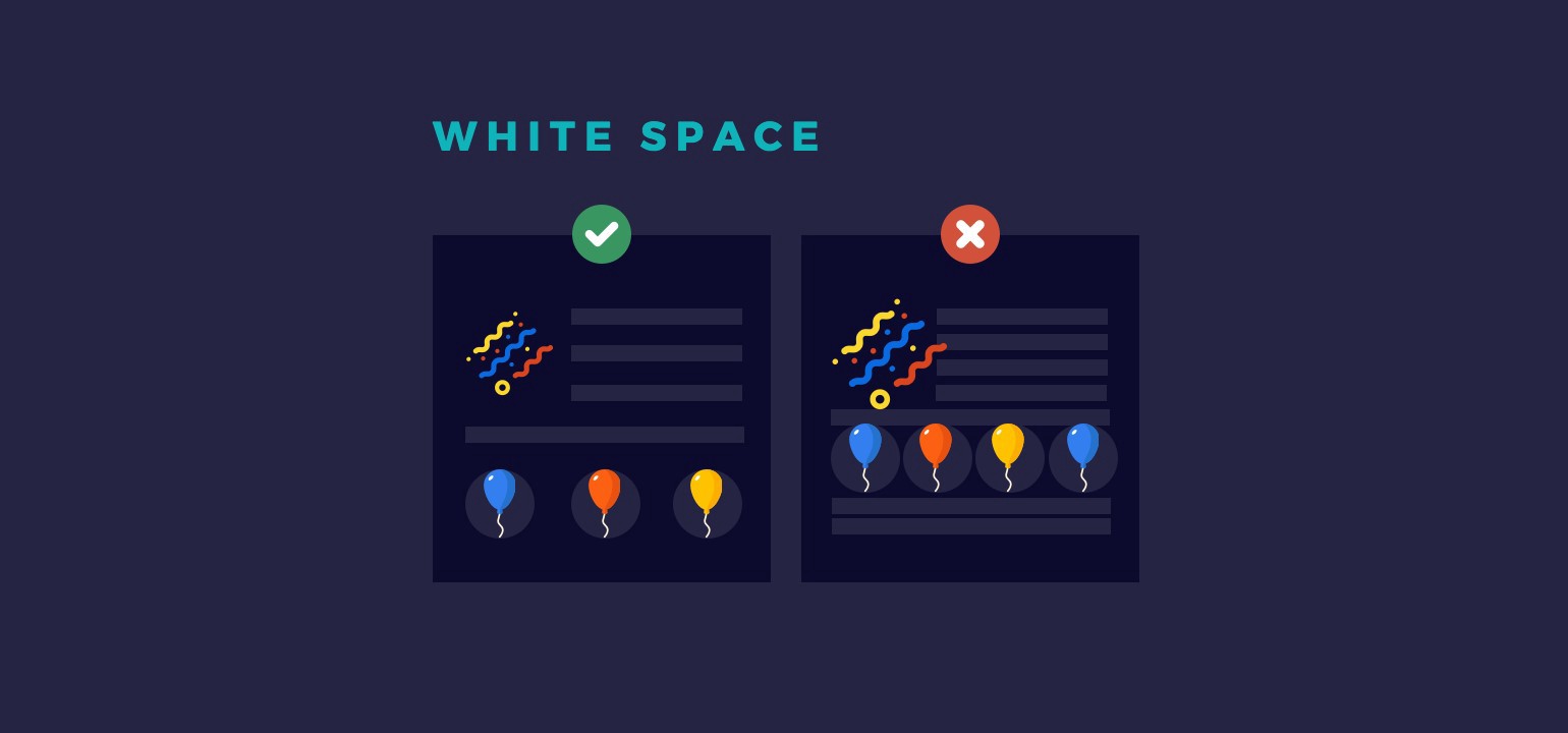
White space visually improves content
Text with extremely tight line spacing turns into an unreadable blur. On the other hand, line spacing between 1.2 and 1.5 visually makes text more structured, rhythmic, and readable.
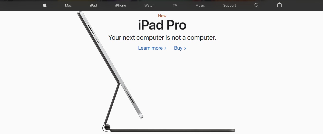
With the help of white space, you can create emphasis and guide user attention. For example, large empty areas on Apple's website highlight and elevate the product, making it feel almost three-dimensional.
White space influences decision-making
White space helps you highlight the main offer or call to action on a website or landing page. You can direct the user's attention to the key action — just like Google does on its homepage. The user has only 6 seconds to make a decision, so don’t distract them with secondary elements.
Information organization
White space helps group information into logical blocks. Content surrounded by the same amount of space is perceived by users as a single unit. This allows you to clearly build content hierarchy and logical flow.
Avoid overwhelming the user with information
Negative space helps the layout “breathe,” gives the eyes a rest, and prevents information overload. The same amount of content — text, buttons, videos, etc. — but spaced out, is much easier on the eyes. When content is crammed together, it becomes tiring to absorb. White space gives relief and clarity.
White space = wasted space?
While designing, you may encounter clients who want to fill every pixel of space. Why leave anything empty when we could place a list of product benefits, company values, a “Buy Now” button, and so on? Chances are, you’ll get asked this more than once.
Try to explain to your client or team lead that white space is not just visually pleasing — it’s effective and essential. It makes content more visually appealing and readable. It helps direct user attention, emphasize key elements, guide decision-making, and organize information into logical blocks. It also prevents cognitive overload and gives the user’s eyes a break.
In thoughtful combination with the basics of composition, white space is your design’s best friend. It’s not literally “empty” — it’s a compositional element, part of rhythm and harmony, like a pause in music.
Learn web design and land your first freelance clients in 5 weeks
During the intensive course "My New Online Profession" you’ll learn web design, the basics of composition, typography, and color theory. You’ll build a strong portfolio and learn how to work with clients. You’ll be fully prepared for freelance work. Enroll now and get an $85 discount on the course.