
Abstraction is a universal form of expression, a real lifesaver when nothing else seems to work. You can use geometry or wild, irregular lines, any colors or monochrome. It offers endless possibilities to explore your ideas and imagination.
One big advantage is that abstraction is coming back into fashion. Plus, there are more tools than ever to create it. You can prototype or design in Figma and insert your own hand-made abstractions directly into the project. For details on how to work with Figma, check out our article “Our TOP-15 Simple and Useful Figma Plugins”.
 Abstraction can be a standalone or supporting element in design. Use it as an illustration, or to highlight important blocks or buttons using jagged shapes and lines. A subtle pattern can even guide users through your site, leading them to follow the scenario you’ve intended.
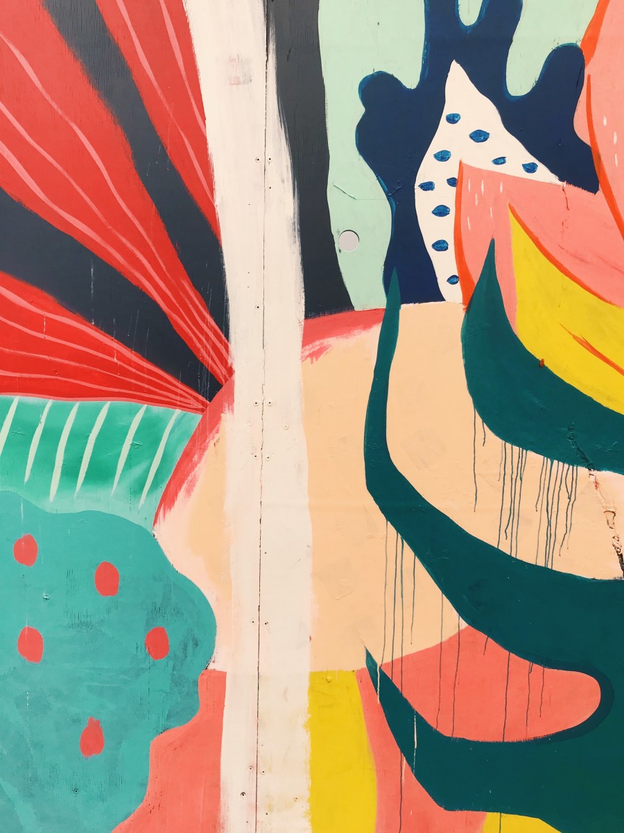
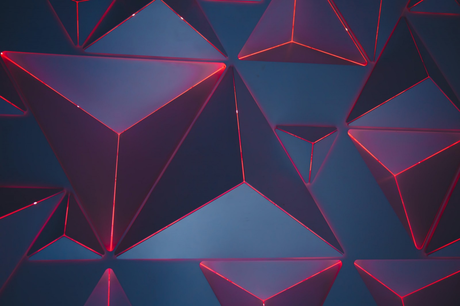
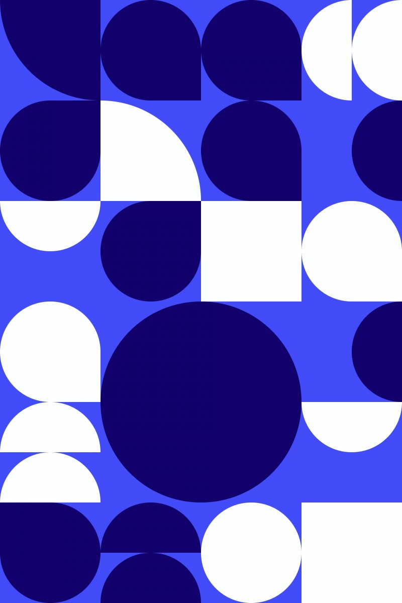
In terms of form, abstractions can be geometric or improvisational.
Geometry
Polygons, clean lines, circles, and ovals — mix them all together and enjoy. You can use symmetrical or asymmetrical forms. Beginners might find symmetry easier to handle because compositions feel more balanced, even with little illustration experience.
The secret to creating them is simple — pick a few geometric shapes and assign your project’s main colors. Now cut, merge, and layer them. You can mirror certain parts within shapes, then mirror the entire set vertically and horizontally. Merge everything into a single object — it’ll likely be unique. Making the shapes visually pleasing takes practice, but soon you'll be able to see abstract potential in basic forms.
Asymmetry is harder to master. It requires some artistic instinct to balance the element properly. Sometimes it stands alone. Other times, it's a supplement — in which case, its shape and visual weight must complement the “neighbor” element. But don’t worry, this too gets easier with practice.
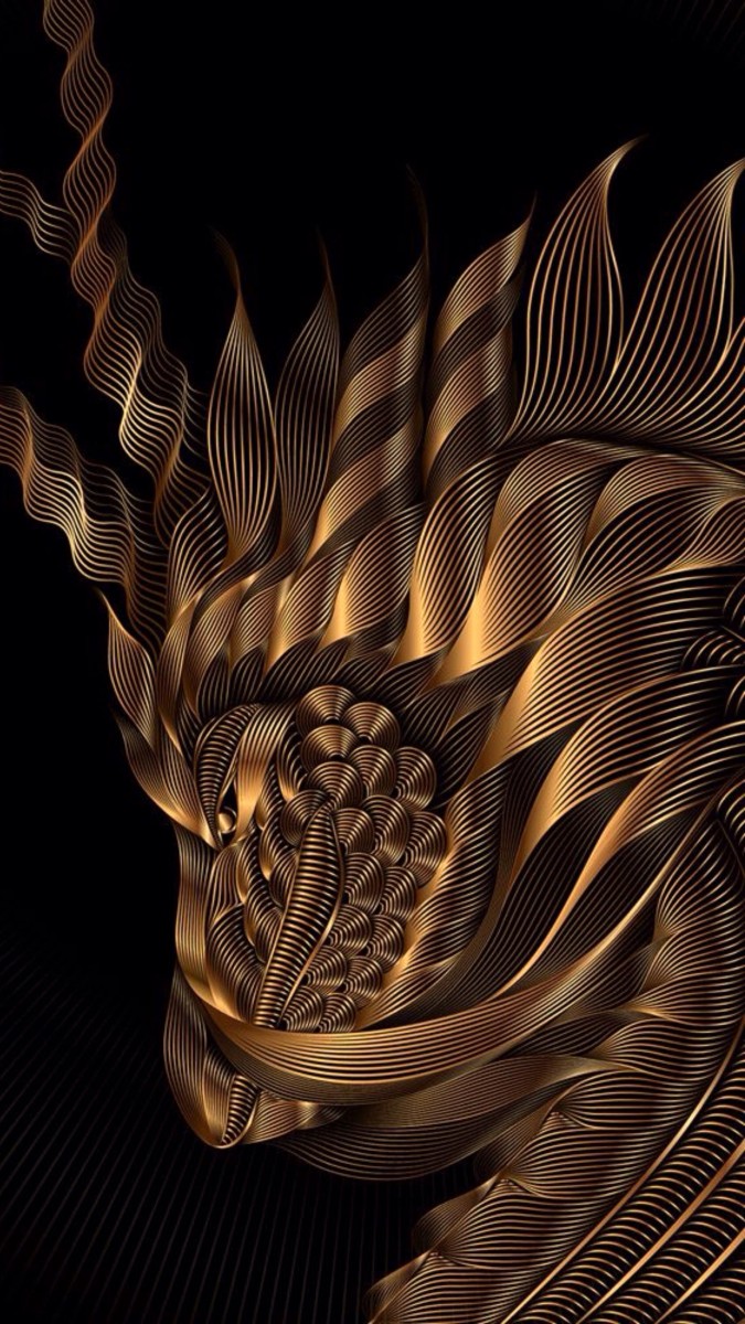
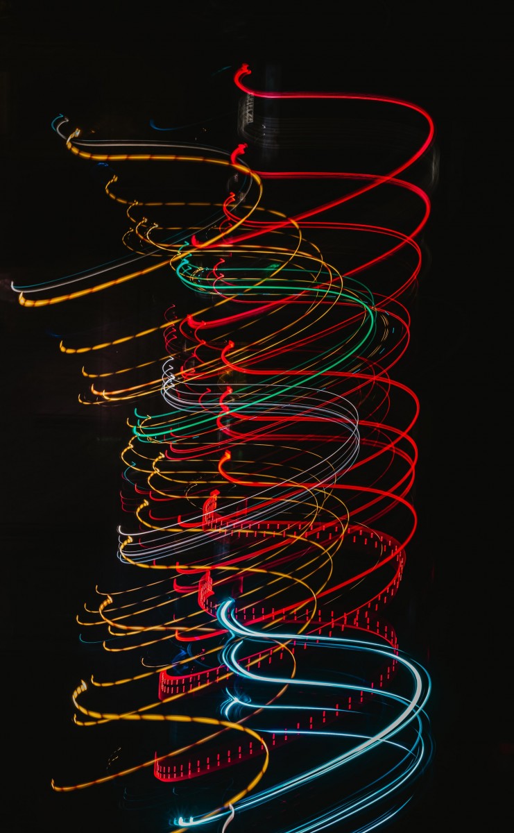
Improvisation
Unlike geometry, improvisational abstraction has no boundaries or rules. It still follows the principles of color hierarchy and composition, but the form is entirely up to the designer’s imagination. You can use ornamental templates, draw freehand lines and shapes, create collages or sliced-up forms. Improvisation is more advanced — it lacks clear structure, so the result reflects the designer’s skill (though that’s a subjective metric). Learn the basics in our online premiere “A Captivating Journey Through Illustration”.
Abstractions can be used as:
The beauty of abstraction is that you get to decide what it looks like. Make it futuristic or retro, childlike or elite. If you master matching the tone and expressing your concept through form, motion, and color — it can become your superpower.

Shapes and Colors
The language of shapes is one of the most important tools in a designer’s arsenal. Straight lines, sharp corners, triangles, and squares appear bold and aggressive — often associated with cutting-edge tech, progress, and precision. Use them for projects in those directions. Rounded forms like ovals and circles feel softer and are better for gentle, emotional content.
The lines themselves also matter. Thin, sharp lines vs. soft, voluminous ones will give totally different impressions from the same shape.
 Perception is also heavily influenced by color. If a brand already has a color palette — stick to it. If not, you’ll need to understand color theory and psychology: not just individual meanings, but also combinations. You’ll also need to master gradients, brightness, and contrast.
Colors can enhance or mute each other. Even the most beautiful shade can become annoying in the wrong combo. Define your core palette and build around it. When choosing colors, think about your target audience. There's no universal solution. Color perception is subjective, so group people where you can — kids’ palettes, youthful tones, feminine and masculine palettes all exist for a reason.
An interesting technique is creating a spontaneous collage from an existing image. Take an illustration or photo that matches the project’s color scheme. Cut out shapes, rearrange them randomly until the original picture is unrecognizable. Then mirror it a few times, add some gradients or extra lines — and your custom abstraction is ready.
Smart arrangement of lines and shapes can create a sense of motion. Even static forms can energize a page. But if you also add light animation — you’ll get fire. Just be careful not to let the abstraction overshadow the content itself.
Want to learn how to create striking abstractions from scratch? Master modern tools and techniques? Dive into vector graphics and branding? Join our online coaching “Graphic Designer: The Vector of the Brand”. Apply now and during the course, you’ll create 4 standout portfolio projects!
 View the course program