
Happy colors / palettes that cause the release of dopamine - let's talk about why this is back in fashion, how it has flowed from other spheres and is used in web design. We'll discuss the specifics of creating happy palettes and the feasibility of using them.
Recently we published an article with a list of current trends in web design, it mentions the new fashion for old solutions - "happy colors" + retro. Today we'd like to explore this topic a little deeper.
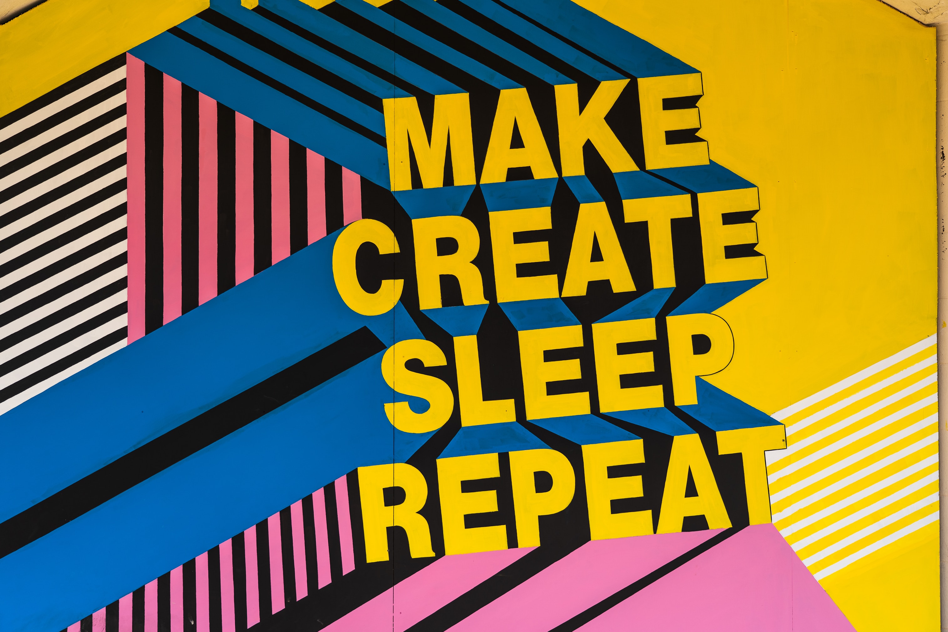
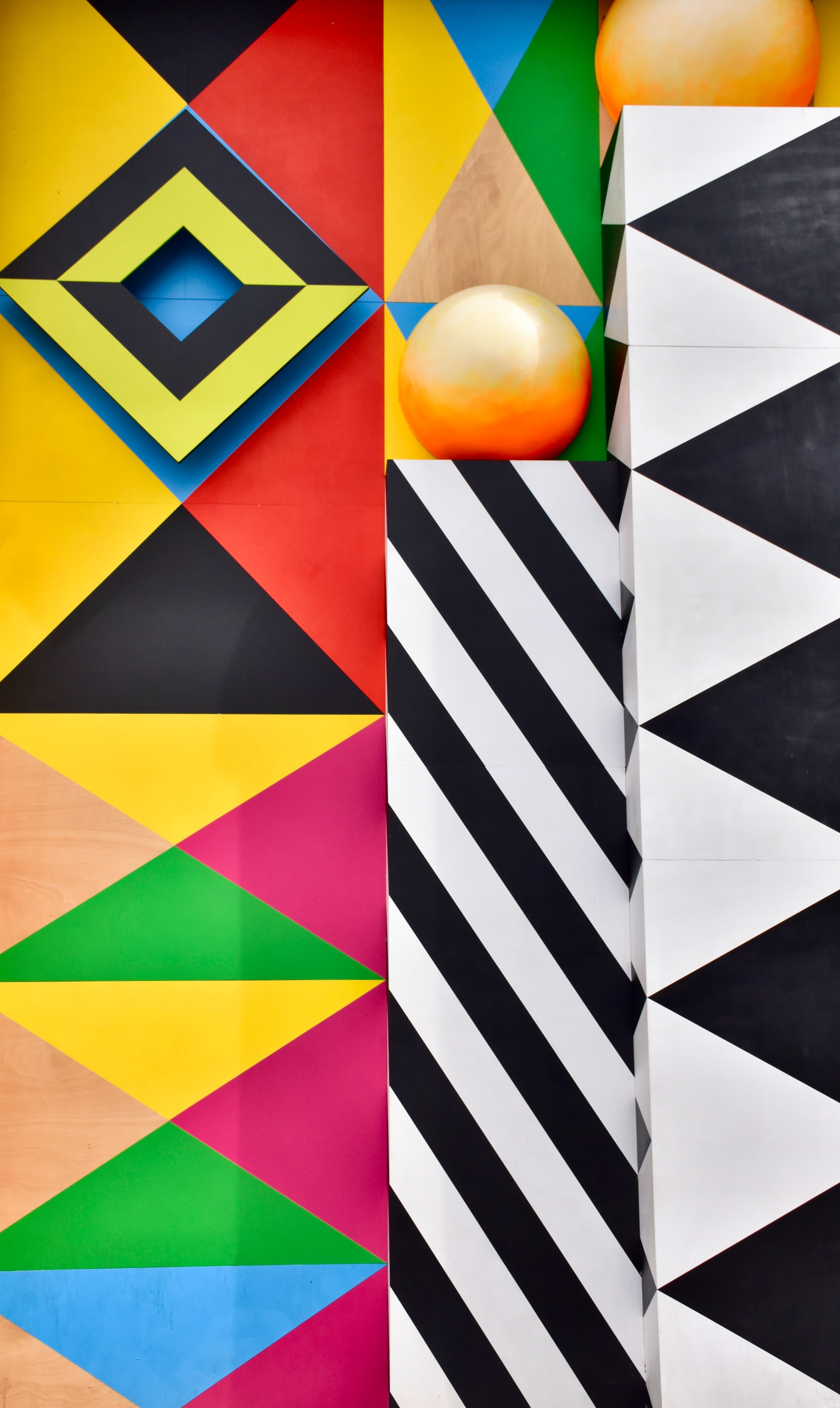
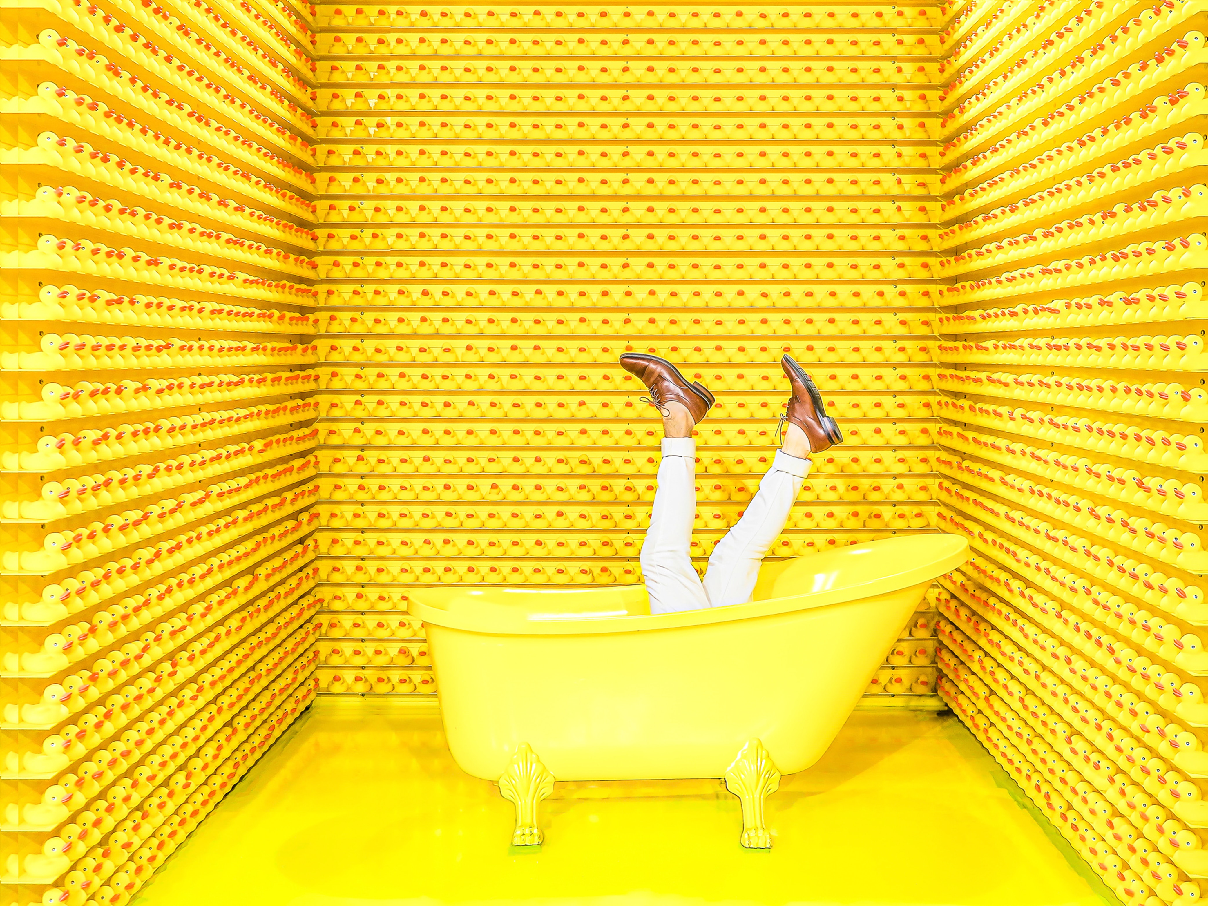
Happy colors are palettes that trigger the release of dopamine. Although it should rather be called a style, because there's more than just color involved in this kind of design. But since warm, soft hues are the foundation, this is what we will call it next. Happy palettes are most often used in combination with the retro style, because in the 70-80's exactly such color schemes were already in fashion, so they look organic.
Why is it fashionable again?
Retro style in general often finds new rounds of popularity, it happens. But in this case, it is the color schemes that dictate fashion. And they don't necessarily fit into the retro style, it can simply be the use of bright warm hues.
Where it all started - Donna Karen, author of fashion books, coined the term "dopamine clothing". This is in her mind something that doesn't fit within the confines of mainstream fashion, clothes that are crazy, bright, crazy. It necessarily has strange combinations of colors and prints. And at the same time unequivocally helps to lift the mood. The trend for this style went viral on social media during the pandemic. And it's logical - when you are all the time in a confined space, you want something bright and joyful. And so soon the trend migrated also to interior design, and then to web design.
Bold and "happy" shades in interface design help to play up brand positioning in a new way. Soft textures, warm tones and overlaying brutal contrasting details look bright.
This is the answer to the ubiquitous minimalism, which has held the palm of superiority in trends for many years. But there is a category of users who are bored with neatness and calmness. Just as there are brands that want to stand out among the restrained competitors.
Where a happy palette comes in handy
Sometimes the whole site is executed in dopamine palettes, it becomes a chip, a part of the image in the media space.
And sometimes such a technique may be appropriate only for certain product lines or promotions, without the need to update your main brand. Complex work is necessary here. Because just making new banners in this style is weird. The fresh style will not echo the old one, the brand will not be recognizable. Therefore, if we are talking about a one-time application of the style, you will have to do a lot of work to launch advertising campaigns, create the appropriate landing page, prepare printed materials.
Often dopamine palettes are used in the design of products with children's and youth direction. But just in this case it is more of a standard than a challenge. Therefore, if you want to introduce something original, it is worth trying such a trick on a product aimed at a different audience. Or for a brand that has not previously departed from the framework of seriousness and restraint. But you can't forget about reputation - don't ruin it with inappropriately chosen colors.
How to create "happy palettes"
In web design, happy palettes are combinations of colors that create a positive and pleasant visual impression. They can be used to convey a certain mood or associated with certain emotions. How to select such palettes:
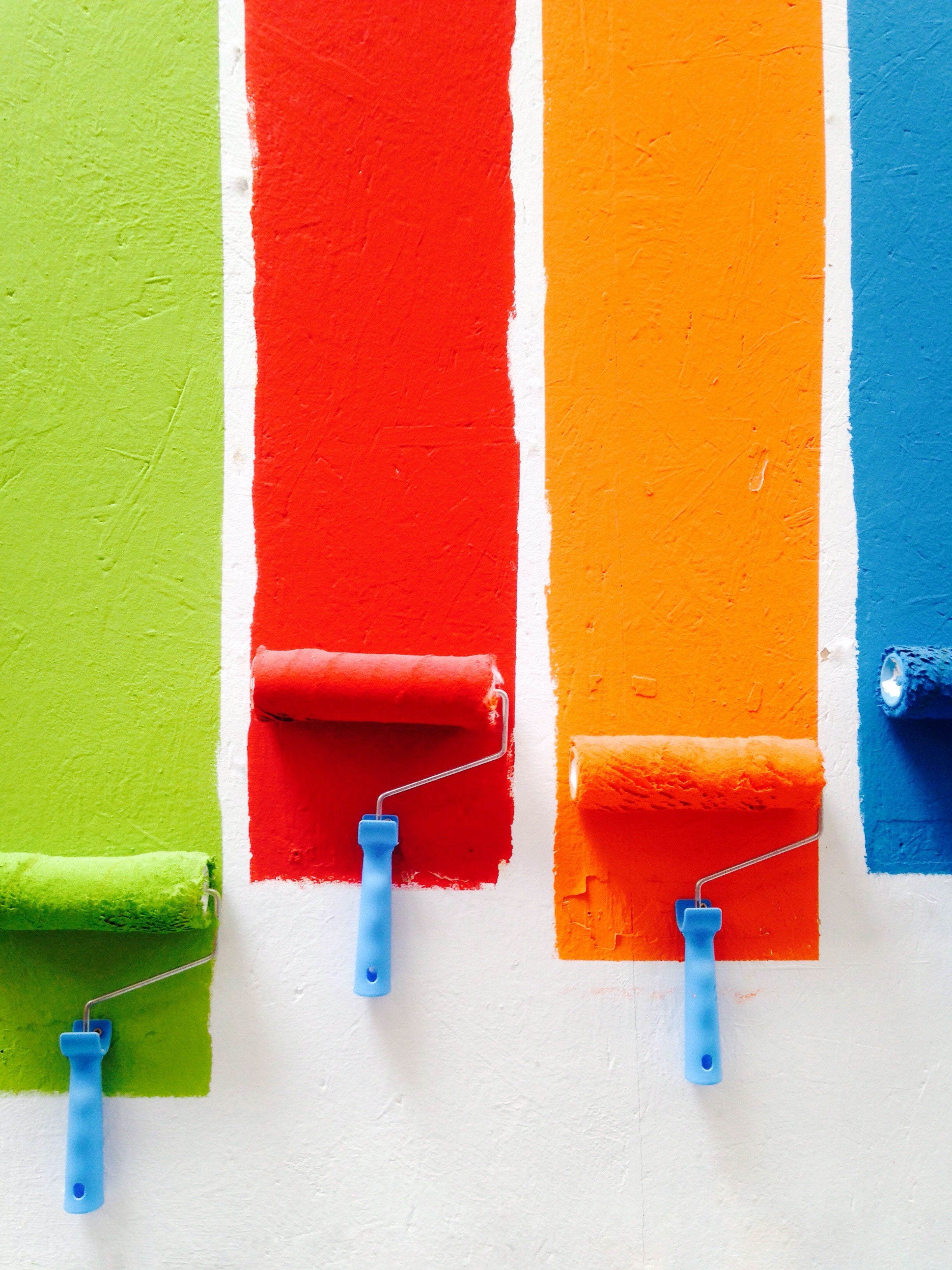
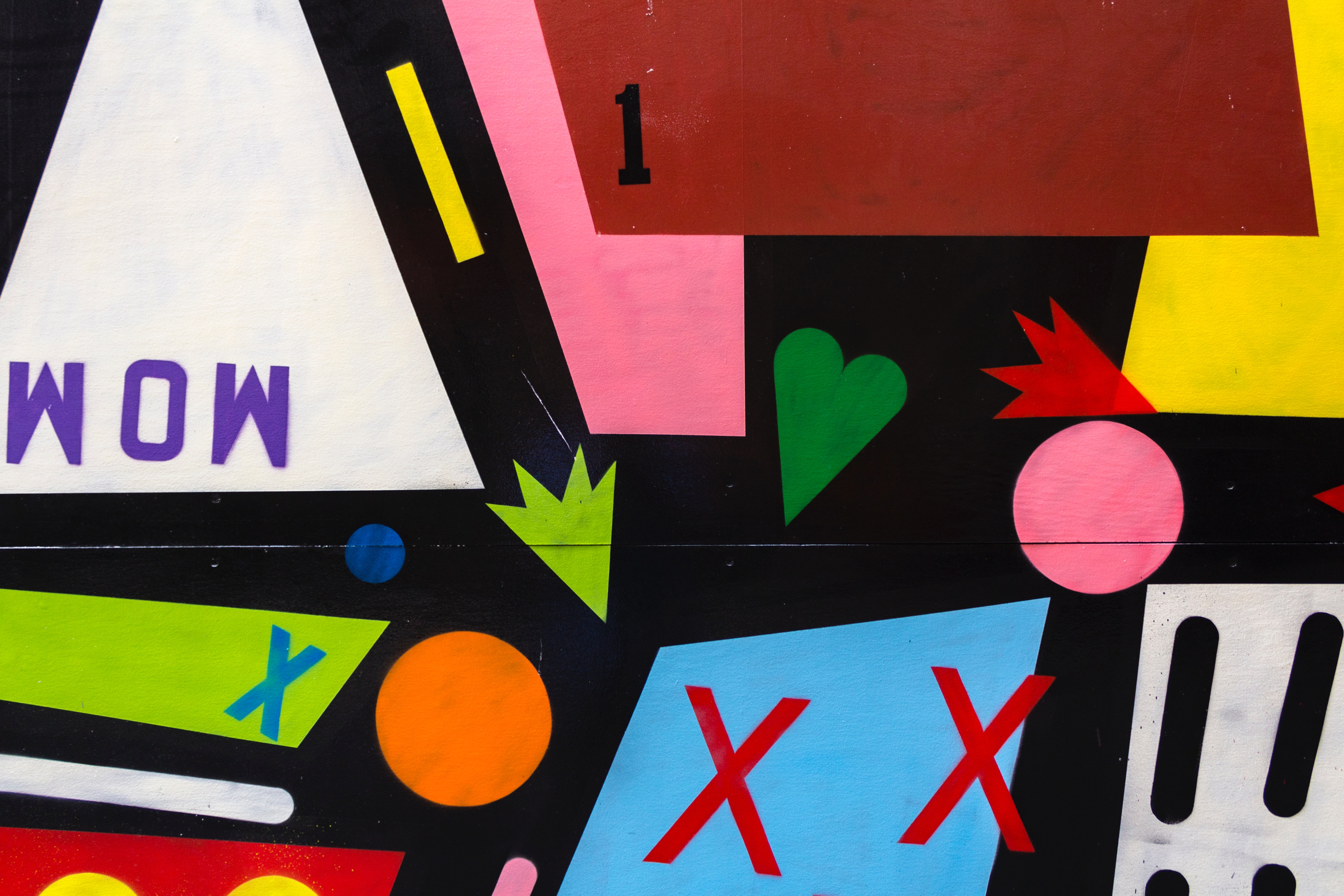
- Bright and cheerful colors: use bright warm hues that are associated with joy and positive emotions. For example, yellow, orange, red, pink and all their warm spectrums.
- Harmonious combinations: choose colors that harmonize with each other. These can be similar colors in the color wheel or complimentary colors that create contrast. Most often for a "happy" palette take two warm colors at once: pink and yellow, sand and orange, etc.
- Pastel shades: pastel colors can give the design softness and tenderness, and it is also an opportunity to take a lot of different colors, but avoid screaming design.
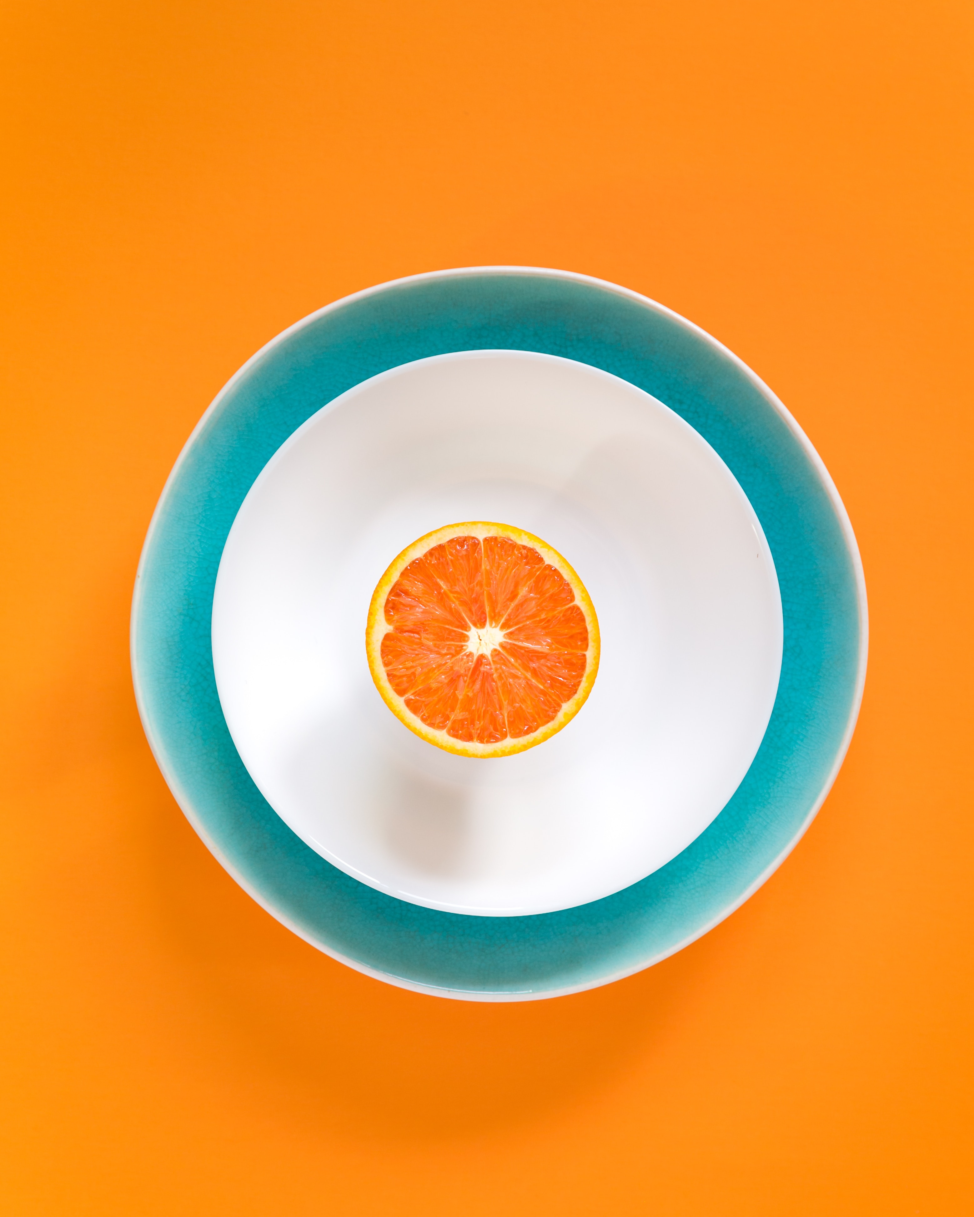
- Look to nature: sometimes inspiration for happy colors can be found in nature. Flowers and plants (especially tropical ones), sunsets, exotic fruits, fish and corals - their eye-catching colors can be a great starting point.
- User testing: test the color palette with your target audience to make sure the design evokes the right emotions.
Palette matching can be done using a number of services:
You can also always ask the GPT chat room for help. Here are the results of a cursory query:
Sun Bunny:
Bright Yellow (#FFD700)
Orange-Red (#FF4500)
Cream (#FFFACD)
Rainbow 70's:
Mint Green (#98FB98)
Lilac (#8A2BE2)
Warm Orange (#FFA500)
Lemon Yellow (#FFFF44F)
Beach Memories:
Silver Blue (#B0C4DE)
Coral (#FF6F61)
Sandy (#FFE4C4)
Spring Cocktail:
Bright Pink (#FF007F)
Bright Green (#00FF00)
Silver Gray (#C0C0C0C0)
Pop Art Peach:
Peach (#FFDAB9)
Bright Yellow (#FFFFFF00)
Rich Pink (#FF69B4)
Funky Fuchsia:
Fuchsia (#FFFF00FF)
Bright Blue (#0000FF)
Yellow (#FFFFFF00)
Orange (#FFA500)
Summer Fun:
Warm Orange (#FFD700)
Bright Blue (#00BFFF)
Mint Green (#98FB98)
Fun 50s:
Bright red (#FF0000)
Warm Yellow (#FFD700)
Blue (#87CEEB)
White (#FFFFFFFFFF)
You can think of a complex multi-level chat request in which you mention the direction of the project, corporate colors or client's wishes, add your own variants for examples. This way you can get a list of good options, which you will tweak to your design taste.
A couple of general tips:
- Try to create a balance, avoiding color overload, choose the right shades for a particular project. Observe moderation - despite the seeming craziness of such designs, they are actually very thoughtful. Use warm colors in moderation to avoid visual overload. Balance them with more neutral shades or white space. It's harder to make a cool, bright design than a minimalist one.
- Make sure the colors you choose provide good contrast and readability of the content. Warm colors can be intense, so it's important to choose the font and background so that the text is easy to read.
- Consider associations and target audience. For example, orange can be associated with energy and fun, while red can be associated with passion and dynamism. Again, there are different stable associations for people from different countries, religions and nationalities. To some, red is a foot color, while to others it's the color of celebration. Take cultural and regional sensitivities into account - this was detailed in a separate piece.
- Add clear patterns - zigzags, curls, polka dots and something similar will perfectly complement the picture, especially if you take them in black and white colors. Such a move will help to add that very note of madness and fun, while playing up the retro motifs.
- Don't forget about hierarchy - when everything is bright and flashy, it's easy to lose the feel of the main colors. Remember that design should push you towards your goal, not distract you from it. So your buttons and transitions are bound to stand out. In this case, you can even play them up with additional graphics in the form of arrows and other emphasizing pointers.
Psychology of color in design
The psychology of color plays an important role in the perception of the website. Warm palettes can create a friendly and welcoming atmosphere, making them an ideal choice for projects that aim to establish a warm relationship with users.
To create a color scheme that truly works, it's important to know the basics. And choose a palette by understanding how each element individually and in combination with others will affect the user.
Retro elements in warm palettes are used for added effect, to give some nostalgia and uniqueness. Emphasized golden shades and soft transitions will create an atmosphere of vintage coziness.
Such palettes in web design are not only a stylish choice, but also a powerful tool that can create coziness, joy and cause a dopamine release in users. Experiment with colors, create atmosphere and make your projects unique with happy colors.
If you're not quite versed in the topic of color and its use, you know where to learn it. Sign up for the online course "Graphic Designer: Brand Vector". There will be a lot of useful stuff there, you won't regret it.