
How to choose colors for a project, find successful combinations, not to repeat yourself, not to repeat your competitors, to find inspiration. And a selection of 20 online services that can make this task easier.
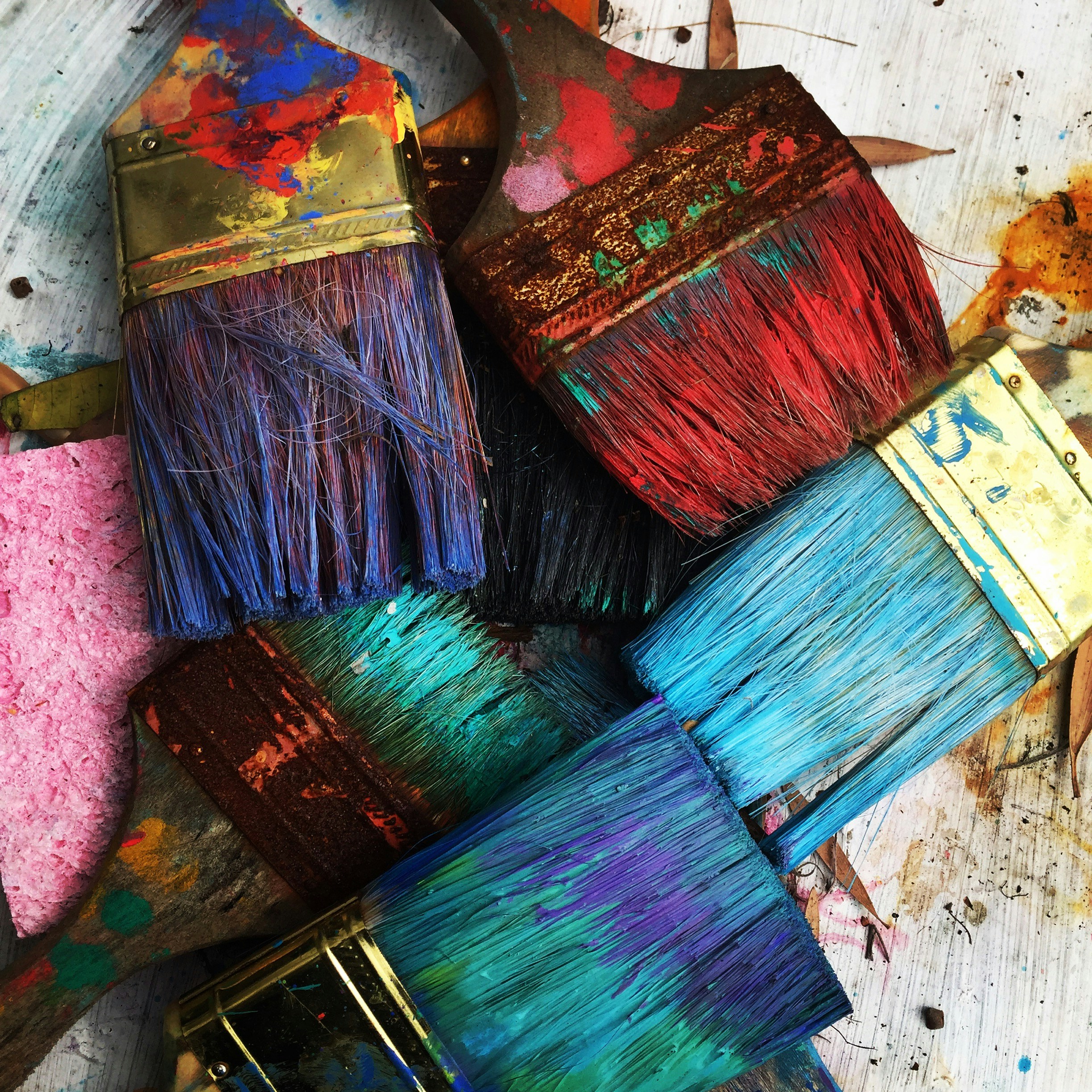
Color is a designer's tool. It's your message to users. A way to express an idea, to convey the right mood, to emphasize the positioning of the product, to help the customer achieve their goals. And with that, there is still the aspect of aesthetics.
There's a lot to consider. And at the same time somehow try to make the project original. Which is not so easy when there are already certain industry standards. You can create a good solution for a product, choose the right contrasts, fit in with the mood, but get something similar to an already known brand. Because the coolest combinations have already been somewhere. But everything is not so terrible - you just need to know the rules of creating successful variants and maybe resort to modern online services for inspiration.

Ideal combinations
In coloristics have long highlighted several options for successful combinations. Here, you just need to understand the principle and substitute your shade options for it. To do this, take the Itten circle and experiment.
Here are the classic options for composing a palette:
- Monochromatic - one color, but three of its shades that stand next to each other in the circle;
- Analogous - take three colors that stand next to each other;
- Complementary - two colors that are on opposite sides of the circle;
- Triadic - divide the circle by the Mercedes sign and take three colors equidistant from each other;
- Split-triadic - the first color + the second through one from it + one opposite on the circle;
- Tetradic - two adjacent colors + two opposite to them;
- Quadratic - divide the circle by 4 and take all 4 equidistant colors.
From this base are born different combinations, extended versions and refinements. But enough to start and basic combinations.
Important: you need to use trends (for example, Pantone color of the year), but if it concerns short-term projects. When you create a website or brandbook that will be used years in a row - do something universal. Otherwise, an outdated trend will spoil the impression of the brand.
Contrasts
You may not be an artist, color selection is a matter of a competent approach and clear calculation. For example, the "60-30-10" rule always works:
- 60% - the base color, which will prevail;
- 30% - auxiliary color, often of a similar shade to the main one;
- 10% - a contrasting color that will shade the main one.
And that's enough to start with. Additional colors may be needed if the project involves complex navigation. And that, these colors can be just darker or lighter variations of the main one.
In any case, you need to make contrast. At least, it is necessary to ensure accessibility - visually impaired people need to look at sites too. And in general, it's just plain pretty. Contrast options:
- Pale + saturated.
- Warm + cool.
- Contrast on the Itten circle.
- Black and white complements.
Remember the dark and light themes on smartphones! Your colors should look equally good either way. Nothing should be lost, improperly shaded, or cut the eye. Elaboration requires mindfulness. Don't miss this point when you're working on adaptive design.

Examples of the real world
Mankind has come up with a lot of things, but nature has done more. And a ready-made palette can be taken from the National Geographic website. Just browse through wildlife photos and try these references on your project. Coral reef, fjords, tropics, savannah, exotic landscapes, Asian markets - everything is mottled with colors that look good in sum. Just pick up and apply.

Palette matching services
There are a myriad of convenient palette matching platforms online. Just set the tone, combine, try things out, ask artificial intelligence to help. And take the result to your project.
1. Paletton.com
6. Hexcolor.co
9. Khroma.co
10. Mycolor.space
12. Material.io
14. Coolors.co
15. Bjango.com
16. Coleure.com
17. Colorhunt.co
18. Colorzilla.com
19. Colllor.com
20. Colormind.io
Create, invent, learn
You can write a lot about creating different successful color combinations, the psychology of color, the use of shades in web design and creativity - not just articles, but entire dissertations. But first, you need to know the base. Sign up for the online course "Graphic Designer: Brand Vector" There's a lot of important information about color, identity, graphics, composition, and more.