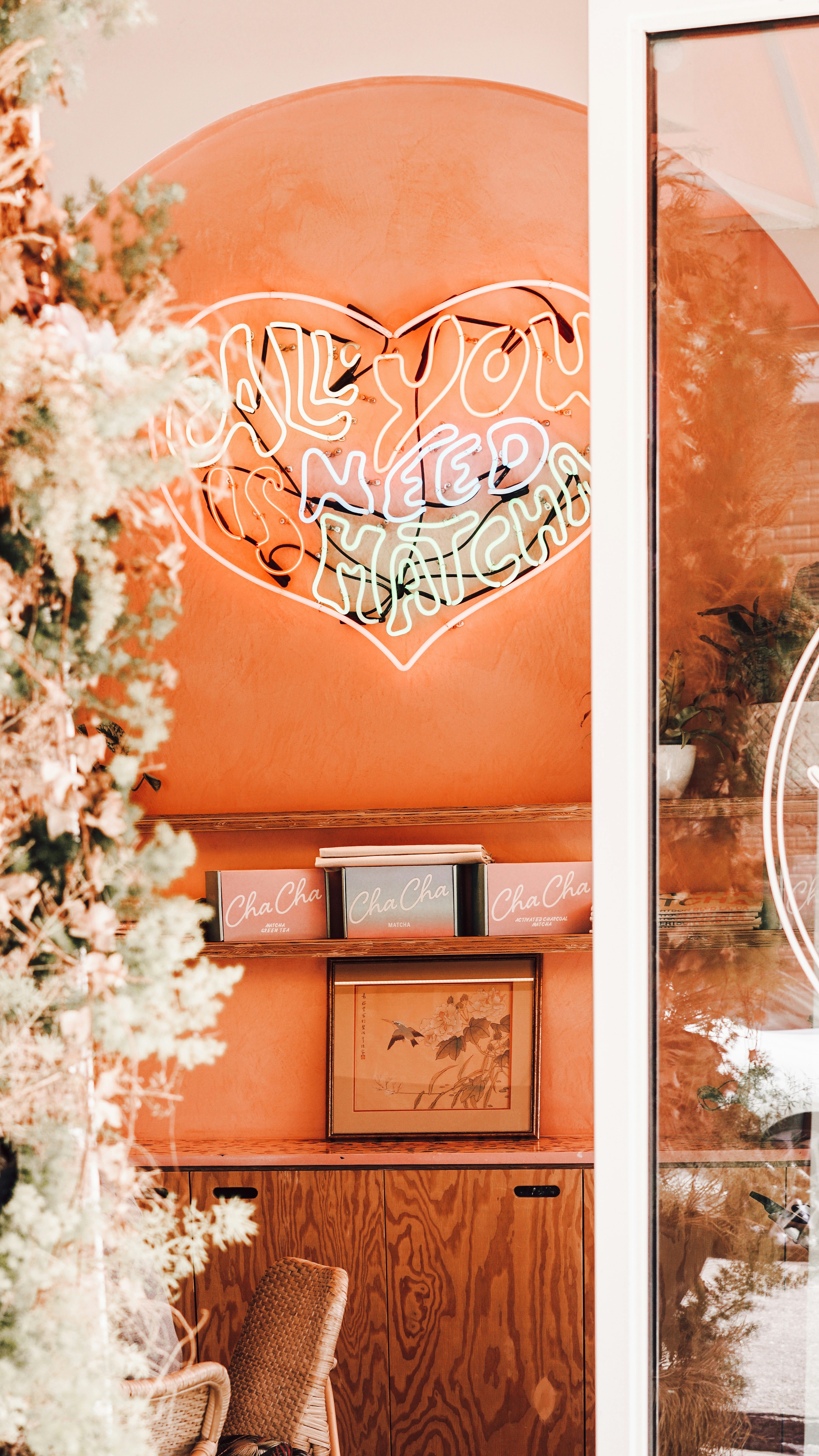
The Pantone Color Institute has traditionally presented the color of the year 2024 - it's Peach Fuzz numbered 13-1023 in their proprietary layout. What does this mean for you and the marketing? Let's now discuss what this event is all about, how you can benefit from it, and in general the history and significance of this phenomenon for the design world.
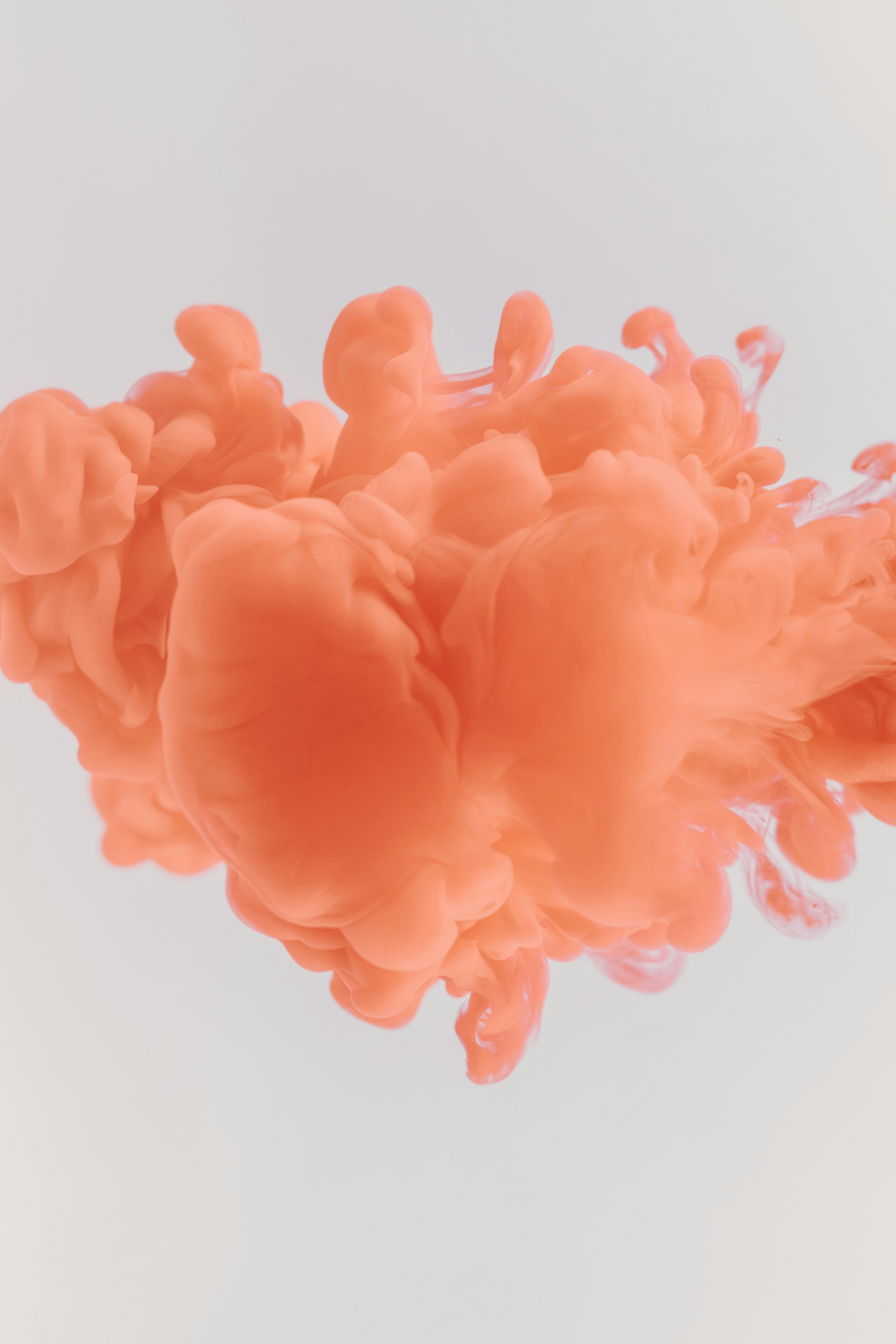
The color of 2024 according to the Pantone Color Institute: 13-1023 Peach Fuzz. A soft pastel "peach fuzz." According to the company representatives, this shade should symbolize healing, empathy, humanity and mutual support.
Pantone Executive Director Leatrice Eisman said that this color is the most appropriate for this period of history. In difficult times, humanity requires warmth and support, which is why such a calming, warm and soft color was chosen. According to her, the very name of the hue conveys tactile softness. Velvet peach is a symbol of caring for ourselves and each other, it should evoke associations with soft dawn, a fluffy blanket and marabou feathers.
Many people live quietly and have not even heard about the choice of the color of the year, although this event has already become part of mass world culture. But we as representatives of the design sphere cannot miss such a phenomenon.
At first glance, the choice of color of the year does not affect our lives in any way. But if you pay attention, you will immediately notice how this peach color flashes here and there.
What this information tells us
Pantone has been choosing the color of the year since 1999. And for more than two decades, this event has had a strong influence on different industries. Such an event in the world of design covers both fast fashion and industrial spheres. Manufacturers release products in a trendy hue, advertising is mottled with trendy color, the event touches interior design, cosmetics brands, printing, makeup trends.
The relevance of the color of the year is, of course, a temporary phenomenon. And the boom on the hue lasts not even a year, but much less. Therefore, many designers express skepticism about the fashionable color. But to be honest - it is not a question of creating masterpieces for centuries. It's a matter of drawing attention to urgent problems, to present here and now. And this is not academic art, but marketing.
Why adopt the color of the year? Not because Pantone dictates fashion. In fact, the experts at the Color Institute do not invent new things, but observe trends and highlight a shade that has already become a trend. Therefore, you should not ignore their decision - a whole team of professionals has highlighted the trends and it is worth taking advantage of it.
How the color of the year is chosen
We already know that each person has a different subjective perception of color. In addition, there are still different color rendering and monitor settings. So it's hard to argue that creating one standard color palette is a great idea. And Pantone made their legendary fan of shades with numbers. Now you can just specify a clear name and shade number and everyone will understand each other.
The system works beautifully. You as a designer can create brandbooks and corporate identity by specifying key colors in the document. Everything will be created according to them - from souvenirs to painting the facades of departments. And thanks to a clear indication of color, there are no problems with sameness. All this is the merit of Pantone.
As part of the work on the systematization of colors, the Institute of Color itself was founded. Specialists not only structure the familiar tones, but also create new ones, collect palettes, research the market. And the analysis of trends in different cultural layers and allows you to highlight trends and determine the color of the year.

A dozen qualified professionals track events in the world of fashion, cinema, fashion design, any cultural and social manifestations.
And starting from spring and up to December, they collect their variants of shades, finally choosing the main color of the next year. This color is the sum of trends, moods, general tendencies. The reputation of the Pantone Institute is undeniable in the design community. Therefore, the confirmation of an already fashionable color makes it even more in demand.
Its color of the year is highlighted not only by Pantone - it is done by the agency WSGN, paint brands Dulux and Tikkurila. But only Pantone is on the rumor. Take note, by the way, it's a good example of a developed brand that started as a paint manufacturer and now dictates fashion in the design world.
And you could let the color of the year choice pass you by, but you'd be foolish not to take advantage of such a great tip. People put a ton of effort, money and time into this research for a reason.
How you can use it
Designers have their own view of the situation. We know that doing "trendy" isn't always appropriate. But using a trend can be done smartly. At the very least, the color of the year is a good infodump. It's worth picking up the wave and playing on the trend. Consumers tend to trust big-name influencers. Therefore, products in a trendy color are bought better.
You can make banners in trendy Peach Fuzz.
You can put together a selection of products in this shade for a promotional carousel.
You can use the event as an occasion for a new advertising campaign.
It's clear that peach doesn't fit everywhere. But users are already aware that it's a trend. So you need to take advantage of it.
Using the color of the year in their products helps to "parasitize" on the fame of Pantone. To get a taste of their fame. And at the same time, it shows that your brand is keeping up to date, which is a good reputational move.
Use trends wisely. It is very convenient for "quick" products - seasonal advertising, promotions of the month, limited edition products. But remember that relevance will quickly fade - often this fashion holds for the first six months. Therefore, it's important to catch up with the action and not get caught up in long-term solutions.
What to combine Peach Fuzz with
The trending color of the current year has a pastel shade of peach, which gives great scope for harmonious and pleasing to the eye combinations in web design. It fits perfectly into the concept of "happy palette" - we wrote about it recently, read a separate article, the material from it will come in handy when creating new projects.
Here are some working variations of Peach Fuzz combinations:
- Combination with gray #A7A7A7A7
- Accent with dark blue #001F3F
- Delicate shades with mint #B2E0D9
- Classic combination with white #FFFFFFFF
- Combination with dark green #20603D
- Harmony with pastel orange #FFDAB9
Why does Pantone itself need this?
Pantone's main business is producing palettes, developing shades and catalogs. And that doesn't make them unique, because many companies do that. But because of its popularization of the color of the year, the brand is well PR'd. Thanks to the prominence of the color of the year selection event, Pantone has a ton of commercial collaborations. And it also makes money on related products.
Designers collect color of the year cups and other branded trivia in the trending hue that comes out each year.
Trending colors of the past years
A selection of a few shades that have been chosen as the color of the year. You can trace some trends and patterns. And just use these shades - some of them are still trendy.
2018: 18-3838 Ultra Violet
Pantone chose this color as a symbol of space, creativity, intuition and inspiration. Relevant enough shade even now, it fits well into the products of the themes of innovation and information technology, so it has not left the arena of web design.
2019: 16-1546 Living Coral
The color was chosen on the wave of eco-activism and the need to preserve the coral reef and in general look closely at the relationship of mankind with nature. It has been very well applied to fashion products from the "feminine" sphere, in clothing and cosmetics collections.
2020: 19-4052 Classic Blue
When choosing this color Pantone talked about the calmness of blue, stability and purity. Here they missed, of course - 2020 did not turn out to be calm and stable at all.
2021 has two colors at once: 13-0647 Illuminating Yellow and 17-5104 Ultimate Gray
A beautiful combination. A rare case where two colors are chosen at once. Yellow and gray look good not only in trend pieces, but in general. Can be safely applied even today.
2022: 17-3938 Very Peri
This color can still be found on the counters. What makes it special is that it is the first shade in the history of color selection to be digitally created directly for an event. In its symbolism, it stands for curiosity, the power to overcome challenges and the courage of the discoverer.
2023: 18-1750 Viva Magenta
The bright crimson hue was a blast, but it doesn't look like it stayed on trend. As we can see, the world is more in favor of something pastel, pleasant and calm.
Conclusion
Don't miss the opportunity to use the color of the year in your projects. But be careful with it in long-term projects - fashion can pass quickly.
Therefore, take on the job taking into account the positioning of the product and the peculiarities of the target audience. Peach Fuzz can be a good solution, it is calm and quite flexible. It can be combined in different variations, evoking warm emotions in the user.
It is important to delve into color theory. We can help you with this in the online course "Graphic Designer: Brand Vector". Come to the training and make stylish trendy works! We will work on your portfolio as part of the course.

