We’ve already touched on the topic of website prototyping in one article, and now we’ll take a closer look at the nuances of creating a prototype specifically for a landing page.
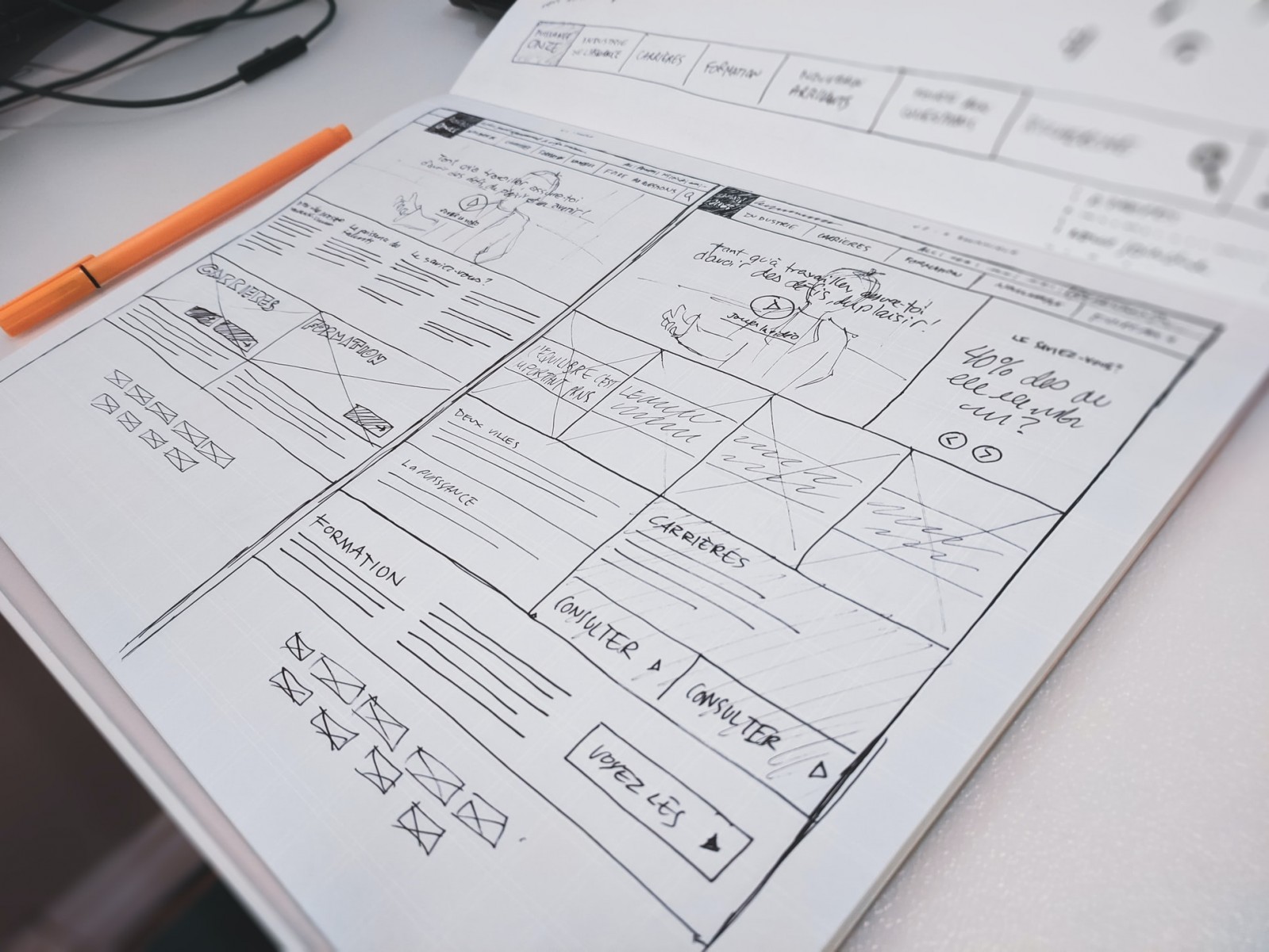
Landing page prototypes are called mockups. A mockup is essentially a full landing page, just without the design—only the structure and essence.
A landing page has specific goals, and achieving them mainly depends on the right structure and messaging. That’s why design, while important, is secondary. After all, you might have the most beautiful wallpaper and furniture in the world, but it’s all pointless if there’s no front door.

Preparation Stages
It’s already clear that creating a prototype isn’t just about sketching some boxes by hand. But it gets more serious—there are key steps you need to follow before diving into building a prototype. Here’s the process:
Some experts switch the first two steps. Because if you analyze competitors and the niche first, it’s easier to ask the right questions and identify key selling points. Competitor research is essential: at the very least to stay competitive, ideally to outperform the market.

Meaning
The main goal in creating a prototype is to define the core messages and arrange them into blocks in the right order. But how do you find those messages?
There are two main approaches. The first is to use a standard landing page structure and adapt the client’s info to it. Choose a template, plug in the offers, benefits, and calls-to-action—and voilà. But this method results in a weak, generic page that won’t perform or make your portfolio proud.
The second approach is building the structure based on a brief. You ask your client tons of questions about their product. Ideally in conversation, not just a form—this brings out hidden angles and insights.
Record all the answers—even the little things. Sometimes a tiny detail becomes the key to a unique selling proposition or a great addition to a feature list.
Then you build a meaning map—highlighting key thoughts, differences from competitors, advantages, and potential CTAs. Group the ideas, and each group becomes a separate block. This approach lets you create a truly unique, high-performing site.

Texts
Often mockups are too sketchy—just boxes labeled “text,” “headline,” “USP.” That’s fine for a draft, but not for actual work. You should write out all the copy—every single label and note.
First, it shows how the content will really look—line lengths, font size, layout. Second, the meaning comes from the content, not just the structure. And it’s much easier to choose visuals and backgrounds when you know what kind of copy will go where.
The copy itself? Punchy, concise, snappy. Landing pages aren’t for long reads. Headlines and messages should be instantly grasped. Lists with icons, infographics, and short descriptions work best here.

Call to Action
A landing page must have a clear goal—usually collecting user contact info. So never leave it without a CTA and a form. The user sees your offer, likes it, is ready to act—what now? Don’t make them hunt for your contact info. Add a button right away.
Ideally, place a CTA on the first screen, in the middle, and at the bottom of the page. Especially on long pages, CTAs should appear more than once. A good CTA doesn’t ask the visitor to pay upfront—better to invite them to sign up, download, or leave a request. Asking for a purchase right away can scare them off (though this depends on your niche).

Should It Look Pretty?
Ideally, a marketer should handle the mockup—not a designer. But they need at least basic knowledge of design and layout so the designer can later translate the mockup into a website.
You don’t need to focus on colors or fonts at this stage. Just give a general direction—light or dark background, highlight important sections with color if it helps convey meaning.
But aesthetics do matter. The mockup is what the client sees first, and it shapes their impression. They might not fully understand that the final design will look better—they see what’s already on screen. So the content comes first, but clean blocks, proper spacing, readable fonts, and a balanced layout matter too. “How to Increase Your Chances of Getting Work Approved” is a great online session for both design and mockup presentation.
To keep things clean, avoid using Word or (god forbid) Paint. Use proper tools that let you draw and align elements precisely:
You can also use Figma or Corel if you’re skilled with them.
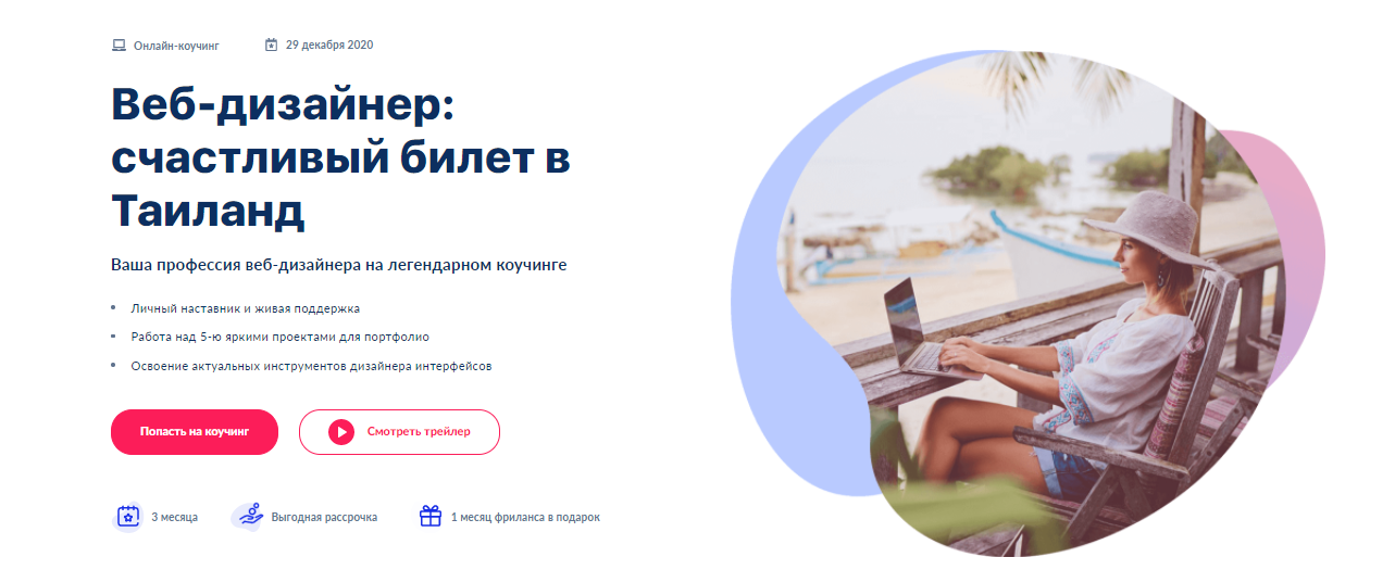
You don’t need much to create a prototype—there are free tools and services. But to build a quality prototype that turns into a successful landing page, you need much more: knowledge of marketing, web design, and copywriting. If that interests you, join our online coaching program “Web Designer: Your Ticket to Thailand”.