Fashion trends from the 90s are making a comeback. Slightly modified, yet still recognizable. Those who held onto their old platform sneakers and Adidas tracksuits can now retrieve them from the back of their closets.
This trend has also migrated into the world of web design, though it's the 2000s that are in vogue. After all, the 90s didn't boast the wild abundance of GIFs. Glittery rose e-cards, mismatched color schemes, element overload, and italic fonts—what once was considered tacky is now a popular aesthetic.
Want to be on-trend? Ready to attract your own haters? Aiming for the fame of Artemy Lebedev? Try creating a website in this style. Or at least a promotional banner. But it's not as easy as it seems—to design something "bad," you first need to understand how to do it well. This requires practice, a keen eye, artistic taste, and knowledge of web design fundamentals. Of course, you can't learn this in a day. Start with the online premiere "Secrets of the First Screen: Creating 5 Versions".
Why is this appealing?
Part of the audience enjoys nostalgia, finding such a quirky look endearing. Younger viewers see this chaotic mess as mysterious and uniquely retro. In every case, this design grabs attention.
Among hundreds of perfect websites and thousands of similar banners, you stop noticing how good they are. Everything is harmonious, and using such resources is convenient and pleasant. Then, suddenly, a site appears that's worthy of the Mad Hatter's madness. Naturally, you'll at least notice it. You're almost certain to visit it. You'll try interacting with its elements. And just like that, you're hooked.
Conversion rates on such sites are always excellent—if done correctly. This means that despite the apparent extravagance, you shouldn't forget the website's main goal, a proper grid, and well-placed accents.

The experience of the 2000s and the incredible charisma of that era set the trends—this style is mainly appreciated by digital professionals who understand the nuances. An average user, unfamiliar with the virtual world, might think it's just ugly. Even worse, they might think it's okay. But an IT specialist will definitely appreciate it. Therefore, it's important to understand your target audience or find it through creative design—believe me, such work will look original in your portfolio.
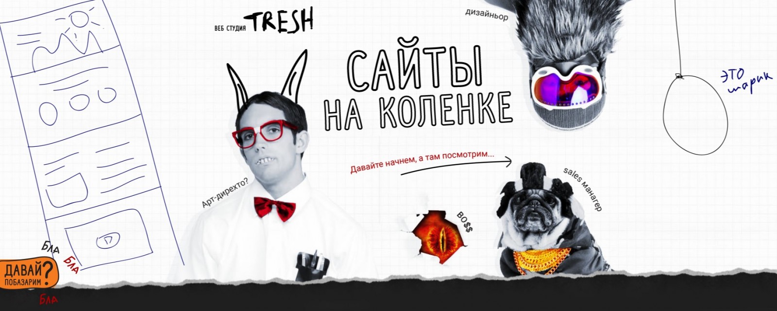
Image sourced from freshweb.agency/tresh
No secrets—just do it
How to recreate the 2000s trash aesthetic in your own project. Here are some tips for designing a layout reminiscent of Odnoklassniki:
Large captions should be the star of the show. Ideally, find something akin to "WordArt Objects." Google it if you're from a generation that missed out on floppy disks. The main message should be easily readable—that's the key condition. Classics include italics, Comic Sans, and large outline fonts. You can add secondary captions that are glittering or neon. All additional fonts should be smaller than the main one; even though we're creating a trashy design, typographic rules and hierarchy must still be followed.
Aim for a rough look—no pastel or gentle shades. Contrasts are crucial. Only hardcore, no half-tones. Alternatively, you can use shades of gray with a single bright accent, often red. This choice makes it harder to create an unpredictable effect—it's a choice for professionals.
Today, we often use asymmetry, but executed with precise balance. In your wild project, you can use symmetry—it appears more outdated. It's also a good way to provide users with orientation amidst the chaos—symmetrical placement makes it obvious that if there's an element on one side, there will be one on the other as well.
You'll have many different details, which means you need to reduce the amount of information. If you don't, users will simply get lost among the plethora of buttons, captions, and popping-up kittens. Despite the apparent overload, there shouldn't be clutter or non-functional junk. Keep it hardcore, but don't overdo it—you can't ruin the idea.
This is a very modern trend. But even in strange designs with retro elements, it has its place. Movement must bring your design to life. Let a rose, cut out from an old postcard, move slightly; highlight elements with shimmering glitter; surprise visitors with a popping-up Chuck Norris when they click a button.
Imagine you've printed different website elements separately on a printer, cut them out with children's scissors, and made a collage. That's roughly how your final product should look. It's not devoid of style and composition, but it's clear that spacing wasn't measured to the pixel, and colors were chosen by eye.
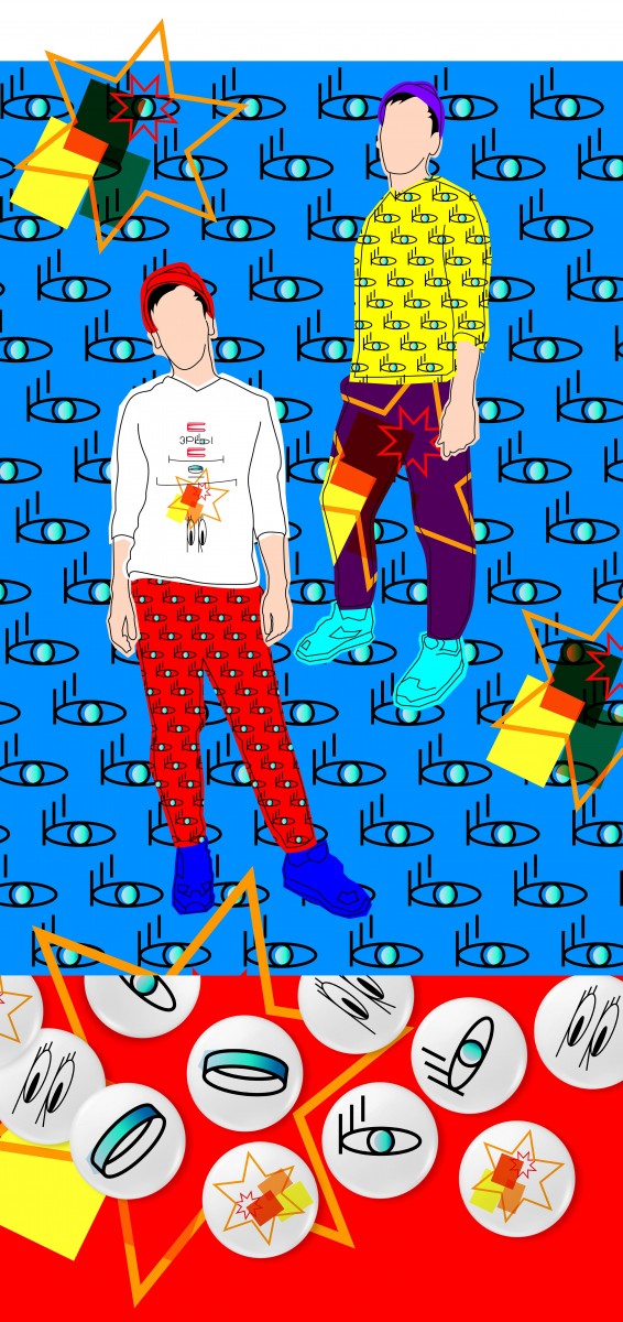
Image sourced from www.artlebedev.ru
Be bold
Mixing retro and modern features is always a winning option if it's appropriate for the product. Attractive typography can turn nostalgia into a marketing tool. Rhinestones in a coffee cup became a joke that got out of hand. When we see hundreds of websites daily and grasp their message in an instant, standing out is tough. But then comes unprecedented boldness—deliberately creating top-tier trash.
You can create shock value even on a shoestring budget if you know what you want to achieve. And here, you can't do without custom graphics, because using established images and concepts might be illegal, and simply downloading all this from a stock site is unrealistic. Where can you learn this?
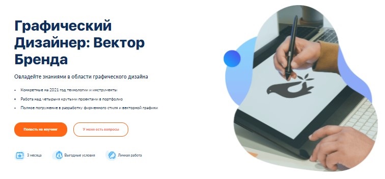
Join our online intensive course "Graphic Designer: Brand Vector". You'll dive into vector graphics and learn what a brand identity is and how to develop it. As a bonus, during the course, you'll create four cool portfolio pieces—perfect for beginners. Join now!