12 tips to make your design more usable and efficient. Use it when starting a project and at completion, to check it off. And everything will be beautiful.
Making design decisions can be a daunting task. But there are very simple solutions that don't require the use of special knowledge - you just need to follow the rules and immediately everything will become a little easier.
A system of logical rules helps to make design decisions not intuitively, but reasonably. This not only helps to make the design successful, but also simplifies the work. It doesn't require inspiration, just do it. Don't move elements from place to place without purpose, just do.
This is a checklist to help you do just that.
1. Do the grouping of blocks
Initially, when building a structure, it's important to break down information into logical pieces and group them into blocks. First and foremost is proper sequencing. The thought should unfold clearly and gradually.
You break the information into small groups, which you combine into blocks with a common design. This will help to structure and organize the interface beautifully and efficiently. Consequently, the visitor better perceives the data and goes through the funnel smoothly and as intended. Here are ways to group related elements:
- Make a common container
- Place close, indented blocks away from other blocks
- Unify elements with a common design
- Make elements align on a continuous line
A container is the simplest and most popular solution, but it's worth working off the type of content and applying different grouping options if it helps simplify the design.
Use icons. If you can make a listing with icons rather than text, that's great. If you can group similarly styled elements into a block with icons, do it. We had a great article about this, and there are also links to 10 free resources with cool icon sets.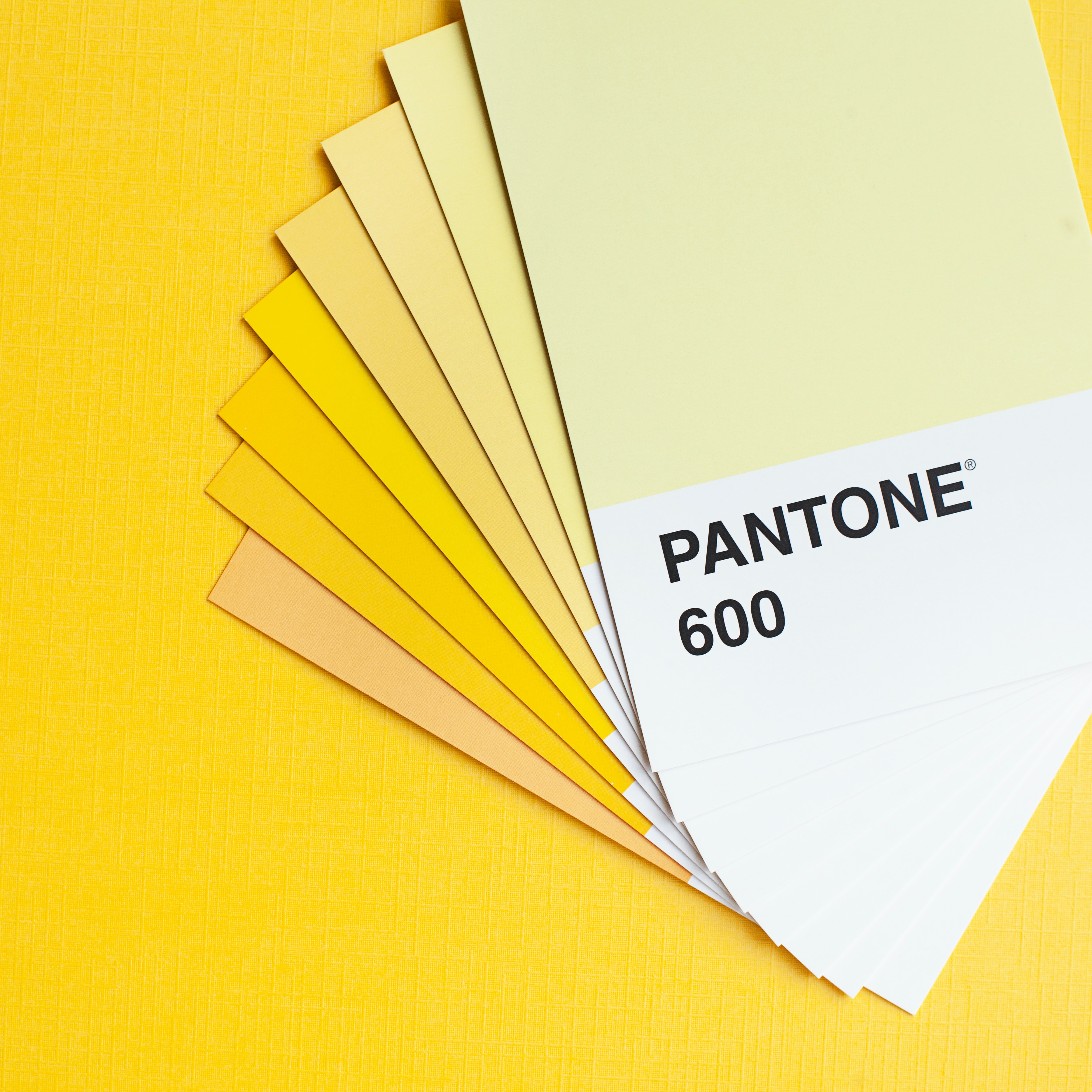
2. Build a clear visual hierarchy
In addition to grouping information, it's important to identify what's more important and what's less important. And you need to highlight key elements so that they can't be missed. This will help the visitor in a cursory look at the page/presentation/banner to highlight the specifics. And only when he needs to know the details, he can delve into the study of elements that are lower in the hierarchy.
This also ensures the aesthetics of the design - highlighting the main and secondary details is much easier to build a composition and apply palettes. Different tools are used to build the hierarchy, but the first and foremost are size, color, contrast, indentation, and positioning.
How do you know it's done right? Squint your eyes or blur the image. In this view, important elements are highlighted and secondary elements are blurred or barely visible. If several details are fighting for "primacy" in such a case - simplify, redesign.
3. Adhere to the grouping of styles
Similar and similar elements should look and work in the same way. It's important to adhere to this rule not only within your own project, but also relative to common UX/UI standards. That is, ensure predictability. Especially when it comes to designing navigation and functional elements. A person shouldn't have to constantly learn how an element works - if it's a button, it's already clear what to do with it. If it is a non-standard chip, then the first time the visitor understands it, and the second time - already understands the principle, and not trying to get into the essence anew.
The sequence of stylization is important. For example, empty icons are not clickable, and filled - lead to another page or show a hint when hovering. And that's the only way within the project, no creative digressions.
Conversely, make sure that elements with different functionality look different.
4. Color is a tool, not a decoration
Use color purposefully. Define a core palette of several primary/supplementary/contrasting colors depending on the direction of the project and brand positioning. If there is a brand book, it makes it easier.
But having a palette doesn't mean color is needed everywhere. Start with a monochromatic design and add color first in the main elements in the hierarchy, then only where it's needed. Branded primary color is most often used on key details - buttons, interactive elements. And only at the very end add colors for decoration or accent.
Color should carry a semantic load, do not load it where you can do without unnecessary coloring.
5. Test the design in b&w
You can't rely solely on color as an indicator. It is important to highlight important and functional elements so that even without color, the aforementioned hierarchy is followed. The person watching your project may have different difficulties - from a broken display to different degrees of color blindness. And your efforts should help everyone to make a conversion action, although the percentage of such cases is not very high.
For example, if you highlight links in blue, there is a reason why they invented an underline in the standard variant. It highlights the link even without color. It is good if all clickable elements have some minimal hover effect, it is not only stylish, but also practical. For variants of execution and application of hover-effects read in a separate material.
6. Check the contrast
Contrast can range from 1 to 1 to 21 to 1. A black font on a black background is 1 to 1. And white font on a black background is 21 to 1. Now the accepted standard is the use of contrast on sites with an index of 3 to 1. This allows text to be easily perceived even if there are visual or perceptual impairments. Read more about Web Content Accessibility Guidelines (WCAG) in the article about inclusive design.
The contrast of the main button should be at least 3 to 1, maybe even higher. This will help visually impaired users to easily recognize it. It's also one way to establish a visual hierarchy.
The contrast of standard small text according to the same WCAG 2.1 norms should be at least 4.5 to 1. And large and bold headings can be left, like buttons, with a ratio of 3 to 1.
Checking color contrast and color perception can be done by any free online tool, there are a lot of them, just google it and choose a convenient one for you. How to correct contrast? You don't have to change the hue of the element, just add/remove shadows or gradient overlays.

7. Avoid pure black text
Too high contrast causes eye fatigue and looks harsh, although this is not always obvious. In UI design, it is usually best to avoid pure black as it is very contrasty against white. This high contrast can cause eye strain and fatigue when reading text.
Dark gray is much easier to read, use its shades for different content options.
8. Get people out of capsize
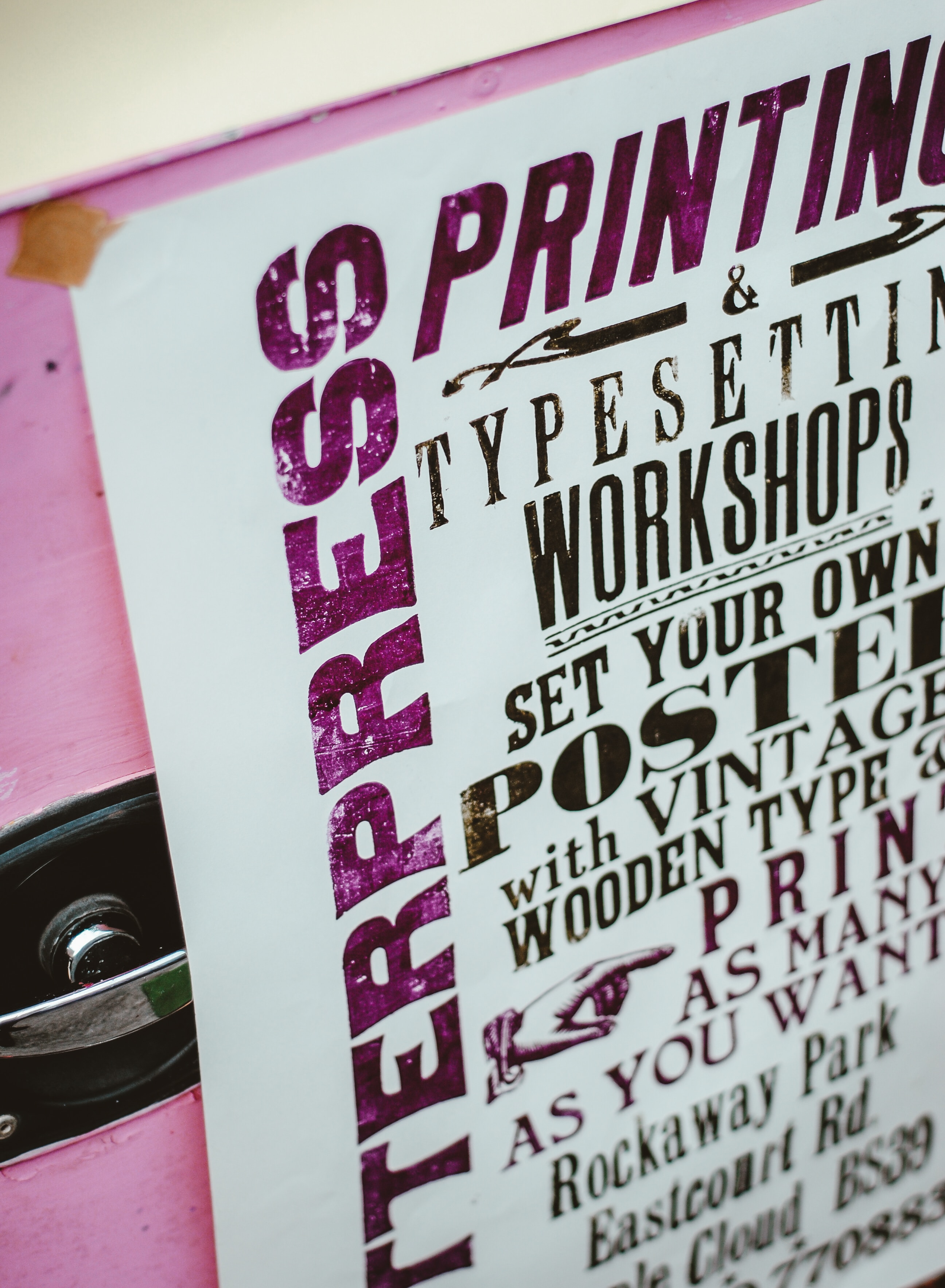
If you need to make something stand out - use a large bold font, indent, apply a primary color, and other available ways to show hierarchy. A design is bad if you can't show something without a caption. And try not to use it unless absolutely necessary, because it's ugly and hard to read. It looks like the reader is being yelled at. And if that's the effect you're going for, then okay.
9. Check the alignment of the text
If your target audience is Europe/America - align the text on the left edge. If Asia/Arab World - align to the right. Take reading patterns into account. This applies to text blocks.
Headings, captions, and short text can be center-aligned. But avoid this if there are more than a few lines. It will appear that the starting point of each line is constantly changing, this is inconvenient and strains the eyes.
10. Check indents and spacing
Need I say that they should be the same in all elements of the same type? Besides, it is recommended to use one and a half spacing for standard text to make it easy to read.
11. What about fonts?
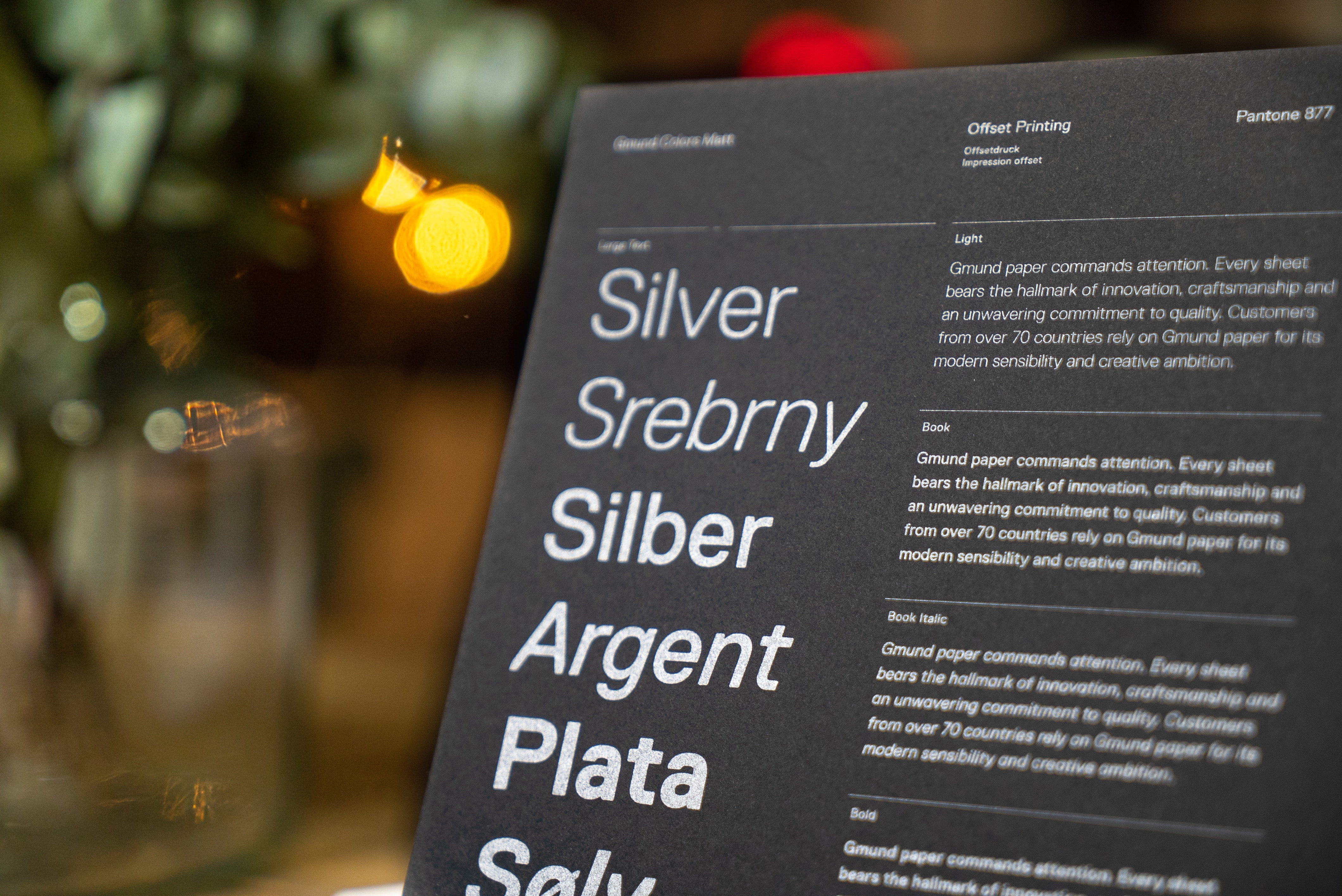
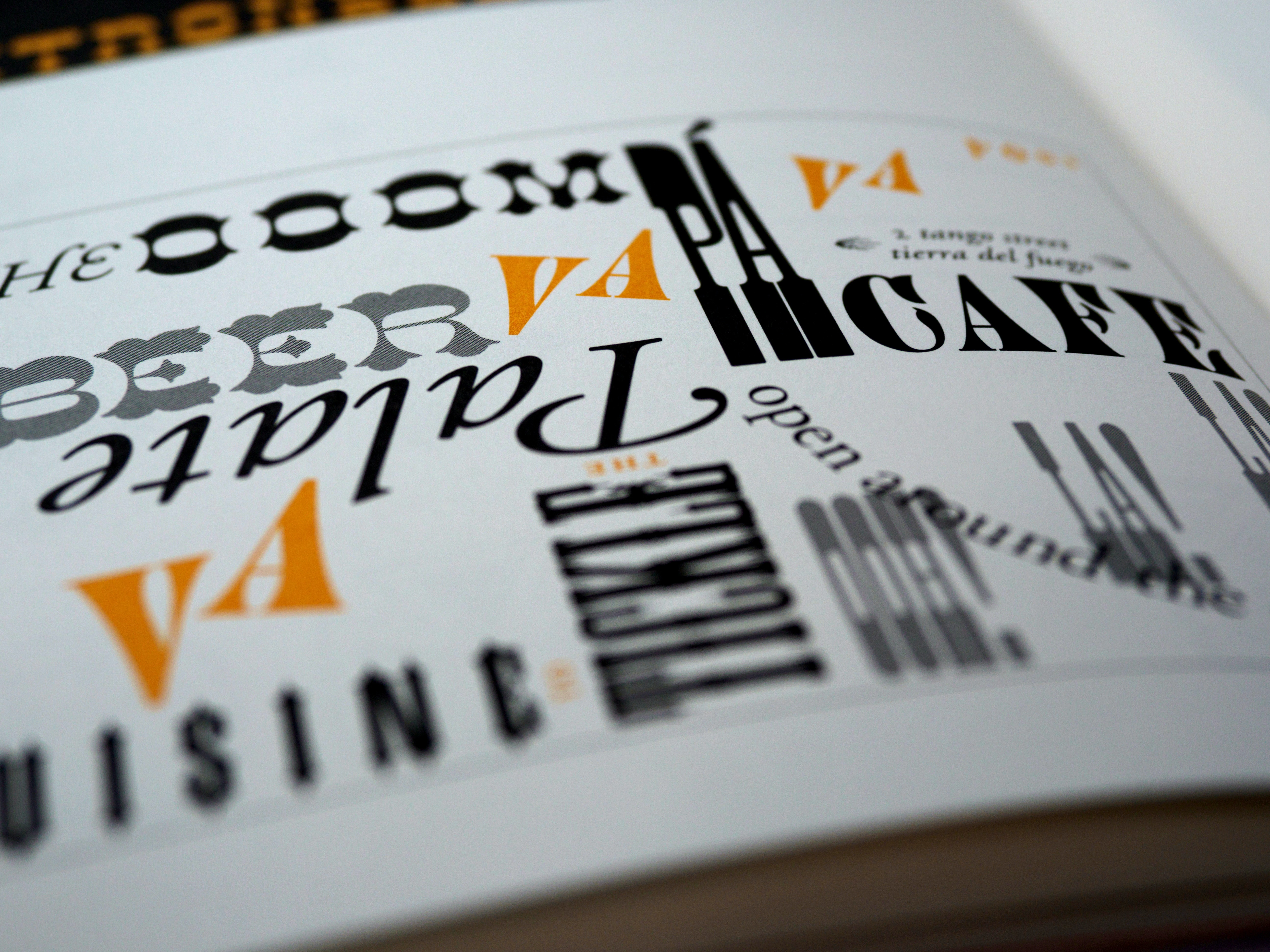
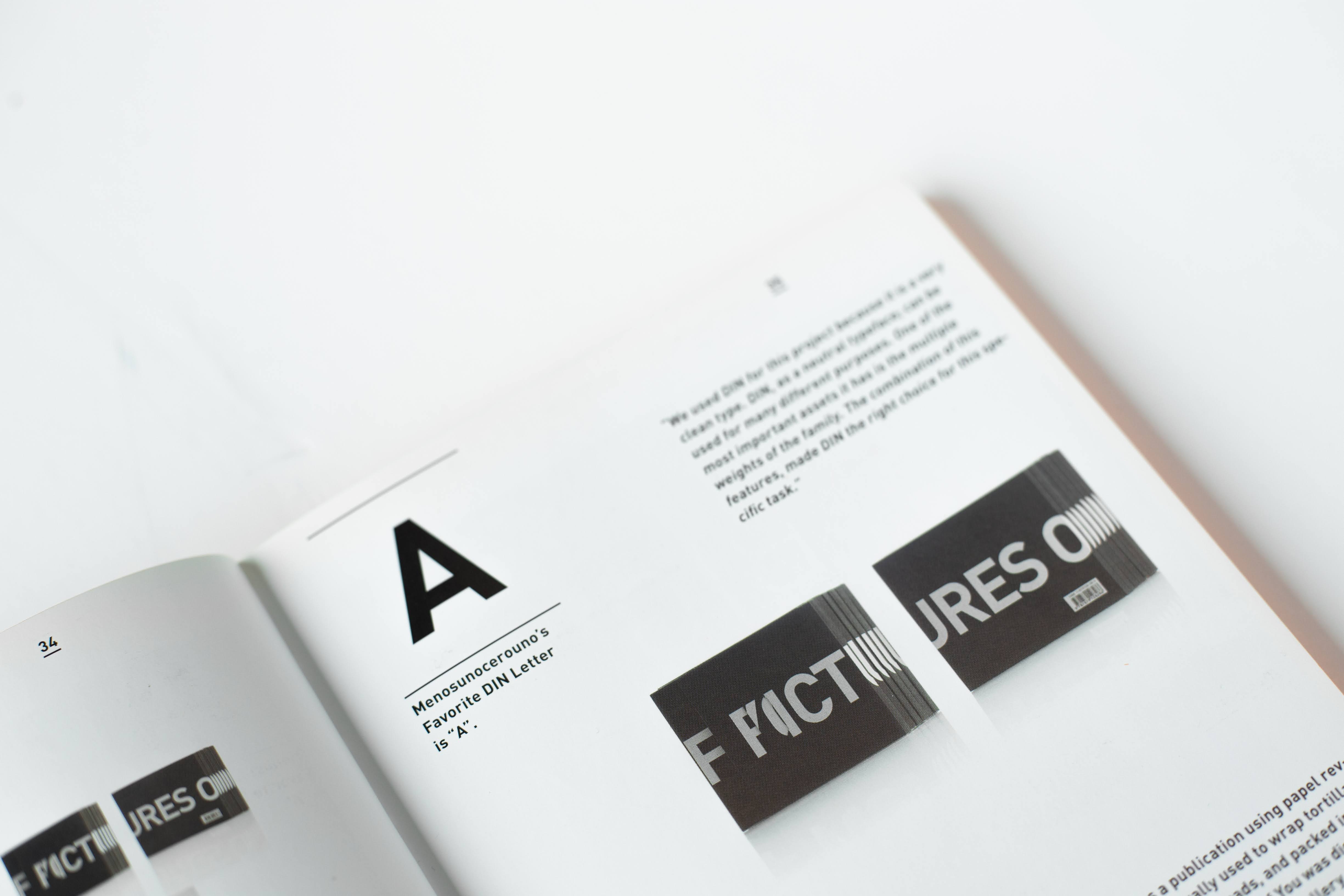
If you're not a typography guru yet, use sans serif fonts in your project, trust me, it will look fine in any situation. Sans serif fonts are usually the most legible, neutral and simple.
Choose fonts with taller lowercase letters and longer character spacing. They read better at smaller sizes.
There are often multiple lettering options within a single font. And just because you choose one or a couple fonts for a project doesn't mean you can use all variations of a font. Different character weights introduce visual noise. And you'll also have a harder time keeping track of peer styles. Keep your design simple and concise. To do this, use only regular and bold fonts.
Take bold fonts for headlines to emphasize them. And for the rest of the text, use regular typeface.
12. Remove unnecessary stuff
Unnecessary extra styles, tinsel and excess animations only get in the way. They increase the cognitive load and distract from the important. And it usually looks bad and tasteless. It's important for you to make a simple and focused interface without visual complexity.
One more thing: check the integrity
Check this list at the beginning of the project and at its completion. But always keep in mind the specifics of the project, its goals and requirements.
To a large extent, interface design consists of logical rules, but if you have done everything clearly, but the result is not very good - make changes safely. Still, a share of creativity should also be present, otherwise we would have been replaced by artificial intelligence and one-size-fits-all designers long ago.
If you want to feel design and not just understand its rules, you need to practice. That's why our training emphasizes practice. And our graduates show cool results even while taking the course. Do you want to be a professional? Then we are waiting for you on the online course "UX/UI legend".

