
Пожалуй, у каждого дизайнера имеется свой план процесса создания дизайна, когда дело доходит до очередного проекта, но все же всех их объединяет один общий список важнейших элементов, которые просто обязан включать в себя любой современный сайт.
Начиная от свободного пространства и огромных изображений, вплоть до функционального поиска по сайту и четкого «призыва к действию», эти элементы являются именно тем, что пользователи ждут получить, когда речь идет о легком использование веб-сайта.
Но что это за элементы, которые столь приоритетны в дизайне и как их правильно использовать при создании нового дизайн-проекта? Именно об этом мы и поговорим в сегодняшнем посте.
#СВОБОДНОЕ ПРОСТРАНСТВО
Любой опытный дизайнер скажет вам, что пространство – это один из наиболее важных элементов в дизайне, потому как именно оно определяет подачу контента и его читабельность. К тому же они научились использовать этот инструмент таким образом, каким бы вряд ли увидели еще десять лет назад. Особенно важно оно, когда дело касается создания точки фокусировки для пользователей, ведь любой кусочек текста или изображение будут казаться значительно больше в окружении свободного пространства. При этом не стоит забывать о последовательности: схожие элементы должны иметь схожие интервалы между собой.
И хотя в привычном лексиконе дизайнера можно услышать определение «whitespace» (белое пространство), это вовсе не значит, что оно должно быть именно белым. В реальности это относится к отсутствию множества элементов и может быть любым другим фоновым цветом или текстурой.
Как использовать: начните с ключевых элементов, таких как меню навигации, например. Убедитесь, что элементы организованы таким образом, что расстояние между ними одинаковое и гармоничное. Такой подход поможет вам выделить каждую кнопку или фрагмент текста, сделав их более четкими.
#ПРОСТАЯ НАВИГАЦИЯ
Навигация не должна быть сложной. Она должна быть понятной и удобной в использовании. Важно также свести навигационное меню до минимума, поэтому не перегружайте пользователей. В зависимости от типа веб-сайта, необходимо стремиться к тому, что бы количество элементов навигации было от пяти до десяти.
Навигация также должна включать в себя инструменты, которые помогут пользователям ориентироваться по сайту. Запомните: чем легче людям использовать ваш сайт и ориентироваться в нем, тем дольше они будут взаимодействовать с ним.
Приведенный выше пример удобен тем, что хотя навигация и изображена немного необычным способом, выглядит она довольно стильно, а главное – остается в верхней части сайта, не изменяется и не движется, на какую бы страницу не переходил пользователь.
Как использовать: используйте простую навигацию в качестве основы для вашего сайта. Помните, что пользователям нужны несколько ключевых вещей от навигации: знать, где они находятся на сайте, способ вернуться, куда им нужно и простой маршрут, в случае необычного или сложного интерфейса.
#СТРАНИЦА «О НАС»
Эта страница особенно важна для представителей малого бизнеса или авторских сайтов, чтобы сообщить пользователям о себе.
Страница “О нас” должна сообщить пользователям о том, кто вы и чем занимаетесь. Тут может содержаться небольшая история о вас, ваших целях и принципах. Также тут могут быть представлены отзывы довольных пользователей и клиентов и даже собственная история успеха. Кроме того, вы можете выложить ссылки на аккаунты в социальных сетях или материалы, представленные в СМИ.
Единственная проблема заключается в том, что зачастую страницу перегружают лишней информацией и она получается немного скучной и даже нудной. По этой причине, необходимо сделать ее максимально простой, содержащей только необходимую информацию, чтобы заинтересовать посетителя. Ну и конечно, дизайн – он должен быть интересным!
Как использовать: страницу "О нас" можно и даже нужно использовать, чтобы наделить бренд личностью – оживить его. Если дело касается команды, то было бы неплохо, включить в дизайн фотографии всех ее членов и прикрепить к ним краткие биографии с навыками.
#КОНТАКТЫ

Контактная информация, чаще всего, предоставляется двумя способами:
В заголовке или основной навигации
На странице «Свяжитесь с нами» в качестве формы или более расширенной информации
При этом стоит отметить, что оба этих варианта могут превосходно работать для веб-сайта, но, опять же, в зависимости от создаваемого дизайна.
Мало кто из дизайнеров или клиентов догадывается, но именно наличие контактов – номера телефонов, адрес, форма обратной связи добавляют компании своего рода легитимность, что, в свою очередь, увеличивает доверие пользователей. К тому же стоит подумать и о том, что пользователь может почувствовать себя не слишком приятно, если он желает связаться с вами, но на сайте отсутствует четкая информация, как это можно сделать.
Как использовать: обязательно добавьте контактную информацию для всех статических хедеров и футеров, а если у вас имеется конкретный физический адрес, то включите в контакты информацию о местоположении и даже способ проезда. Продумайте форму обратной связи таким образом, чтобы пользователи имели возможность написать вам напрямую с сайта, без необходимости делать десяток ненужных действий, копируя е-мейл, заходя на свою почту и так далее.
#ПОИСК ПО САЙТУ

Сколько раз вам самому хотелось найти на сайте какую-то старую информацию, либо то, что вам запомнилось, но вы точно не помните, где это видели на сайте? И как часто вас расстраивал тот факт, что вы никак не можете это сделать. Вот где пригодится строка поиска! Этот элемент имеет одно из важнейших значений для современного дружественного веб-дизайна и ваших постоянных пользователей. Однако, следует создавать этот элемент так, чтобы он не был навязчивым, но при этом его можно было легко найти и также просто воспользоваться. Если для идентификации строки поиска вы решили использовать иконку, то не нужно «изобретать велосипед» - остановите свой выбор на стандартной увеличительной лупе.
Как использовать: создайте простую строку поиска, которая будет находиться в верхней части сайта. Желательно в правом углу, ведь именно там, как правило, пользователи ожидают ее найти.
#ИНФОРМАЦИОННЫЙ ФУТЕР

Футер является тем самым элементом, с помощью которого вы можете предоставить своей аудитории кучу информации (нужной и полезной), без того чтобы перегружать ваш дизайн. Так как располагается он в самом низу вашей страницы, то целесообразно разместить тут ссылки на основные разделы сайта, контактную информацию, ссылки на социальные сети и обратную связь.
Постарайтесь сделать футер максимально полезным, но при этом не лишенным простоты. Это именно тот случай, когда фантазию в дизайне можно отключить. Независимо от выбранного вами стиля для футера – стильные кнопки или ссылки – он должен гармонировать с общим дизайном и быть более минималистичным. Сделайте его легким в использовании!
Как использовать: если верить практике, то идеальный футер содержит все вышеперечисленные элементы. К слову сказать, если вы не можете придумать, куда лучше «запихнуть» тот или иной элемент из предыдущих, то спокойно добавьте его в футер. Поверьте, пользователи знают, что если чего-то не нашли, то стоит посмотреть в самом низу.
#ПРИЗЫВ К ДЕЙСТВИЮ
В большинстве случаев веб-сайт является призывом к действию – купить товар, скачать книгу, подписаться на рассылку. И чтобы это действие гарантировано было выполнено пользователем, необходимо, чтобы данный призыв был четким, понятным и заметным.
Изначально необходимо определить, что должен делать сам сайт, а затем создать дизайн таким образом, чтобы данное действие было очевидным и он вел пользователя непосредственно к его совершению. Такие приемы, как цвет, пространство и контраст помогут вам выделить «призыв к действию» и приведут посетителя к нужной кнопке.
Однако стоит отметить, что «призыв к действию» свойственен не только для лендингов, но и для простых сайтов. Ведь та же форма регистрации – это тоже своего рода призыв. Если ваша цель заключается в том, чтобы пользователь зарегистрировался, то расположите форму в заметном месте и выделите ее, но при этом оставьте ее простой и легкой для заполнения. И главное – старайтесь не перегружать ее полями. Если все, что вам необходимо это электронный адрес, то не надо спрашивать посетителя о его дате рождения и семейном положении.
Как использовать: сделайте призыв к действию заметным. Он должен размещаться в самом видимом месте вашей страницы. Что же касается кнопок, то они должны контрастировать с общим фоном и четко давать понять, что пользователь должен сделать: купить, загрузить, подписаться, зарегистрироваться.
#КНОПКИ
Все кнопки на сайте должны быть распознаваемыми. Они должны иметь одинаковую форму и эффект при взаимодействии независимо от того, где они расположены и для чего предназначены. Конечно, если сайт имеет много интерактивных элементов, то создание собственного набора кнопок может стать сложной задаче, поэтому в этом случае лучше использовать готовые дизайнерские наборы, настраивая их по своему усмотрению.
Как использовать: разрабатывая собственные кнопки, постарайтесь их сделать уникальными, при этом придерживайтесь последовательности – все кнопки имеют один оттенок, эффекты, форму, текстуру. Так пользователь не будет путаться и сможет легко взаимодействовать с сайтом.
#БОЛЬШИЕ ФОТОГРАФИИ

Не секрет, что человек быстрее реагирует на визуальные эффекты, поэтому если вам удалось привлечь внимание пользователя с их помощью, то это уже плюс. Именно поэтому так необходимо создавать дизайн с учетом этого фактора. Используйте огромные изображения, которые могут завлечь посетителей и даже рассказать им некую историю.
В зависимости от тематики сайта, покажите посетителям свой продукт или услугу при помощи красивых изображений, способных передать куда более мощное послание, чем отточенный, грамотно написанный текст. При этом старайтесь использовать как можно меньше стоковых фотографий, иначе вы рискуете потерять индивидуальность.
Как использовать: когда дело касается изображений товаров или услуг, то предпочтительнее воспользоваться услугами специалиста, который сделает необходимые снимки или иллюстрации. Если тема веб-сайта позволяет использовать стоковые снимки, воспользуйтесь ими, но опять же, не забывайте о переборе.
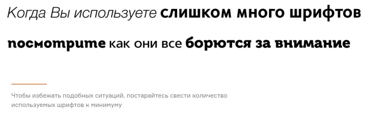
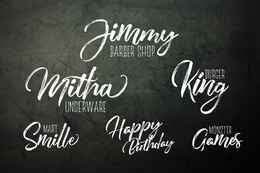
#ВЕБ-ШРИФТЫ
Если речь заходит об использование шрифтов, то раньше на ум дизайнеров приходили только самые простые, которые легко распознавались большинством браузеров и девайсов, однако сегодня эти границы полностью стерлись и отныне вы можете использовать в своих проектах сотни красивых и ярких шрифтов. Главное – знать об их совместимости и лицензировании. К тому же, используя сервисы веб-шрифтов, напрочь отпадает проблема поисковой оптимизации.
Как использовать: самый простой способ начать использовать веб-шрифты – это обратиться к популярному сервису Google Web Fonts, являющимся абсолютно бесплатным и предоставляющим огромное количество красивых и весьма необычных шрифтов, способных сделать ваш дизайн привлекательным и отзывчивым.
ЗАКЛЮЧЕНИЕ
Безусловно, существует еще множество различных элементов, которые играют не менее важную роль в дизайне, вот только их отсутствие, как правило, не сильно влияет на эффективность сайта. В то же время, если вы забудете при создании дизайна хотя бы один из вышеперечисленных элементов, то вероятно, это создаст некоторые проблемы для пользователей, а, следовательно, и для самого веб-сайта. Поэтому сделайте небольшой перерыв, отдохните и пройдитесь еще раз по нашему списку, убедившись, что ничего не упустили.