There are many changes happening in the world of logos, and sometimes it feels like every company is constantly updating, rebranding, or completely replacing its logo. The reason is that a single static logo is no longer enough to elevate a brand — not even to an average level. In reality, businesses must eventually develop an entire logo library to meet all their needs and only then settle on one — and even that, just temporarily.
The idea of the "death" of the static logo has been evolving for some time, especially among web designers who often think about web design trends, social media projects, and small favicons in browsers. When reflecting on the evolution of web design, styles, and trends, one thing becomes clear: the static logo is being used less and is slowly fading away.
On the other hand, you can easily find many examples of companies still using a simple static image as a logo, without any animation. This is because there hasn’t been a global shift toward animated logos yet — but there are countless opportunities and good reasons to make the switch. For example, the portfolio of Clear Design demonstrates the purposes and goals of animated logos. And yes, it includes actual examples. Animated logos are widely used in video content, social media projects, and on many websites.
So is the static logo becoming a thing of the past, or will animated logos never fully replace it and thus completely transform web design? Let’s explore this topic and also look at how logos relate to site design and how the two influence each other.
Starting point: vectors
In fact, the design of logos hasn’t changed fundamentally. Every brand still requires a well-crafted vector image, whether in monochrome or multicolored form. This is the foundation, and from it, variations can be created. For instance, different color schemes or a mix of clean vector lines with elegant decorative elements. Examples of logo variations from major brands: Opera, Nivea, Slack, Mercedes. A traditional vector logo is scalable, making it perfect for both print and digital use.


So what exactly has changed in recent years — subtle yet important?
The presence of a vast number of mobile platforms. There are countless apps for various devices (consoles, smartphones, smartwatches, etc.), and not all of them can display full-sized images or small text (e.g., the Rainbow6 logo). In such cases, a small animation can enhance logo visibility. Additionally, many social media platforms use circular profile images, where traditional logos don’t always fit well. Take BMW — they’re fine. But brands like GJ, with many variations, may struggle. Animation helps users better see and recognize the brand.


Multiple sizes for responsiveness
The biggest shift in logo development is the adaptation of logo sizes for responsive design, as a single size may not work across all devices and could be completely unreadable. Designers typically create a main version, a secondary one for social media profiles or app icons, and a third — miniature — version for small icons.

The similarity between these versions depends on the shape, design elements, text readability, brand style, and other factors. But most importantly, all logo variations should align with each other and remain consistent and recognizable.
Now, the dynamic logo takes the stage, offering a different perspective on design. Thanks to its flexible construction, it allows a brand to combine multiple variants into one cohesive identity. This may include initials, icons, or colors that are easily associated with the brand — essentially fragments of a standard (large) logo.
Examples include Twitch, Macaw, Rog.ie, Yondr Studio, Shazam.


A dynamic logo can change its color or shape based on current web design trends and styles — adapting itself to what’s fashionable at the moment.
The challenge with dynamic logos is that users may get confused by the variety of shapes and styles, and their association with the brand can weaken. Still, some dynamic designs successfully incorporate variety while maintaining brand clarity.
Think of Slack, for example, which features animation in its app. Also Skype and Telegram.

Animated elements in a static logo
Specific animated elements in the structure of a static logo became popular alongside their use in web design. If you take a closer look at many websites, you’ll find small or noticeable animated details almost everywhere. Naturally, this trend extended to logos as well — even Facebook now supports animated profile pictures. See how elegantly animation is used in the logo for Fubiz and their website, where all versions of their logo are shown in action. Also worth noting: Todoist, Rainbow Six Siege, Ubisoft The Division.


After animated logos became widely used on TV, they were gradually introduced into web design. Typically, the original logo includes one dynamic component. Ideally, animation should be subtle, light, airy, and non-intrusive. Just like good web design. Still, some brands successfully use fully animated logos that take up a significant portion of the homepage and serve as the central visual element.
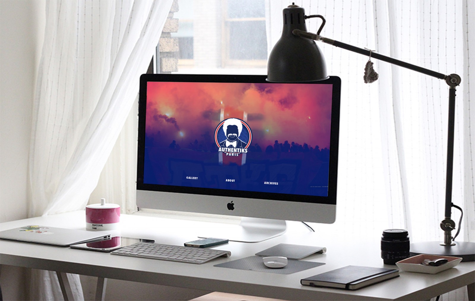
Some logos change when scrolling, some during page load, others on hover, or on their own. Examples include abelodor, kommigraphics, inavoué restaurant, The Hunt for the Cheshire Cat, Wibicom, Authentiks Paris XV, Project Redspace.


Most of these logos are created as GIFs or using CSS and SVG. Regardless of the format, dynamic logos help users recognize the brand, enrich website content, and add uniqueness and personality to the site.
Seeking consistency
Now that you have a ton of ideas and feel a bit overwhelmed, a logical question arises: how do you handle everything and arrive at a single, functional logo design that works across all platforms and use cases?
This is where a new concept emerges — the logo system. Eva Brown wrote a great piece on this for Design Mantic. Let’s highlight only the points that are relevant right now.
A logo system can partly be seen as an evolutionary story — there’s a core, and then there are variations. And yes, Google’s logo is animated.


So, by creating different logo sizes and formats for a single company, you’re building a system — a library of components, all of which are important and will be used. For example, Wildberries has a separate logo for each project, but all of them match the overall corporate style and form a consistent identity.


The static logo is still alive
Simply put, the static logo is fading away — gradually. Maybe not as fast as we thought earlier. As branding evolves across multiple channels, the need arises to build a full logo system and create variations for different platforms. Often, it’s hard to do alone — you’ll need help from animators, designers, or layout developers to build a complete branding toolbox.
Once you’ve designed various versions, the time comes to pull everything together into one consistent identity that matches the company’s style and is tested across apps and websites. It’s important to clearly define which version of the logo is used in what context — so that both users and clients (brand owners) can see the unified concept across all platforms (web, social media, apps, video, etc.).


Conclusion
You might ask: why would a web designer care about logos? It’s only the beginning of a new year... The thing is, design almost always begins with — and is driven by — the logo. So having this background is essential. And what if you’re not just designing websites or writing code?
As the static logo risks becoming "dead," you need to focus on creating a strong emblem that can truly represent the brand. A logo is key to recognition — users identify the company through it. Think about the Coca-Cola or J7 logo — don’t they instantly make you want to grab a drink?
To ensure animated logos are successful, it's crucial to develop all variations under a unified visual concept. If you first create a static vector logo and then — months later — add animation, inconsistencies may arise that force a redesign of the entire site. But if you plan ahead and align the animated logo with the static one from the start — that's the right approach. A quick example: in fall 2017, Ubisoft updated its logo. Imagine if the site featured the new version but apps still showed the old one — awkward, right?
So, whether you’re working on web design or logos, ask your client: are there other versions of the logo? Should we create them? And which version is the website being designed for? If the logo is already animated, too much animation on the site might create chaos. But if it’s static, then animation in menus or other sections might actually enhance the experience. And of course, don’t forget to think about logo size and the devices it will appear on — and whether it aligns with current design trends.