You can hear about DPI and PPI almost everywhere — how important and essential they are, and how you should manage to use both at once. Oh yes, and in web design — absolutely necessary, otherwise, are you even a web designer?! But what do these size specifications really mean, and how can a web designer actually use them? Should we even pay attention to these values, or are the default settings enough?
In essence, it all depends on your project. If you know in advance what environment your site or logo is being created for, and how your work will be used afterward, you can immediately define whether and how to use DPI and PPI. Still, before starting any project, it’s worth recalling these values and refreshing your memory.
In this article, we’ll discuss DPI and PPI in more detail and with examples to understand when and why a web designer should pay attention to them. We'll say upfront — the article might seem “dry” or boring, but we’re sure you’ll find useful insights here. Strangely enough, PPI values may or may not affect design and images — even external PSD files and copied elements. And let’s not forget screen PPI. Imagine — it’s all connected. At the end, we’ll summarize all our findings.
Pixels and PPI
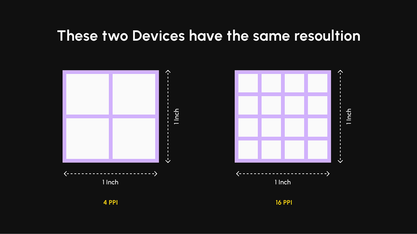
Pixels are the building blocks of images — the tiniest units that form a picture on a grid. The number of pixels per inch is known as PPI.
The higher the PPI, the sharper the image, and the more visible the tiniest details of a composition.
Pixelation occurs when the number of pixels per inch is very low. As a result, each pixel becomes clearly visible with hard edges and no tight spacing between them.
PPI is a quality measure for images and is the default unit in Photoshop.
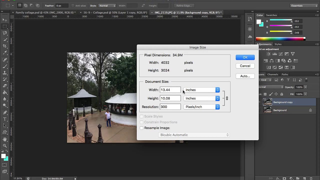
When working with photos, you can change the image’s sampling or resampling (the number of pixels) or change its physical size (the size of each pixel, but not the count). In Photoshop’s image resize dialog, it’s important to monitor the pixel dimension and resampling settings (resolution and pixel count).
The web standard for images is 72 pixels per inch.
At this resolution, images look good — assuming the source quality is high (not distorted or blurry). Remember, your photo should always be full-sized and wide enough to fill its container. For example, a large Facebook page cover image must be 851 pixels wide.
To avoid pixelation at 72 PPI, your final image width should be almost 12 inches (at 72 PPI) to cover the visual space without quality loss.
Surprisingly, PPI also affects text. Just like a high PPI makes photos sharper, it makes text easier to read. Fonts rendered at high PPI are more legible — even when the font size is small. In other words, text can appear sharp or blurry, just like images.
Finally, when thinking about the role of pixels in web design, remember that the browser window constantly changes — even for a single user. A few years ago, apps and sites were designed for fixed window sizes. Now most web design is responsive. And with scalable layers, you can let images resize with the browser window without exceeding their actual dimensions. This helps preserve image integrity and quality.
While PPI is important for the web, it’s not very useful for print. In print design, the better-suited measure is dots per inch, or DPI.
Dots and DPI
The term DPI — dots per inch — was created to measure print quality. When an image is printed, it consists of hundreds of thousands of tiny ink dots, overlapping and aligned next to each other in various colors. These dots mix ink on paper, producing a broader color spectrum.
DPI refers to the number of printed dots in one inch.
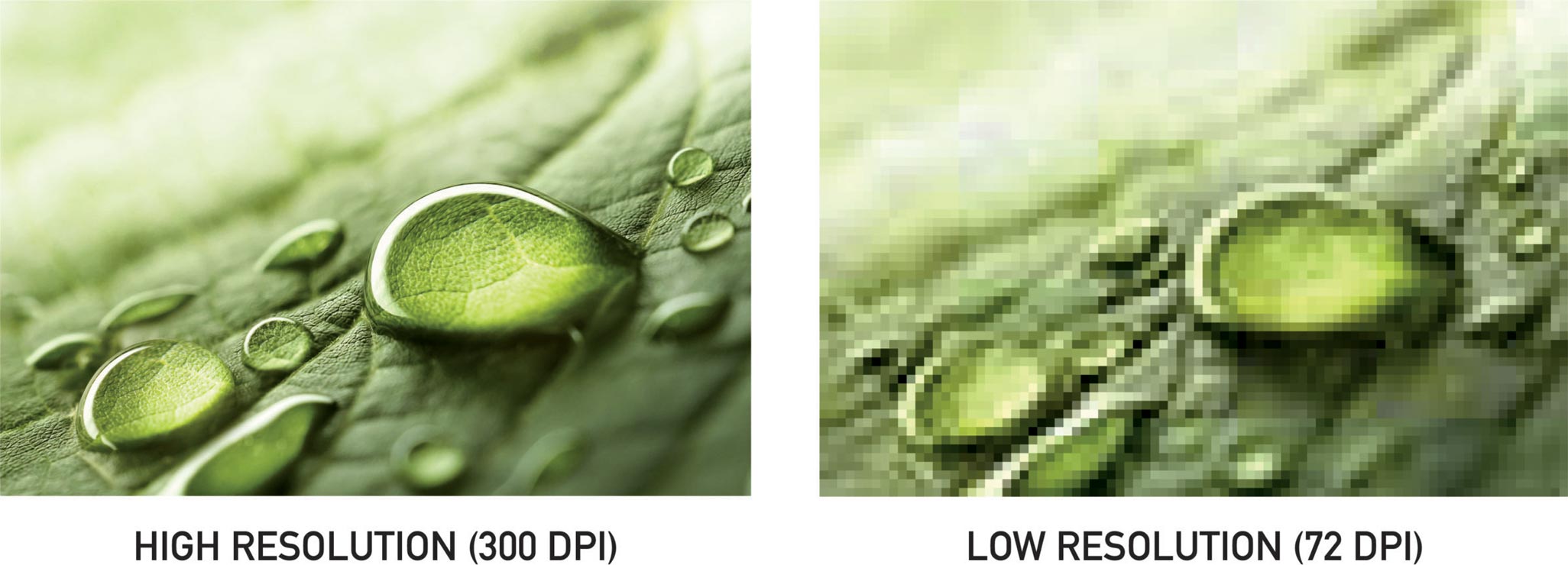
The higher the DPI, the smoother and more realistic the image will appear — especially gradient transitions.
However, in everyday use, people often use “DPI” to refer to any resolution and confuse it with PPI. If you’re working on a digital-only project, there’s no need to worry about DPI. But if you’re creating a logo to be used both online and in print (business cards, stationery, etc.), you should design with print quality in mind. Create a separate version of your image with high DPI, specifically for print.
When it comes to screens, it’s unlikely anyone can tell the difference between two identical images created at 100 DPI and 300 DPI. That’s because screens don’t render images in dots. For them, DPI values are irrelevant.
For printing, however, the standard DPI is 300.
This ensures the printer won’t override the resolution due to missing metadata in the file. Otherwise, the image may become distorted, or even the colors may shift.
DPI also comes into play when converting printed materials into digital formats. The higher the DPI setting, the better the scan quality. Good printed photos usually have 200 DPI at real size. Still, it’s best to scan at higher settings to make editing easier and to allow for enlargement or reprinting.
Megapixels
Since we’re talking about using high-quality images in web design, it’s worth mentioning the megapixel concept. Megapixel blocks are used in professional cameras to help users understand what high image quality really means and how it compares to regular pictures. In numbers, one megapixel equals one million pixels.
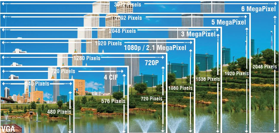
All digital images, regardless of their source, consist of pixels (not dots). Megapixels help describe resolution and quality — just like we use centimeters, meters, and kilometers to measure distance.
Numbers in Web Design
A pixel has no inherent size, value, or meaning outside of its mathematical context. It serves as a bridge between the screen’s physical size (inches), screen resolution (pixels per inch), and pixel dimensions (in total pixels). Standard desktop monitors (non-Retina) usually have a PPI between 72 and 120. Designing at 72–120 PPI ensures your work appears in relatively consistent proportions across different displays.
Here’s an example: an LG w2253tq 22-inch monitor has a PPI of 102. That means it shows 102 pixels per inch of screen space. The screen width is about 18.8 inches, and 18.8 × 10² ≈ 1920 — which matches the native screen resolution of 1920×1080 px.
We’ve found a handy PPI calculator for monitors — it might be useful for you.
That’s why users see web design layouts differently. The goal of a web designer is to find a compromise that works for most, since not everyone has the same screen as you do.
One More Interesting Point
What happens if you change the PPI setting in Photoshop and create projects at 100 or 120 PPI? The thing is, digital content is measured in pixels regardless of the PPI value. PPI doesn’t directly affect the layout itself. That’s why multipliers are used when scaling images.
In Photoshop, let’s create a new document at 72 PPI. We make a 102×102 pixel square and add 14 pt text.
Then we create the same square and text in a 102 PPI document.
Now compare them. The text in the second document (which matches the screen PPI) appears larger, while the square remains the same. Why? Because Photoshop automatically scales point sizes based on document PPI — hence the larger-looking text.
The square, however, was defined in pixels, so it didn’t change. A pixel doesn’t change — regardless of the PPI. To alter the square’s actual size, the screen’s physical PPI must change. This can’t be done via software.
So remember: in web design, PPI only affects how your layout is perceived — images, block sizes, and text (measured in points) all respond to it.
There’s another scenario: when you have multiple PSD files with different PPI values. What happens in Photoshop? The app automatically adjusts element sizes to match your screen and the document’s PPI. The same will happen if you're designing at 72 PPI and insert a logo from a 100 PPI file — the image will auto-scale, possibly causing issues.
The solution? Stick to the default 72 PPI setting when working on web projects. That’s Photoshop’s default anyway. But if clients or colleagues say “something’s off,” consider how they’re opening the file — and what their app settings are.
Also keep vector graphics in mind, which scale cleanly and eliminate the need for multiple raster images at different PPI values. Vectors scale based on multipliers, monitor resolution, and more. However, vectors have limitations — you can’t easily create complex visuals like shadows or gradients. They can also be heavy on system resources and may cause slowdowns if overused on websites.
Conclusions
When you use the appropriate PPI or DPI values for your project, you can influence its quality and appearance. PPI is meant strictly for digital content and controls image quality on-screen.
PPI plays a major role in web design because it affects image sharpness and element proportions. Photos can appear blurry or crisp, and sizing can vary — especially if not defined in pixels. If you want your entire design to look great, use your monitor’s native PPI or the default 72 PPI. Pixels don’t like fractions. There’s no such thing as half a pixel. You’ve either got one or two — which is why precision is everything. And that can only be achieved by sticking to your native specs.
Another thing: many users zoom web pages to make them easier to read or browse. This can distort your layout and make your design look broken — but there’s little you can do. Convenience comes first for visitors. That’s why files are usually created at 72 PPI — to reduce server load. Image files will be smaller and load faster . And even though they’ll be lower-res than original photos, they’ll still appear larger on most screens, since most monitors today have 100+ PPI.